Earth is still bound to the Late Cenozoic Ice Age, and our planet's average global temperature still hovers around a very livable 15°C.
This is far below the world's long-term planetary average of 18°C to 24°C - seen throughout most of Earth's biological history. It makes the idea of a global warming crisis seem out of sync with reality.
Despite four decades of continuous climate alarmism, roughly 10% of the Earth's total land area remains permanently capped by glacial ice, which covers 15 million square kilometers (5.8 million square miles).
That is nearly a third of its extent during the peak of the Last Glacial Maximum (26,000 to 19,000 years ago), when continental ice sheets reached their historical zenith.
The Antarctic ice sheet remains the largest and thickest body of ice on the planet, extending up to 4.8 kilometers (about 3 miles) deep. It holds roughly 90% of global ice volume and accounts for 85% of total glacial land cover. Spanning 14 million square kilometers (5.4 million square miles), Antarctica alone makes up 8.3% of Earth's total land surface.
A basic geographical reality is often forgotten: land comprises a mere 28% of the planet's surface. All human cities, towns, and infrastructure combined occupy just 1% to 3% of that land (while deserts take up 33% and forests 31%).
We live on an ocean world, and waters cover 72% of the globe to an average depth of 2.3 miles.
Crucially, the oceans hold 86% of the global carbon reservoir and absorb over 90% of retained thermal energy. By contrast, the atmosphere holds a fraction of a percent of each. The oceans—not human industrial activity—serve as the true long-term regulatory engine for atmospheric carbon dioxide and global climate stability.
The current Quaternary Glaciation is part of an ice age cycle that began 34 million years ago with the thermal isolation and glaciation of Antarctica, later intensified by the closure of the Isthmus of Panama and orbital variations (Milankovitch cycles).
Carbon dioxide was not the driver of these immense shifts.
All of human civilisation, agriculture and technological progress has unfolded within a brief, warm respite: the Holocene interglacial period, which began just 11,700 years ago.
Yet for 40 years, the narrative has been dominated by a campaign driven by an unaccountable bureaucratic authority—the United Nations—pushing an agenda of global control.
The promised catastrophe of runaway, unprecedented warming never arrived.
🚨 Quantum Experiments Hint Time Doesn’t Flow Forward — It Loops
New research suggests something astonishing: time might not be a simple straight line.
In certain quantum conditions, future events could mathematically influence — or even alter — the past.
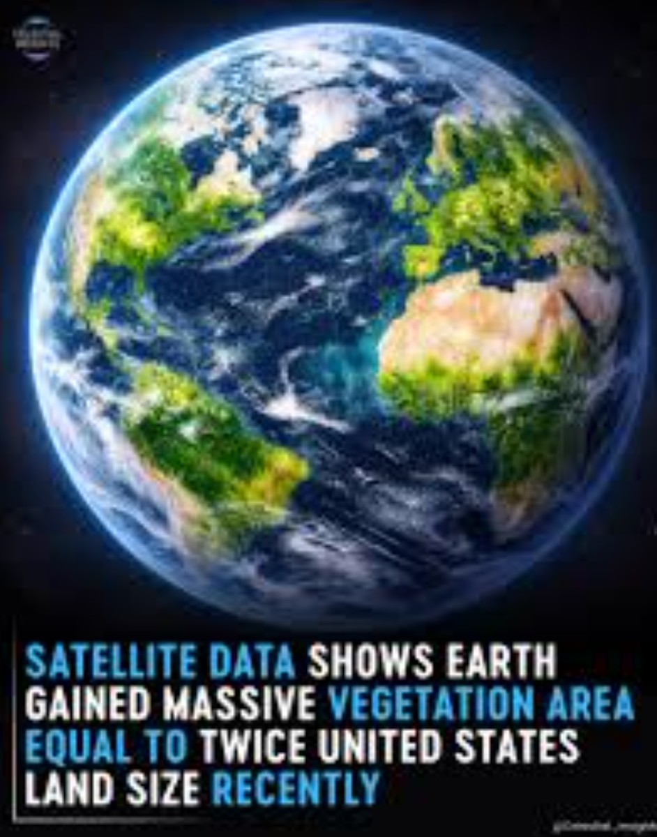
Trillions of leaves are currently breathing more deeply across the planet.
While the world stays glued to dead screens, filled with narratives of a collapsing planet, a much bigger story is unfolding right outside our windows. It’s not a story of a sinking abyss but a world coming to life. The data is in and the Earth is greening at a rate that defies the code red message.
NASA satellite data shows that over the last few decades 25% to 50% of Earth’s vegetated lands have shown significant greening. We are seeing existing biomes becoming more lush and productive from the Amazon to the Australian Outback.
The secret ingredient is CO₂ - the primary building block of all life. As CO₂ levels rise, plants become more water-efficient. They don't have to open their pores as wide to breathe, meaning they retain more moisture in the process.
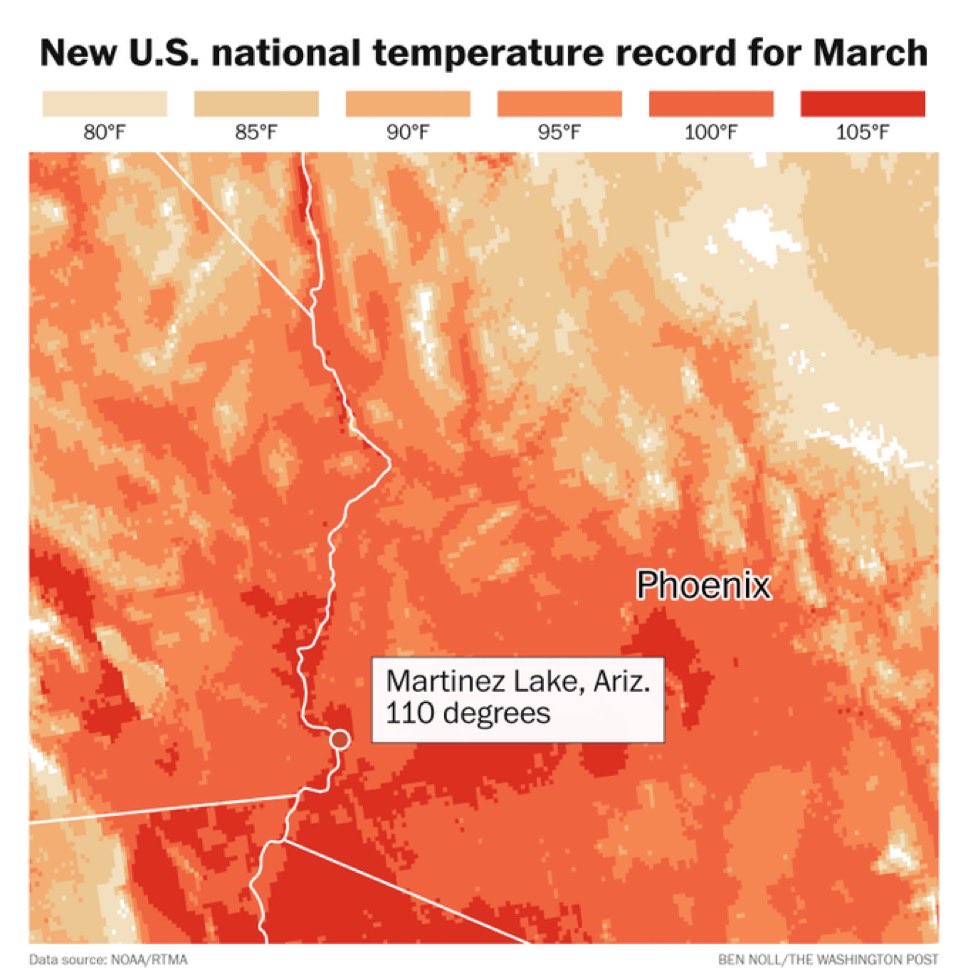
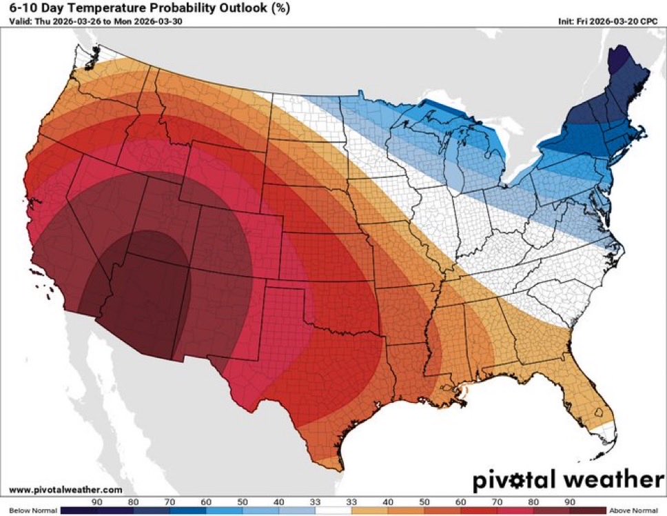
When I look at this map from March 19, 2026, I see something completely different than most people do.
Most folks glance at it and say “climate change made the West Coast red-hot.”
I look at the same dark-red band running from Alaska through Washington, Oregon, California, Idaho, Montana, Wyoming, and Colorado and I say: “This is CDIGR happening right in front of us.”
Let me explain it like you’ve never heard any of this before — because that’s exactly how I explain it to people who are just hearing about my work.
What my CDIGR theory actually is (super simple)
I call it Core Displacement Internal Geodynamic Rebalancing — CDIGR for short.
Here’s the whole thing in plain English:
1. Back in 1998 the Earth’s inner core shifted just a tiny bit off-center (think of sliding a heavy weight inside a spinning basketball).
2. When the core moves like that, the whole planet has to rebalance itself — the same way a washing machine starts shaking when the clothes bunch up on one side.
3. That rebalancing releases energy as heat, speeds up or slows down the spin, moves the magnetic poles, and puts huge stress on the crust.
4. The result? Strange deep earthquakes, weird magnetic storms, ice melting in specific spots, oceans warming or cooling in weird patterns, and surface heat showing up exactly where the stress is highest.
I track this as a 5-phase process in my paper. Right now, in March 2026, we’re in late Phase III / early Phase IV— the “loaded and ready to cascade” stage.
Why this exact red map is CDIGR to me
Look at where the darkest red is: Alaska → Cascadia → California → the Rockies.
In my model, the core shift that started in 1998 is slowly pushing Earth’s mass toward Siberia to create a new balance. To compensate, the opposite side (the Pacific and western North America) has to dump extra heat.
That heat is exactly what the map is coloring red.
It’s not “climate change” making it red — it’s the planet’s internal rebalancing showing up as surface temperature. The same GRACE satellite data I use in my paper proves mass is moving from the poles toward Siberia. This red band is the visible proof on the surface.
The 2004 deep earthquakes are the perfect real-world example
This is the same pattern I point to all the time:
In 2004, four real, confirmed deep earthquakes (around 700 km down in the Fiji region) hit first. Those were the deep “warning lights” from the core trying to rebalance. Just months later, the giant shallow 9.0+ Sumatra quake released all that built-up stress.
The red heat map today is the same warning light— only now it’s showing up as surface temperature instead of just deep quakes. It’s the planet doing the exact same thing again.
Everything else we’re watching fits the same story
The G3 geomagnetic storm that just hit (still active right now): The Sun gave our already-weakened magnetic field a big shove — exactly the “final trigger” I describe in my paper.
The New Moon maximum tides + the two shallow M6+ quakes that hit on the exact same day the map came out: Maximum pull on the crust while it’s already stressed.
All of it happening during Solar Cycle 25 maximum : The Sun is adding pressure at the perfect time.
In my CDIGR framework, I call this the “geodynamic cascade.” The red map isn’t the cause — it’s the receipt showing the cascade is working, just like those four deep Fiji quakes in 2004 were the receipt before Sumatra.
So when I say “This is CDIGR”…I’m saying: “Stop looking at the red as ‘climate change.’ Look at it as the visible symptom of Earth’s core rebalancing itself — exactly like the 1998 trigger, the GRACE data, the polar drift toward Siberia, and the deep-quake precursors in 2004 that I’ve been mapping for years.”
A giant weak spot in Earth’s magnetic field is now half the size of Europe
Earth’s magnetic field plays a critical role in making the planet livable. It acts as a protective barrier, shielding us from ...
Read More: https://t.co/5wGgqWjZno
Back in 2009, the newly appointed director of the NSIDC, Mark Cerise, warned that Arctic sea ice was in a "death spiral". He predicted the Arctic could be ice-free by the summer of 2030, likely even earlier.
Nearly two decades later, the data tell a different story.
According to the NSIDC's own records, September sea ice has shown no downward trend since 2007.
That's 18 years of stability.
Despite rising CO2 levels and every claimed feedback mechanism, the ice is not budging.
As climate researcher Javier Vinós put it, "clearly the models on which these predictions are based do not accurately reflect the actual climate."
The Arctic death spiral never happened, yet Ceres remains director of the NCIDC. There is zero accountability.
The Thermohaline Circulation (the Great Ocean Conveyor Belt) is a massive, slow-moving system that transports tropical warmth toward the poles.
A single parcel of water takes roughly 1,000 years to complete this circuit. This means the warming we see at the surface today could be influenced by cycles that began long before the industrial era.
The sheer scale of the ocean's heat content (measured in Zettajoules) makes it the primary driver of surface temperatures. Internal oscillations - like El Niño (ENSO) or the Pacific Decadal Oscillation (PDO) - release or bury heat on a scale that dwarfs annual atmospheric changes. This creates a reality crisis for those focused only on a CO₂ narrative.
1 in 3 Americans have Non-Alcoholic Fatty Liver Disease.
It silently fuels insulin resistance and chronic disease while doctors rarely test for it and there are no medications for it...
So here are 8 foods that'll help you restore your liver health (bookmark this): 🧵
1. Eggs
🚨 CLIMATE SCIENTIST REVEALS THE TRUTH! - “This was NEVER EVER science!There was NEVER a global warming trend!!! It was data manipulated to tell a story. The ice age never came….First wrong prediction….🃏
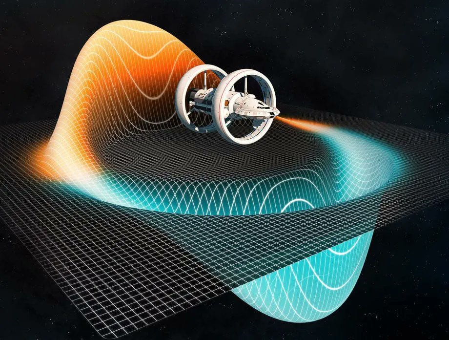
In 1989, Bob Lazar said UFOs move by bending space rather than flying normally.
Five years later, in 1994, Miguel Alcubierre introduced the Alcubierre Drive, a concept describing faster-than-light travel by bending space-time.
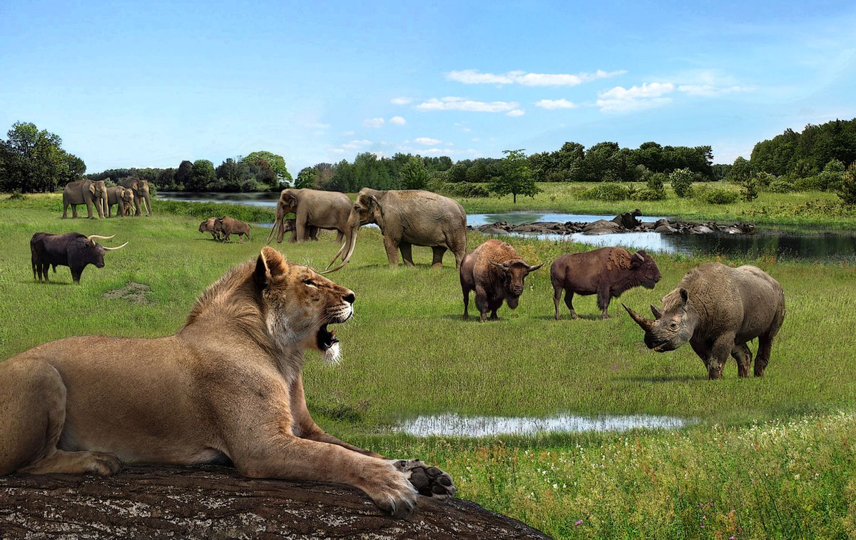
Sea levels were 6–9m higher than today and arctic summers were likely to be ice-free. Forests stretched to the poles. African savanna species lived across Europe but there were no mass extinctions from the warmth itself. Ecosystems adapted over time. Earth was greener, wetter and more vibrant. This was the Eemian interglacial period 125,000 years ago. Temperatures were around 2 degrees higher yet CO₂ levels were far lower than today at 280 ppm. None of this was caused by human activity or driven by CO₂ levels.
The Eemian is just one of perhaps 50 interglacial cycles over the 2.58 million years of the Quaternary Ice age. Life had rebounded and Europe was a thriving paradise of subtropical forests. African animals thrived along the Thames River valley, where London stands today.
Fast-forward to today: temperatures in the current Holocene interglacial period are still a little cooler than the Eemian. The past 11,700 years has experienced a warmer recovery from the last glacial period, which had dominated the earth for around 100,000 years. All the northern areas of Eurasia and north America are still scarred by the massive movement of glaciers miles thick grinding down the surface rock. The Canadian great lakes were carved out of bedrock by these movements.
This landscape was produced by Joschua Knüppe—who is brilliant at bringing these lost worlds to life. The scene perfectly captures lush, vibrant Eemian Britain: A large male cave lion (Panthera leo spelaea)—bigger and more robust than modern African lions, with a primitive mane—straight-tusked elephants (Palaeoloxodon antiquus, close relatives of modern African elephants but with longer, straighter tusks), hippopotamuses wallowing near the water (the common hippo, Hippopotamus amphibius, did live as far north as Britain and Germany back then), forest rhinoceroses (like Merck's rhino, Stephanorhinus kirchbergensis) or narrow-nosed rhino—browsers/grazers similar in size and ecology to modern African species, aurochs or wild cattle, and possibly bison or other ungulates.
Prof. Ian Plimer calls out "global warming" fear mongering: "It was much warmer a thousand years ago... Because we are not as warm as in medieval times, or in Roman times, or in Minoan times."
Arctic sea ice measured 4.6 million km2 at the 2025 summer minimum, which is 35% higher than the record low of 3.4 million km2 set in 2012.
Late-season ice retention has improved drastically in the past 13 years. Losses have not accelerated.
And when the trend is extended, the data show no net summer ice loss for 18 years now.
A collapse was forecast.
But it did not occur.
🧵What does paleoclimatology tell us about Earth's present climate?
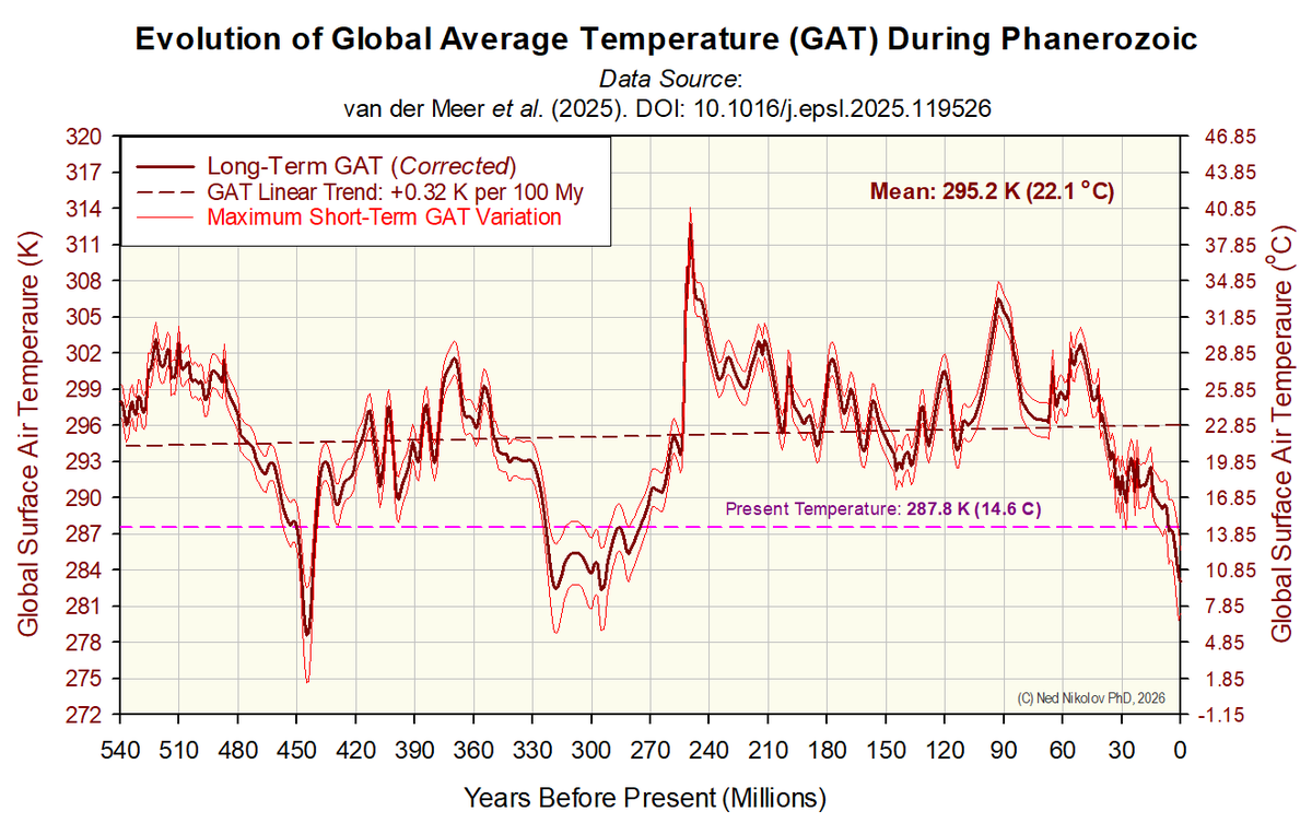
1. We live in one of 3 brief ice-age periods that have occurred since higher life forms appeared on this planet some 540 My ago. Despite large climatic variations during the Phanerozoic, the overall trend of global temperature in this Eon has been close to zero, and the Earth is currently 7.5 °C cooler than the long-term Phanerozoic average of 22.1 °C as shown on the attached graph.
Our present cold period marked by permanent Polar icecaps and mountain glaciers called the Pleistocene-Holocene Ice Age, which began 2.6 My ago, is climatologically similar to only two other periods in the last 540 My: the Hirnantian glaciation of the Late Ordovician some 445 My ago, and the Pennsylvanian glaciation of the Late Carboniferous about 320 My ago... Thus, from a geological standpoint, we inhabit an unusual "cold snap" in time.
Watch Jordan Peterson absolutely destroy a confused Alarmist.
And notice how the alarmist gets excited by "record temperatures" - and you can see why the BOM are cooking Australia’s climate records - destroying historical records and fabricating new ones by shrinking the Stevensons Screens to artificially record higher temperatures.
There is a belief among paleo-climatologists and evolutionary biologists that the rise of oxygen (O2) concentration in Earth's atmosphere was a result of the evolution of plant photosynthesis, which splits water molecules and release O2 as a byproduct of the CO2 fixation.
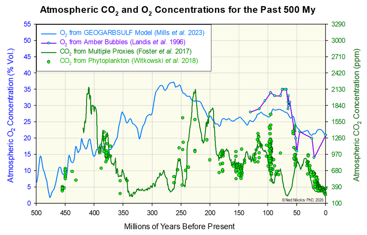
This belief implies that, throughout Earth's geological history, periods of high atmospheric CO2 should be associated with high O2 concentrations as well, since CO2 stimulates photosynthesis and plant growth.
However, the best available data we have about changes of atmospheric CO2 and O2 levels for the past 500 My do not support this belief. The correlation between O2 and CO2 is not only poor, but in many cases, high O2 concentrations were associated with relatively low CO2 levels (see the attached graph).
These results indicate that the oxygen in Earth's atmosphere is likely NOT controlled by plant photosynthesis. An alternative source of O2 might be Sun's UV radiation and the solar wind (mostly protons), which can split the water molecule as efficiently as photosynthesis. This alternative hypothesis is supported by the fact that Jupiter's moon Europa has a thin atmosphere composed of 100% O2, which apparently originated from the water ice covering the surface of that moon bombarded by solar wind.
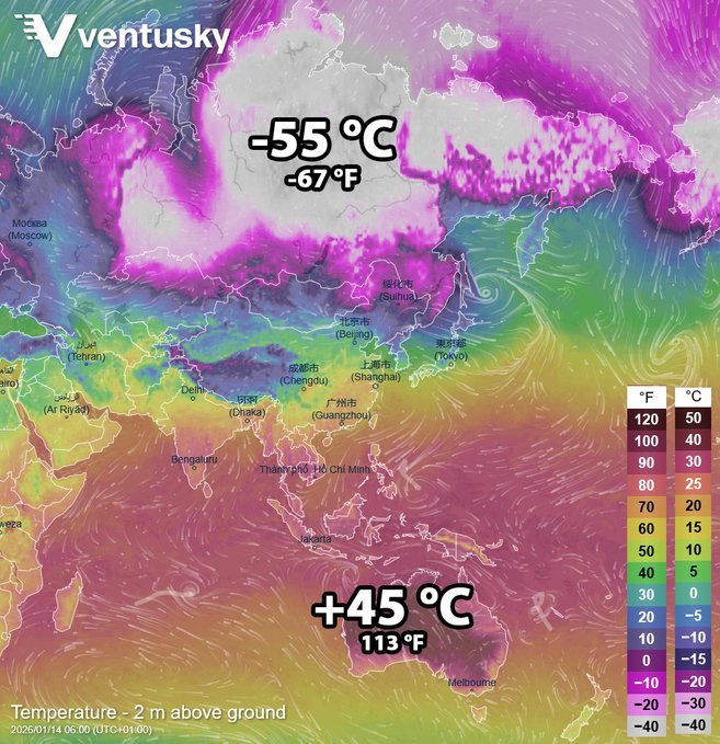
Temperature is an intensive property. You don't average intensive variables across a non-equilibrium, open, heterogeneous system like Earth's surface/atmosphere/oceans and expect it to describe the actual energetic state.
Averaging -55°C Siberia with +45°C Australia doesn't tell you anything physically meaningful about heat content or "the climate."
It's a statistical construct with zero thermodynamic foundation.
Its only real use? Political. Scare. Tax. Control.