𝗧𝗵𝗲 𝗯𝗶𝗴𝗴𝗲𝘀𝘁 𝗺𝗶𝘀𝘁𝗮𝗸𝗲 𝗺𝗮𝗻𝘆 𝗨𝗜 𝗱𝗲𝘀𝗶𝗴𝗻𝗲𝗿𝘀 𝗺𝗮𝗸𝗲 𝗶𝘀𝗻’𝘁 𝗯𝗮𝗱 𝘃𝗶𝘀𝘂𝗮𝗹𝘀. 𝗜𝘁’𝘀 𝘀𝘁𝗼𝗽𝗽𝗶𝗻𝗴 𝗮𝘁 𝘁𝗵𝗲 𝘃𝗶𝘀𝘂𝗮𝗹𝘀.
A beautiful screen is only a small part of good product design.
The real challenge starts when you have to design an entire experience
→ How does a user move from one task to another?
→ Can they achieve their goal without confusion?
→ Does the flow align with business objectives?
→ Will users keep coming back because the experience feels effortless?
I’ve seen many designers create stunning screens on LinkedIn and X, but struggle when asked to design complete user journeys, information architecture, edge cases, and scalable product flows.
UI gets attention.
UX keeps users.
Great designers don’t just make products look beautiful, they solve problems, reduce friction, and create experiences that work for both users and businesses.
Every screen should have a purpose, and every interaction should move the user closer to their goal.
That’s the difference between designing interfaces and designing products.
#UIUX #ProductDesign #UXDesign #UIDesign #Figma #DesignThinking #UserExperience #ProductStrategy
🚀 Currently designing Academix, a modern student productivity and academic management dashboard focused on helping students stay organized, track progress, and achieve their goals more efficiently.
The design process has been centered around creating a clean, intuitive, and premium user experience, combining academic planning, productivity tracking, and progress analytics into a single dashboard. Exploring how thoughtful UX and modern UI patterns can transform the way students manage their academic journey has been an exciting challenge.
Looking forward to sharing more of the design process and final outcomes soon. 🎨✨
#UIDesign #UXDesign #ProductDesign #DashboardDesign #SaaSDesign #EdTech #Figma #Academix
A quick snapshot of a recent UI/UX project: Smart Electricity Management App ⚡
Focused on creating a clean, intuitive, and modern experience for monitoring usage, buying units, and managing multiple meters.
#UIUX#ProductDesign#Figma
Designed a 𝗦𝗲𝗻𝗱 𝗠𝗼𝗻𝗲𝘆 𝗳𝗹𝗼𝘄 for a fintech mobile app in Figma.
My focus was to make peer-to-peer transfers simple, intuitive, and frictionless, from selecting a recipient to entering an amount and receiving instant confirmation.
Small details and smooth experiences make all the difference.
Feedback is welcome.
#UIUX #UIDesign #Figma #Fintech #MobileAppDesign #ProductDesign #UserExperience
Designed this mobile banking card management UI 💳
Focused on making everyday banking faster and more intuitive:
✓ Freeze card instantly
✓ View sensitive details securely
✓ Change PIN
✓ Set spending limits
✓ Toggle online & ATM payments
✓ Clean transaction history
Good design isn't just about looking good—it's about making users feel in control.
What would you improve?
#UIUX #Fintech #UIDesign #UXDesign #Figma #MobileDesign
Designed this fintech mobile app concept in Figma.
Focused on creating a clean dashboard, card management, spending insights, and a simple user experience.
Always improving one screen at a time.
#UIUX#Figma#Fintech#MobileDesign#ProductDesign
Every Nigerian with a prepaid meter knows the pain:
Buy token → Walk outside → Enter 20 digits → Hope you don't make a mistake.
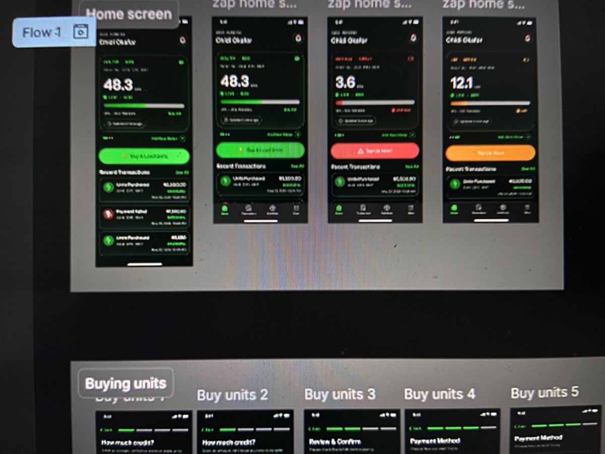
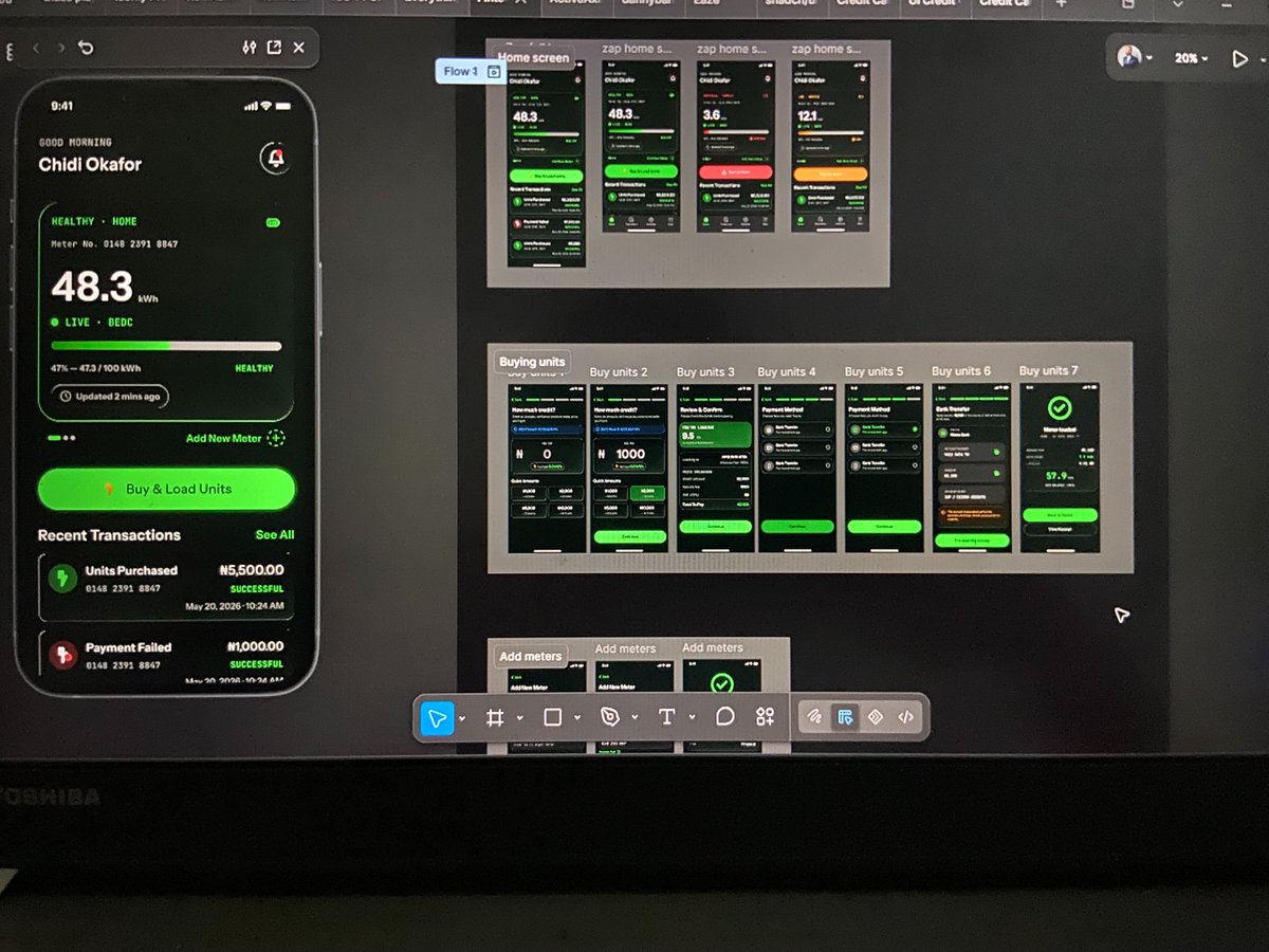
So I designed ZAP
An app that lets you buy electricity and load it directly to your meter.
Case study 👇
https://t.co/kTgE6XkfsY
#UXDesign