#DataForACause is an initiative that connects #datavisualization professionals with non-profits to help bring attention to social and environmental issues.
Here is a good educational resource for our volunteers💡Learn more about periphery plots for contextualizing heterogeneous time-based #charts#ieeevis: https://t.co/fm4HGlpPJw
Data visualization has been leveraged to create local change across the globe. Explore graphs and maps that helped to make an impact: https://t.co/3wGHMWSaBi
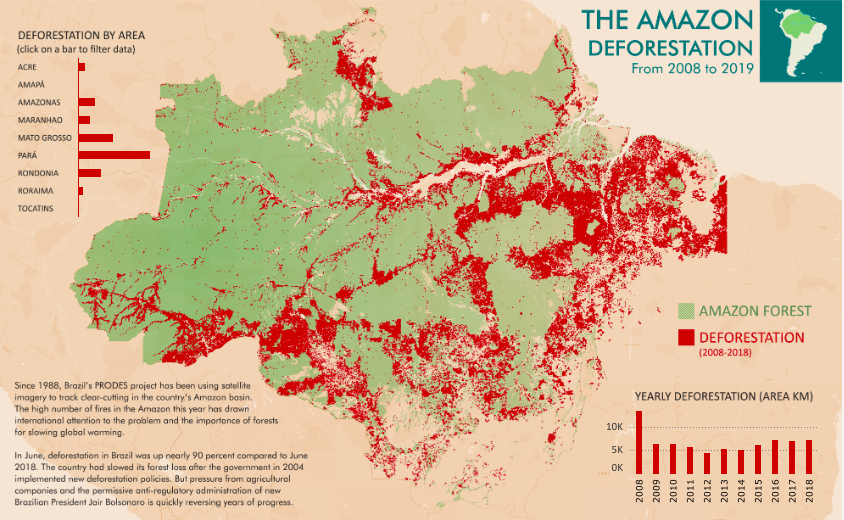
This June, #deforestation in Brazil increased by 90% compared to 2018. @FilMastroianni helps us see and understand this deforestation with an interactive #map of the Amazon rainforest: https://t.co/gCfpgsnvO9
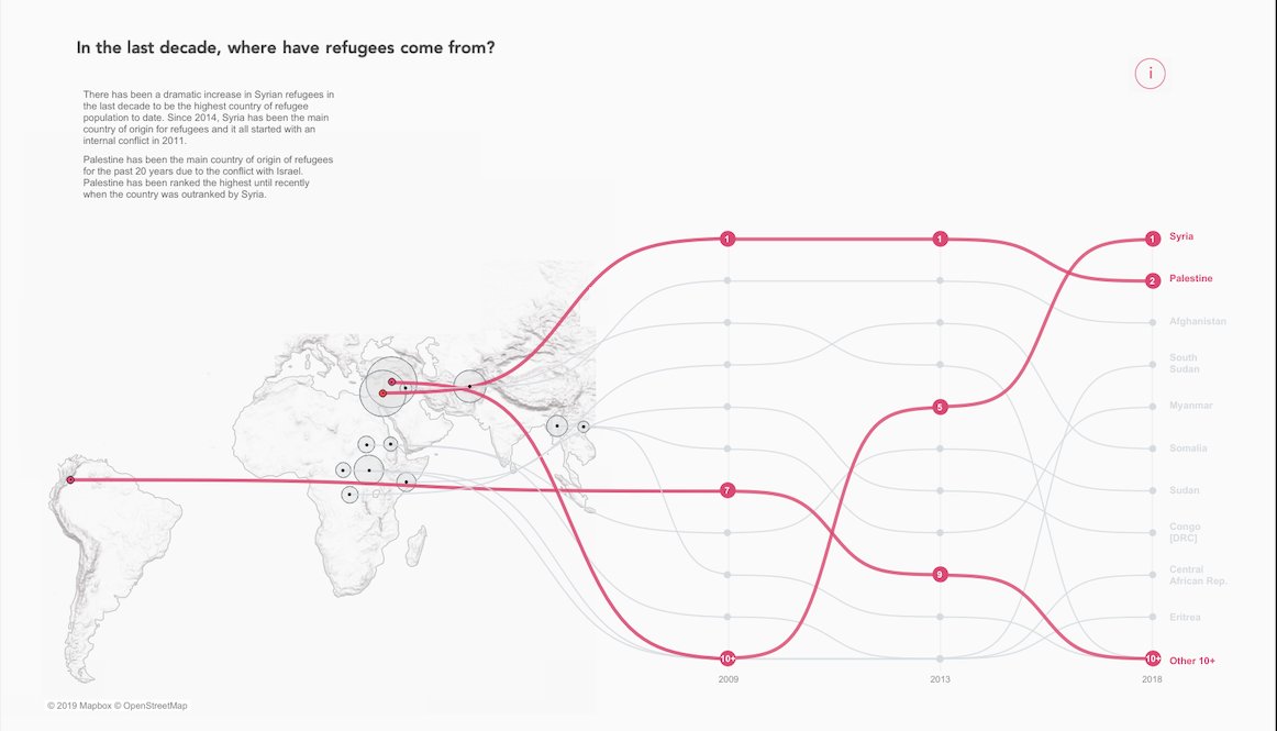
The global refugee population reached a record high of 25.9 million in 2018. In this #visualization, @VizSaiyan takes a look at the journey of refugees after they are forced to flee their homes: https://t.co/By8vfQRqJc
To what extent do you agree with the view that people may develop talents of their parents due to biology and their genes?🔬@ZenDollData shares some curious thoughts on this topic: https://t.co/vbMhaJOKFx
For @washingtonpost@tierneyl and @joemfox mapped fall foliage colors across the US🍂 Click through to the full story to see leaf profiles and an animation of the changing colors as fall arrives: https://t.co/4sfYwHUfml
The @NatGeo created colourful #dataviz based on the latest Gates #Goalkeepersreport. As the visualization shows, key signs of progress, such as health and education, are improving worldwide — but not equally: https://t.co/96bhgIudXj
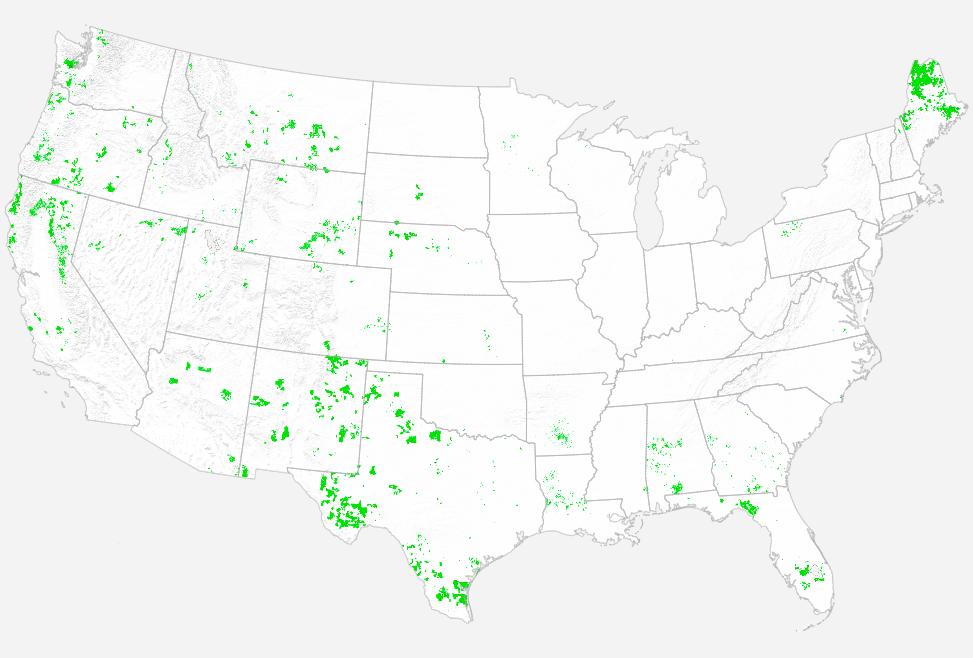
Do you trust genetically modified foods?🌽 Explore an interactive map showing how #GMcrop production has changed in the US over time: https://t.co/37LBiNvB4T
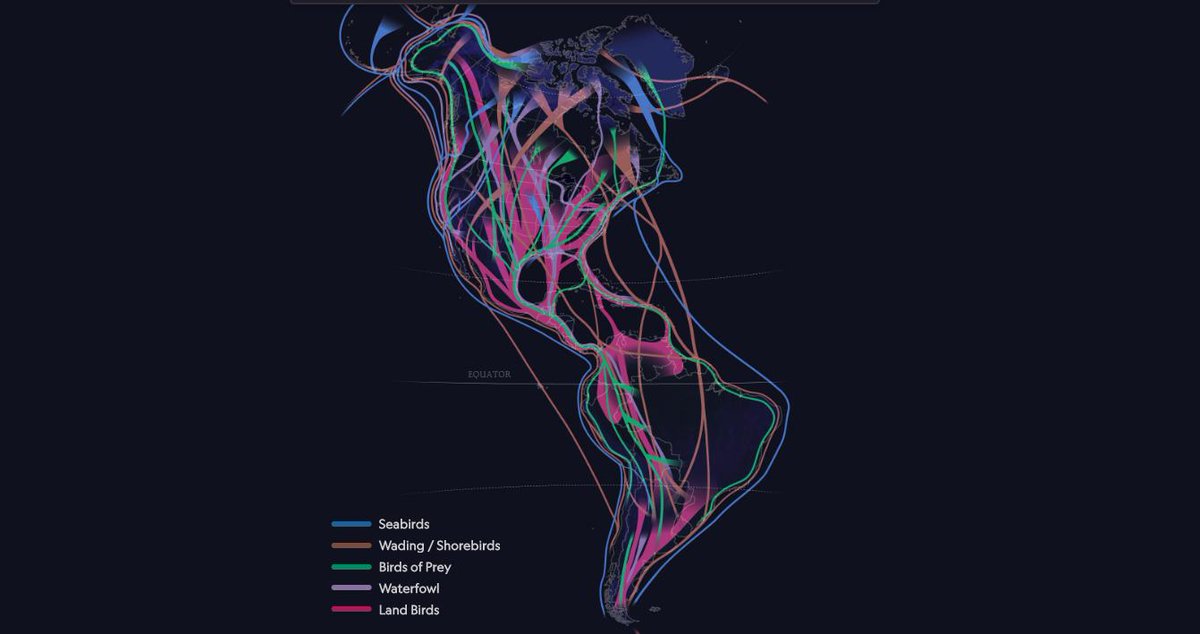
@NatGeo interactive map of migration patterns for birds in the American continent. Some #birdmigrations can be equivalent to almost two round-the-world trips: https://t.co/tp0cElpnO7
Are you attending #dataviz conferences to hear about the latest findings in your field? Check out the #encode2019 blog post by @theneilrichards with takeaway quotes, inspirations and ideas from the conference: https://t.co/A22iwY5nrJ
#MachineLearning methods dependencies referenced and visualized in 3D💫 A very useful tool when looking for the right algorithm to solve a problem: https://t.co/we7m5yQgru
Have you ever tried to create a #visualization by hand?✍ @ripley_cleghorn shares her experience with handcrafted visualizations: https://t.co/KTtCzXpmsJ
Explore the @BBGVisualData map showing the land owned by the largest owners in the US. The 100 private #landowners own 40 million acres — an area the size of Florida: https://t.co/oZ0LfOvL6p
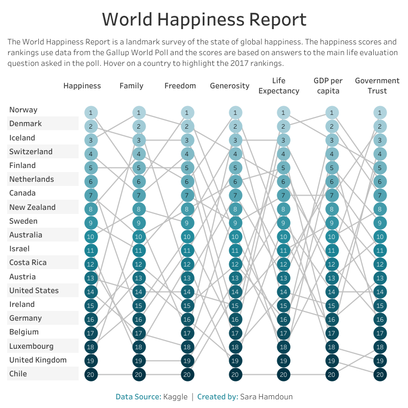
Did you know Norway ranks #1 in the world for happiness and freedom? In this #visualization, @SaraHamdoun10 takes a look at the happiness ranking of twenty countries according to the #GallupWorldPoll: https://t.co/949emjjDSZ
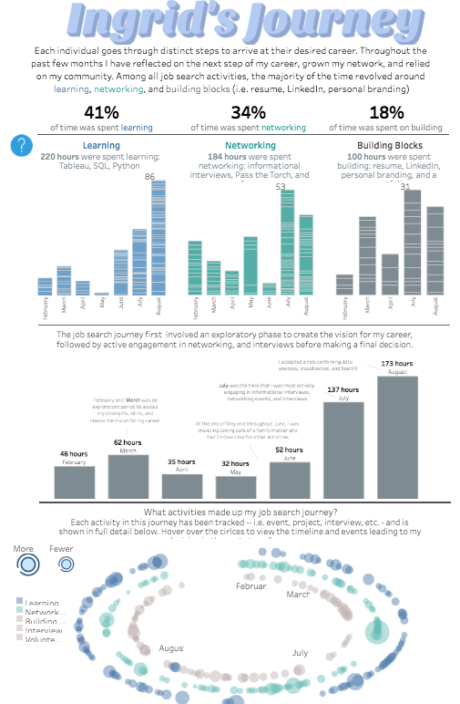
#datafam I appreciate all who have helped me improve my #DataViz skills. It's been a tremendous help as I've searched and found the next step in my career at IU Health. Here is a viz on the journey https://t.co/b7AeboxP65 Tips & learnings here https://t.co/dDAcK3ikng #grateful