I love storytelling |📊 Passionate about turning raw data into visual stories | | Helping insights come to life one chart at a time! | 1X Hackathon winner!
One of the PowerBI project with students @ ESanalysis.
Writing DAX and structuring Dashboard is only hard when you learn the wrong way.
To join the next cohort contact @edwige_songong
New to dashboards and feeling overwhelmed by the UI/UX?
Here are 7 sites to spark your dashboard design creativity:
https://t.co/mVD5Hp9qJr
https://t.co/GL9sRLfoD2
https://t.co/TAfiQ7J2Zn
https://t.co/XCh8SFc6dI
#DataViz#DashboardDesign#PowerBI#Tableau#UXUI#Inspiration
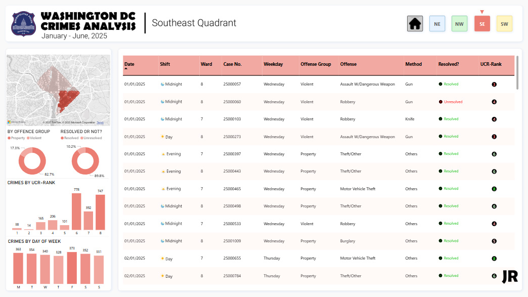
Hi #DataFam, this month I decided to look into crimes in Washington D.C.
DC is divided into four quadrants, and that’s the perspective I chose.
Here's what I found:
- The Northwest quadrant accounts for nearly half of all reported crimes.
- Theft-related offenses dominate citywide.
- Most crimes occur during evening hours.
Here's the interactive Power BI dashboard:
https://t.co/i1VjFO4OTO
I made a LinkedIn post too:
https://t.co/0E0ZhS1j35
This is 6/12 of my #OneDashboardaMonth challenge.
Feedback is welcome.
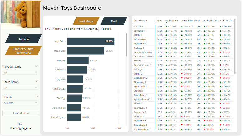
Hey #DataFam Just finished building one of my favorite dashboards yet and this time, I did it differently. I wanted to build something different this time.
Not sales. Not finance
Just something more visual, fun, and personal.
Interact here👇
https://t.co/bT3gSMdLZ0
#PowerBI
Morning guys,
due to popular demand, Below is the link to this dashboard.
The dataset, Analysis and the Dashboard
You can Explore it and possibly Recreate it
Have fun. 👇👇
https://t.co/pwFYh0xOcn
#Datafam
I've been getting some questions in my DM lately.
Here’s what #TheFirst30 is:
- You’ll master common data analysis tools.
- You’ll write actual SQL queries.
- You’ll build and share dashboards.
- You’ll get one short lesson in your inbox every day.
It’s everything you need to get started and build real skills, delivered one day at a time.
So, in essence, when we launch, you'll get one short lesson in your inbox every day over the course of 30 days.
To sign up: https://t.co/nmRkXm7sdN
@bricklinkgh @DabereNnamani The major problem with the chart is that you used a continuous x axis. This gives the illusion that the sleep happened throughout the period. Use a discrete x-axis.
Also, a column chart might be better than line in this case too.
@Rita_tyna Is it okay to tweak your client's data, build a report then add it in your portfolio?
Yeah, tweak it so it's almost unrecognizable but of course the column names are the same.
@Ezinne_Jubilee I do not settle for general instructions, I ask specific questions.
Even after asking specific questions, I recap what was discussed, then ask for confirmation again.
These tips have helped me gain stakeholders' trust.
I learned an amazing technique this week—how to display all negative values on one side and positives on another, in Power BI charts.
It was an insightful analyzing the data to uncover insights. Feeling proud of how it turned out! 😍
Explore in Power BI: https://t.co/AP6ivA1k7n
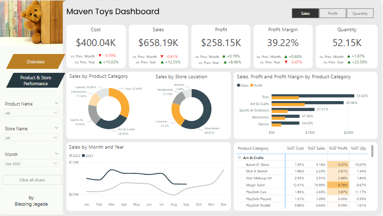
I completed another data project using Power BI.
Thanks @Rita_tyna! It was insightful learning from you 🥰
Link to Dashboard: https://t.co/z8yLDreK1P
Enjoy!