Age of Mythology got a glow-up recently and hit PS5 and Xbox, so I figured why not give it a go and see if I can recreate the UI with a splash of myself all over it.
Enjoy!
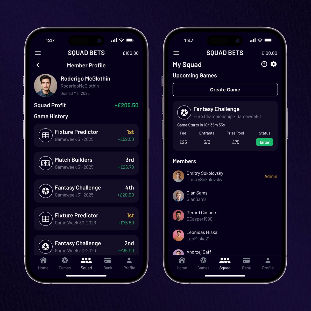
Squad Bets is coming along nicely! Horse Racing? Football? Golf? Do I play any of these? No. What matters is that I get to figure it out as I go along.
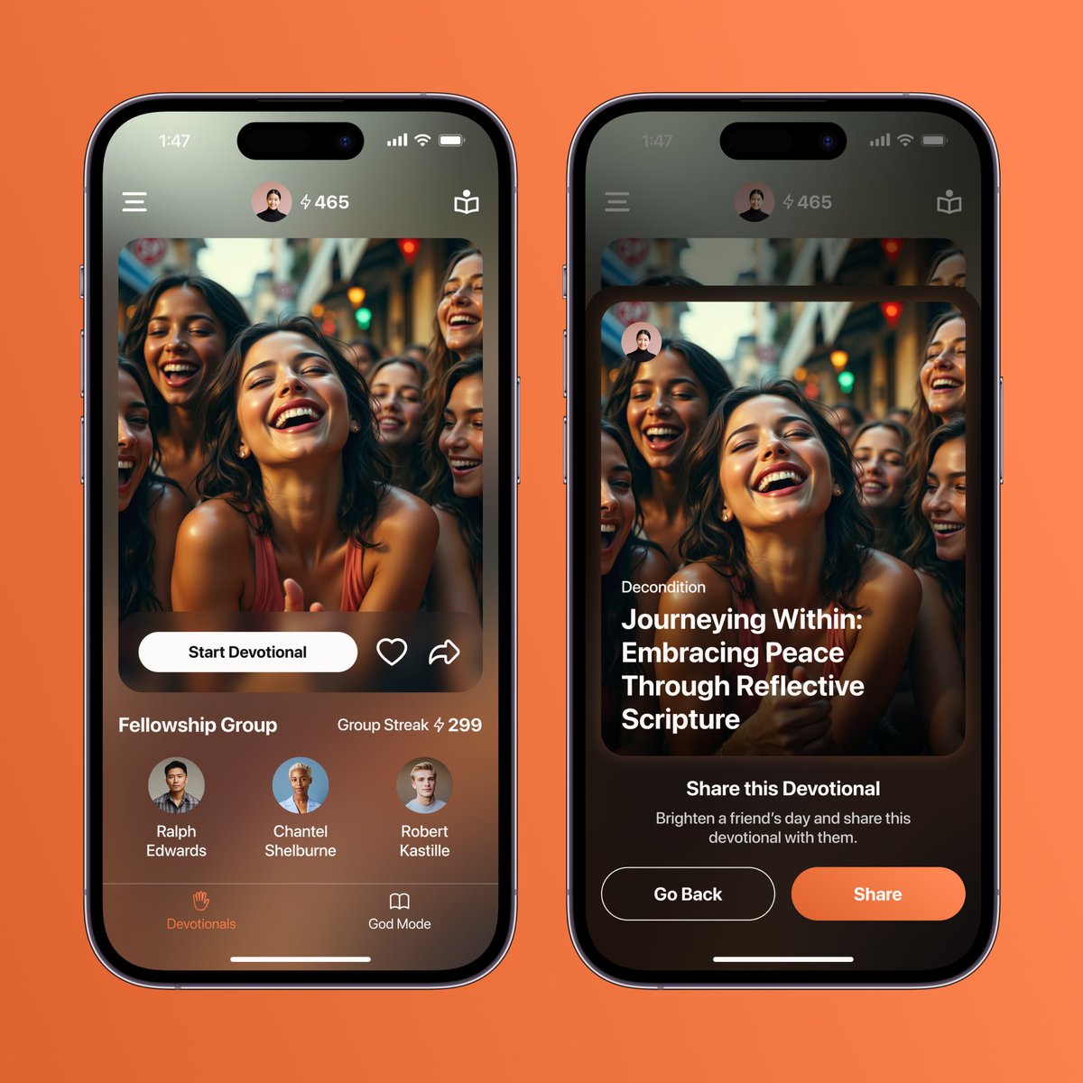
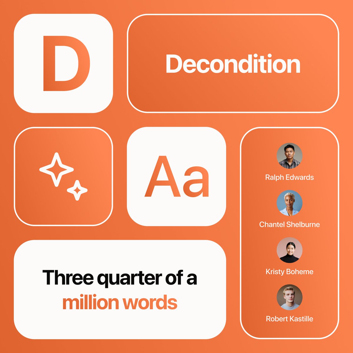
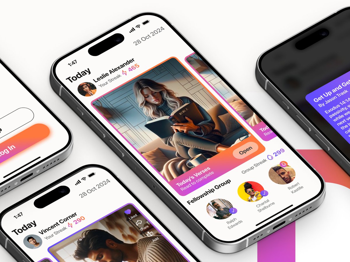
Plugging in some new features for Decondition. It's a lot of fun to work on this app and be trusted to be bold with orange. It's wild, but I like it like that.
🔥 Awesome new update from myself with regards to my design work that’s been under the hood recently: Decondition has now officially been released on the iOS App Store.
My "High Fives" Wall this year is slowly growing!
I’m grateful for these kind words and I’m excited to eventually reveal some of the projects I’ve been working on this year into next year. Some might surprise you.
As with every project, I’m always surprised in myself!
Currently juggling four under the hood app projects across four different industries, but like in The Craft when they needed a fourth: Would you like to be my fifth?
Dive into the dark side; it is Autumn after all! 🍁
https://t.co/fM0pAd3TqC
“Build it and they will come” or whatever the saying is. I never much believed in it until now. Strengthening my network, making those important connections and constantly honing my craft has been the best way to cope with the looming face of rejection after rejection this year.
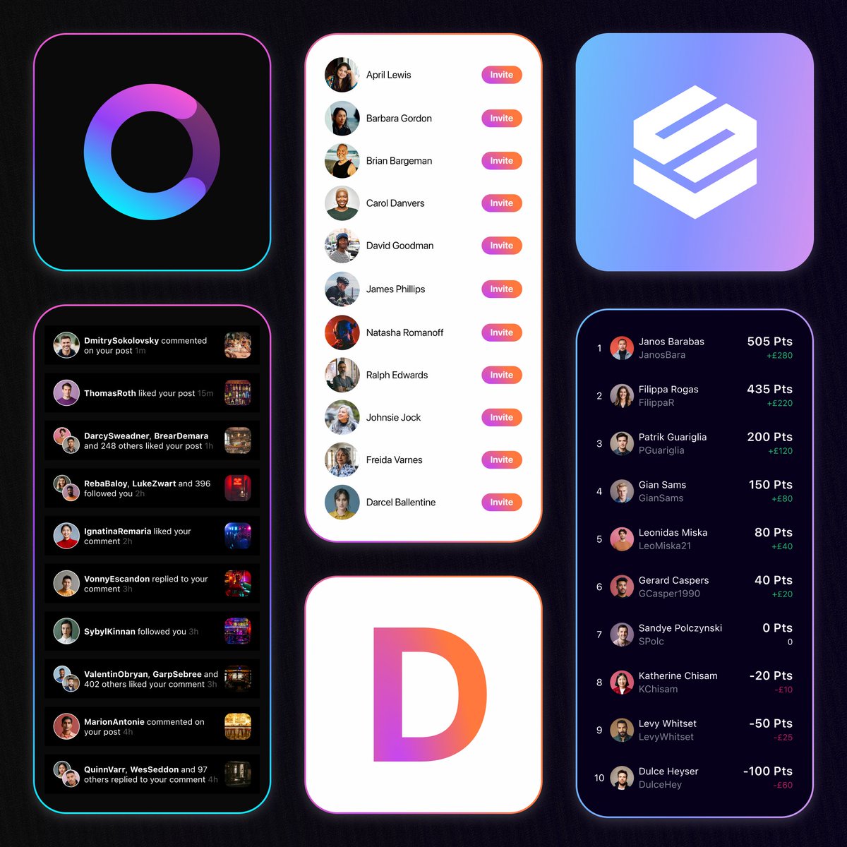
As a designer juggling multiple app projects, patterns start to emerge in your work. What’s the difference between notifications, inviting and leaderboards? Several, but they can be kindred views with similar components.
But making them feel different? That's the fun part!
It's been a pleasure adding features like:
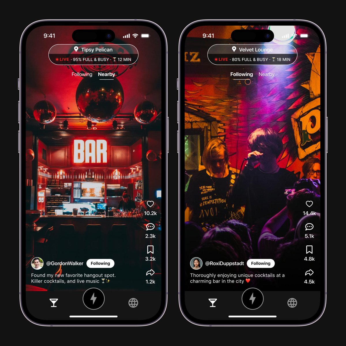
📲 TikTok Vibe Feed
📲 Liking, Commenting & Sharing
📲 User Profiles & Following
📲 App Icon Update
Hopefully more to come!
Introducing Circles, your nightlife companion! Merging the best of TikTok and Yelp, this app helps you discover the hottest spots through engaging videos.
I'm thrilled to see the impact this app will have and proud to have contributed to its design.
Live on the US App Store 🚀
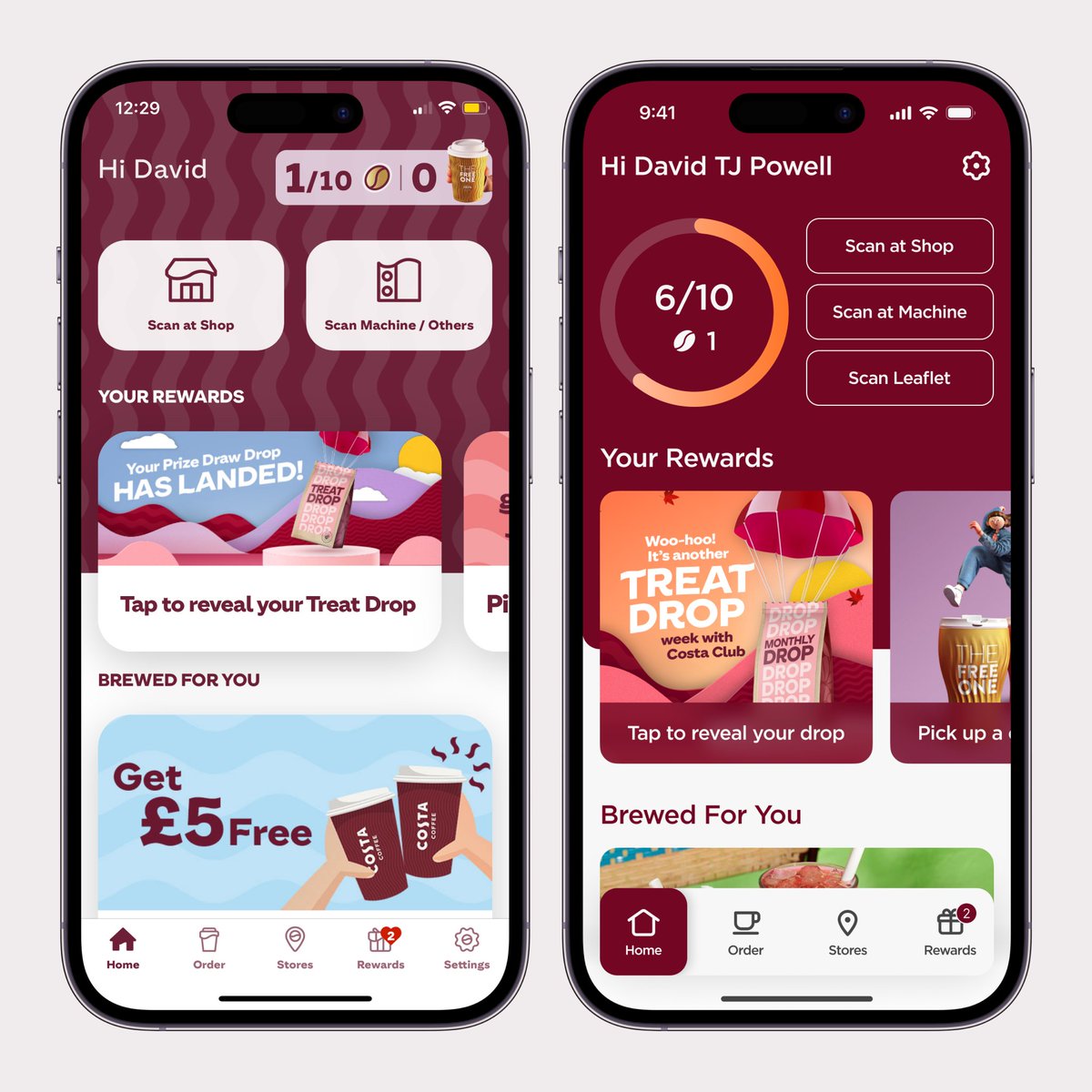
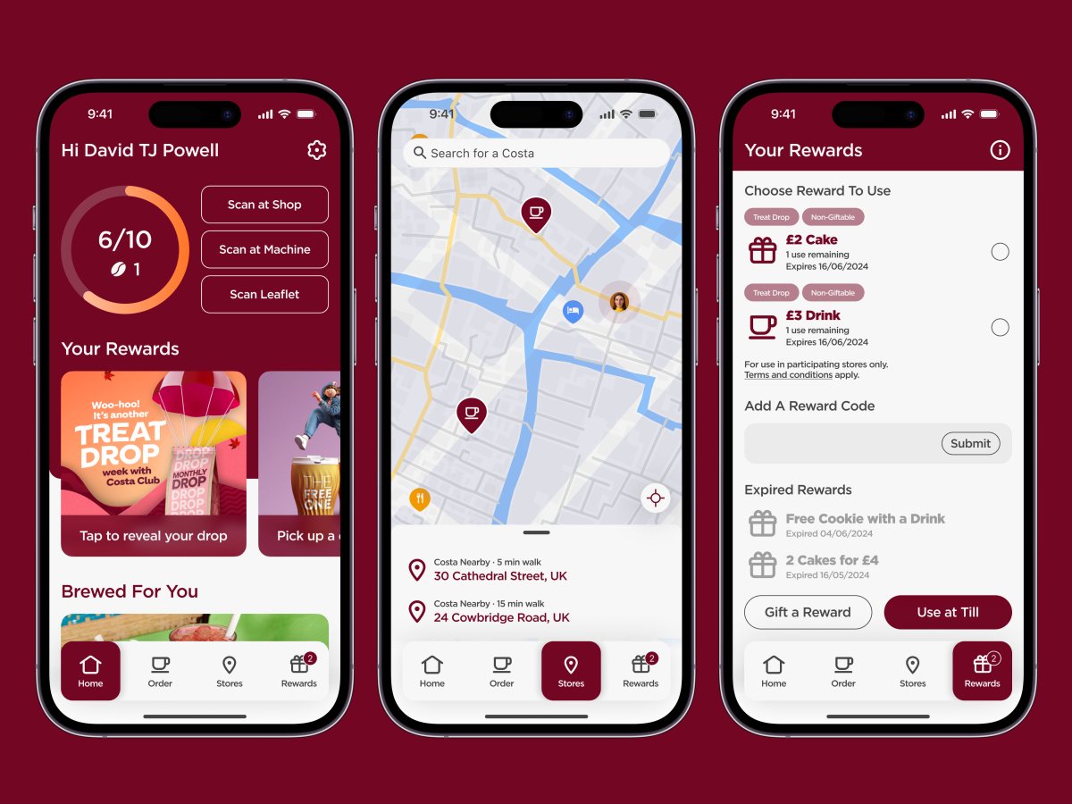
Further changes to simplify could include:
✨ Bigger titles & simplified nav
✨ 3 scan buttons instead of 2
✨ Visual purchase progress
🤩 And more
Lots of fun!
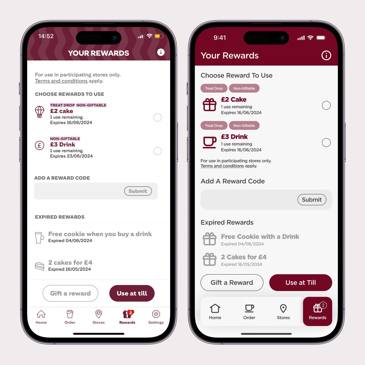
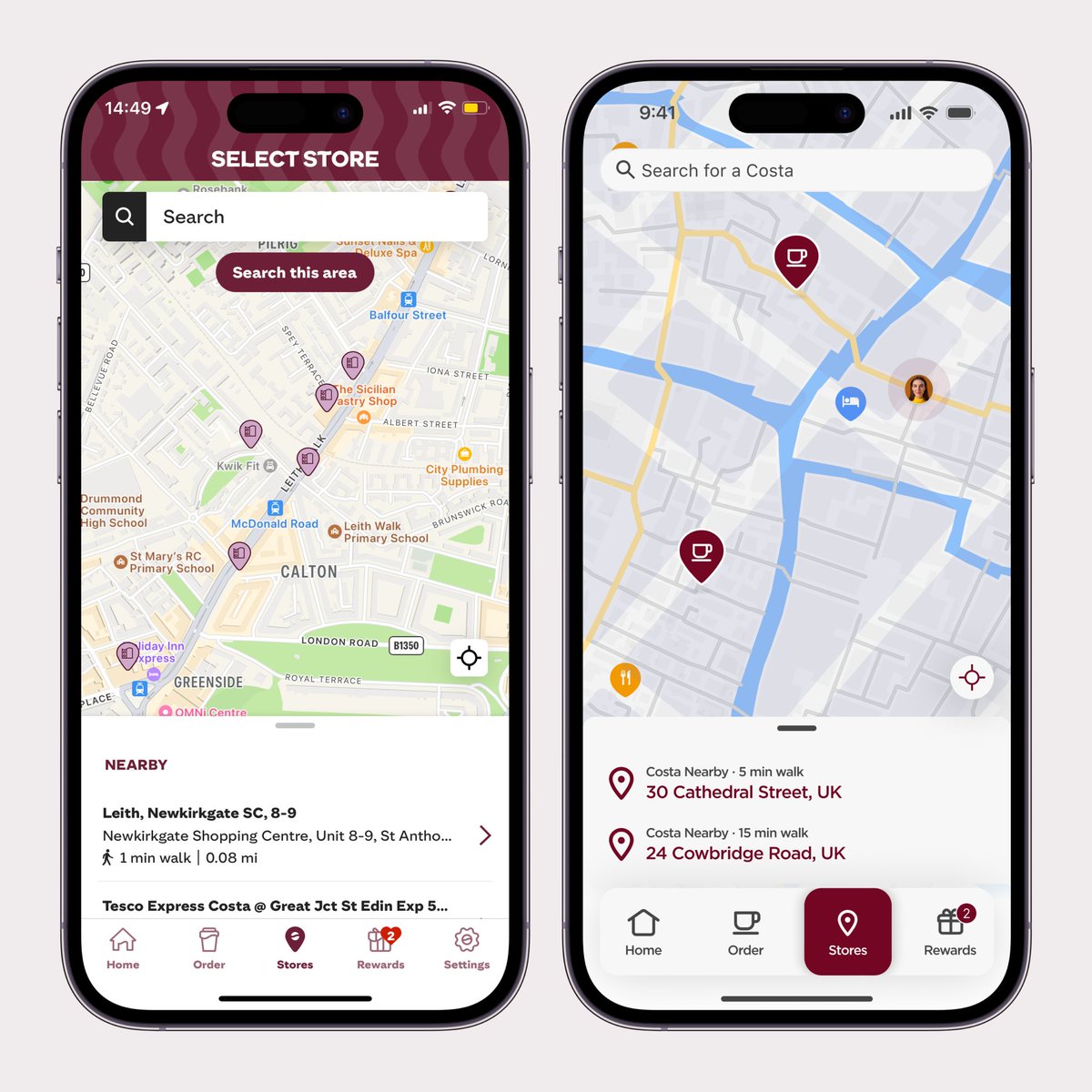
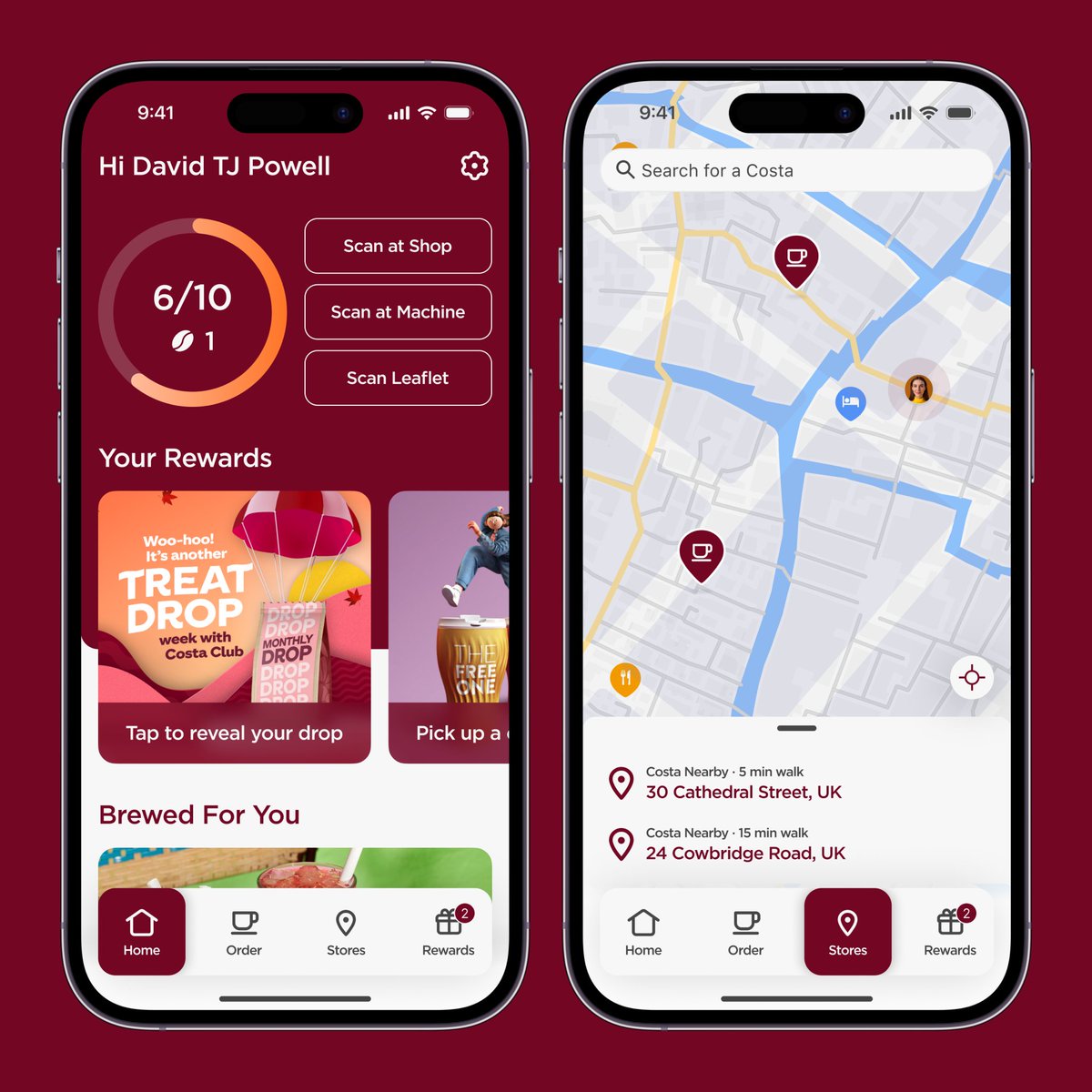
What if we gave the Costa app a boost by returning to its roots? Imagine bringing back that Mulberry Wood Red as the dominant colour in the app.
Here's why I prefer it:
☕️ It's beautifully bold
☕️ It's fragrantly fresh
☕️ It's high contrast
Enjoy!
From my experience doing digital signage all over the UK, it's clear that photography and video are what sell. You guide the viewer, and keep it simple, with enough options to give freedom.
Without deep diving, I think my little aperitifs are enough to get my points across.
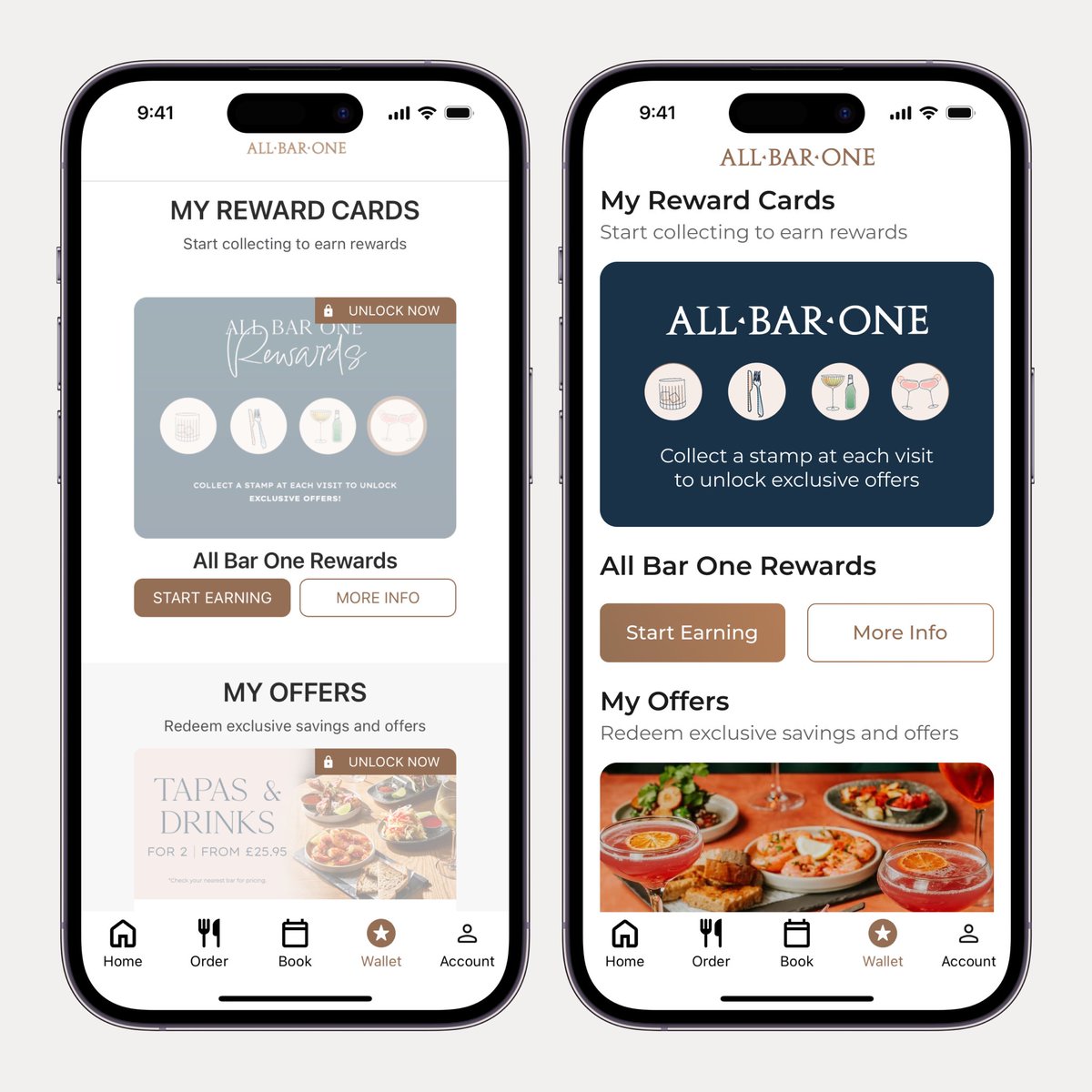
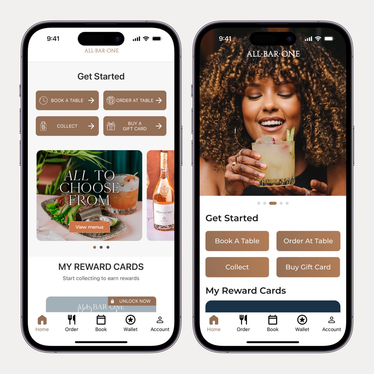
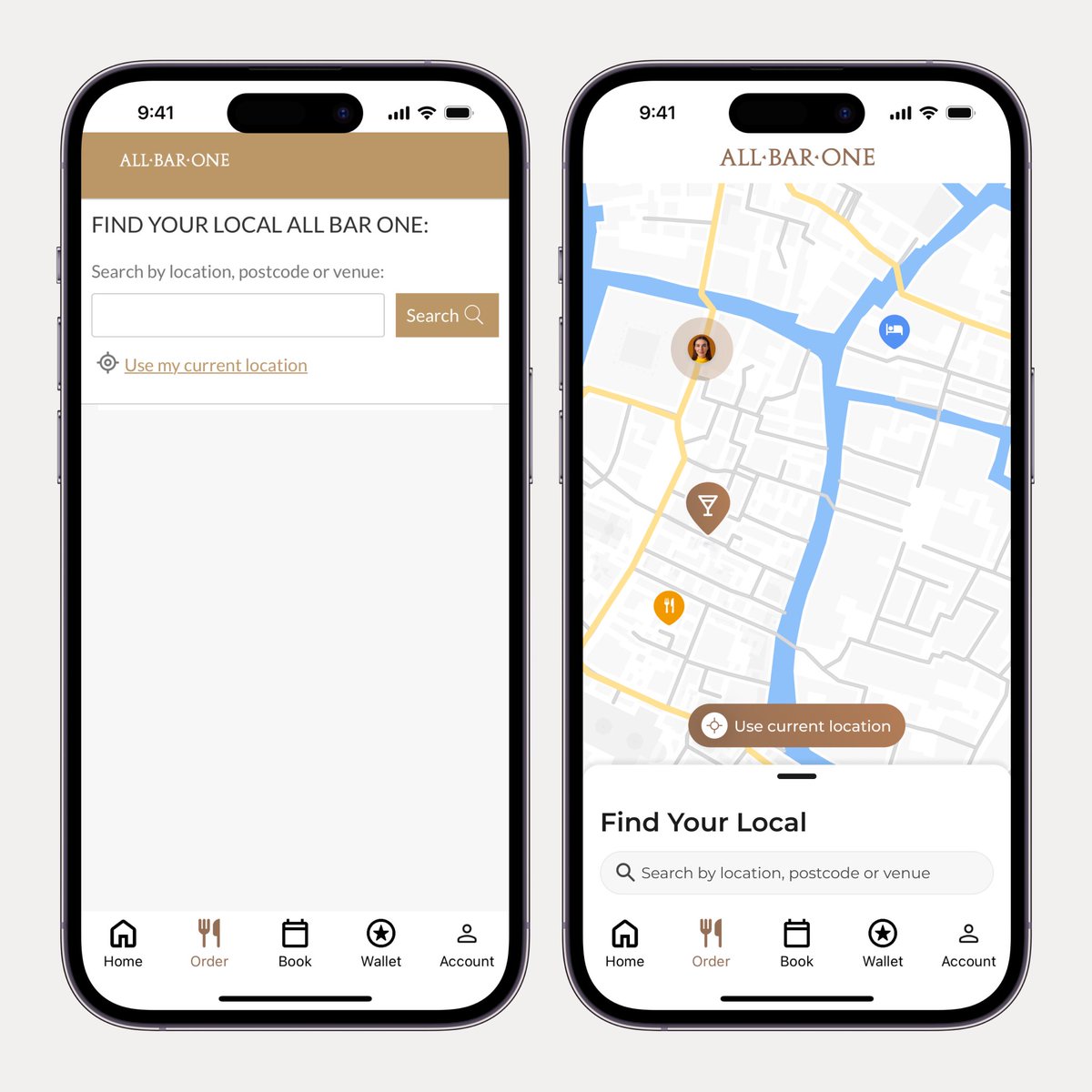
Recently I visited an All Bar One and opened their app and thought that it could use a dash of zest.
As another fun exercise, like in other app redesigns, I kept the original tab bar and used their Montserrat font with a touch of Trajan Pro, reflecting their serif logo.
Enjoy!
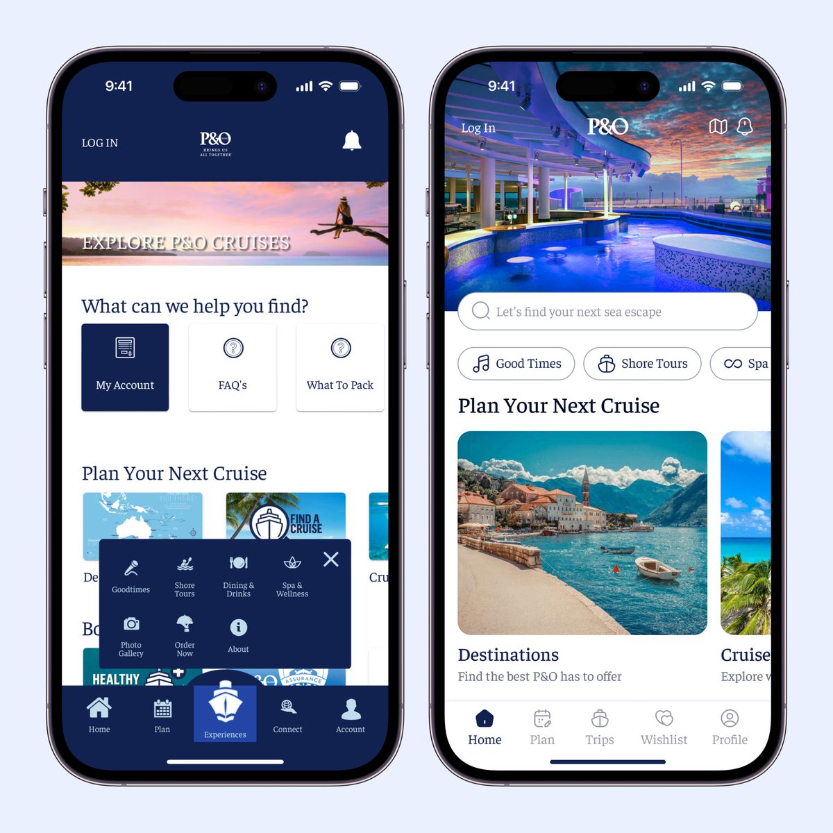
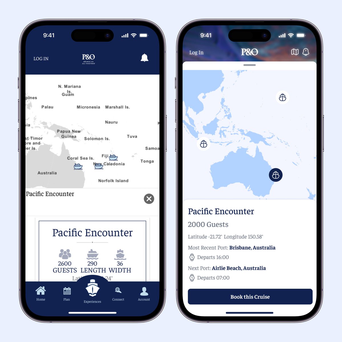
I started by pulling colours from their website and sticking with their Faustina serif typeface. This font, like many serifs, requires tweaking to work well with icons and screen layouts. It’s quite a difficult typeface to work with, nonetheless I was up for the challenge.
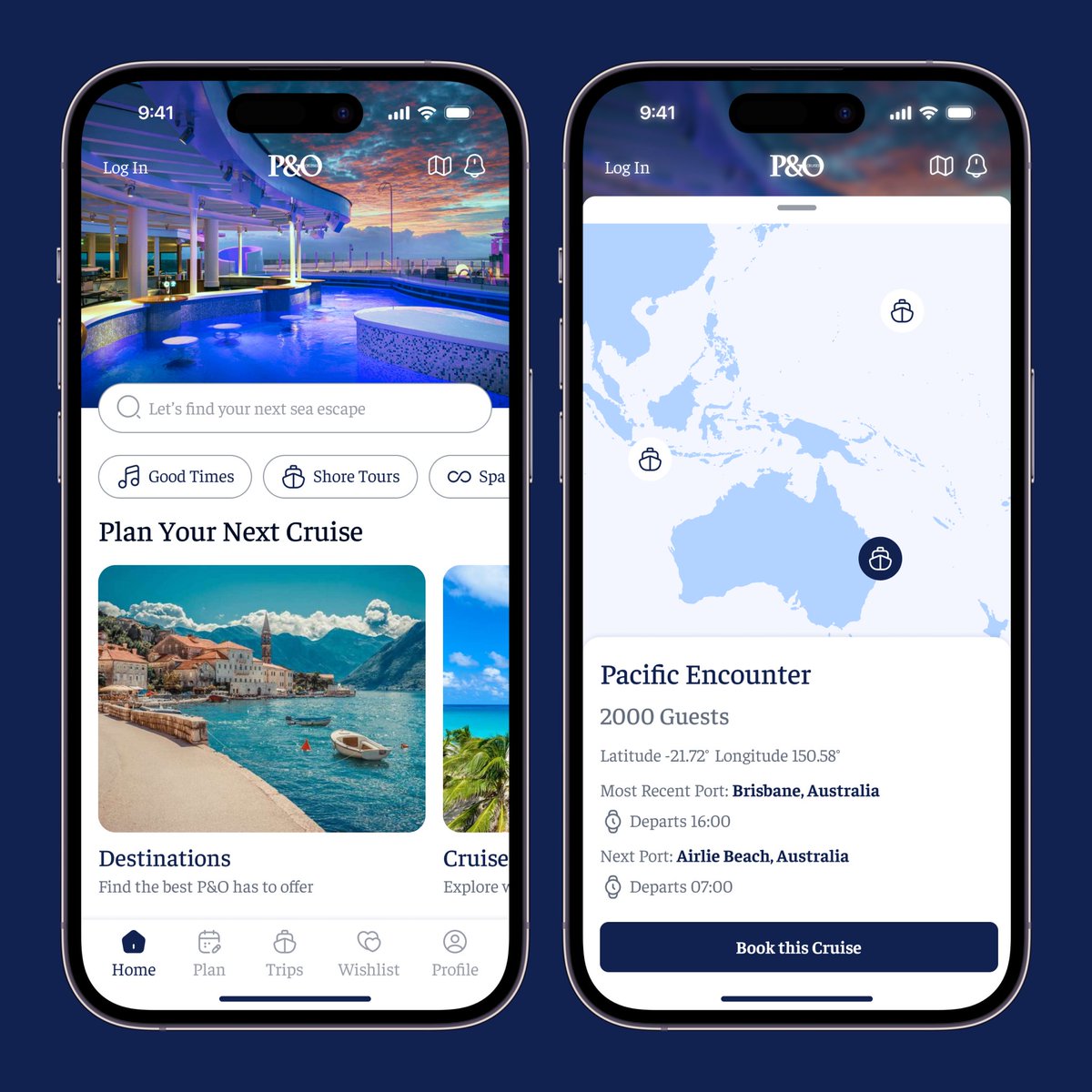
Ever had a family member ask you to revamp an app? During our usual Sunday chat, my Mother mentioned she wanted to go on a cruise but was put off by the high prices. She ended with, "Have you seen the P&O Australia app, David? It’s absolutely useless.”
So I gave it a bash!