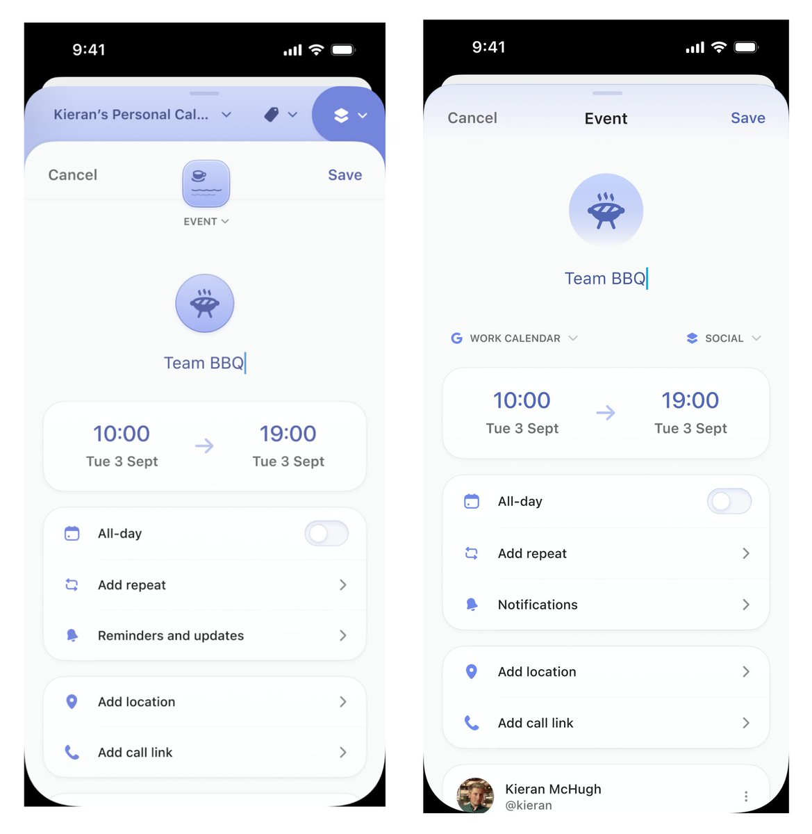
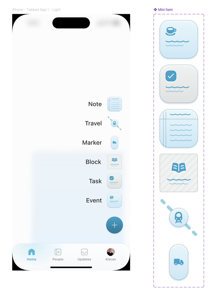
The @daybridge design on the left was rejected for being too messy, complex and confusing. The design on the right was signed off after a feedback round. Design is a constant battle between complex/fancy and simple/practical.
We’re nearly there 😅 Building Daybridge has been a long, long journey but the wait will be worth it. Building great product takes such a long time and I want to deliver on what we promised.
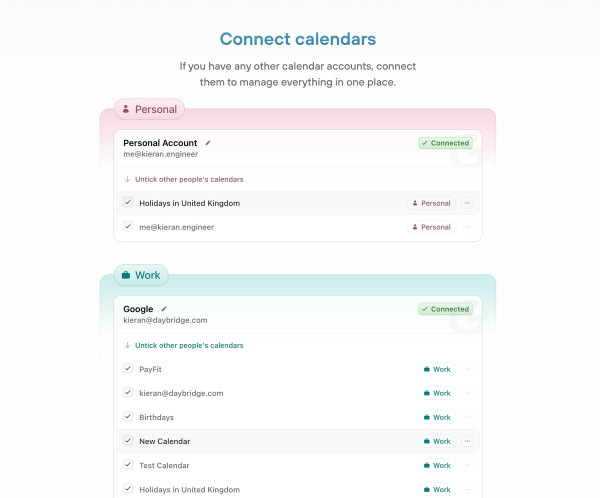
After vs before. The hierarchy of the page was confusing, it was unclear what the tickboxes were for. Sometimes you just have to design something, see what feels wrong, and then re-do it from a place of understanding. Will collect more feedback and make more tweaks.
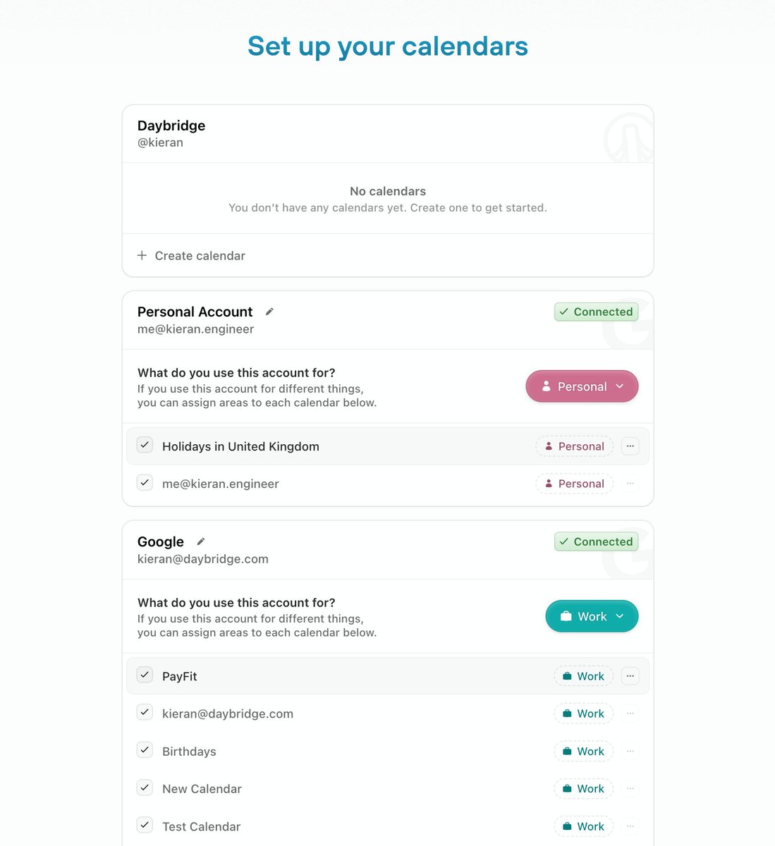
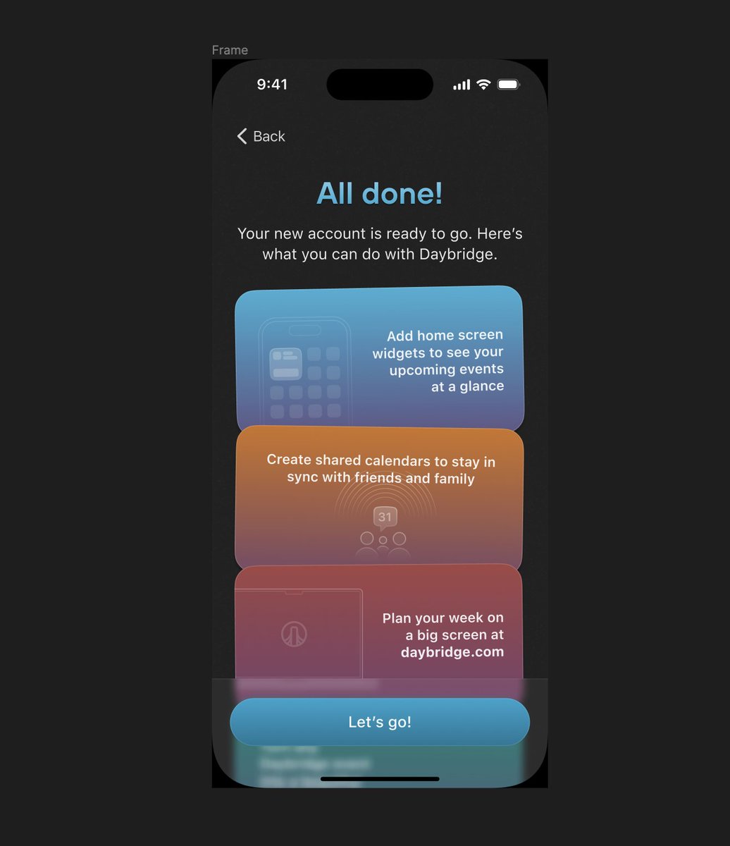
Sign-in, sign-up and onboarding for @daybridge V1 are completed! That was an enormous piece of work touching the entire codebase. Only a few more things to do now before we can start onboarding the first users 🔜
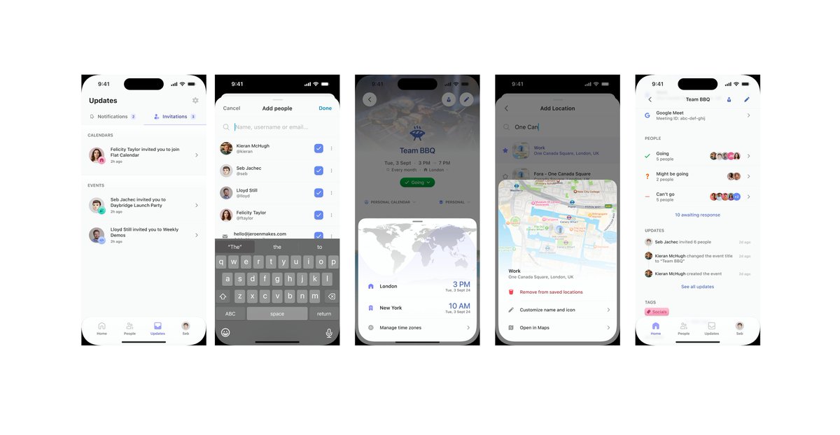
Feedback request! What would you improve about these screens? What do you like about them? Is the copy clear and confidence inspiring? Do you know what they mean, or are they confusing? 🙏