https://t.co/8fECbtJhDL
A map is a piece of art that the viewer brings to life.
The Oculi Mundi digitisation project has made it possible to browse beautifully rendered maps from antiquity on your browser- some of them centuries old!
#maps#cartography#geography#oculimundi
‘Urban Mythbusters’ is the highlight of #mentorshipmonday this week. This project is a geospatial exploration of tacos and tokos in the city of Amsterdam. Read all about @deboleenam5 and Mandy Maas’s findings in their blog post: https://t.co/iNlKaa8XnG
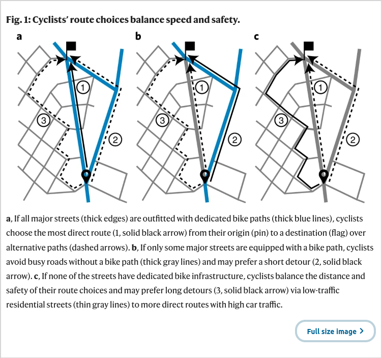
This looks like a great paper. Encouraging that there's an open code repository also for transparency, reproducibility and therefore scientific rigor: https://t.co/Ko4HyW8vKc Applicable to other modes (walking+wheeling 🚶🦽) and places? I believe so!
Failing to restore jobs for women — who have been less likely than men to return to the workforce as covid wanes — could shave trillions of dollars off global economic growth.
https://t.co/WLYVPMvKWv via @bbgequality
@AlbertoCairo I also really enjoyed these but thought they could have benefited from an “approximately x days” label for each of the phases to clarify their duration, beyond the relativity clearly displayed.
Everyone is tired of hearing about The New Normal but what does it mean? @axios@schemadesign, and @AlbertoCairo have discovered through @GoogleTrends how our shopping searches have been disrupted or changed forever in this cool #dataviz
https://t.co/bqY6ZzMdtE #datajouranlism
🧵: At historical growth rates, it will take >2,000 years for 🇸🇳 Senegal to catch up to 🇫🇷 France's 2019 GDP p.c.
How long will it take for developing countries reach rich world income levels?
I've built a quick tool to simulate growth scenarios: https://t.co/dLLPCABZyS.
1/N
Our interactive explanation on global exposure to climate extremes is featured in @Datawrapper's roundup of the best #COP26 related dataviz projects — https://t.co/U6u7XuFjrc
@stormhur Congratulations!! Currently deciding between Amplitude and [insert major competitor here] for our team and this is a very compelling endorsement
An elegant example of #interactive#dataviz with many moving parts: graphs, overlayed interviews, annotated visuals, and also runners running SO FAST
https://t.co/gG1tXOtDQm
I wrote a blog post about how to build at data team in the form of a story (and it ended up being about 4x longer than I anticipated): https://t.co/AoOQ0RP9Xw