Hi, I’m Divine.
I’m currently on my journey to becoming a pro graphic designer and would love to connect with fellow creatives and mentors.
Let’s connect and grow together.
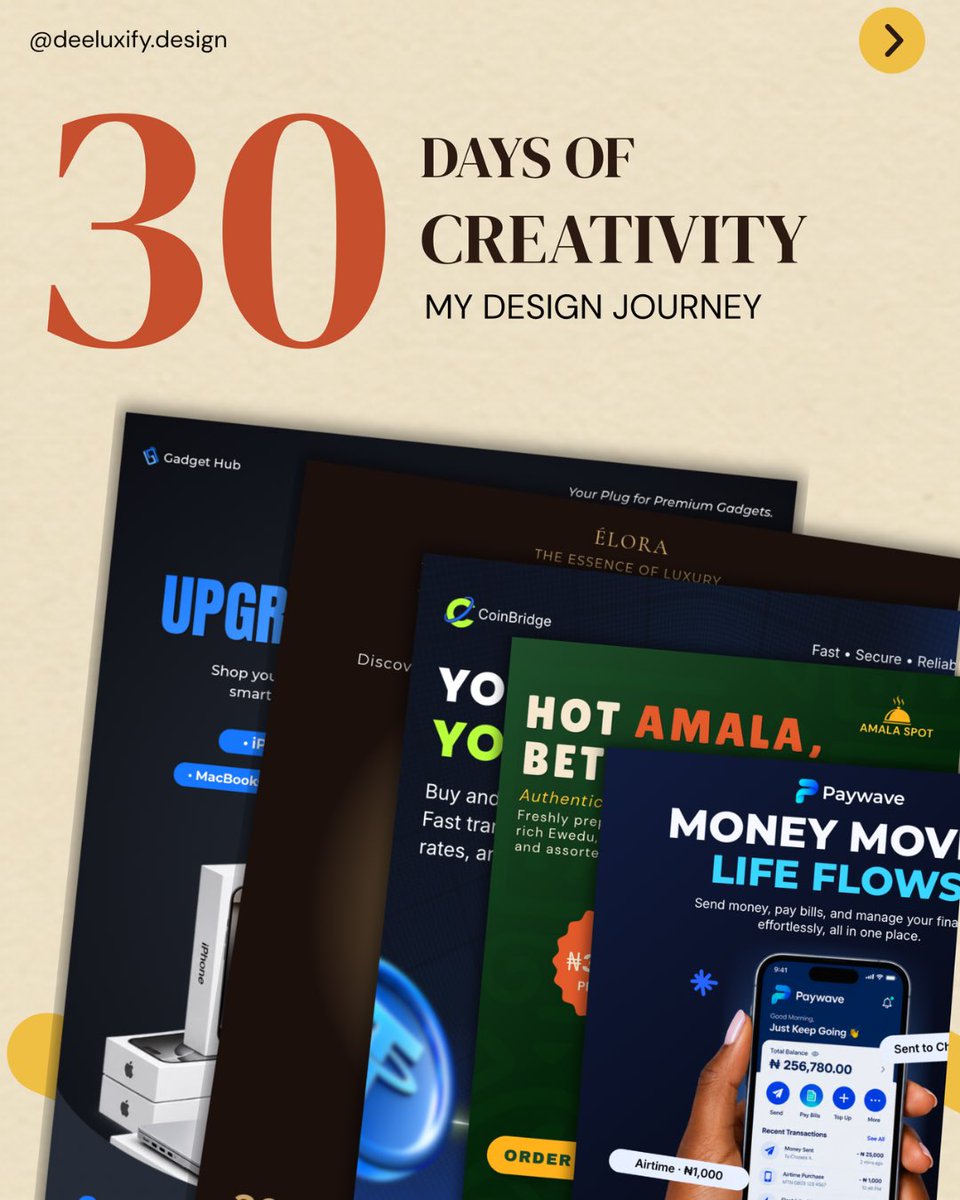
Day 30/30🎉
And that’s a wrap on the 30 day design challenge
This has been a really good experience. I enjoyed trying new things, exploring different ideas and seeing how much I could create in 30 days.
Day 30/30🎉
And that’s a wrap on the 30 day design challenge
This has been a really good experience. I enjoyed trying new things, exploring different ideas and seeing how much I could create in 30 days.
Day 25/30
A logo built on one idea: grace is a gift freely given.
The golden flame is hope, and new life. The navy cupped hands symbolize a welcoming community where everyone belongs, while the gold leaves at the base represent spiritual transformation and growth through faith.
Day 24/30
Today’s task was a food promotional flyer for AMALA SPOT. Went with a deep green background, bold typography and warm colours to make the food stand out.
Day 23/30
For this logo, I wanted to create something bold and structured without going for the usual car symbols. I used sharp geometry and negative space to build the VA monogram, with the peak of the A standing for excellence and the slash adding speed and precision.
Day 22/30
HAVENCREST is a real estate brand built on trust, so I wanted a symbol that feels steady and premium. The peak and the arch form an H, standing for the crest and the haven. Swipe to see the full set.
Day 21/30
I played around with typography and came up with this.
The Art of Slow Living. It's about choosing less noise and more meaning, and finding beauty in the quiet, everyday moments.
Day 20/30
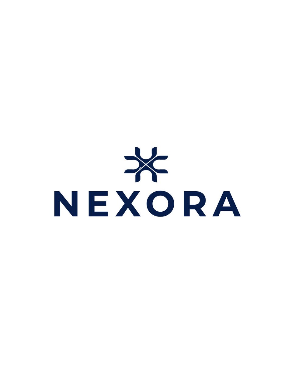
Created the NEXORA brand identity, a tech company built around innovation and connection. The symbol is made from a simple letter shape repeated and brought together at the center, so it feels connected, balanced and modern.
Day 19/30
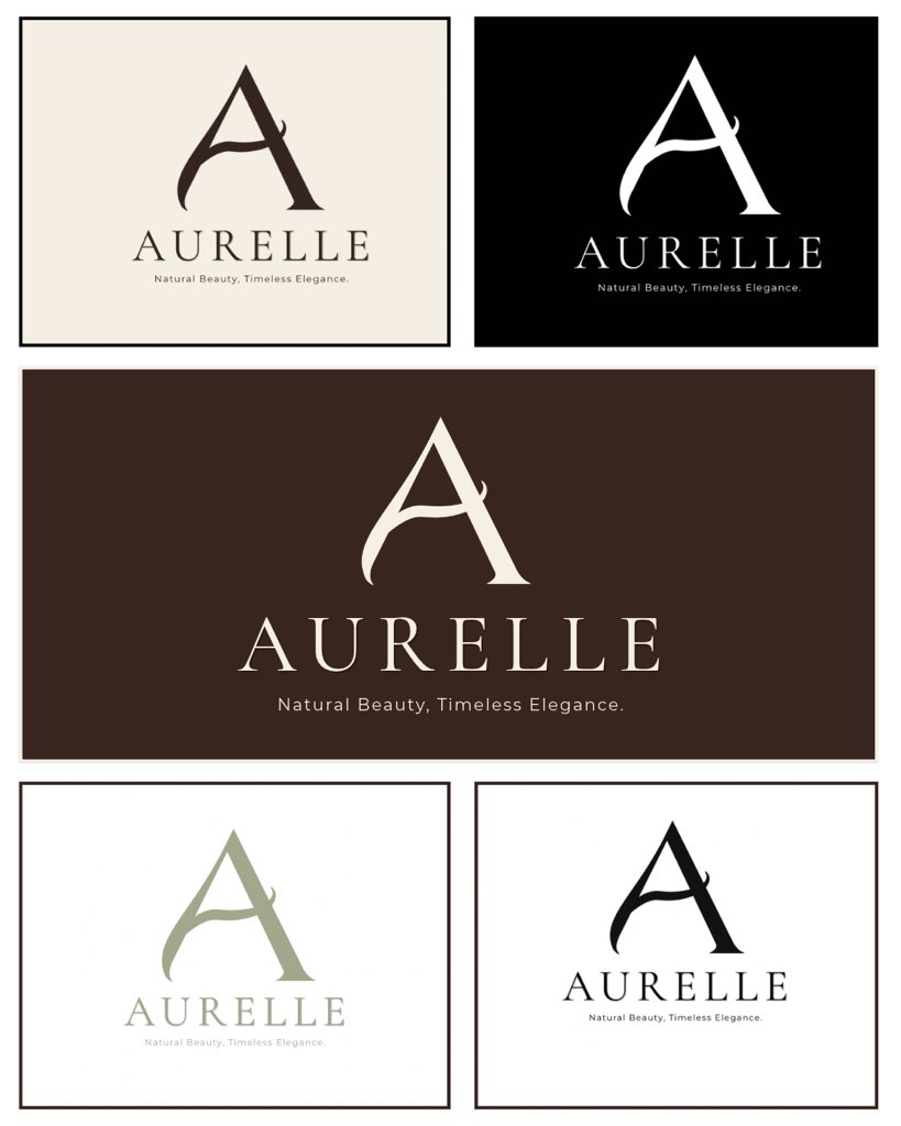
I designed a logo for AURELLE, a skincare brand, starting with a custom A I drew in Illustrator. Kept it minimal in ivory, espresso and sage, with black and white versions, and tested it on packaging.
Swipe to see the full identity.
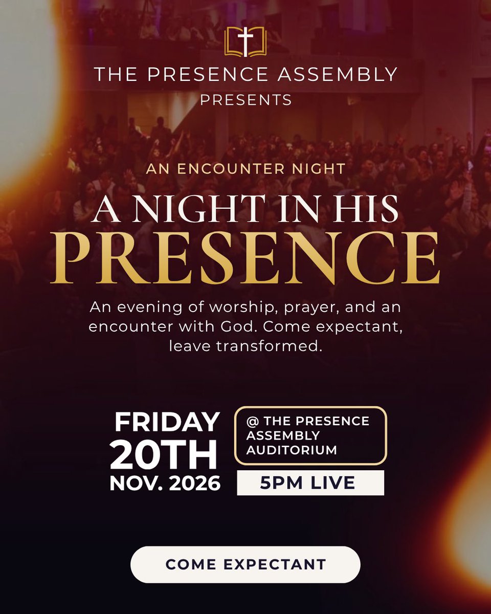
Day 18/30
A church flyer design for The Presence Assembly, an encounter night.
Playing with light, typography, and colour to create a design that captures the atmosphere of worship.