"The CNN Fear and Greed Index reads 1. It's not ideal, sure, but the market will recover."
"Comrade Secretary, 1 is the lowest that CNN's standard index can register. If we used a more advanced index... it would read -15,000."
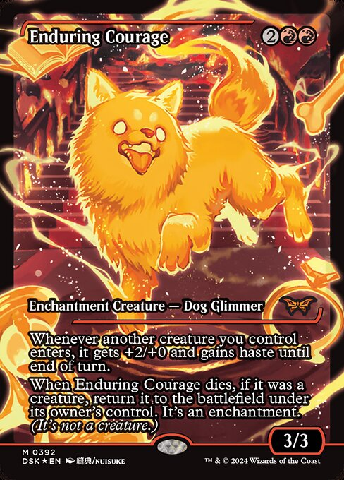
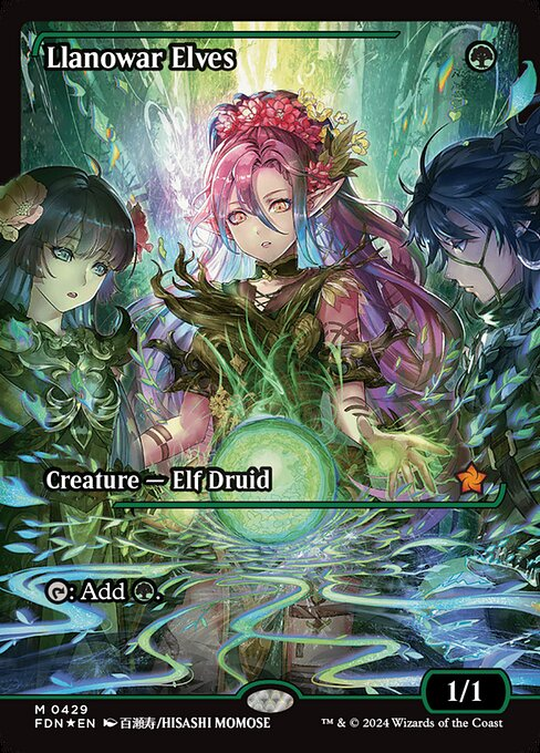
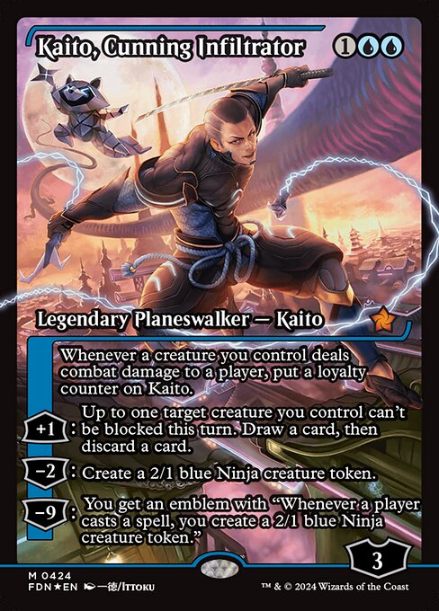
these frames are an accessibility nightmare for me. they're often mechanically new cards that require reading, but the text actively fights you to get through
it's especially frustrating in matte sleeves. i love mtg for readability, it's unfortunate that flair has taken priority
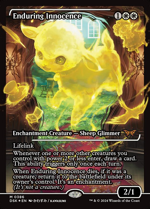
From a design perspective, these frames have been bugging me, but it took a minute to realize why: the (arguably) inelegant use of a heavy black stroke to the elements.
The goal is to feature the art, but the text on them looks (again, IMO) pretty bad. A rare design 🧵:
Girl you need to stop fucking on these pompous knights and get you a damn skirmisher in the kings regiment of light foot
Benefits to dating a skirmisher:
- Nimble
- Good hands
- Will go down on you and won’t stop until you’re screaming
- Not pretentious
- No horse smell