Everyone assumes startup websites are white.
What unicorns do:
~1/3 dark
~1/3 light
~1/3 lead with a brand color
The white SaaS homepage isn't the default always. Dark is the brand. Blue is one popular brand choice.
Data from @dembrandtcom#Design#Branding#Colors#UI#SaaS
Free UX improvement prompt for @claudeai and @AnthropicAI:
When tokens tend to get less, the user might feel agony, that can be solved by providing an experience that helps user to understand token consumption, and when the disruptive paywall is there, the user needs guidance.
Think of the future when AI automatically does everything - What does it do?
Maybe @GoogleDeepMind is something that thinks about that. #Future#Society
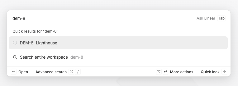
@linear uses a subtle abstract circular logo mark on the bg of the prompt textarea to break the minimalistic design.
Nice execution. #Design#WebDesign#Dev#FrontEnd
Developing with @claudeai Fable be like:
Okay, drive straight the road for 100km
> Okay it's driven! (4m 32s)
😯 Where I am.
VS. Opus:
> Okay, the 230 kilometers of the road are mapped in GPS and GLONASS and please stay on the road! I will not drive anywhere.
🫡 Thanks!
If you never visited @Chiquita website...
Blue primary, yellow accents = Strong brand hierarchy.
Neutral white and gray base = Keeps focus on content.
Consistent interaction colors = Improves usability and recognition.
#Bananas#Chiquita#Colors#Design
Can someone please design new PR review view?
I feel it was nice for the old times but now the multiple commentors and multiple agentic phases and long PR's become impossible to review with setups such as @github or @gitlab - you know, the typical PR page?
Maybe @linear ?