UI is more than colors and spacing — it’s how users feel clarity.
This space is for clean, functional, human-centered interfaces.
Let’s build better UI together.
#UI#UIDesign#InterfaceDesign#Figma
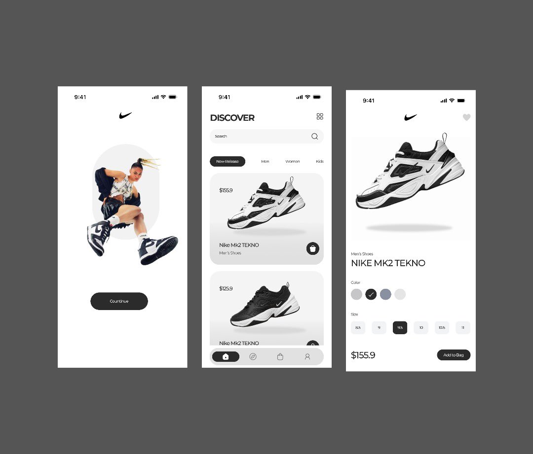
Been a minute since I last shared a design .Here’s a fresh Nike shopping app concept I worked on. Keeping it minimal, modern, and user-focused. #UIDesign#UXDesign
Been a minute since I last shared a design .Here’s a fresh Nike shopping app concept I worked on. Keeping it minimal, modern, and user-focused. #UIDesign#UXDesign
So I was scrolling through Twitter and saw this design by @mikkyinnovate had me stuck for a minute! I tried playing with the button styles: one with a pill shape and another with a softer rectangle.
Would love to hear your honest feedback on which works better
#UIDesign#Design
Yesterday I shared just the hero section… here’s the full landing page design for AirPods Max Clean, minimal, and product-focused — just how Apple would have it
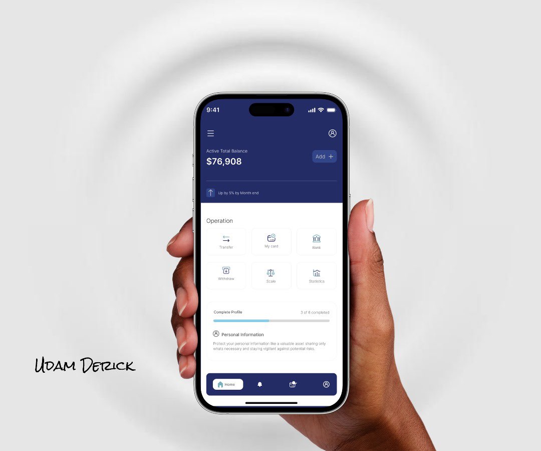
Hey fam, I’m Derick — a UI/UX designer always cooking up clean and user-friendly designs. Here to connect, follow, and vibe with other creatives. Let’s grow together #FollowBack
I’m Derick — a UI Designer focused on building clean, functional interfaces that feel right.
I’m starting a 30-day journey to design in public, learn out loud, and grow as a creator.
Let’s build better UI, one screen at a time.
#Day1#DesignInPublic#UIUX#Figma#LearnUI
Day 15/30-Every pixel here follows design principles — hierarchy, balance, and accessibility
My take on the AirPods Max landing page
Minimalist but functional. Sleek but readable.
Drop your honest hot takes
#DesignTwitter#UIDesign#Creative
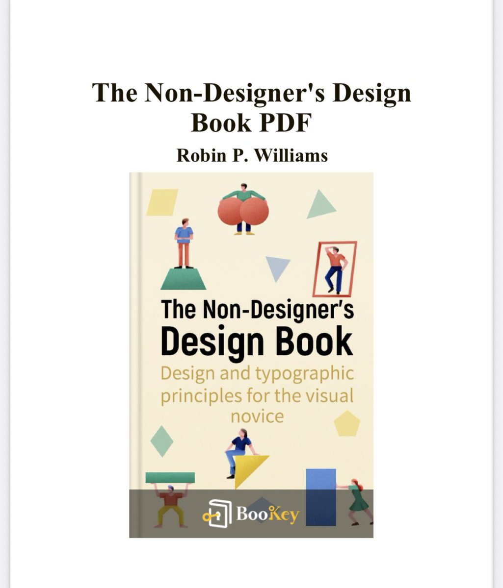
Day 13/30-Just read about contrast in The Non-Designer’s Design Book — it’s more than making things different. It’s how you create clarity, focus, and hierarchy. Without strong contrast, nothing stands out. If everything’s loud, nothing is heard.
#UIDesign#DesignPrinciples
Day 12/30- Just finished chapters 1–4 of The Non-Designer’s Design Book
I’ve learned how powerful the 4 basic principles of design are:
Contrast
Repetition
Alignment
Proximity
Now I can see what makes a layout weak or strong and I’m already applying it in my UI designs
#UIUX