Clarity > Creativity
Don’t lead with a vague headline like:
❌ “Innovating the future of business”
Instead, say:
✅ “We help small businesses grow with fast, modern websites.”
Clear beats clever—every time.
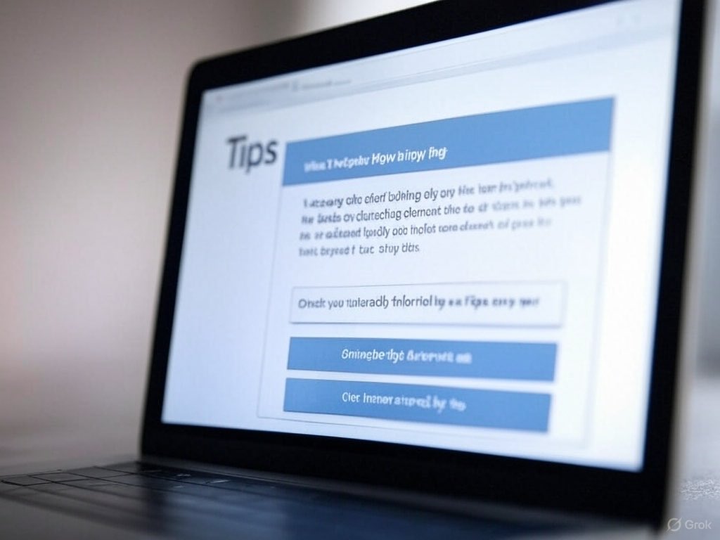
3️⃣ Poor Visual Cues: Without design elements like arrows or contrasting colors, important actions can be overlooked. Use visual cues to draw attention to your CTA.
Here are 3 common mistakes hurting your conversion rate:
1️⃣ Unclear CTA: Too many options overwhelm users. Focus on one compelling action.
2️⃣ Weak Headlines: Generic greetings like “Welcome” lack impact. Be specific about your offer.
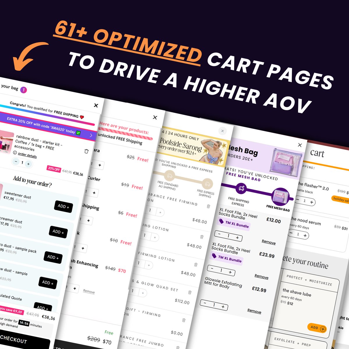
This Figma file has 61+ examples of CRO optimized carts.
These carts can make a huge difference in CVR & AOV.
However, they have to be tested, and no structure works for all brands the same way.
That's why I compiled this file with 61+ examples of different cart structures.
All focused on driving a higher AOV and CVR.
My team studies these from time to time:
-> Bundle, subscription, or product upsells
-> Free gifts, discount codes, shipping thresholds
-> Safe checkout, guarantees, risk-reversal
All of these, combined, make a great cart.
Want the file?
👉Like (Repost for priority access)
👉Comment "Cart"
👉Connect with me so I can DM you.
I’ll send you the link to this Figma file in your DMs!
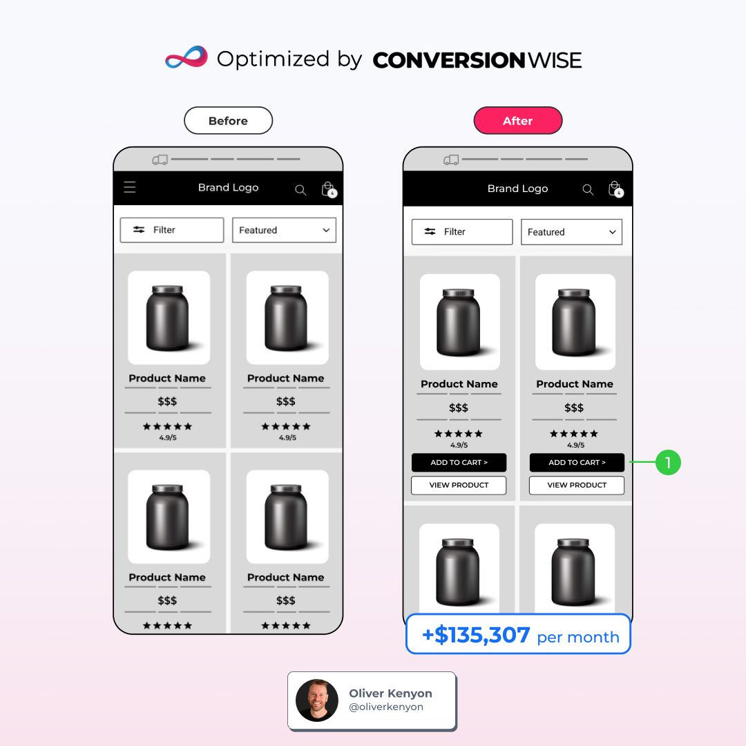
We recently ran a test that added over $135K in monthly revenue for our client.
Here's the story & how we did it:
This client is an online fashion retailer.
They've cracked the code on customer loyalty.
Their shoppers keep coming back. Again and again.
→ 70% of purchases came from repeat buyers
→ These customers were ordering an average of 2.4 items per visit
That's HUGE!
But something wasn't quite right.
The path to purchase was like a maze.
Customers had to click through multiple pages just to add items to their cart.
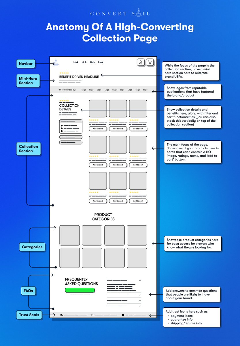
Our solution was simple: Add 'Quick Add' buttons (ATC & View Product) directly on the collection pages.
This way, customers could add items to their cart without leaving the page they were browsing.
It's like adding a "grab and go" section in a physical store.
No need to walk all the way to the checkout for each item.
We implemented the change and the results were impressive:
→ Monthly revenue jumped by $135,307
→ That's an extra $1,623,684 per year if the trend continues
→ Revenue per session increased by $0.19
All from one simple change.
Sometimes, the biggest wins come from the smallest tweaks.
It's not always about flashy redesigns or complex algorithms.
Often, it's about understanding your customers and removing obstacles from their path.
In this case, we aligned our solution with customer behavior.
They were already buying multiple items.
We just made it easier for them to do so.
The lesson?
Pay attention to your data. It tells a story.
Listen to that story, and let it guide your optimization efforts.
You might just stumble upon your next 6-figure win.
--
This was our CRO Case Study Episode 61 🧪
If you enjoyed this post, then:
→ Like and share it now.
→ Follow for more CRO insights and tips.
I just made a FULL GUIDE on ChatGPT to help you finish hours of work in seconds.
Usually, I'd charge $100 for this, but today I'm giving it away for FREE
Like + comment "Send" and I will DM it to you.
For the next 24 hours, it's FREE. ⏰ (Must follow to receive DM)