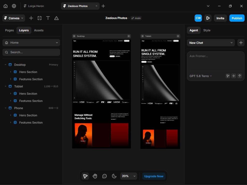
Day 5, I've learnt a lot about scroll triggers, responsiveness and persomance optimization.
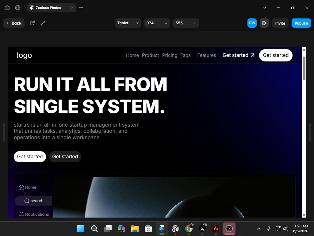
I have decided to turn this simple project into my first SaaS landing page template. Full Responsive, with morden animations that focus on driving attention and increasing conversion.
In design, clarity is a decision.
At the end of the day, the goal of a business website is conversion. turning vistors to customers Here is a new hero section for my upcomining portifolio website.
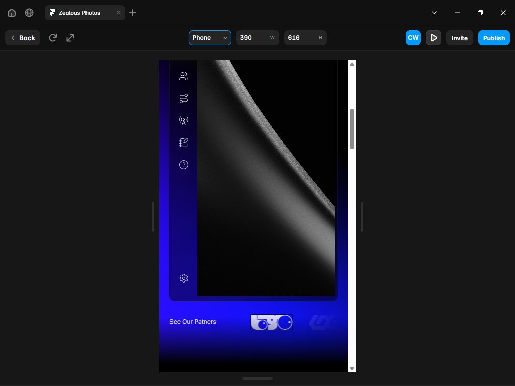
A premium SaaS footer. This entire project is built around a mostly monochrome palette, mainly using color to drive attention. so instead of relying on color to create interest, I use subtle motion.
Restraint actually creates a stronger visual identity than adding more colors.
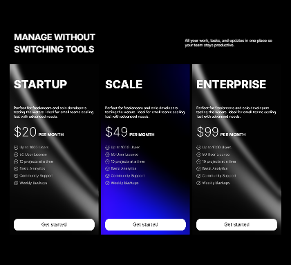
Just finished building the pricing section for my SaaS website template.
A pricing section shouldn't make people think harder.
☑️ Clear pricing hierarchy
☑️ Featured plan naturally draws attention
☑️ Clean, distraction free layout
☑️ Fully responsive
#Framer#WebDesign#SaaS
Have you noticed that on most websites you never pay attention to the logo?
I built this navigation so the brand gets noticed from the very first second.
A large, low opacity logo introduces the page in the hero section, then smoothly transitions into the Navbar as you scroll.
Just finished building this testimonial section for a template I am building.
☑️ Clean spacing
☑️ Smooth animations
☑️ Modern typography
☑️ Responsive layout
Small details like these can make a website feel more premium and keep visitors engaged.
#Framer#WebDesign#UIDesign
Day 5, I've learnt a lot about scroll triggers, responsiveness and persomance optimization.
I have decided to turn this simple project into my first SaaS landing page template. Full Responsive, with morden animations that focus on driving attention and increasing conversion.
Day 4 of learning by building a website on Framer. Today I focused on building responsive layouts, naming the layers and cleaning up performance. Framer is already starting to feel as natural as breathing.
My goal is building a fully responsice animated web page by day 7.
Day four of learning by building value on framer, I've built this gradient background using adobe illustrator, then used it on the website. feels like its a $10k client project.
Day 3 of learning by building something using framer. today I learnt and used, on appear & scroll triggered animations (on the navbar, header text and dashboard), using external components like (smooth scroll and the background) and using animated vector sets.
It feels like magic
Day three of learning and building using framer, today I learnt how to animate vector sets, I can't wait to show you the final use case i have for them in the project.
A complex mix of views, comments, likes, remixes, previews, purchases, account health, etc.
We keep the exact ranking system private to protect Community discovery and prevent manipulation. What matters most is simple: publish useful, original, and polished work that people genuinely want to view, discuss, like, remix, use, or share.
It’s not as simple as: get tons of likes and comments and you’re at the top. This is obviously too easy to manipulate and is not a signal of good work.
Its my second day using Framer, I just made this dashboard for the hero section. Next i am working on adding patnership logos and a transition to the features section.
This is where i end learning framer day 2. Tomorrow i plan to experment with more advanced layouts and scroll animations.
Framer is easy since i have experience building websites using code. its an easy transition.
Just built this simple navigation bar without a tutorial. uses an animated menu component that changes when the icon is clicked, and a reusable link component. I am now working on the hero section.