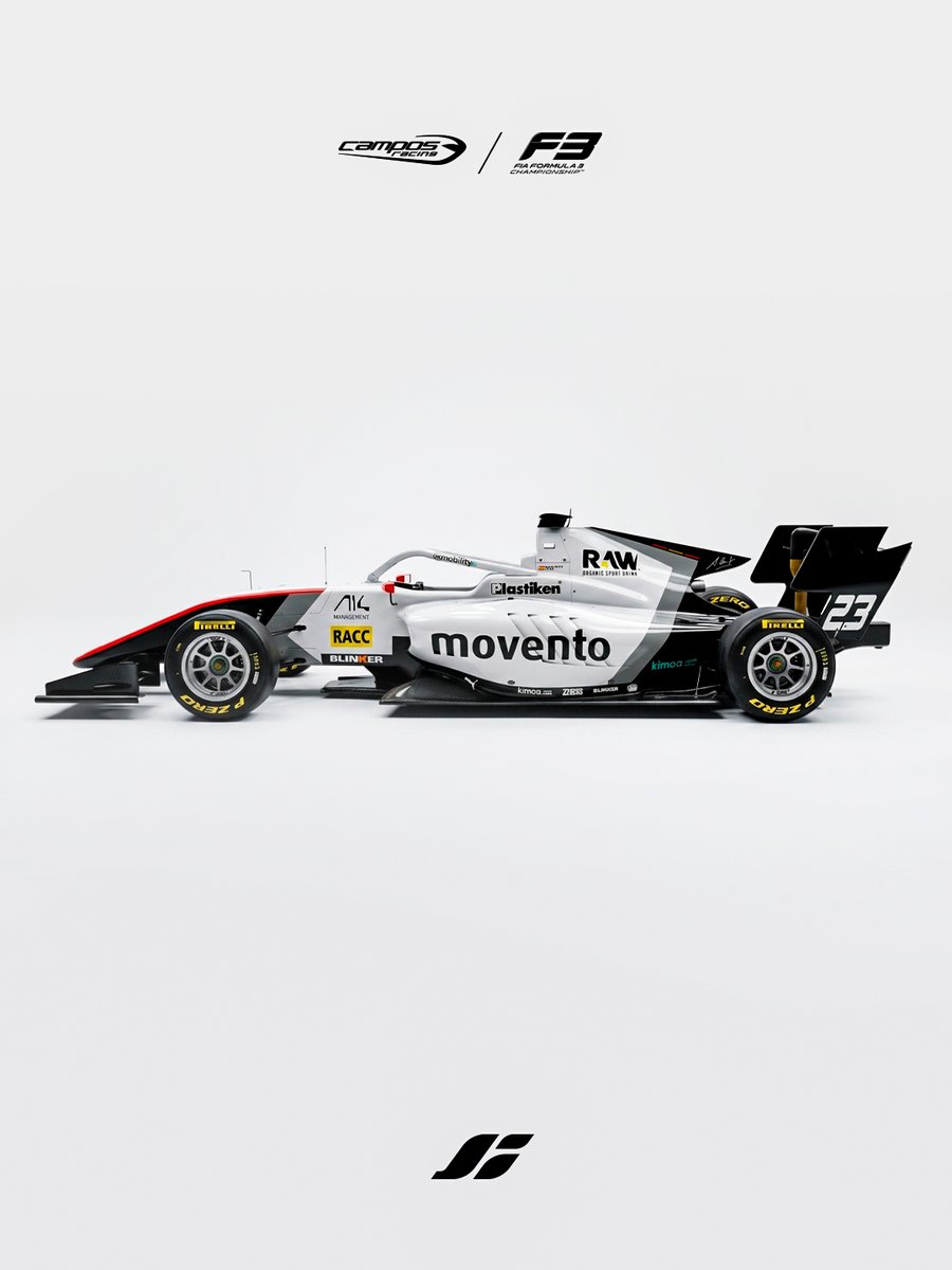
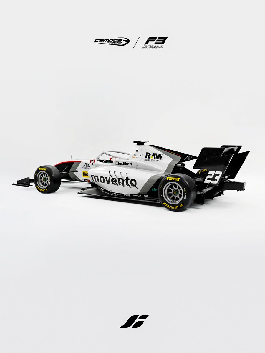
The design evolved the previous season’s visual identity through a cleaner and more simplified approach, built around a predominantly white base with black and grey accents. +
I'm seeing a lot of differing opinions. Personally, I would only change one thing: the lack of contrast in the white space between the letters and numbers that was there before. It was more legible before, especially at smaller sizes, because of the white space it created.
The design also incorporated floral graphics inspired by the regional identity, while the rear section paid tribute to motorsport heritage with a classic number 6 typography and a reference to Adrián Campos’ legacy.
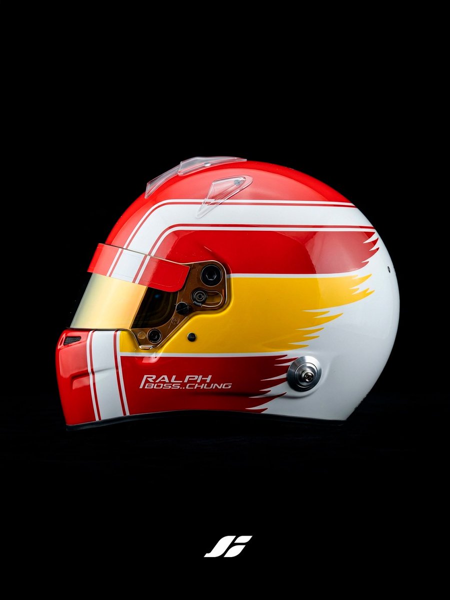
The concept was inspired by Valencian culture, using a clean white base to emphasize the colours of the Valencian Community flag through a balanced combination of red, yellow and blue tones, complemented by subtle orange and black details. +
Traditional Valencian elements were incorporated through a floral pattern inspired by a fallero vest, adding texture and identity across the helmet, while the rear section features a monochromatic photographic graphic and subtle custom details.
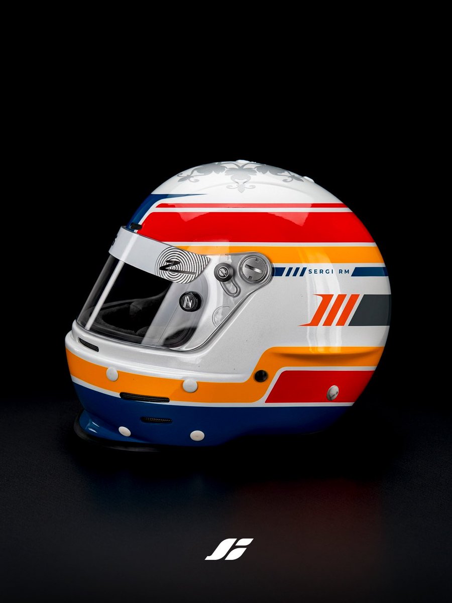
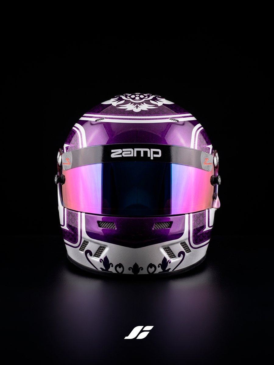
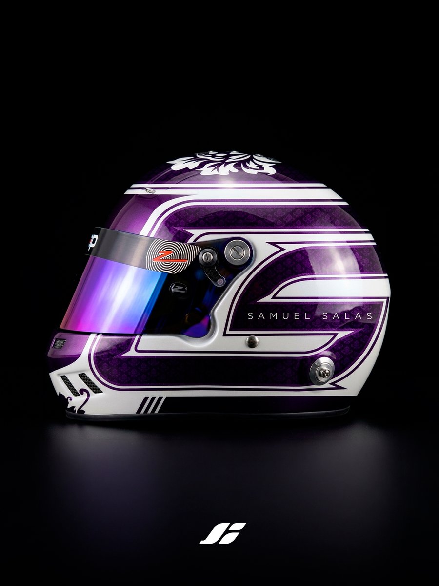
The concept continued my exploration of Valencian-inspired visual identities, combining personal symbolism with cultural references. The design integrates Samuel’s initial “S” on the sides, alongside a dual-tone purple palette chosen to reflect his personality. +