I thought people were exaggerating but I sent one message to Claude Opus and hit my 5 hour limit on Pro … just a job posting asking about my personal fit not even a crazy request.
Yooooooo! They actually ... well sorta reverted the stadium icons in #overwatch. Honestly huge improvement. Still love to see a little iconography similar to the hero items to give that quick visual for stats.
Can we bully #blizzard into changing the #overwatch stadium icons back? I feel these new icons break every basic rule of design it's so hard to tell what an item does or what item is what.
Asked Opus4.6 about the design of the #overwatch stadium icons for some extra perspective, found it interesting.
The Prompt: Consider these two pictures in the context of design of everyday things / a professional UI/UX designer for a video game. ignore my feelings on the subject and look at them critically. What strengths do each of them have, which follows the principles of design better and why.
Image 1 (Old Design)
Strengths:
The old design leans heavily on color coding as a primary signifier. Each icon uses a distinct, saturated color within a simple circular frame — greens, blues, purples — that creates immediate visual grouping. Even at a glance, you can start to categorize items by hue before you ever read a label. This aligns well with Norman's principle of visibility: the state and category of each item is communicated through a redundant channel (color) on top of shape.
The icons themselves are abstract and symbolic — simple geometric or stylized shapes on clean backgrounds. This works the way road signs work: you don't need to identify what the object literally is, you just need to recognize and differentiate it from other icons. Once you've learned what the green circle with the plus shape does, you can spot it instantly in a grid. This supports recognition over recall, which is critical in a fast-paced competitive game where you have limited time in the buy phase.
The high contrast between icon and background also helps. The dark circular frame with a bright, clean symbol pops well against the blue UI background.
Weaknesses:
The abstract icons do require an initial learning investment — you need to hover or read tooltips the first time. And the color palette, while distinctive per category, could be confusing for colorblind players since it relies so heavily on hue differentiation.
Image 2 (New Design)
Strengths:
The new design embraces skeuomorphic representation — each icon is a tiny illustration of the actual item (a drone, a rifle attachment, a syringe, etc.). This aligns with Norman's concept of affordance and what he later refined as signifiers: the icon is trying to tell you what the thing is through a literal depiction. In theory, this should support discoverability — a new player might intuit what "Aerial Distresser" does because the icon looks like a drone.
The categorization tabs across the top (Weapon, Ability, Survival, Gadgets, Filter) are a genuine UX improvement, giving players more structured navigation. The layout is also cleaner with more breathing room between items.
Weaknesses:
This is where the design breaks down significantly against Norman's principles:
1. Loss of discriminability. The biggest problem is that nearly every icon now shares the same visual language — small, detailed, dark illustrations inside similarly-colored circular frames. When you scan the grid, especially under time pressure, they blur together into a wall of dark blue circles with tiny objects inside. Norman would call this a failure of mapping — the visual differences between icons don't map clearly to functional differences. The old design's color coding gave you a "free" layer of information. The new design strips that away.
2. Detail doesn't scale. These illustrated icons are information-dense at a resolution that's too small to parse, especially on console or from typical viewing distance. A fundamental principle of icon design is that the silhouette alone should be recognizable. Many of these new icons fail that test — you'd need to squint to distinguish one weapon attachment from another.
3. Violation of "recognition over recall." Ironically, by trying to make icons more literal, they may have made them harder to recognize in practice. The old abstract icons, once learned, were instantly distinguishable shapes and colors. The new realistic icons all look like "small dark object in a circle," forcing the player to examine each one more closely. This is the opposite of what you want in a timed buy phase.
4. Color now only signals rarity, not function. The ring colors (blue, purple, pink/magenta) indicate Common/Rare/Epic tiers, which the old design also did. But the old design additionally used the icon's internal color to signal function. The new design lost that second channel of information.
Verdict
From a pure design principles standpoint, Image 1 (old) is the stronger UI for its context. The key word is context — this is a competitive game mode where players make rapid purchasing decisions under a countdown timer. The design priorities should be fast scanning, instant recognition, and clear differentiation. The old design optimizes for all three through color coding, high-contrast abstract symbols, and strong visual distinctiveness between icons.
The new design optimizes for learnability and thematic immersion — making icons look like what they represent. That's a valid design goal, but it came at the cost of usability under pressure, which is arguably the more important axis for this specific interface. It's a textbook case of what Norman warns about: prioritizing the conceptual model (making things "make sense" intellectually) at the expense of the operational model (making things work in practice).
A better solution would likely be a hybrid — keep the illustrated style but with much bolder silhouettes, bring back color-coding by function within the icon, and increase contrast so icons read clearly at small sizes.
Can we bully #blizzard into changing the #overwatch stadium icons back? I feel these new icons break every basic rule of design it's so hard to tell what an item does or what item is what.
Love tech, love coding, but at the end of the day I just work in a warehouse. Spent my weekend using claude code to build a receipt parser - snap a photo, OCR pulls the text, ollama cleans it up, posts to my notion pantry. Nothing fancy but I made it myself. Wild times.
Kind of wish the new Notion Layouts included being able to make our additional property groups and rename them. Love the new section option for it and would love to be able to add it to both columns
Genuinely haven't been doing well recently, and haven't coded in almost 6 months due to burn out and not getting in tech for almost 2 years prior. It's not much but managed to make a small animation just to get back into making something, hopefully more to come. I'm so rusty 🤫😳
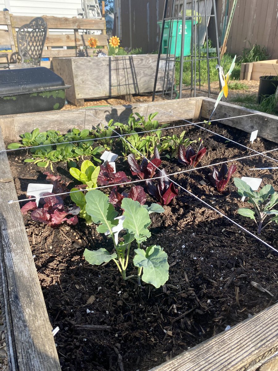
So not my normal content but it’s growing season! Just cut this “sucker” off one of my tomato plants, threw it in the ground and gunna hope for the best.
What if for page visibility of page properties in #Notion we had a "hide when filled", letting us automatically hide values as we enter them in Page View.
Jumped into freecodecamp for awhile and worked through alot of the javascript content today as a refresher cause honestly it’s been *awhile* since I wrote any code.
What a great resource it is for the community and really helped break through the ice of getting back into it.
So far as ChatGPT goes, I've mostly been using it to act as my gardening mentor. It's been fantastic to ask questions in layered ways to dig deeper into a subject, outline an area of gardening I don't know about, or simply recommend more resources to read.


