Sorry but I think about the magic run of BBC Two 6pm when you were getting The Simpsons, The Fresh Prince, Malcolm in the Middle, Buffy the Vampire Slayer, Robot Wars all the time
Rule #1 of Software Architecture:
YOU ARE NOT NETFLIX!
If you don't have 270M users, a quarter of which can be on the system simultaneously, you don't need the complexity necessarily to support that. Build exactly as much architecture as you need. Build it so that it can grow incrementally. Do not future-proof.
Over the last few years, Silverstone and the British GP have accelerated the process of pricing their own audience out of the event. Don't put this down to Red Bull.
A three day general admission ticket last year was £319. This year it's £349 (so far, it could still increase due to the dynamic pricing model).
Assuming you're an average UK family of two adults and one child, you'll be looking at £1047 just for general admission. If you're going by car that's another £95 in parking fees. Food and drink, lets just be conservative and say another £75 per day.
That's £1367 for a weekend, not factoring in petrol, accommodation, merchandise, etc.
You're asking for almost 4.3% of the yearly median disposable household income in the UK for a weekend at the race for the average family, if they go for the cheapest options available.
You're not having trouble selling your tickets because Red Bull are too good. You're having trouble selling them, because people can't afford them.
#F1 #Formula1 #Silverstone #BritishGP
CyberTruck: Solving problems that aren’t problems since 2024.
My son said it looked like something out of his video game Roblox. 🤣
So glad Elon got his $56 Billion bonus for creating the DeLorean 2.0 here.
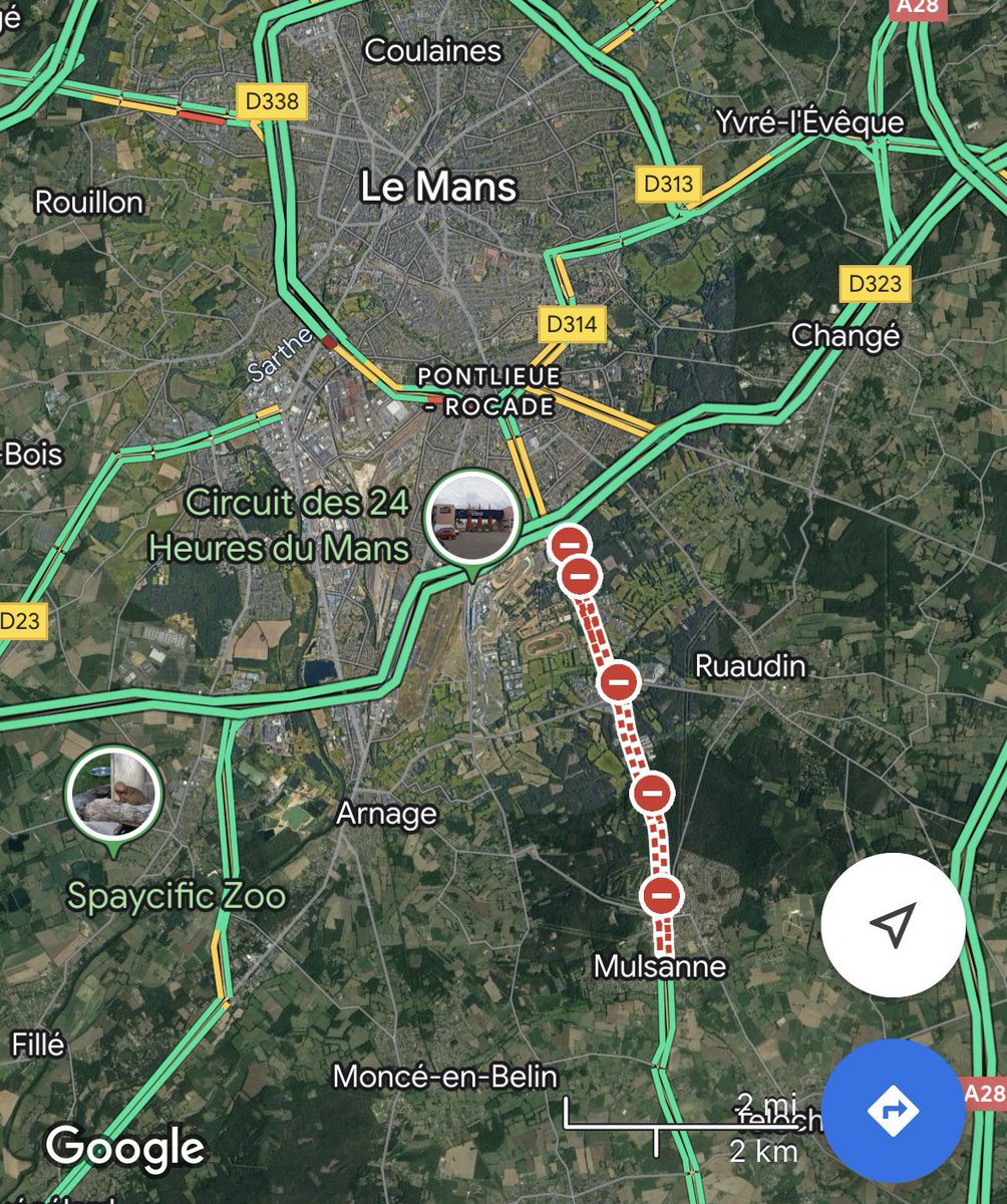
I don't know about anyone else but, personally, I'm off to the tranquil French countryside this weekend and a lovely little town which Google Translate tells me is called 'The Mans'. Expecting a calm, relaxing time and lots of peace and quiet!
Those asking if ‘The Thick of It’ is writing this election may want to note that today’s Tory immigration plan -shunt it off to an independent body to decide, so ministers can avoid talking specifics in interviews- is the main plot of 2009’s special ‘The Rise of the Nutters.’
I have a folder on my desktop named "Old Desktop"
Inside which is a bunch of stuff and a folder named "Old Desktop"
Inside which is still more stuff and a folder named "Old Desktop"
I don't even know how many layers deep it goes at this point.
In 2010, YouTube had 800M active users + streamed 2B+ videos daily.
But internally, we were flying by the seat of our pants.
One burning question was on our minds:
How were people actually using YouTube?
Here's the story of how one UX researcher ignited sweeping changes to how the company approached building the product:
—
I joined YouTube in 2009 and still recall my first planning meeting with the search team.
We sat around a table and the PM asked:
“So what do you all think would be cool to build?”
In asking a few questions of my own, I realized the team had been building without understanding how people experienced the product.
We lacked the information to make informed choices about what to prioritize across YouTube.
And so we started to grow the research team.
—
In 2010, we convinced @kerryrodden (they/them), Google’s first Quantitative UX Researcher, to join YouTube.
To get oriented, Kerry started asking PMs, Designers, Engineers, Execs, and other UX Researchers what their most pressing questions were. One question came up again and again:
How were people actually using YouTube?
Kerry combed through existing qualitative research, and honed in on understanding how people navigated through the site.
To do this, Kerry jumped into YouTube’s user logs and was delighted to discover that YouTube’s data showed a user’s entire session — revealing a user’s navigation across all the pages they visited.
(Note: User sessions were completely anonymized, so no session data was attached to an identifiable person.
Also, usage data was separated from video content, so we analyzed only page types e.g., watch page or search results page, but not the actual videos or search queries.)
To simplify the data, Kerry categorized all the pages of YouTube into five page types: Home, Search, Watch, Channel, and Other (account, settings, etc.).
Kerry counted usage for each page type and then likelihood of the next page to visit.
e.g. If someone was on the home page, what percentage of the time did they search vs watch a video?
When sharing these eye-opening findings with PMs, Designers, and Engineers, Kerry was met with a barrage of additional questions:
- Where were people most likely to start?
- Where did they go?
- What did a typical session look like?
- How/when/where did sessions end?
These questions led Kerry to analyze whole sessions.
So they calculated where people started, and from each page, where they were most likely to go next.
—
Kerry had overcome the first challenge of making sense of the data.
But their goal was not only to understand how people navigated YouTube, it was also to show the data in a way that everyone inside of YouTube could easily understand.
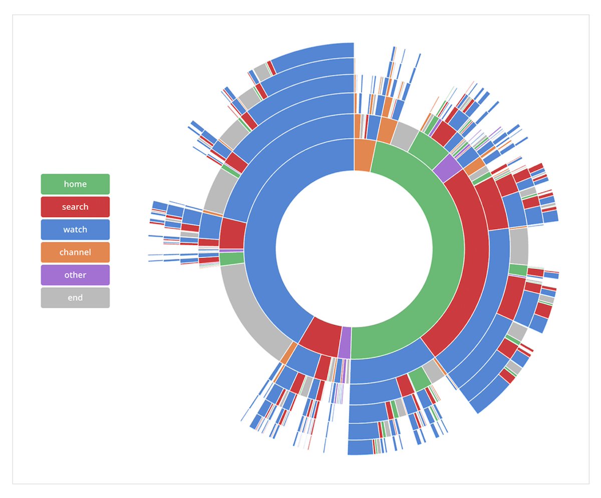
After exploring several formats, Kerry landed on a radial sunburst format to visualize the data.
In this view, it was easy to see the relative % of sessions that started with each page type and it was also easy to follow a user’s path across an entire session.
Kerry built an interactive version that allowed us to hover and trace any path from start to end, with the percentage of sessions that followed that exact path.
The image below is static, but shows the breakdown of paths people took through YouTube.
(Starting from the inside and working your way to the outermost ring)
—
Kerry’s visualization went viral inside YouTube.
It was turned into posters and hung up on the walls, printed onto t-shirts, and referenced in exec strategy decks and new hire orientation.
The mystery of how people used YouTube had been unlocked.
—
We had all assumed YouTube’s homepage was important.
The homepage had 45M+ visits per day and companies were doing home page buyout ads for huge sums of money.
But Kerry’s research revealed less than half of sessions started on the homepage and people mostly came to the home page to search.
The homepage showed a bunch of videos that were driven by a mass algorithm (and was pretty much the same experience whether a person was logged in or not).
We were missing the opportunity to show 45M people the content they wanted to watch each day.
Kerry’s visualization was an inflection point in YouTube’s history.
Their findings created lasting ripple effects that elevated how well we understood users’ experiences, how we approached building products, and how so many subsequent video-first companies shaped their products.
Ultimately, the team invested in building personalized recommendations, which helped transform the homepage from a search portal into a destination for finding content to watch.
This transition was especially pivotal later, when everyone shifted to mobile.
Personalized recommendations set YouTube up to become the dominant mobile video app, where “homepage” discovery was foundational to its success.
Today, we open the YouTube app and start watching videos without even thinking — it just works.
—
This story has stuck with me for the past 15 years.
It is a great example of what can happen when a single person is devoted to understanding the full user experience and is willing to put in the effort to cross traditionally accepted boundaries.
It is so important to have a clear picture of how people experience your product — both qualitatively and quantitatively.
Understanding this fuller picture can open your eyes to gaps and unexpected behaviors as well as focusing on perfecting the parts of your product where the magic happens.
—
A big thanks to @kerryrodden, as well as @shivar + @mags to jog my memory of different facets of this story.
For more on design insights + stories, follow me at @elizlaraki.