I built a Photoshop-like image editor. It’s called Compositor.
https://t.co/5EMXCgaWI1
I originally built it for myself to get off my Adobe subscription, but decided to release it for free and make it open source. It has all the essential tools I need for compositing, with none of the BS.
I know this workflow is kind of archaic in 2026, but I’m still using it until AI can actually get pixel-perfect on some of the details.
The entire app is 12MB. Photoshop is 6,455MB on my machine.
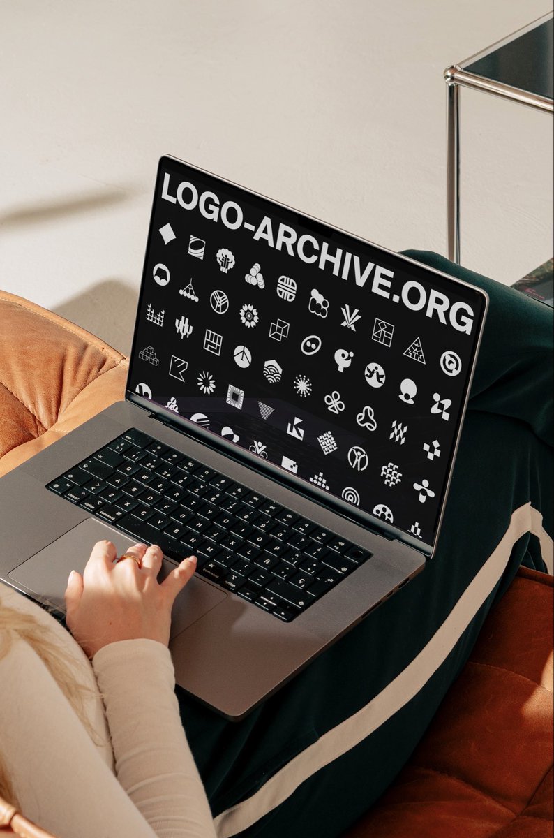
A 3D mockup is not a logo.
It’s just a mockup used to help you visualize how your logo could look in the real world.
And no, not every logo needs to look 3D, shiny or embossed to be a “good logo.”
There are different types of logos, and each one communicates differently. The right choice often depends on your brand strategy, industry, audience and the message you want the brand to pass.
Here are some common logo types:
1. Wordmark
A logo made entirely from the brand name, usually through a carefully designed type treatment.
Think Google, Coca-Cola, Netflix.
Best when the brand name itself is something you want people to remember.
2. Lettermark
Uses initials or abbreviated letters instead of the full name.
Think IBM, CNN, HBO.
Useful when the full brand name is long or the initials already have recognition.
3. Monogram
A symbol created from one or more letters, often intertwined or stylised.
It can give a brand a more personal, refined or established feel.
4. Symbol / Pictorial mark
A visual symbol that represents the brand without necessarily spelling out the name.
Think Apple or Lacoste.
This requires strong visual thinking because the symbol needs to become associated with the brand.
5. Abstract mark
Instead of showing an obvious object, the logo uses an abstract shape to communicate an idea, feeling or concept.
This gives you more room to create something distinctive and strategic.
6. Mascot
A character becomes the face of the brand.
Great for brands that want to feel friendly, playful, energetic or highly relatable. E.g KFC
7. Combination mark
A symbol and wordmark are used together.
This gives the brand flexibility because you can use them together or separately depending on the application.
8. Emblem
The logo has text and imagery contained within a shape or badge.
Often seen in institutions, schools, clubs, automotive brands and organisations that want a traditional or authoritative feel.
So when you’re choosing a logo, the question shouldn't just be:
“Which one looks nice?”
Ask:
“What type of logo best communicates what this brand stands for?”
Because a logo isn't just something you put on a mockup.
It is a strategic visual asset of the brand.
And yes, sometimes the right answer is not the trendiest logo type.
I remain Tina Brown, A strategic brand designer and I’m always out here rooting for your success.
@realtinabrown_ Lol so thats how everyone entered THE ARK and left me? Delay isn't denial. Hope there's still a spot? If there's non i can take yours. Hamzy here, the incognito designer, a relic of the industry. He that coined the color theory and invented gradient mapping. Extend the red carpet
Resources for designers I’ve built over the last decade.
1. https://t.co/NZfdFk474l
2. https://t.co/6PizA3omM6
3. https://t.co/tvKC8Y9rHh
4. https://t.co/VW1VtK56Pm
5. https://t.co/kLHMcWMFvI
@JOLT_xx@KilobyteGraphix Absolutely. Thesame way Ui Ux is classified as tech, you can pick out graphics design and say its non tech when Ui Ux falls under Graphics design. Please let's be informed