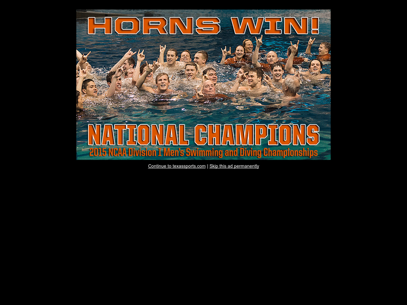
There's a growing trend in higher-ed of hiding menus on desktop sites under either a button or icon. My instincts says this is a negative for user experience. NN Group researched this in 2016 and found as much. Anyone (maybe site owners on this path) done any recent UX research?
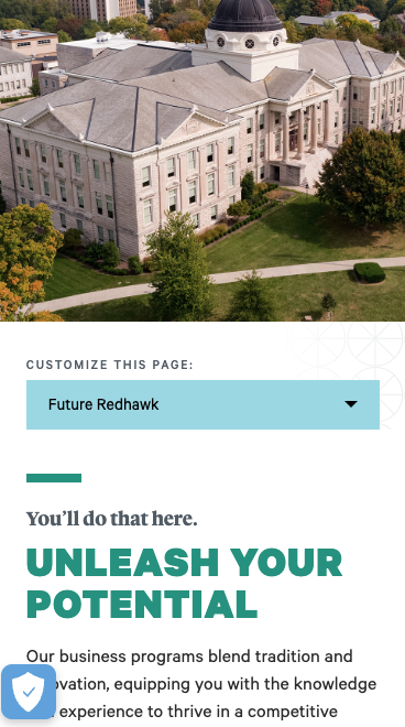
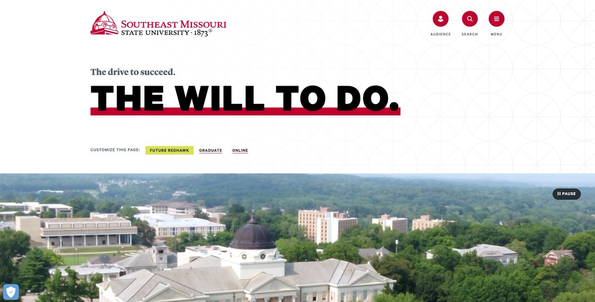
Customize this page? Don’t mind if I do! 🎨 Nice touch from Southeast Missouri State University—makes the experience feel personal. https://t.co/4aaMJM1YWC
The university website redesign launched in beta today. This update improves the user experience and brings elements of the site into the university’s new brand creative platform that was introduced in fall 2022. https://t.co/JCfrS41gv0
The changing background as you scroll is a visually interesting touch! I can't speak to accessibility or other factors, but it definitely caught my attention. https://t.co/svqRPAVhhL @FlaglerCollege
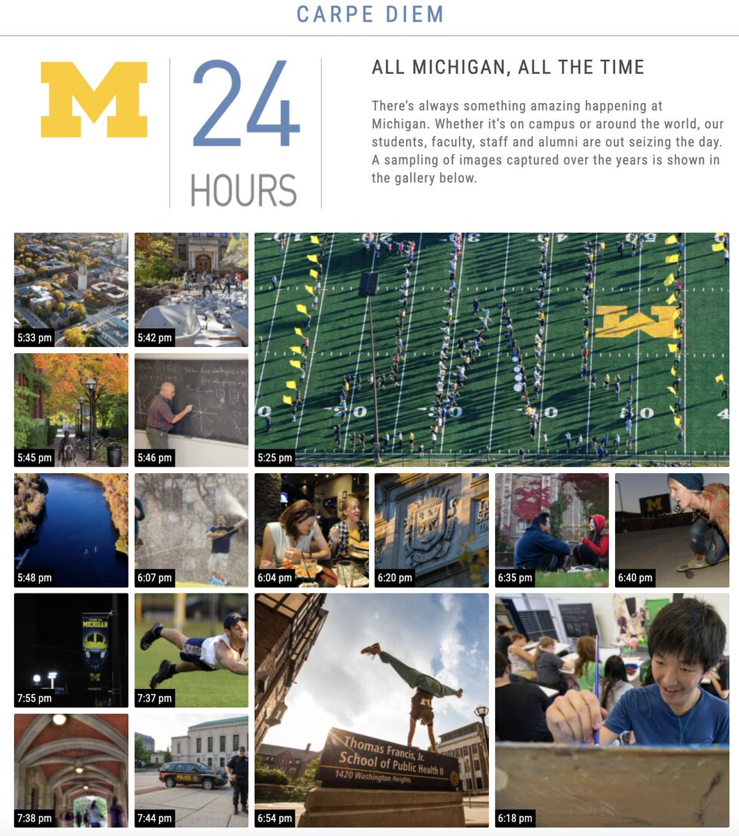
This feature on the University of Michigan’s homepage offers a glimpse of what a day on campus might feel like. Even though it’s more of a representation than a live feed, it’s captivating and completely drew me in. https://t.co/7RweJh47fh @UMich
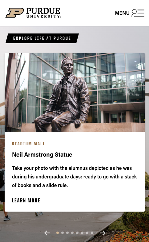
I love how they’ve integrated campus tour features right into the homepage design. Purdue nails it with captivating images that really give you a sense of place. The pulsing plus signs are an intuitive way to access more info on each highlighted feature. https://t.co/1g3bgJsiZd
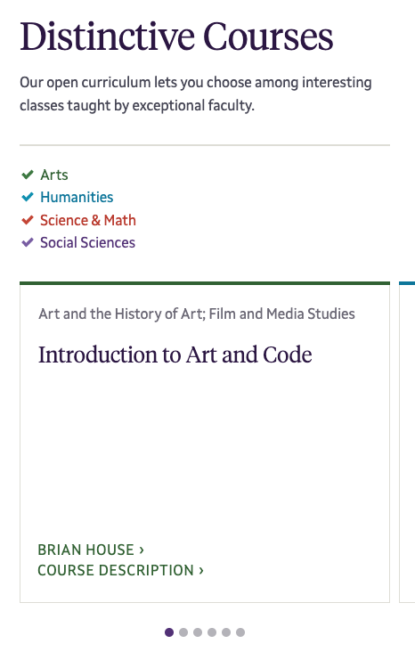
First impression. I like the inclusion of these distinctive courses and having them color-coded by discipline. But I'm curious, does it impact registrations or just aim to attract applicants? Either way, it’s a fun way to spotlight unique offerings. https://t.co/zK2kOUAmht
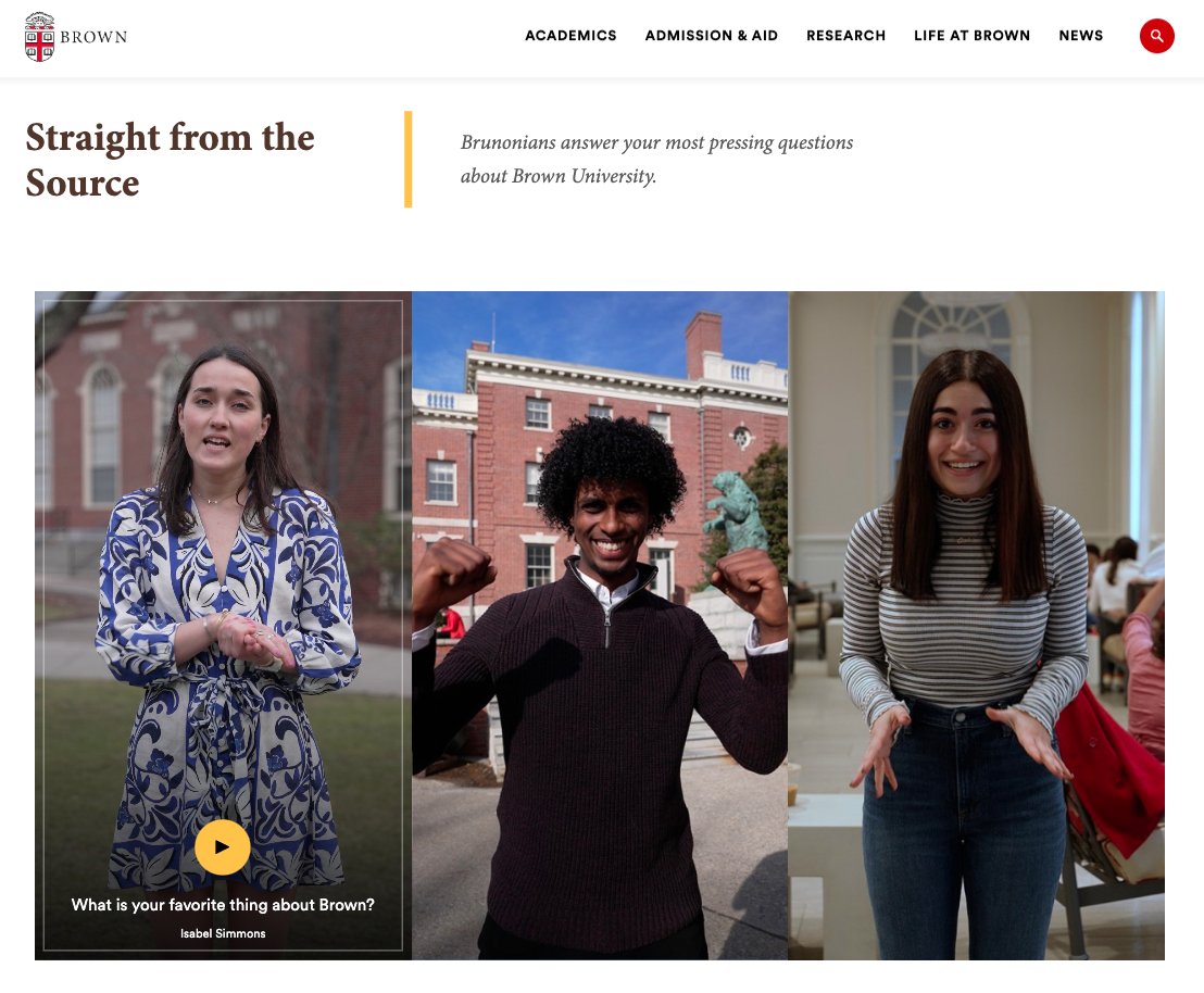
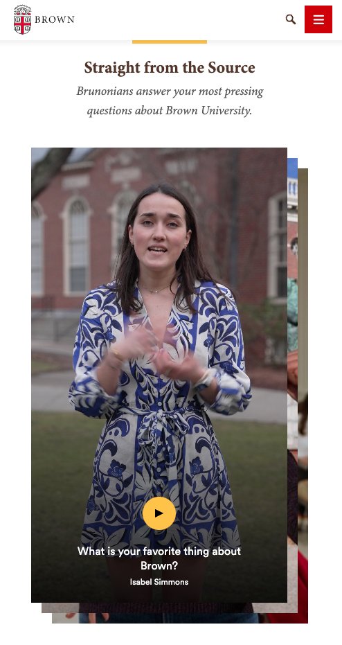
I love how Brown has integrated vertical short-form videos into their homepage design. The swipe action on mobile could be refined—occasionally, the wrong angle leads to scrolling instead of swiping—but overall, the experience feels intuitive and engaging. https://t.co/z8IReKw8x5