The design decision here is more clever than people realize.
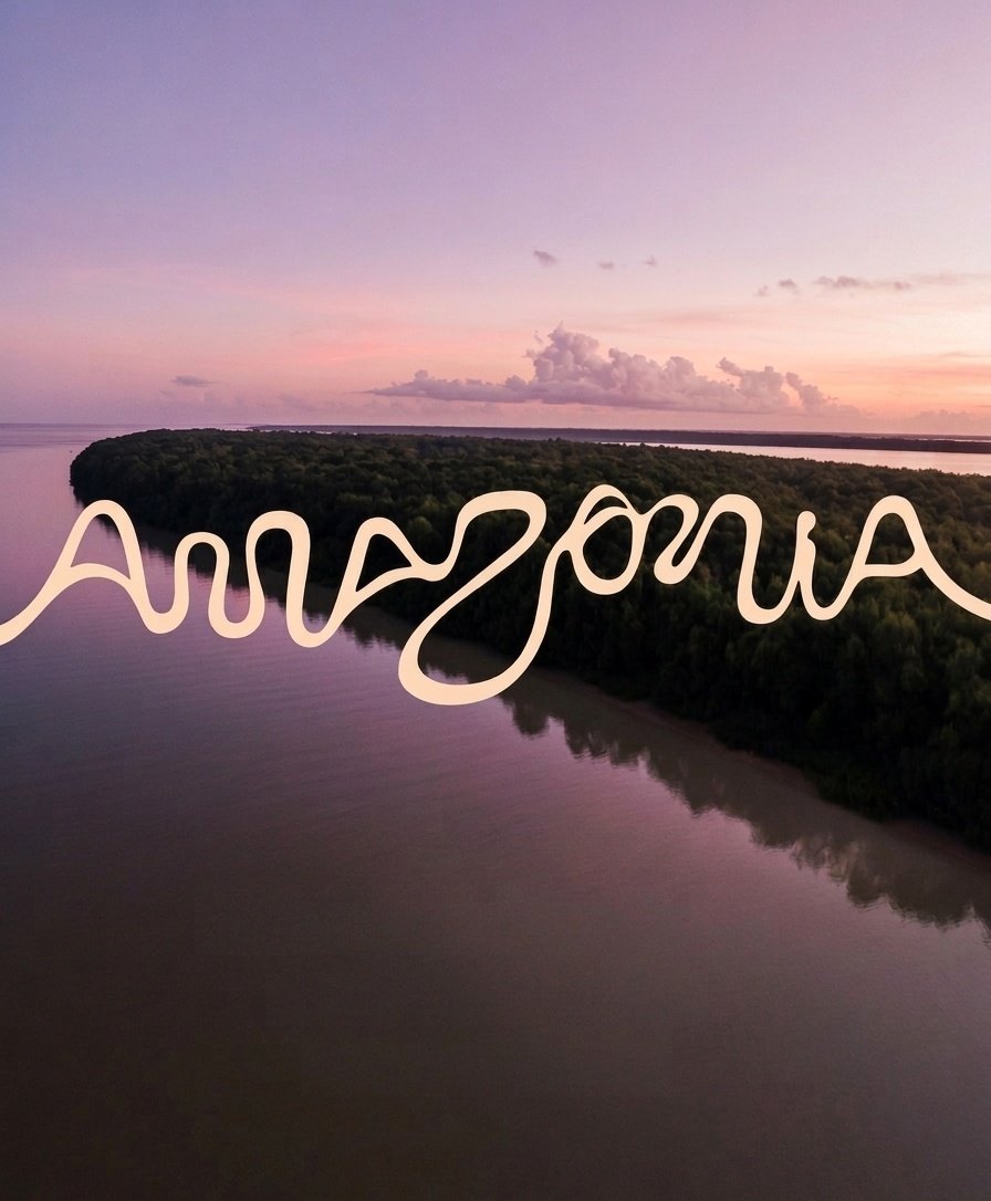
25,000 km of rivers run through the Amazon basin. The team behind "Visite Amazônia" took satellite imagery of every one of them, traced the actual geographic coordinates, and extracted an entire alphabet from the bends and confluences.
Every letter in that logo is a real piece of river. The "A" is a tributary fork. The curves in the script follow actual water flow patterns captured from space. They didn't approximate the shapes. They mapped them.
Then they brought in artists from all 9 Amazonian states to layer regional culture on top. Winny Tapajós, an indigenous Tapajó artist, built the illustrations around the existing letterforms. Nine different cultural perspectives on one shared river system.
The part that gets me: the Amazon carries 20% of all river water on Earth through a basin larger than India. And they compressed that into a typeface you can download for free.
Most regional branding is a committee selecting a color palette. This is cartography disguised as typography.