Open for motion design & creative projects this week.
I create scroll-stopping motion graphics, explainers, and clean visual content for brands & creators.
If you need motion work or design support, I’m currently taking on a few projects.
Drop a DM and we'll kick of from there.
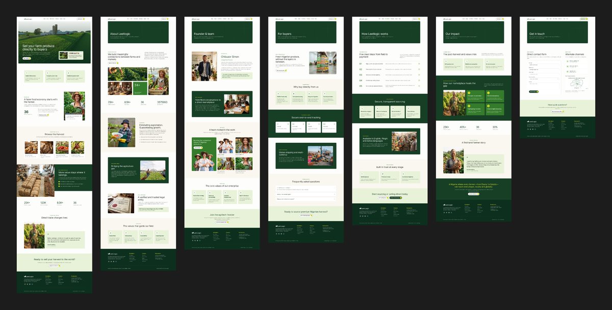
So on the 20th of September I took up a gig I was tasked with creating the brand identity as well as the app and site's UI.
The name of the project is Leetlogic, an agriculture based project.
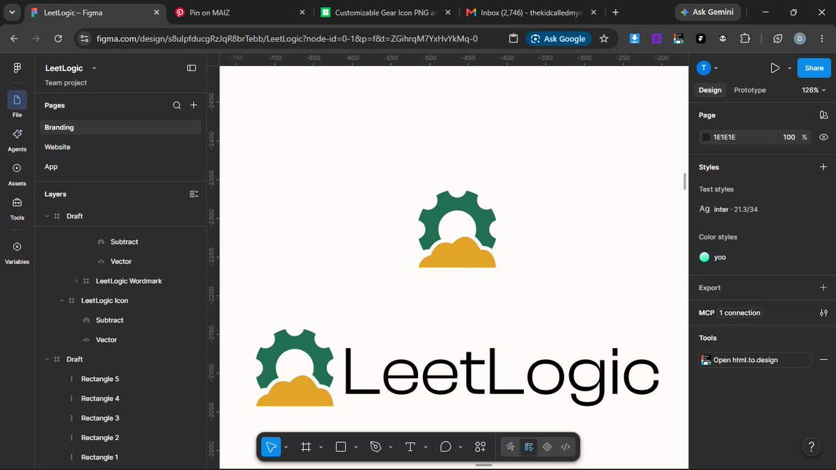
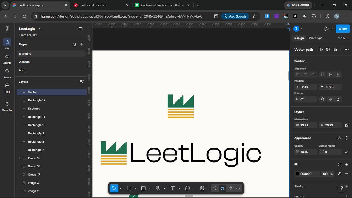
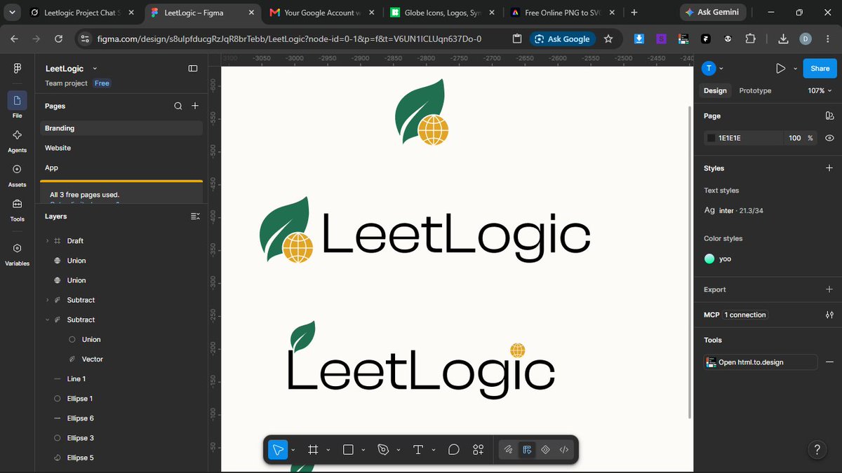
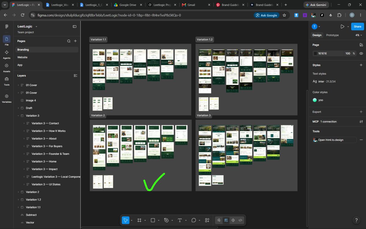
So far I created 4 logo variations...
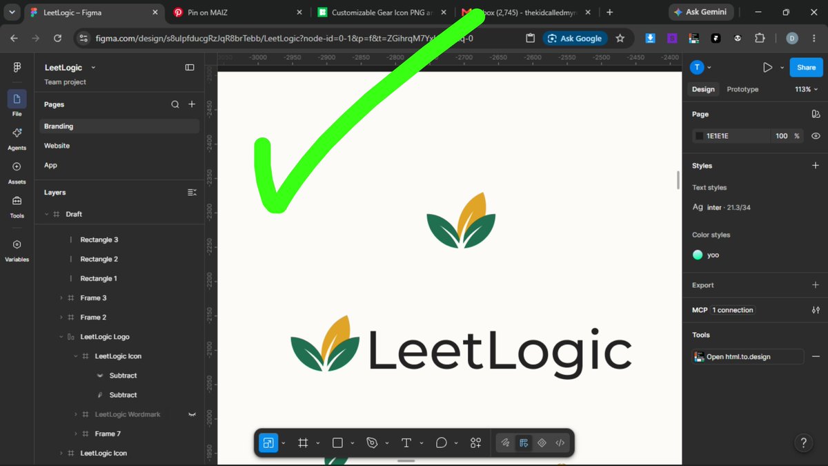
...these are the logo variations and one of them was approved. The branding was fast because the founder knew what he wanted and provided me with a color palette as well as typography suggestion.
So on the 20th of September I took up a gig I was tasked with creating the brand identity as well as the app and site's UI.
The name of the project is Leetlogic, an agriculture based project.
So far I created 4 logo variations...
Happy new month ya'll
This month I'll be starting my building in public journey. I will also be continuing my public project audits.
So be expecting alot. ✌️
I've started a daily series on projects that already have something real but the presentation still hasn't caught up to its potential.
Project Breakdown #216 — @mondaydotcom
https://t.co/oBlOv8NC6Z is a live work platform. Boards, Vibe, and the Org Agent Directory are already how teams share agents instead of rebuilding them from scratch each time.
The current clips still talk before they show anything. A 47 second Vibe film opens on a title before walking through the UI, another is a 65 second story about a prep agent. A first time visitor meets a line about the feature, not monday actually finishing one job.
A clean motion pin would open on monday instead, then run one real task with sound behind it: ask the agent from the board and watch the answer land on the item. That same clip could become both the pin and the ad.
They already have the board running. The first five seconds should feel like watching an item move, not like reading a title introducing Vibe.
See you in the next one.
I've started a daily series on projects that already have something real but the presentation still hasn't caught up to its potential.
Project Breakdown #220 — @twilio
Twilio is live customer engagement. SMS, voice, and the APIs behind those channels already move messages for builders and enterprises alike.
The page doesn't show any of that. Recent video is an 8 second Tweek Week card, a skydive for TwilioWorld, and a space hotline clip. The stills are volunteer photos from Global Impact Week. A first time visitor meets a culture feed, not a message actually leaving Twilio and landing on a phone.
A clean motion pin would open on Twilio instead, then run one real task with sound behind it: send the message, watch it arrive. That same clip could become both the pin and the ad.
They already have the pipes running. The first five seconds should feel like watching a message land, not like reading a recap of the last internal week.
See you in the next one.
I've started a daily series on projects that already have something real but the presentation still hasn't caught up to its potential.
Project Breakdown #219 — @nebiusai
Nebius is a live AI cloud. Clusters, endpoints, and the Builder Program are already how teams train and serve open models without waiting on a closed lab.
The current pin is a 15 second film for that program. It's a well made 3D city of blocks, and the view counts prove the teaser works. What it never shows is Nebius actually doing the job. Around it sit a 47 second careers game, a 55 second efficiency talk, and a long Finland interview. A first time visitor meets a sculpture and a conversation about the stack, not a GPU actually spinning up and returning tokens.
A clean motion pin would open on Nebius instead, then run one real task with sound behind it: spin up the cluster, hit the endpoint, watch the tokens come back. Keep the program film for the campaign around credits, but put the cloud itself on the pin.
They already have the factory running. The first five seconds should feel like watching a job run, not like sitting through a trailer for the program around it.
See you in the next one.
I've started a daily series on projects that already have something real but the presentation still hasn't caught up to its potential.
Project Breakdown #218 — @Plaid
Plaid is live financial connection. Link already pulls balances, transactions, and liabilities into apps, and that same connect now sits inside agents at Meta and Sierra.
The current pin is a 16 second dashboard capture. Institution Insights is live, a cursor clicks the new view. It's a fair record of the screen, but a weak first look. Wyzowl still finds about 72 percent of people finish clips under 15 seconds, and that number drops to roughly 46 percent once a video runs 30 to 60 seconds. A silent cursor tour already burns its first seconds just proving the UI exists. Meta's own work on hook first creative shows about 28 percent higher completion when the opening is a real action rather than a pointer. A screen recording also doesn't travel well. Paid placements end up treating it like a demo file rather than an ad. A 12 second motion piece with brand and sound could serve as both the pin and the ad without needing a recut.
A clean motion pin would open on Plaid instead, then run one real task with sound behind it: connect the bank, watch the balance land. Keep the dashboard capture around for the changelog, but put the connect itself on the pin.
They already move the money data. The first five seconds should feel like watching an account link, not like watching a cursor introduce a panel.
See you in the next one.
I've started a daily series on projects that already have something real but the presentation still hasn't caught up to its potential.
Project Breakdown #217 — @nadoHQ
Nado is a live exchange from the Kraken team. Spot, perps, and money markets already share one margin system, and new names keep listing with leverage attached.
The clips surrounding those listings are launch titles. New perps are live, gold is collateral, three coins spin on a card. A first time visitor meets the announcement, then a slice of 3D, not a trade actually going from order to fill. The product is a book that fills, but the pin is a headline instead.
A clean motion pin would open on Nado instead, then run one real task with sound behind it: pick the market, send the order, watch it fill. That same clip could work as both the pin and as ads.
They already have the venue running. The first five seconds should feel like watching a fill happen, not like reading a title that the market is live.
See you in the next one.
I've started a daily series on projects that already have something real but the presentation still hasn't caught up to its potential.
Project Breakdown #215 — @grafana
Grafana is live open observability. Dashboards, Cloud, Assistant, MCP, and gcx already let a team pull telemetry and act on it without ever leaving the tools they use.
A first time visitor still doesn't see any of that move. The feed is a Eurovision dashboard writeup and 80 to 100 second how to clips explaining which AI tool to reach for. The product is a panel that answers, but the pin is a blog and a lecture instead.
A clean motion pin would open on Grafana instead, then run one real task with sound behind it: fire a query, watch the panel fill in. That same clip could work as both the pin and as ads.
They already have the dashboard running. The first five seconds should feel like watching a panel light up, not like reading a guide to the toolkit.
See you in the next one.
I've started a daily series on projects that already have something real but the presentation still hasn't caught up to its potential.
Project Breakdown #214 — @raycast
Raycast is a live launcher for Mac. Extensions, AI chat, and Raycast 2.0 are already how people jump from a single keystroke into the rest of their stack.
The page doesn't lead with any of that. Recent posts point to a long YouTube list of 102 things, a desk toy clip, and a pricing note. A first time visitor meets a catalog of features, not Raycast actually finishing one job within the first five seconds. The product is a shortcut, but the pin is a playlist instead.
A clean motion pin would open on Raycast instead, then run one real task with sound behind it: hit the hotkey, run the command, watch the result land. That same clip could become both the pin and the ad.
They already have the shortcut running. The first five seconds should feel like watching a command finish, not like reading a list of what the app can do.
See you in the next one.
I've started a daily series on projects that already have something real but the presentation still hasn't caught up to its potential.
Project Breakdown #213 — @gitlab
GitLab is a live DevSecOps platform. Repos, reviews, security, and release already sit in one place, and the team is now rebuilding Git's storage layer because agents are hitting those repos far harder than 2005 ever planned for.
A first time visitor still has to sit through the long version. The current Git Merge clip runs 45 seconds of someone explaining the rebuild. Monday Merge is a 78 second news recap. Transcend is a 15 second event invite. The thinking behind all of it is solid, but the first look isn't there. Most people won't give a 45 second lecture the chance to even get started.
A short motion pin would open on GitLab instead, then run one real task with sound behind it in well under 30 seconds: open a merge request, let the agent move, watch the pipeline go green. Keep the Git Merge talk around, but drop a link to that full breakdown in the text under the post, so anyone who wants the deep cut can go there after the hook. The short clip earns the attention. The long talk rewards whoever sticks around.
They already have the platform running and the full story to tell. The first five seconds should feel like watching a pipeline pass, not like waiting for a talk to begin.
See you in the next one.
I've started a daily series on projects that already have something real but the presentation still hasn't caught up to its potential.
Project Breakdown #212 — @clerk
Clerk is live auth. Embeddable UIs, APIs, and the admin dashboard already sign people in, and Device Authorization Grant is in beta so a phone can approve a device that has no keyboard at all.
The current videos don't make any of that clear. One is a 30 second clip that opens on a title before walking through the UI, another is a v0 logo card, another is a three minute walkthrough of composable components. A first time visitor meets a label for the feature, not a clean pass of the actual job. The product itself is simple, but the video is not.
A clean motion pin would open on Clerk instead, then run that one job with sound behind it: show the short code, approve it on the other device, watch access land. No extra titles, no tour. That same clip could become both the pin and the ad.
They already have the sign in running. The first five seconds should feel like watching a device get access, not like reading the name of the grant.
See you in the next one.
I've started a daily series on projects that already have something real but the presentation still hasn't caught up to its potential.
Project Breakdown #211 — @CockroachDB
CockroachDB is a live distributed SQL database. Nodes fail, the cluster keeps serving anyway, and the new look is already treating the cockroach as a system of parts that adapt together.
A first time visitor still meets the rebrand, not the product itself. The recent clips are an 8 second logo film and a two and a half minute look piece. Text posts go out next to that same mark with no designed graphic carrying the feed. The brand work is off to a start, but the first look is still a title about resilience, not a node going down while the query keeps landing anyway.
A branded motion pin would open on Cockroach instead, then run one real task with sound behind it: kill a node, watch the query finish regardless. Designed graphics next to the text posts would carry that same look through the timeline. That clip could then work as both the pin and as ads.
They already have the database that outlasts the failure. The first five seconds should feel like watching a query survive, not like sitting through another pass of the new mark.
See you in the next one.
I've started a daily series on projects that already have something real but the presentation still hasn't caught up to its potential.
Project Breakdown #210 — @LaunchDarkly
LaunchDarkly is live runtime control. Flags, experiments, and a kill switch for agents already ship without a redeploy, and that's really the whole product.
The page doesn't show any of it. Recent video is Control Panel episode promos, a buzzword explainer, and a conference seat graphic. A first time visitor meets a teaser for a talk, not a flag actually flipping and the app changing in response. The product is a switch, but the pin is an invite instead.
A clean motion pin would open on LaunchDarkly instead, then run one real task with sound behind it: flip the flag, watch the change land, flip it back off. That same clip could work as both the pin and as ads.
They already have the switch running. The first five seconds should feel like watching production change without a deploy, not like sitting through a trailer for the next episode.
See you in the next one.