Fiercely proud of @TheEconomist data team for winning the Data Visualisation category at the Royal Statistical Society's Statistical Excellence in Journalism Awards🥇#RSSAwards
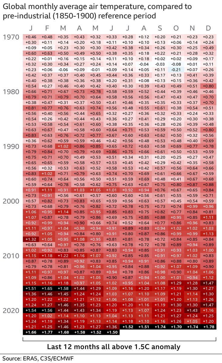
Each of the past 12 months was over 1.5C above pre-industrial levels, inching us closer towards breaking the Paris agreement
The blocks in the heat map show the temperature anomaly for each month since 1970
Where they are black, the month breached 1.5C
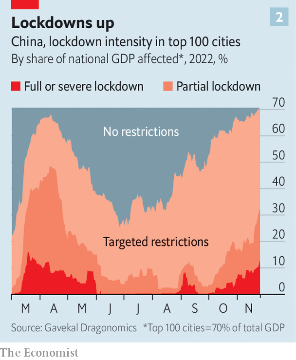
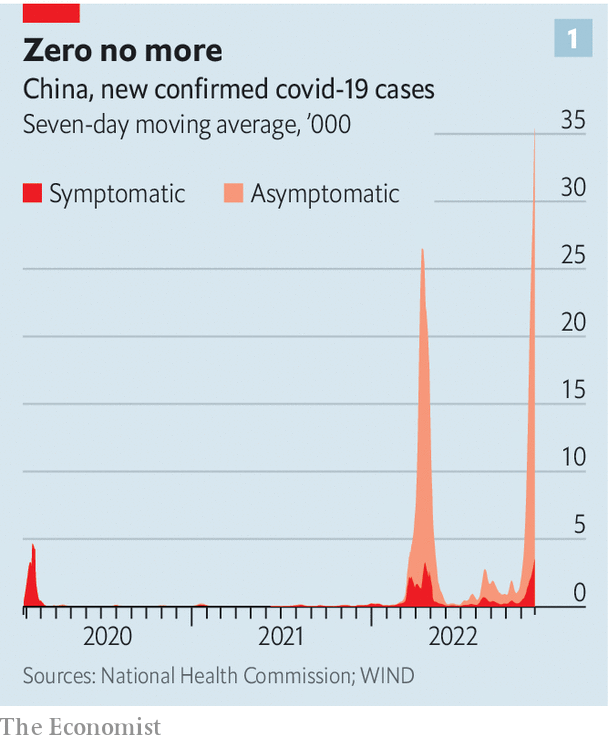
Regardless of emission cuts, most summers will now see dangerously high temps. That's horrible & scary but ever-more suffering / death isn't inevitable—with the right choices & the right resources. For this week's International section @TheEconomist: https://t.co/wxqpo21Rsy
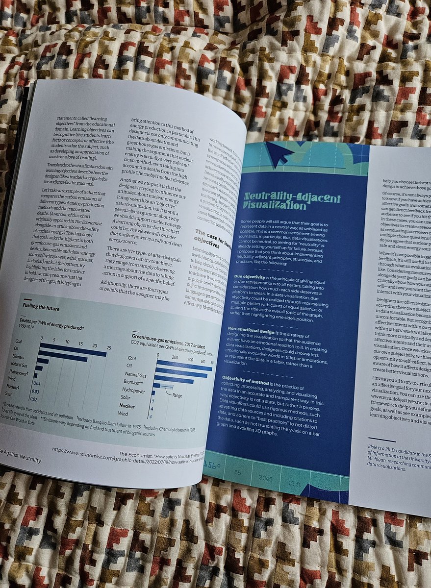
My #NightingaleinPrint from @DataVizSociety arrived! Nice to see a daily chart I made with @MarieSegger a couple of years ago feature in @elsieleerobbins article. The article reminded me of a newsletter I wrote on how charts are never neutral back in 2022 https://t.co/OoIHMunhQ9
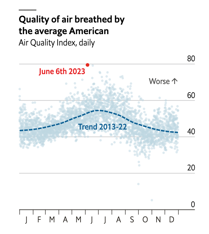
By our calculations, on 6th June, the air quality experienced by the average American was worse than any point in the last decade
Read about the fires, why the smoke is blowing south, and what it means for health in this week's Graphic Detail: https://t.co/4QiQyxYEkt
Excited to announce @washingtonpost has dropped the paywall for our Trans in America series! We partnered with Kaiser Family Foundation to conduct this groundbreaking poll.
https://t.co/bX0R3plpkB
Building this @puddingviz piece has made me feel: creative 🎨, challenged 🧗🏽♀️, irritated 😖, overwhelmed 😓, connected 🤗, and above all, proud 💖. It's a personal story about discovering and visualizing the rich emotional world that exists in all of us.
https://t.co/d6x2vk56IJ
BONUS!
2022's memorable #datajournalism debates:
1⃣The online debate triggered by the @nytimes' spiral graph on COVID variant waves.
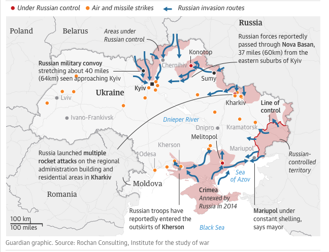
2⃣How to map politically sensitive areas in Ukraine.
3⃣How to portray happenings on the ground with Russia’s invasion.
https://t.co/JM2c1IdmCC
For most of Europe, the impact of Putin’s war in Ukraine has been measured in inflation percentages rather than lives lost. As winter sets in, that may be about to change. Our interactive explains how Europe’s high energy prices could be deadly. A 🧵 https://t.co/uSedN6JVuI
As human activities rapidly transform the planet, the global insect population is declining at an unprecedented rate of up to 2% per year. Amid deforestation, pesticide use, artificial light pollution and climate change, these critters are struggling https://t.co/adUC891HTb
My 1st piece at @guardian 😍
An analysis of #Brazil's runoff:
#Lula made the difference in São Paulo and won the indigenous vote
#Bolsonaro won the most deforested areas and medium-sized cities
Terribly grateful to @GuardianVisuals team for their support
https://t.co/94UrYq7VBs
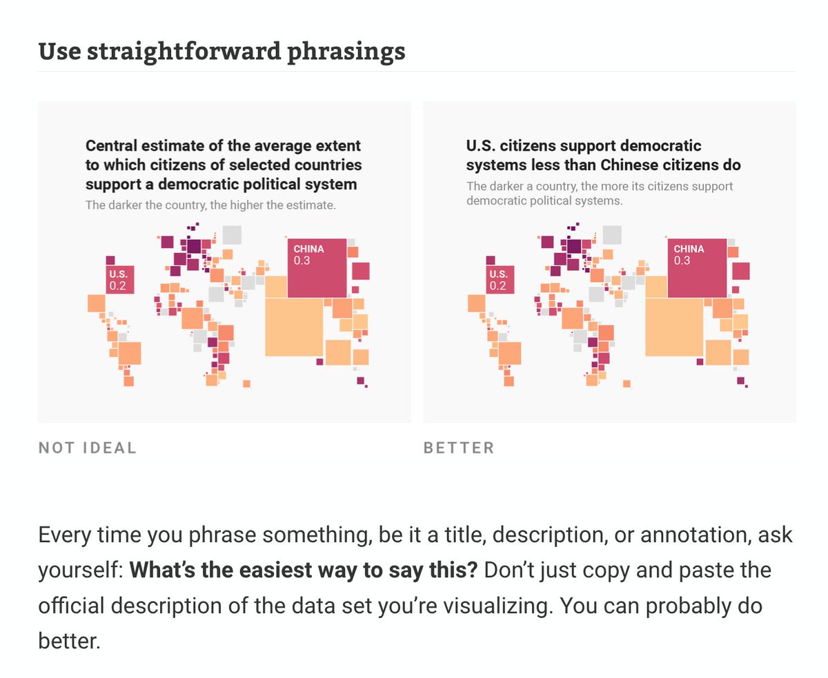
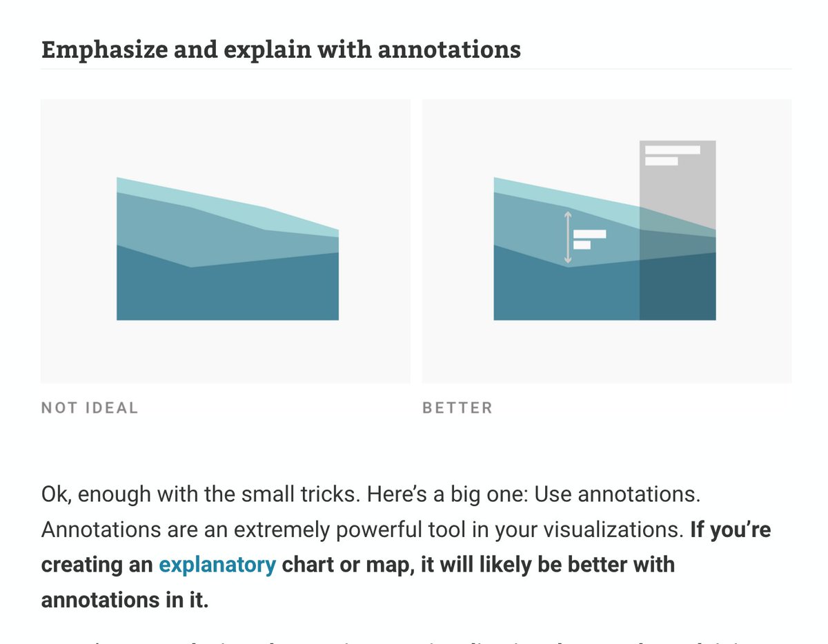
Text might be the most neglected part of #dataviz. We talk a lot about how the right chart type and colors can improve visualizations – but not enough about how to use words well.
So I wrote about that in my latest article: https://t.co/Ao1HhBNZ95