The #EllwoodDigital solution is to move this button to the bottom right corner of the screen. This aligns with @Twitter's treatment of buttons elsewhere on the site. It also fits better with users' natural movements within the screen. #MakeTheInternetBetter#TipTuesday
#WeirdUX spotted right here on @Twitter: The 'Next' button on the password reset screen is located in the upper right corner, as opposed to the lower right corner where we'd expect to find it.
Happy #BlueBeanieDay! Web standards and accessibility are something we can get behind today and everyday. Learn more about Blue Beanie Day at https://t.co/bY62mrKiqd and follow @zeldman for endless web standard inspiration. #MakeTheInternetBetter
The #EllwoodDigital solution is to move this notification to the bottom of the page. This prevents user confusion and keeps things standard across the web. Most of the time users don't care about the cookies and are just trying to read a great article. #MakeTheInternetBetter
#WeirdUX spotted on @Medium: The cookie consent notification shows up at the top of the page, as opposed to the bottom or the center of the page, where most users are conditioned to find it.
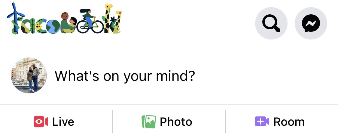
It appears @facebook took a page out of the @google doodle handbook with their climate change info hub. The fun, animated logo caught our attention. It’s not an obvious link, but when you click-through, you’re shown a newsfeed filled with science-based info about climate change.
Fun touches like this contribute to the halo effect, a psychological term explaining how a positive trait (like a do-good, animated logo) can contribute to a better feeling about the brand as a whole.
Does this sort of marketing alter your feelings about @Facebook?
SEO is such a buzzword. But there are some easy—and incredibly valuable—steps you can take today to boost your search engine ranking, improve your UX, and ultimately increase your website traffic.
Two tools we turn to for keyword research are Google's Keyword Planner and Trends.
Ellwood Digital is now a UX Consultancy. We help brands build and revamp their digital presence with straightforward, DIY solutions. We’re rolling out our new services in a testing a phase and offering a free Webpage Revamp to the first 10 brands who schedule a Discovery Call.
The transition to digital might be unfamiliar territory to some. And we want to make sure users, who might already be anxious and frustrated, don’t grow angry with a new digital offering. So we’re here to help.
Reach out at https://t.co/IegIiGnbR7. We’re all in this together.
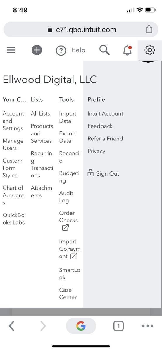
#WeirdUX spotted on @QuickBooks: The mobile "settings menu" is chaotic and hard to read. There are widows, weird line breaks, and I have no idea what the first header is supposed to say.
The #EllwoodDigital solution is to organize the "settings menu" into one, scrollable menu with headings, instead of laying the mobile version out in four columns. #MakeTheInternetBetter#TipTuesday
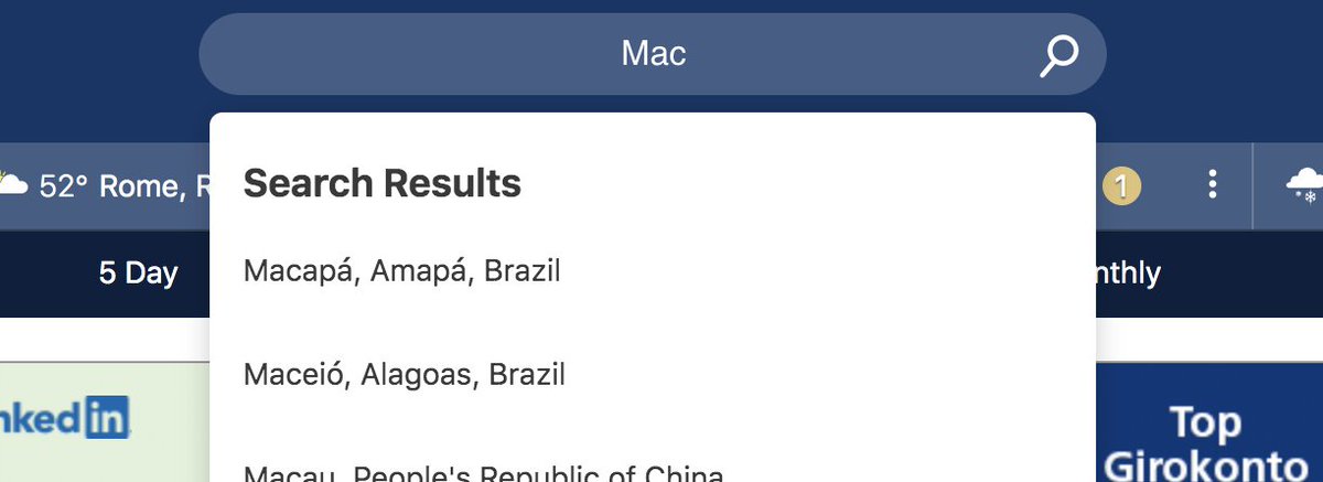
#WeirdUX spotted on @weatherchannel: The cursor in the search bar is centered (which is an uncommon experience for the user) and the search results are left justified. The initial experience was confusing, and my eyes need to work a bit harder to compare my search to the results.
Expectations – we all have them. When it comes to digital experiences, we might expect users to be seated in front of a large display, with their full attention focused on the task at hand. But the reality is often very different.
#UserExperience#UX#MakeTheInternetBetter