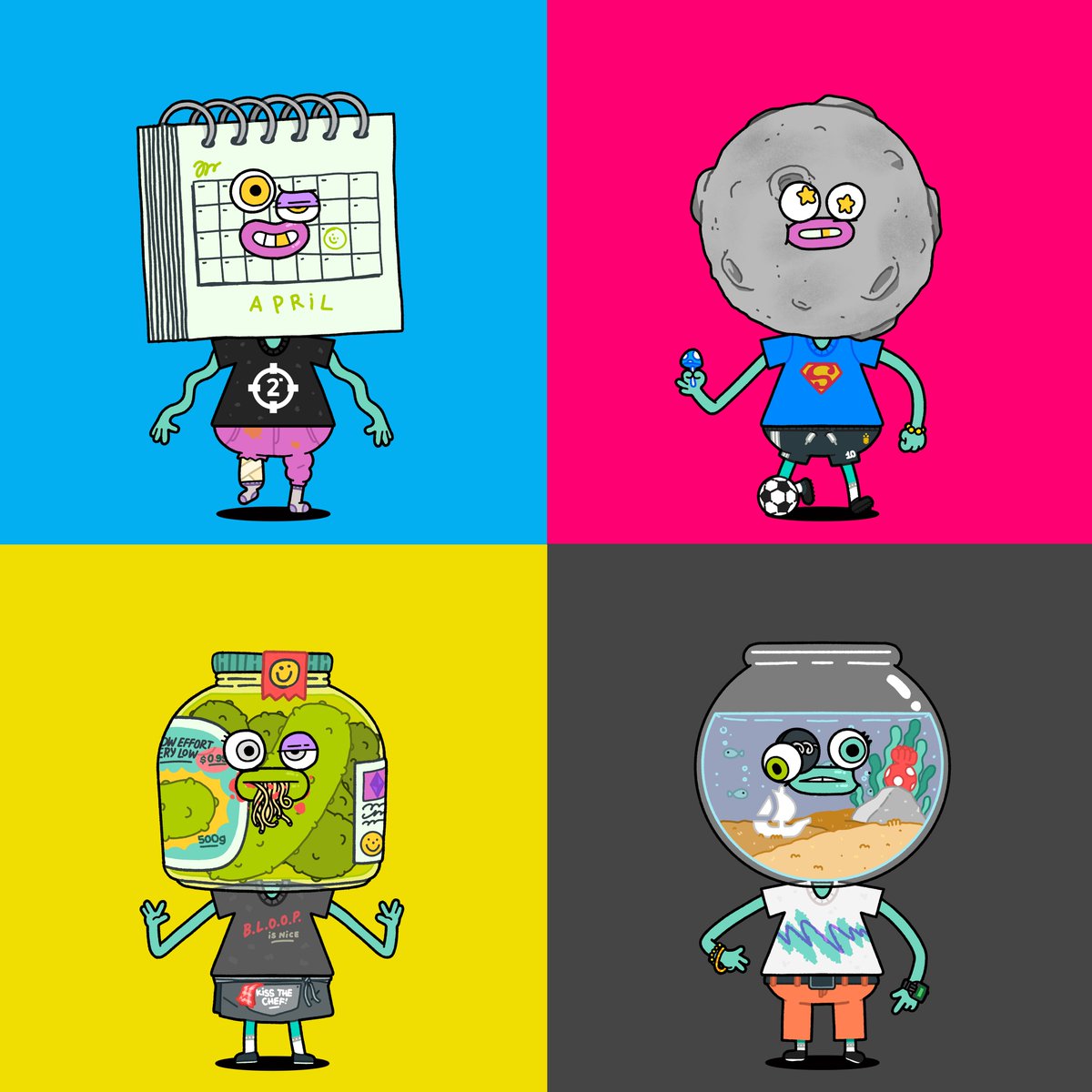
🔎 Part of the *beep* research, sketch, trial and error we made for the EAM was testing out hundreds of different shapes and color combinations.
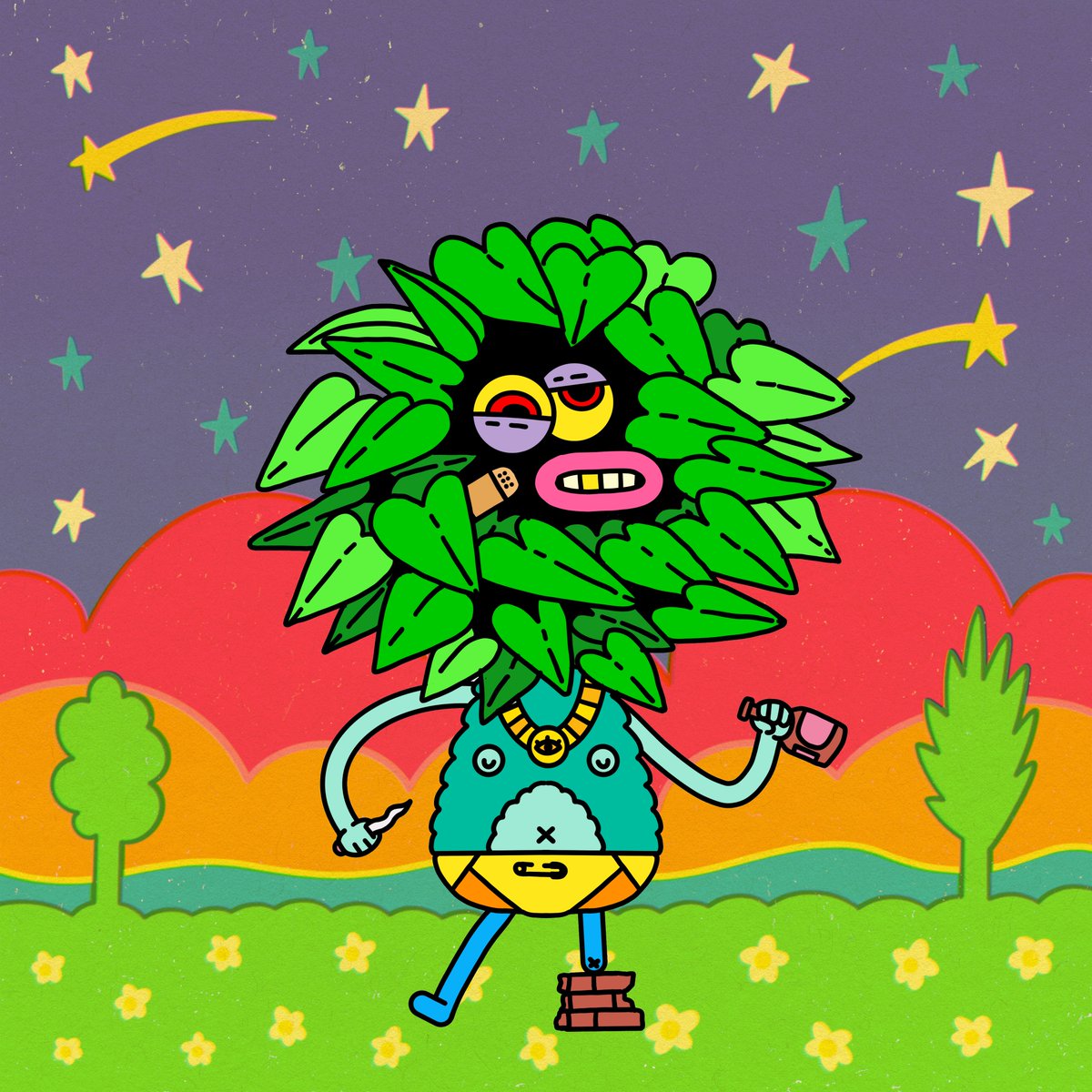
⬇️ Look, this EAMiE was one of the first we *bloop* colored and added a background to:
💭 But something feels *bop* off...
· EAMiE feels gigantic in front of this background, when they're actually really small creatures.
· Black lines on every detail feels overloaded.
· Colors don't play well together, they pop too much it feels overwhelming to our eyes.
· Background is too saturated.
· Background doesn't help either putting the EAMiE in context or making it stand out.
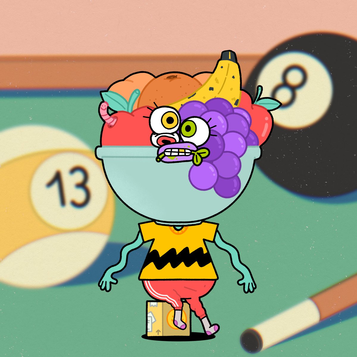
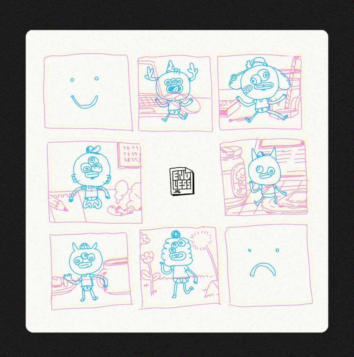
⬇️ Now, with these thoughts in mind, take a look at this EAMiE:
· Colored lines make the details smoother and fine.
· Color palette is in-between pastels and fully saturated tones, so the character stands out without being annoyingly jazzy.
· Background is simpler and comes with a light hazy white layer on top, to help highlighting the EAMiE and adding depth to the artwork.
-
🖼 The process of *beep* experimenting and improving the artwork is essential for us.
Although there's been more than 6 months of work, we're still finding new ways of making it better and better, and that's what excites us the *bop* most.
💖🖨
🌞 GM EAMiES *bloop*
Building cartridge reveal website...
💭 Which one do you like the most? *beep*
• Texture + Pattern + Gradient
• Pattern + Gradient
• Pattern + Flat background
• Flat background