What if you defined a region by where people actually shop? 🛍️
These maps redefine the Midwest using 90 minute drive-time zones around Menards locations. Each zone is seeded by a store and color coded by the population it serves.
From dense high po...
Millions of riders move through New York's subway system every day across 400+ stations and 600 miles of track! 🗽🚇
These animations shows how travel patterns shift throughout the day:
▪️Slide 2 - At 7 AM, the morning commute begins as riders move to...
🎼 We're goin' back in tiiiime - no DeLorean required! Instantly see how places have changed over the years with historical World Imagery now in ArcGIS Earth Mobile. It's perfect for monitoring land use, environmental impacts, or saving Doc Brown. See...
Splatting is the new mapping! ✨👌
Bring your 3D scenes to life with the new Gaussian Splat Layer in ArcGIS Maps SDK for JavaScript 5.0 and create photorealistic experiences right in your browser. Get the details at the link in our bio.
What did your city look like decades ago? 🏜️🏝️🗻🏙️
Explore more than 180,000 historic topo maps from across the U.S. with the Historical Topo Map Explorer. Check out the link in bio and start exploring! 🗺️
Locations Featured:
Death Valley, ...
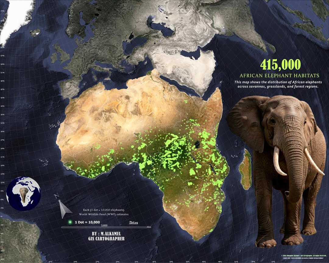
In honor of World Wildlife Day 🐘🌍, we're featuring this powerful dot density map created by Mohamed AlKamel from Elite Agro Projects.
Each dot represents 10,000 elephants, visualizing Africa's estimated 415,000 elephants across savannas, forests, an...
Some landscapes can still be studied even after they change.
Using historical imagery and spatial modeling, researchers reconstructed New Hampshire's 'Old Man of the Mountain' to better understand the cliff and the rockfall that reshaped it.
Explor...
NIMBY or YIMBY? Either way, the US needs more homes. But where to build and for which markets is the question. One home builder isn't leaving it up to chance and is letting GIS guide the way. Read more at the link in the bio.
Discover demographic and lifestyle patterns with ease! 🙌🏽
The new ArcGIS Tapestry Segment Infographics Dashboard offers a clear, visual overview of each ArcGIS Tapestry segment, making it easier to understand demographic and lifestyle trends.
...
From city streets to alpine peaks, the 2026 Milano Cortina Winter Olympics are set against some of the most stunning landscapes in Europe! ❄️🏔️
This 3D tour from shows where the events are happening in relation to Milan using ArcGIS Online and Scen...
"Geographer" is one of the top 40 occupations that will be most affected by AI, according to a well-known Washington state tech company. But geographer Dr. Trisalyn Nelson, Director of the Center for Spatial Science at UCSB () isn't worried. In fact,...
Water use on Earth is growing at twice the rate of population growth. The Aqueduct 4.0 Global Water Risk dataset from shows current water conditions and how they may change in the future. These featured maps show the relationship between water deman...
In 2001, archeologists Carl Lipo and Terry Hunt set out to collect imagery of Easter Island using only a camera and a kite. Today, they use a 3D digital twin made with drones and GIS. It allows them to study the moai statues without excavation and ha...
Cased lines for clarity!💡 Give your maps depth and hierarchy with simple symbology tricks in ArcGIS Pro. Explore the blog and "how-to" video at the link in our bio.
For the first time, Global Fishing Watch layers are available directly in ArcGIS Online 🌍
That means you can explore AIS-based global fishing activity and vessel presence and radar-based vessel and fixed infrastructure detections alongside your own...
Mapping risk, reimagined 🗺️
This interactive map transforms National Risk Index into a multivariate visualization. 18 natural hazards are aggregated into 1,000 square mile hexagons and visualized through an innovative mapping approach. Designed to ...
Collaboration goals unlocked! 🔓 🙌 Make a layer editable for you and your team in just 10 minutes with just 4 steps. Check it out now at the link in our bio.
Maps that pop! ✨
This map of Nova Scotia uses visual hierarchy, a design technique that indicates which elements on a map are important. Read the blog, linked in our bio, for different techniques on how to make your maps stand out.
Ready for your next GIS milestone? 🚀
Get certified and stand out with exams for every level, from first time learners to experienced ArcGIS users. Find the right exam for you at the link in our bio.
Water moves across landscapes in complicated patterns, with far-reaching impacts on local people and places. That's why and its partners created the National Hydrography Dataset Plus High Resolution, providing the most detailed map of the waters of ...