The best entries never feel comfortable…
and that’s exactly where $SUI is sitting right now.
Most traders only become interested after a coin has already doubled or tripled.
But if you look at previous cycles
the biggest moves usually started from moments when the chart looked completely forgotten.
Right now, $SUI has returned to what I consider a critical support zone.
Price is testing the base of this long-term structure after a deep correction
while historically these areas tend to attract buyers before momentum shifts.
If this level continues to hold and bulls reclaim control
the current setup opens the door for a potential move of nearly +870% from today’s prices.
Nothing in crypto is guaranteed.
But the highest risk/reward opportunities are usually found when fear is high
expectations are low, and almost nobody is paying attention.
That’s often where the next major trend begins.
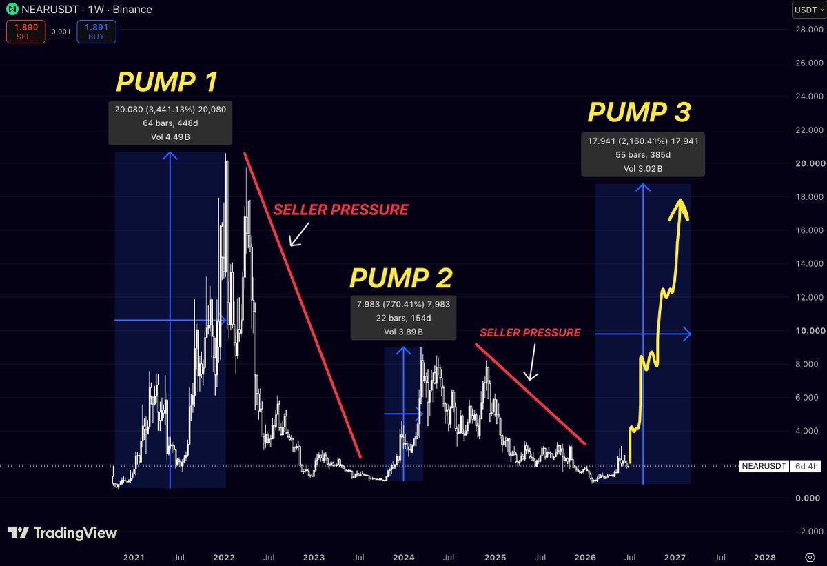
$NEAR has already gone through two complete expansion cycles
and despite the different market environments, both followed the same macro sequence.
A powerful impulsive rally was followed by a long period of distribution, heavy seller pressure
and an extended correction that convinced most participants the trend was over.
Only after that reset did buyers gradually regain control and begin building the foundation for the next move.
The current structure looks remarkably similar.
After Pump 1, $NEAR experienced aggressive profit-taking that erased the majority of the previous gains.
The second cycle produced another strong advance
but the upside became noticeably smaller as sellers stepped in earlier, creating a prolonged period of weakness.
That declining momentum is exactly what often happens late in corrective phases
when supply is slowly absorbed by long-term buyers while market interest fades.
Now the chart is beginning to show the opposite behavior.
Price has stabilized near long-term support after months of sideways accumulation
volatility has compressed, and selling pressure appears significantly weaker than during previous corrections.
Instead of making fresh lows, $NEAR is starting to build a higher base
often the first indication that a new macro cycle may be developing beneath the surface.
History also provides an interesting reference.
The first expansion delivered more than 3,400%
while the second produced roughly 770%.
Although every cycle is different, the important takeaway isn’t the exact percentage return
it’s the recurring transition from accumulation into a sustained trend.
Once buyers regain control, momentum tends to accelerate in waves rather than through a single impulsive candle.
If that historical rhythm continues, the current accumulation phase could become the launchpad for a third major expansion.
The initial objective would be reclaiming the major resistance zone created during the previous cycle.
A successful breakout above that structure would likely shift market sentiment completely and open the door for a much broader continuation toward higher macro targets.
No pattern guarantees the future, and crypto markets are constantly shaped by liquidity
macroeconomic conditions
and investor sentiment.
However, when an asset repeatedly follows the same multi-year structure, it deserves attention.
$NEAR appears to be approaching another critical turning point where long-term accumulation could eventually transition into the next major bullish phase.
$CHZ has spent years moving through one of the deepest corrections among major altcoins
but that prolonged decline may now be creating the conditions for a meaningful reversal.
After reaching its all-time high
Chiliz entered an extended bear market that erased more than 97% of its value.
This wasn’t a short-term pullback
it was a multi-year process of distribution, declining participation, and persistent seller dominance.
Throughout that period, every recovery attempt was met with renewed selling pressure
preventing any sustainable trend reversal.
Today, the structure looks fundamentally different.
Price has stopped making meaningful new lows and is beginning to stabilize after a lengthy period of compression.
Markets often behave this way near the end of large corrective cycles. As volatility contracts and aggressive sellers become exhausted
supply gradually dries up, allowing accumulation to take place beneath the surface.
Historically, assets that experience these types of prolonged reset phases don’t require explosive news to begin recovering.
Once buyer demand starts consistently overwhelming the remaining supply
momentum can accelerate much faster than most market participants expect.
What initially looks like a quiet base can eventually evolve into the foundation of a much larger macro trend.
That doesn’t mean the breakout is guaranteed.
The current accumulation zone still needs to hold
and buyers must continue defending higher lows for the bullish thesis to remain valid.
But if $CHZ follows the same transition seen in previous long-term market cycles
the asset may be approaching the point where seller pressure gives way to a sustained period of buyer control.
The strongest trends rarely begin when sentiment is optimistic
they often start after years of disbelief, exactly when the majority has already stopped paying attention.
$XLM has respected this pattern through multiple market cycles.
The first cycle began after a prolonged accumulation near the lows.
Once momentum returned
$XLM rallied more than 2,500% before eventually entering a deep correction of almost 90%.
The next cycle looked surprisingly similar.
After another extended accumulation phase
buyers stepped back in and pushed price more than 650% higher.
Once again, the rally was followed by a major correction that brought $XLM back into a long-term value zone.
Today, the structure is beginning to resemble those previous turning points.
The latest correction has already played out
the market has spent months building a new base, and price is gradually attempting to shift back into an uptrend.
History never repeats perfectly, but markets often rhyme.
If $XLM continues following the macro cycle it has respected for years
the current phase could become the foundation for the next major expansion.
The strongest trends rarely begin when everyone is bullish
they usually start when most market participants have already lost interest.
$ONDO is starting to show who controls the market
For months
every rally was sold.
Lower highs.
Lower lows.
Sellers were in complete control.
That structure has changed.
The aggressive sell-offs have faded,
while buyers continue stepping in at higher prices.
Momentum is slowly shifting in their favor.
This is how major reversals usually begin—
not with one giant candle,
but with demand consistently overpowering supply.
If buyers continue to defend this structure,
$ONDO could be setting the foundation for a much larger trend higher.
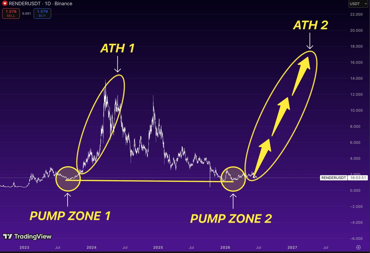
The last time $RENDER traded here, it rallied over 1300%.
Back in 2023,
buyers stepped in around the same accumulation zone
and price exploded more than 1300% from the lows.
Fast forward to today,
$RENDER is trading back inside that exact demand area once again.
History doesn’t have to repeat,
but markets love to rhyme.
When an asset revisits a zone that previously launched a parabolic move,
it’s worth paying attention.
Risk is relatively defined,
while the upside remains asymmetric if buyers regain control.
This is one of the cleaner long-term accumulation structures on my watchlist.
If this base holds,
another major expansion phase wouldn’t surprise me.
$NEAR has repeated the exact same cycle three times.
And every single time,
it started with the same trendline.
Trendline 1.
Trendline 2.
Now we’re watching Trendline 3 unfold.
The structure looks almost identical.
Strong impulse off the lows,
a steep expansion,
followed by acceleration once momentum kicked in.
History doesn’t always repeat,
but crypto loves to rhyme.
If this cycle follows the previous two,
a move toward $20 doesn’t look unrealistic at all.
What’s interesting
is that every cycle started
when everyone had already given up on the asset.
That’s usually when the biggest opportunities appear.
I’m staying bullish on $NEAR
until this structure proves otherwise.
$XPL has spent months trading at the bottom while volatility completely disappeared.
That’s usually not where cycles end.
The structure is simple:
Price has built a long accumulation range after an aggressive post-launch selloff.
Sellers continue to lose momentum as downside becomes increasingly limited.
The first meaningful breakout could quickly shift attention back toward previous distribution levels.
The roadmap is clear:
→ First target: ~$0.56
→ Second target: ~$1.07
→ Third target: ~$1.70
Each of these levels acted as major supply during the initial decline
and will likely become magnets once momentum returns.
After such an extended period of compression, it doesn’t take much demand to create outsized moves.
$XPL looks like one of those charts where patience could be rewarded when the market finally rotates into overlooked alts.
$DASH is repeating a pattern that has already played out multiple times.
Every major bull cycle started the same way:
First, price reclaimed the nearest macro resistance.
Then momentum accelerated into the next historical level.
Finally, the market expanded toward the previous cycle highs.
The roadmap remains clear:
~$151 - first major breakout level.
~$286 - next macro resistance where previous rallies accelerated.
~$476 - the major historical target before price enters a much thinner resistance zone.
None of these levels have been reclaimed yet.
That’s why this stage matters.
Markets don’t go from the bottom straight into all-time highs
they reclaim important resistance one step at a time, building momentum with every breakout.
After years of consolidation, $DASH is once again trading from a deeply discounted area where the risk/reward looks far more attractive than it does after a vertical move.
The biggest gains usually belong to those who position before the reclaim
not after everyone starts calling it a breakout.
$ONDO is still trading at the bottom of its range
while most of the market is chasing coins that have already pumped.
Current price: ~$0.32.
The chart has spent months building a base around the strongest support zone of this cycle.
Above price, two levels matter the most:
$0.625 - former key support.
$1.16 - previous cycle high.
Neither has been reclaimed yet.
That’s why this setup is interesting.
The market doesn’t need miracles.
It just needs buyers to push $ONDO back into the previous value area.
A reclaim of $0.625 would completely change the weekly structure and put the $1.16 level back into focus.
RWA remains one of the strongest long-term narratives in crypto, and $ONDO continues to be one of its leading projects.
The best opportunities rarely appear after confirmation.
They usually appear while price is still sitting on support and sentiment is at its weakest.
I’m watching this one closely.
Buying $CRV today feels similar to buying abandoned
Layer 1s
before they made everyone regret ignoring them
Current price: ~$0.20
Most traders only see a chart that’s been bleeding since 2021.
I see something different.
Trading ~99% below ATH
Multi-year accumulation near cycle lows
One of the strongest DeFi brands still alive
Massive upside if capital rotates back into DeFi
The interesting part is the math:
ATH ≈ $24
Current price ≈ $0.20
Even a return to previous highs would imply over 100x upside from current levels.
The market spent years destroying sentiment around $CRV.
That’s usually what accumulation looks like before people start calling it a “comeback.”
If DeFi becomes a leading narrative again, these prices may look absurd in hindsight.
Watching closely.
$CRV 🚀
$NEAR spent almost 4 years doing nothing
The last time $NEAR emerged from a multi-year accumulation range
it exploded from under $1 to over $20
Since then:
- Full bear market reset
- Multiple years of consolidation
- Sellers exhausted
- Price back at historical accumulation levels
Now the chart is starting to look eerily similar to the setup that preceded the 2021–2022 expansion.
What’s interesting is that the previous cycle ATH formed almost perfectly along the same long-term trajectory shown on the chart.
If that structure remains intact, the next major expansion phase could send $NEAR back toward the previous ATH region
and potentially beyond it.
Most people only become interested after a 5-10x move.
The best risk/reward usually appears after years of boredom, when nobody wants to talk about the asset anymore.
$NEAR has already proven it can deliver a multi-thousand percent move from these levels.
The market is about to find out whether history wants to rhyme again.
$RENDER is back at the exact area where the last major expansion started.
In late 2023, $RENDER spent months building a base around $1 before exploding to nearly $14.
Today?
Price has returned to that same accumulation zone and is once again holding the level after a long bear market correction.
The setup is simple:
- Previous cycle launchpad: ~$1
- Current price: ~$1.5
- Previous ATH: ~$14
That’s why this chart is interesting.
The downside is relatively defined, while the upside stretches multiple times higher if AI narratives regain strength.
People forget that $RENDER was one of the strongest performers of the last cycle.
Now it’s trading almost 90% below its highs while AI adoption is significantly larger than it was during the previous run.
History doesn’t repeat perfectly.
But it often rhymes.
If $RENDER can build acceptance above this accumulation range, the path back toward double digits becomes very realistic.
The best risk/reward opportunities usually appear when nobody wants to touch the chart anymore.
$RENDER looks like one of them.
$TEL is one of those charts where almost nobody is paying attention anymore
And that’s exactly why it looks interesting.
The entire chart is basically a giant accumulation range sitting near historical lows
while most of the previous cycle liquidity sits far above current price.
What stands out:
Current price ≈ $0.0023
First major historical supply zone around $0.012
Next large resistance near $0.036
Previous cycle peak around $0.065
Those levels aren’t random.
They’re the exact zones where sellers stepped in during previous cycles.
The important thing is that $TEL isn’t trading near resistance.
It’s trading near the floor.
That creates a very asymmetric setup.
A move back to the first major supply zone would already represent a multiple from current levels.
And if capital starts rotating into forgotten small and mid-cap alts, the higher targets become surprisingly realistic.
Most traders only become interested after a chart has already moved 300-500%.
$TEL is still sitting in the stage where almost nobody cares.
Historically, that’s where the best opportunities tend to appear.
Not saying it happens tomorrow.
Not saying it happens next month.
But from a risk/reward perspective
few charts offer this much upside while sitting this close to long-term lows.
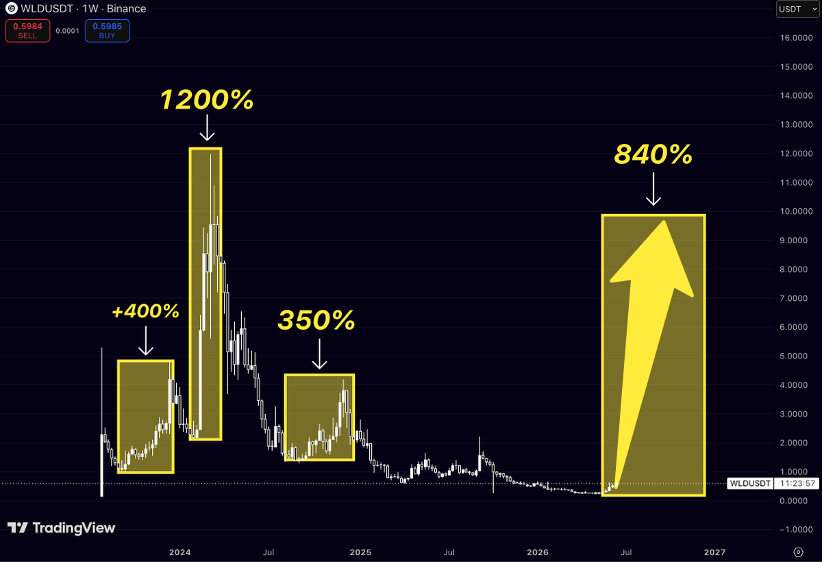
$WLD has a habit of doing one thing when everyone gives up on it.
Exploding.
Look at the previous expansion phases:
+400%
+1200%
+350%
Every major rally started from periods where volatility completely disappeared and interest collapsed.
Sound familiar?
That’s exactly where $WLD is today.
The chart has spent over a year compressing near its lows while most traders moved on to the next narrative.
But markets don’t care about attention.
They care about positioning.
What’s interesting is that even the smallest historical expansion on this chart was over 3x.
The strongest one exceeded 12x.
Current price is sitting much closer to the bottom of the range than the top.
That means the risk/reward profile looks dramatically different from what it did during the hype phase.
Will $WLD repeat a 1200% move?
Nobody knows.
But history shows one thing clearly:
Every time this chart entered a low-volatility accumulation phase, a violent expansion followed.
The longer the compression, the larger the move tends to be.
Most people see a dead chart.
I see a chart that’s behaving exactly like it did before its biggest rallies.
$FET has already shown the market what it’s capable of
The numbers aren’t speculation
They’re history
2021 → +1500%
2024 → +3500%
Current cycle projection → +5500%
Every major expansion has been larger than the one before
Not because the chart magically repeats itself
Because the narrative keeps getting stronger
Back in 2021, AI wasn’t even a mainstream investment theme
By 2024, it became one of the hottest sectors in the world
Today?
AI is attracting more capital, attention and development than ever before
Yet $FET is still trading a fraction below its historical highs
That’s the setup
Not euphoria
Not price discovery
Setup
Most people focus on how much a coin has already moved
The better question is:
How large were previous expansion phases once momentum truly arrived?
For $FET, the answer is clear
+1500%
Then +3500%
And if the trend of expanding cycles continues
the next move could make previous rallies look small in comparison
The AI narrative isn’t going away
The chart isn’t broken
And the market is once again giving investors a chance to accumulate before the crowd remembers why it became one of the strongest performers of the last cycle
$FET isn’t trying to make a new story
It’s trying to continue the old one
And historically, those have been the most explosive moves
$AERO is approaching the first level that has rejected every rally since the top
The structure is simple
After the cycle high, price kept printing lower highs:
Target 3 → ~$2.21
Target 2 → ~$1.58
Target 1 → ~$0.63
Each bounce failed beneath the previous major resistance
That’s why these levels matter
Not because they’re guaranteed targets
Because they’re the exact zones where sellers previously took control
Right now, $AERO is still trading below Target 1
So unlike many charts that are already in expansion, this one is still in the recovery phase
The first real test sits around $0.63
If buyers reclaim that level, the next major liquidity zone doesn’t appear until roughly $1.58
And above that sits the final major resistance from the cycle high around $2.21
The interesting part is that price spent months building a base near the lows instead of making new lows
That’s usually how strong reversals begin
Not with an instant vertical candle
But with long accumulation followed by a gradual reclaim of former resistance
For now, $AERO isn’t showing a confirmed expansion
It’s showing a market trying to transition from accumulation back into trend
The first proof comes at $0.63
$CHZ already did what most people are waiting for
Back in 2024, the important levels were clear:
Target 1 → ~$0.14
Target 2 → ~$0.29
Target 3 → ~$0.65
At the time, those levels looked unrealistic from the lows
Now look at the chart
$CHZ has already reclaimed Target 1
It has already reclaimed Target 2
And it’s now trading around Target 3
That’s what makes this setup interesting
Most traders see a coin after it has moved 20-30% and call it “too late”
But the reality is that the biggest cycles usually begin after major historical resistance levels start getting reclaimed
The orange trendline tells the story
For years, every rally produced a lower high
Then that structure broke
Since the breakout, price has been systematically reclaiming former resistance zones one by one
What matters now isn’t whether $CHZ can reach $0.14 or $0.29
Those levels are behind us
The real question is whether the market can accept above the final major resistance zone around $0.65
Because if that level flips into support
$CHZ enters a completely different market structure than the one traders have been watching since 2022
And historically, that’s where the strongest expansions tend to start
$RENDER is sitting in the exact same zone that launched the last major expansion
The chart isn’t really about the 1600% or 2100% moves
It’s about the orange box
That range has repeatedly acted as a high-demand accumulation zone throughout $RENDER’s history
Look at what happened previously:
🔸 Long consolidation inside the critical zone
🔸 Sellers get exhausted
🔸 Price escapes the range
🔸 Expansion phase begins
In both prior cycles, once $RENDER established acceptance above this area
the move that followed wasn’t 100% or 200%
It was a full trend expansion measured in thousands of percent
What’s interesting now:
✅ Price is back inside the same historical demand region
✅ Multi-year correction has already occurred
✅ Previous cycle excess has largely been washed out
✅ The AI narrative remains one of the strongest sectors in crypto
The key level isn’t $10, $15 or $18
The key level is the top of the orange range
As long as $RENDER continues holding this zone, the higher-timeframe structure remains constructive
What bulls need next:
Break above the range highs
Turn former resistance into support
Begin printing higher highs on the weekly timeframe
Only then does the market enter a true expansion phase
And that’s the part many people miss
RENDER isn’t in expansion right now
It’s still in the area where previous expansions were born
The opportunity exists because the move hasn’t happened yet
If the range breaks to the upside, the market will start discussing the previous cycle highs around $13–18+ again
Until then, this remains an accumulation thesis, not a breakout thesis
$ZEC just printed one of the cleanest V-shaped recoveries in the market
Most traders are focused on where the price is today
The bigger story is the structure
📈 Strong impulsive rally from the March lows
📈 Higher lows continue to form after every pullback
📈 Buyers keep defending trend support despite recent volatility
The latest correction looks more like a reset than a trend change
If $ZEC can hold this recovery zone and reclaim momentum
the chart suggests the next leg higher could be aggressive
The key level isn’t today’s price
It’s the previous major high near $1,100
which acts as the ultimate magnet if the uptrend remains intact
What’s interesting is that every major dip since March has been bought faster than the previous one
That’s usually what strength looks like before continuation
As long as the structure of higher highs and higher lows remains untouched
the broader trend still points higher
Trend. Pullback. Recovery. Continuation.