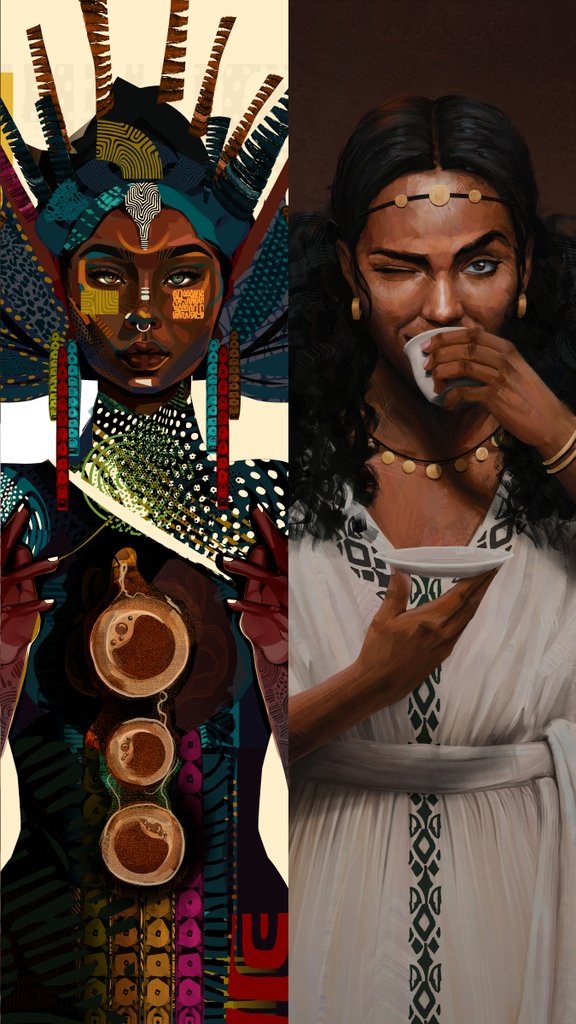
On the packaging I wanted to create a design that would not only look visually appealing, but also communicate the brand's values and story. I chose to incorporate a sketch of coffee forest around keffa and the people, since they used Letter K on their logo to express keffa.
The lion shape in the logo represents
strength, a nod to the coffee shop's commitment to serving strong, bold coffee. And, the pattern in the logo represents sunlight, evoking feelings of warmth and comfort that come with enjoying great cup of coffee.
And K represents Keffa
In the wake of iCog Labs' 10-year anniversary, I am traveling to over ten cities throughout the USA to bring you a new product and engage with the Ethiopian Diaspora.
Fill out the form below if you are interested
https://t.co/NJmukJWIlE
#10yearsINthefuture
I keep circling back to this in my head, the only meaningful competition you can have in life is one with your self. It only truly makes sense through time.