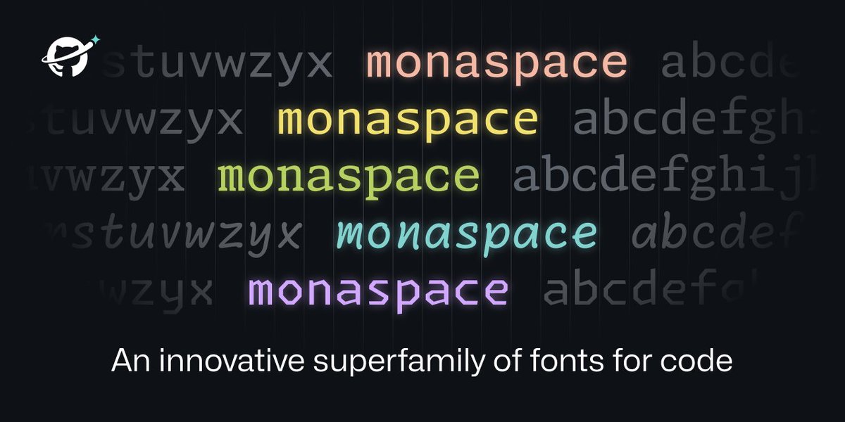
Cool to see the concept of contextual repositioning for better monospaced typefaces finding a huge audience through GitHub’s new coding font. A small credit for the idea would have been nice tho. https://t.co/tpHrRJTBVl
https://t.co/ZZcJ8VviUc
All code has been letters, on a grid, since the days of the teletype machine. How can we advance the state of the art to make code itself more expressive and powerful? How can we layer more meaning onto code?
Last chance to get a sweet taste of our massive #uniwidth superfamily. Our special offer @fontspring will end tomorrow. #bestfonts2021 https://t.co/naBNJHAyNO
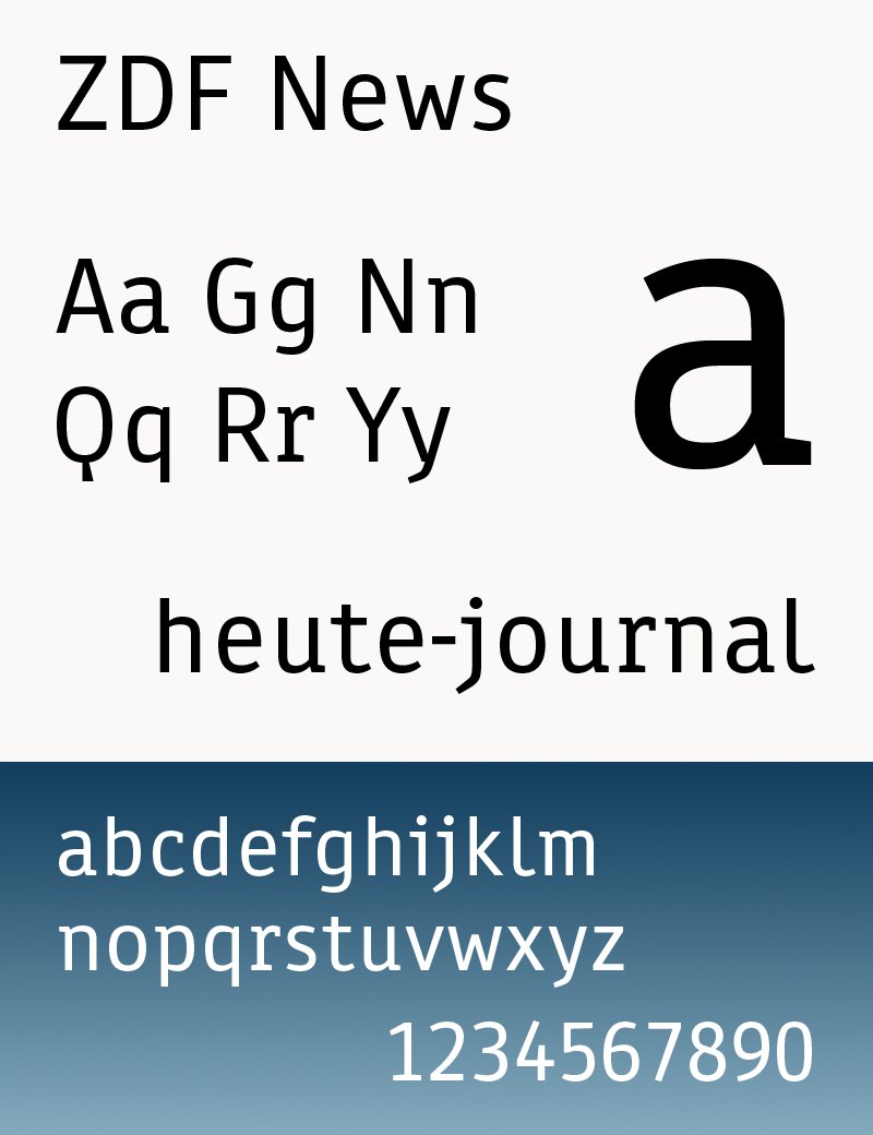
Die neue Schrift, abgeleitet von der »Helvetica« (aber besser lesbar und ebenfalls #uniwidth), erinnert in manchen Details (I,i,l) auch an die »ZDFnews«. So lebt vielleicht ein Teil von ihr im Geiste weiter. Ob das stilistisch Sinn ergibt, bleibt aber fraglich. (6/6)
Anfang des Jahres wurde zunächst im Web eine neue ZDF-Hausschrift »ZDF Type« (von @bboxtype) eingesetzt. Heute erfolgte die Umstellung im TV. Damit ist die ZDF-News von @espiekermann ein Fall für die Geschichtsbücher. (5/6) https://t.co/NvK8cvuXlW
I will give a short introduction to #uniwidth typefaces at the @TypographicsNYC TypeLab Europe. My talk starts in about 30 minutes https://t.co/fxO194SmwK