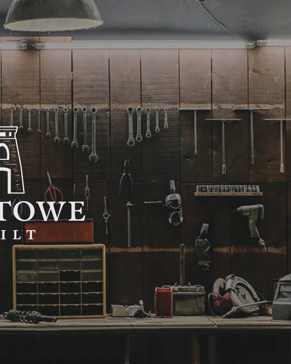
I loved working with Bristowe Built, an upcoming fine woodworking and trades business, to bring their branding and logo to life.
The name Bristowe is a call back to Bristol in the UK’s original spelling and pronunciation. It is home to the stunning Clifton Suspension Bridge...
...a symbol of strength, craftsmanship, and timeless design. That inspiration flows through their identity. The result is a brand mark that feels refined yet resilient, much like the pieces Bristowe Built creates. #BrandIdentity#BrandDesign#VisualIdentity#logo#branding
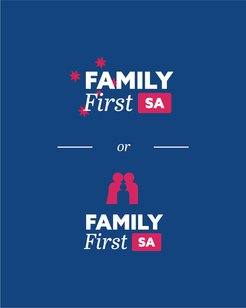
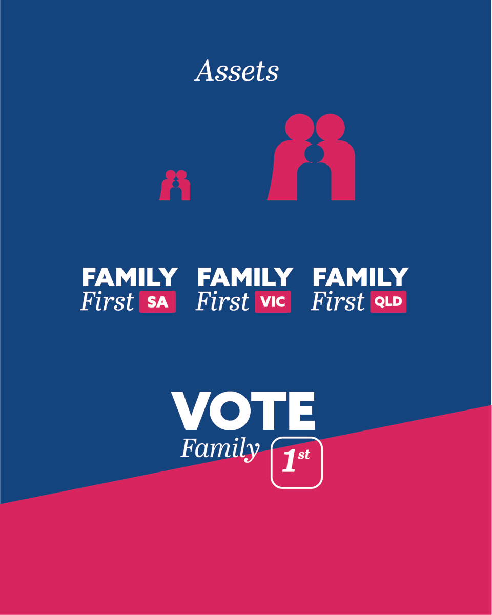
For this design project, I explored how a political party like Family First could refresh its identity while staying true to its core values. The concept plays with traditional and modern elements, blending familiar, heritage visuals with a contemporary aesthetic...
Continue...
This mock rebrand focuses on:
- A contrast of classic and modern fonts
- A colour palette that reflects both tradition and progress
- Visual storytelling designed to resonate with both long-time supporters and new audiences
Continue...
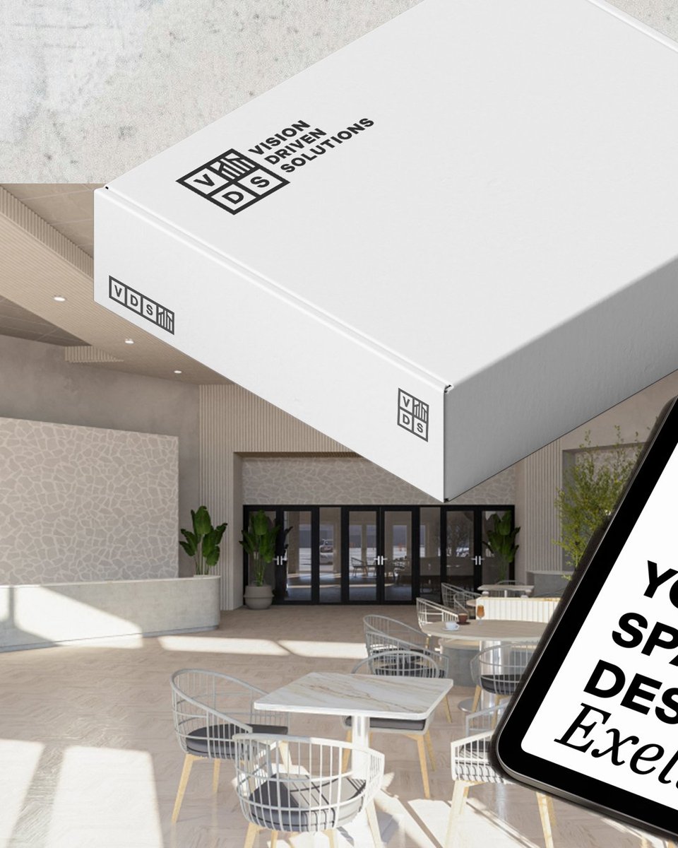
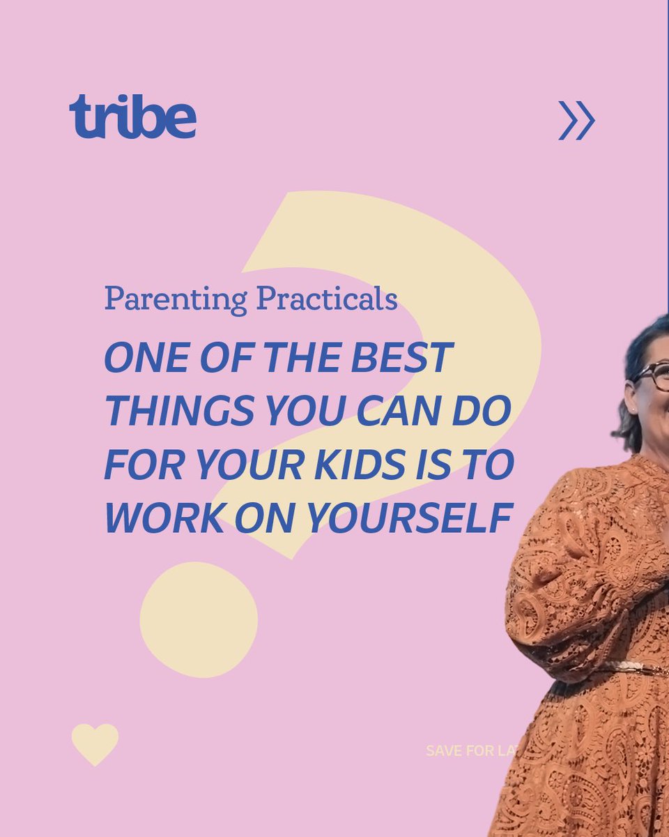
I LOVED creating this fun and vibrant identity and I couldn’t have chosen better people to work with than JP & Tina at Tribe_AUS
I can’t wait to hear about all the amazing things you are doing for families around Australia.
-
#graphicdesign#graphicdesigner#branding#logo
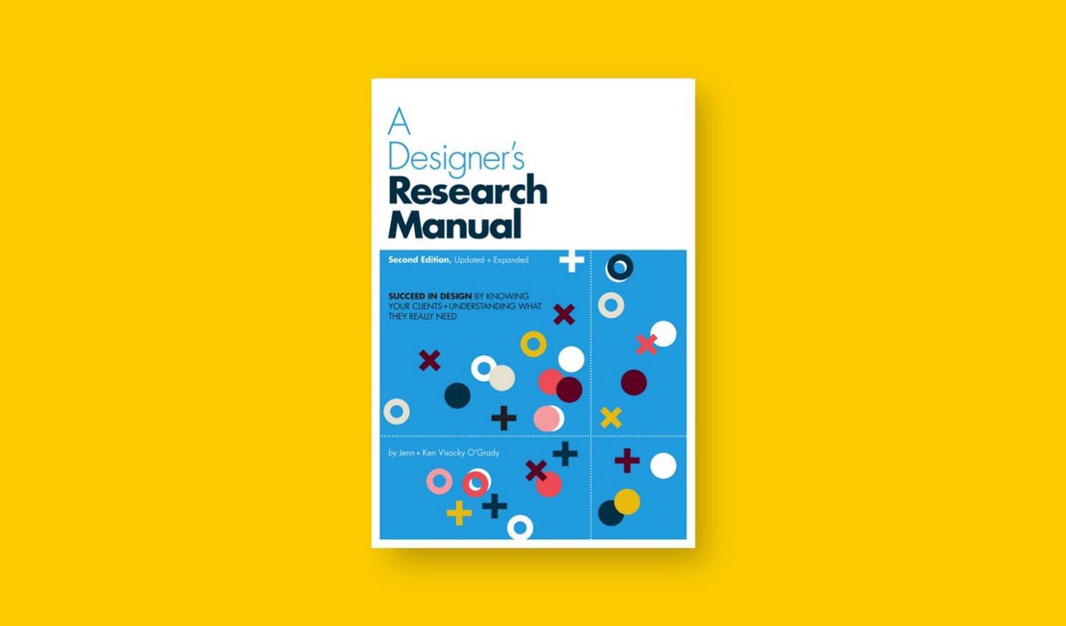
"Informed decisions— based on research instead of an intuitive best guess—amplify the power of the artefacts they create." - A Designer's Research Manual
@logogeek@wearecollins This is a great *RE*brand for several reasons; here’s two. 1) It unifies iconography and design systems 2) It does an unbelievable job of making GS relevant again: modern, fun, feminine, and enticing for multiple age groups. @wearecollins have ADDED to the brand not de-branded.