@British_Airways I’ve been waiting for weeks if not months now for my compensation claim #03473863 and it still hasn’t been picked up by anybody. How long is the wait? Nobody replies to my emails or answers the phone, please help
@Pharmacy2U I’ve tried ringing and it says everyone’s busy, go on the website and use the chatbot or ring back later and then hangs up. But the chatbot is not on the website. UGH
@Pharmacy2U with the new update to online doctor I am unable to view the messages from the gp and reply to them. How do I get to this page? The link in the email is not taking me to the actual conversation
@Pharmacy2U I went to the help page and it said to chat click the widget in the bottom left, but no live chat widget has ever popped up on this new site today. I’ve seen they’ve now dispatched the medication no longer wanted. I want the refund
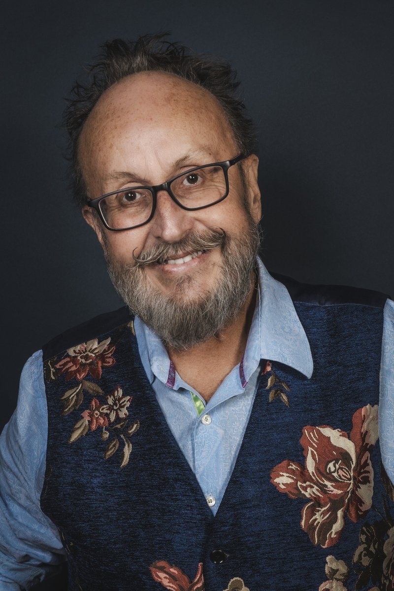
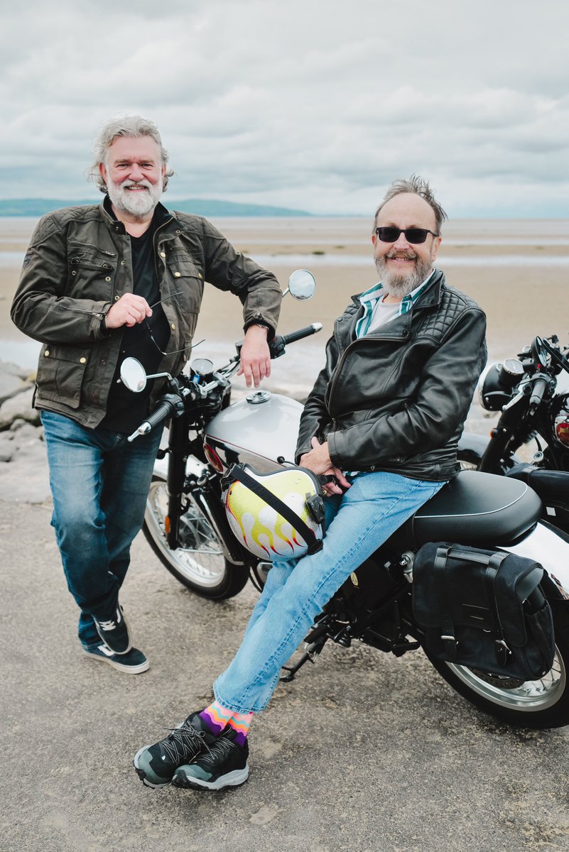
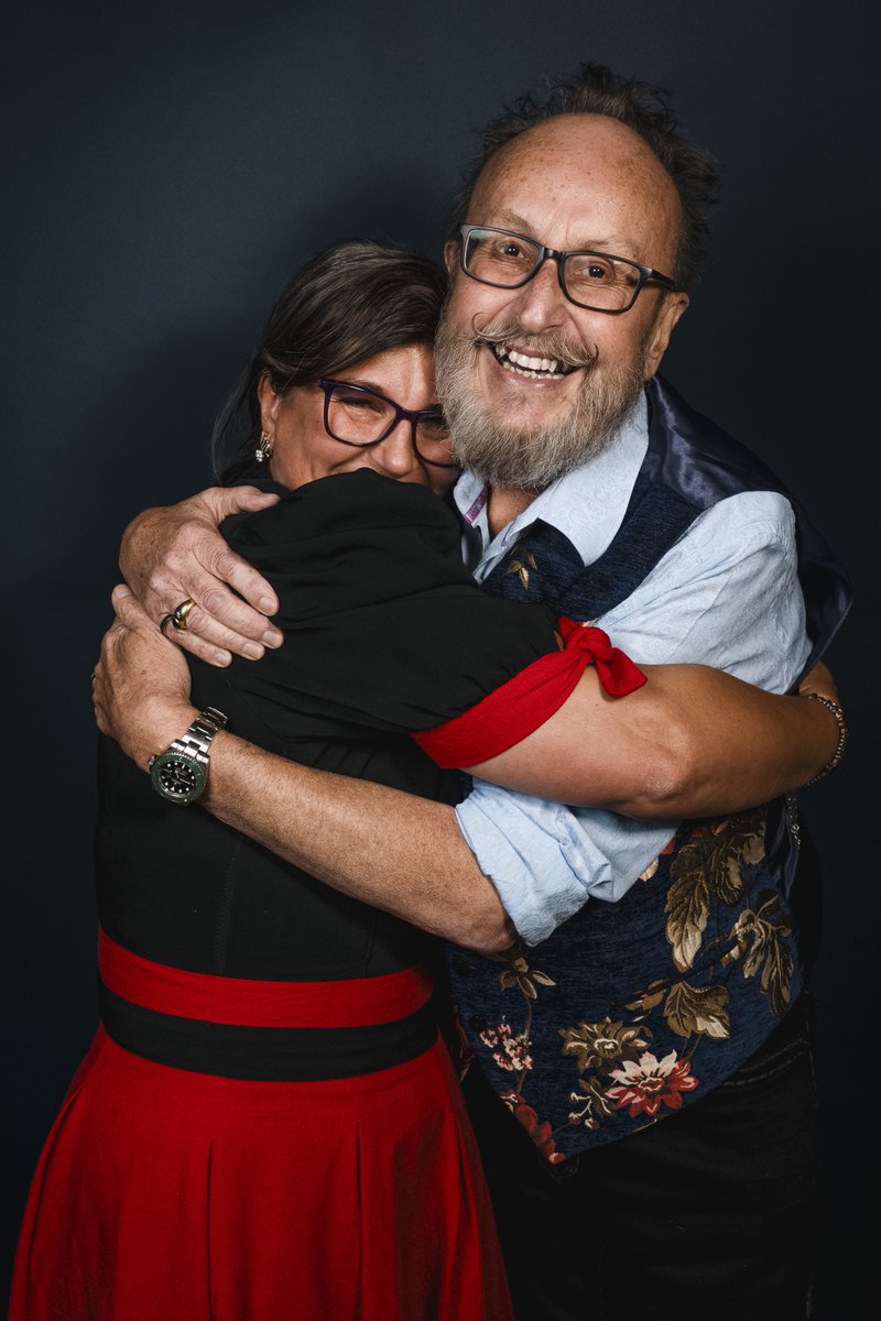
Hi everyone, I’m afraid I bear some sad news. Most of you will know Dave has been fighting cancer for the past couple of years. Last night, on 28th February 2024, with Lili, Dave’s wife, his family, close friend David and myself by his side, he passed away peacefully at home. All who knew Dave are devastated at his passing. His beloved wife brought him such happiness as did her children, Iza and Sergiu who Dave loved like his own.
Personally, I am not sure I can put into words on how I feel at the moment. My best friend is on a journey that for now, I can’t follow. I will miss him every day and the bond and friendship we shared over half a lifetime. I wish you god’s speed brother; you are and will remain a beacon in this world. See you on the other side. Love ya.
I know Dave and his family would want me to thank all of you who sent messages of support in recent times. It meant the world to him, his family and all The Hairy Bikers team. I am sending you all much love and gratitude for those simple acts of kindness, generosity and spirit. We are eternally grateful for them.
May I ask you all for one further kindness and allow Lili, his wife, his family, close friends and I some time and some peace to process our huge loss. I am sure I will see you all soon.
Love Si x
@WeAreOpenreach I live in an area that has fibre. All service providers like BT and Vodafone are refusing to allow me to sign up for Broadband because the cabinet is full. I also cannot sign up to copper services because they’ve been turned off. What are my rights?
@northernassist please can we have some more trains stop at Dunston. Just missed one and now the next one from Newcastle isn’t due until 18:13 that’s an hour and 15 minute wait. There’s other trains in between on route to metrocentre but none of them stop at Dunston
CSS Trick! 🤙
I got you! You can create this Disney-inspired loading animation with a single element and some CSS ⚡️
The "trick" is to create the ring part with a pseudo-element and offset it against the element 😎
Start with the element, this creates an offset white dot
.loader {
width: var(--size);
aspect-ratio: 1;
background: white;
border-radius: 50%;
position: absolute;
/* Rely on transform order to spin it */
--y: calc(var(--size) * -4.5));
transform:
rotate(0deg)
translateY(var(--y));
animation: spin 1s infinite linear;
}
@ keyframes spin {
to { transform: rotate(-360deg) translateY(var(--y);
}
The ring part is an offset circle that gets masked 😷
.loader::after {
content: "";
width: calc(var(--size) * 10);
aspect-ratio: 1;
position: absolute;
top: 0%;
left: 50%;
translate: -50% 0px;
/* Create a conic-gradient */
background: conic-gradient(
white,
hsl(var(--hue), 100%, 70%),
hsl(var(--hue), 100%, 10%),
transparent 65%
);
border-radius: 50%;
/* Mask it to leave a border. That 1px difference helps with making it look less rough */
mask: radial-gradient(transparent 39px, white 40px);
}
The last piece is the "glow". Use the other pseudo-element and set the offset to -50% and give it a blur filter 😎
.loader::before {
content: "";
position: absolute;
inset: -50%;
border-radius: 50%;
background: white;
filter: blur(10px);
z-index: -1;
}
Why didn't we create the ring with the main element? We didn't want to mask out the blur of the ::before element so we had to work around that limitation and use the offset ✨
Happy animating!
@CodePen link below! 👇
@NewcastleCC pay by phone app is down. Your machine only takes cash as an alternative. My partner is getting the same error message on their phone too.
Your icons should be SVG sprites instead of JSX
- make a component like <Icon name="trash" />
- get autocomplete for icon names
- auto build the spritesheet when new svgs are added
https://t.co/G9DnKL2w5n
✨ https://t.co/dWFeULxgzA now has searchable API docs!
The pages are automatically generated from the codebase TypeScript types and JSDocs.
APIs include links to live examples on the site so you can see the props in action.
So, I have a <div> containing an arbitrary amount of text. When that text is too long to fit, I want it to be truncated with an ellipsis.
Please tell me that this isn't as impossible as it's seeming.
It's hard to go into depth since this is an arms race situation. At a high-level though, aside from hardening your auth, there are 4 things you can do:
1) Use a rate limiter against IP and user ids
2) Block traffic from bad acting nation states
3) Only allow requests from real browsers
4) Build a predictive model based on your own app's mouse and click event analytics that can continuously validate human-like behavior during a session
Most sites don't need 4, but it's very useful.


