6. Activate reporting for events in your project
Regular reporting allows you to receive and share dashboard updates. And when it’s time for your performance review, you can use those reports as a base for your presentations.
To gain meaningful insights from your product analytics, you’ll need to go beyond pre-built dashboards and create custom ones tailored to your project objectives.
Here’s how to build zero-fluff product dashboards🧵.
5. Configure dashboard access
Configure access permissions to ensure that the right people have the appropriate level of visibility into your product data.
4. Limit the number of tiles per dashboard
Cluttering your dashboard will only confuse your goals and make it difficult to find the information you’re looking for. Instead, focus on including only the most important tiles.
3. Select metrics and KPIs
A clear objective sets the direction and focus of your analysis, guiding you in selecting the right metrics and visualizations to include.
2. Create different types of dashboards based on projects and objectives
We recommend one major objective per dashboard. Think of each dashboard as a focused lens through which you can examine specific metrics and data points related to a particular goal or area of analysis.
1. Use product analytics software with data visualization capabilities.
Some tools offer limited customization capabilities & others struggle to provide up-to-date insights. Look for software that allows you to easily create, customize, & update visualizations to suit your needs.
See exactly how users are flowing through your app and identify any points of friction in the user journey.
Try it out for yourself👉 https://t.co/iWffsj4Jso
#productmanagement#productanalytics
Several factors determine #ProductExperience:
💻Usability: Is the interface user-friendly?
👨💻Functionality: Does the product include features users want?
🎨Design: Does it have appealing design?
🆘Support: Can users resolve issues fast?
💰Value: Does the product provide value?
#ProductAnalytics relies on session recordings. But when it comes to #flutter apps, it can be difficult to capture enough context without collecting sensitive data. Our wireframe rendering mode seamlessly avoids the capture of sensitive data. Learn more👉 https://t.co/jzYfq7Egor
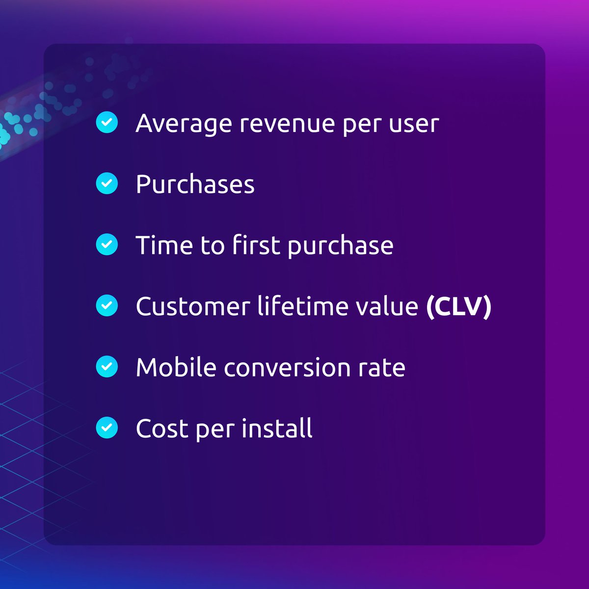
Revenue refers to the profit gained from your app through in-app purchases or purchases through the app. These metrics can be perceived as #mobileapp marketing KPIs, as many show the direct consequences of your marketing activities.
#mobile#mobileappanalytics#productmanager
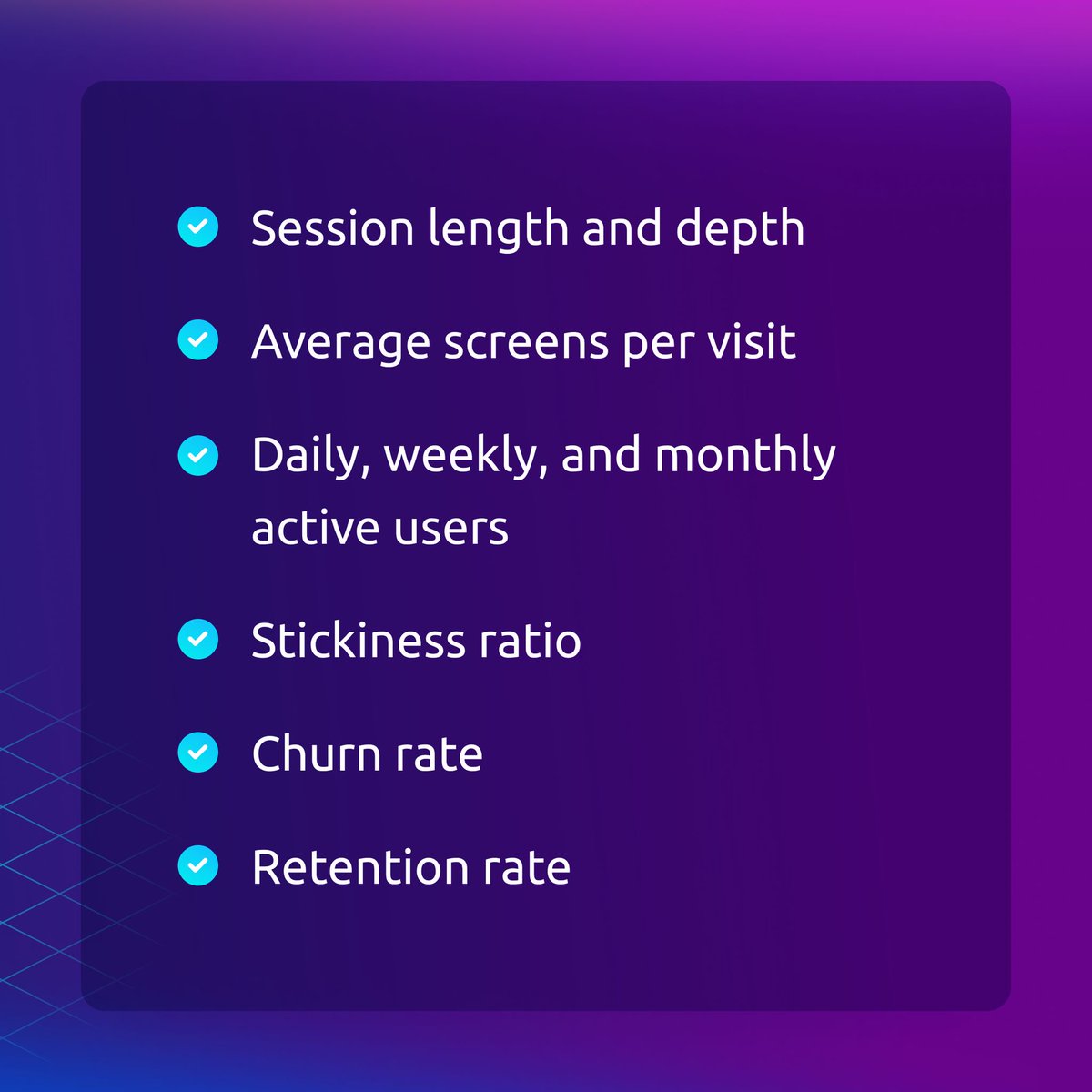
Engagement metrics show how users interact with your app. They enable you to determine whether your users like your app or not. #EngagementRates are directly related to your revenue — be sure to pay close attention to them. 👀
#mobile#mobileapp#appanalytics#productmanager
#ProductExperience is the impression users get when interacting with your product. It's not just about what it does, but how it does it and how it makes users feel. Usability, functionality, design, support, and value all contribute to the overall experience. #CustomerJourney
Hubspot users, we have a gift for you🎁.
Your Smartlook session recordings will now be visible directly in HubSpot so you can gain more user behavior insights without leaving the platform.
#hubspotintegration#userbehavior#digitalmarketing#analytics
https://t.co/HqeBxYphXb
How to build a #ProductExperimentation framework:
1️⃣ Analyze product data
2️⃣ Create a hypothesis
3️⃣ Choose a testing model
4️⃣ Define KPIs
5️⃣ Set up tracking
6️⃣ Determine significant results
7️⃣ Run the experiment and evaluate
Get all the deets: https://t.co/vNxKcXzZFZ
#productmgnt
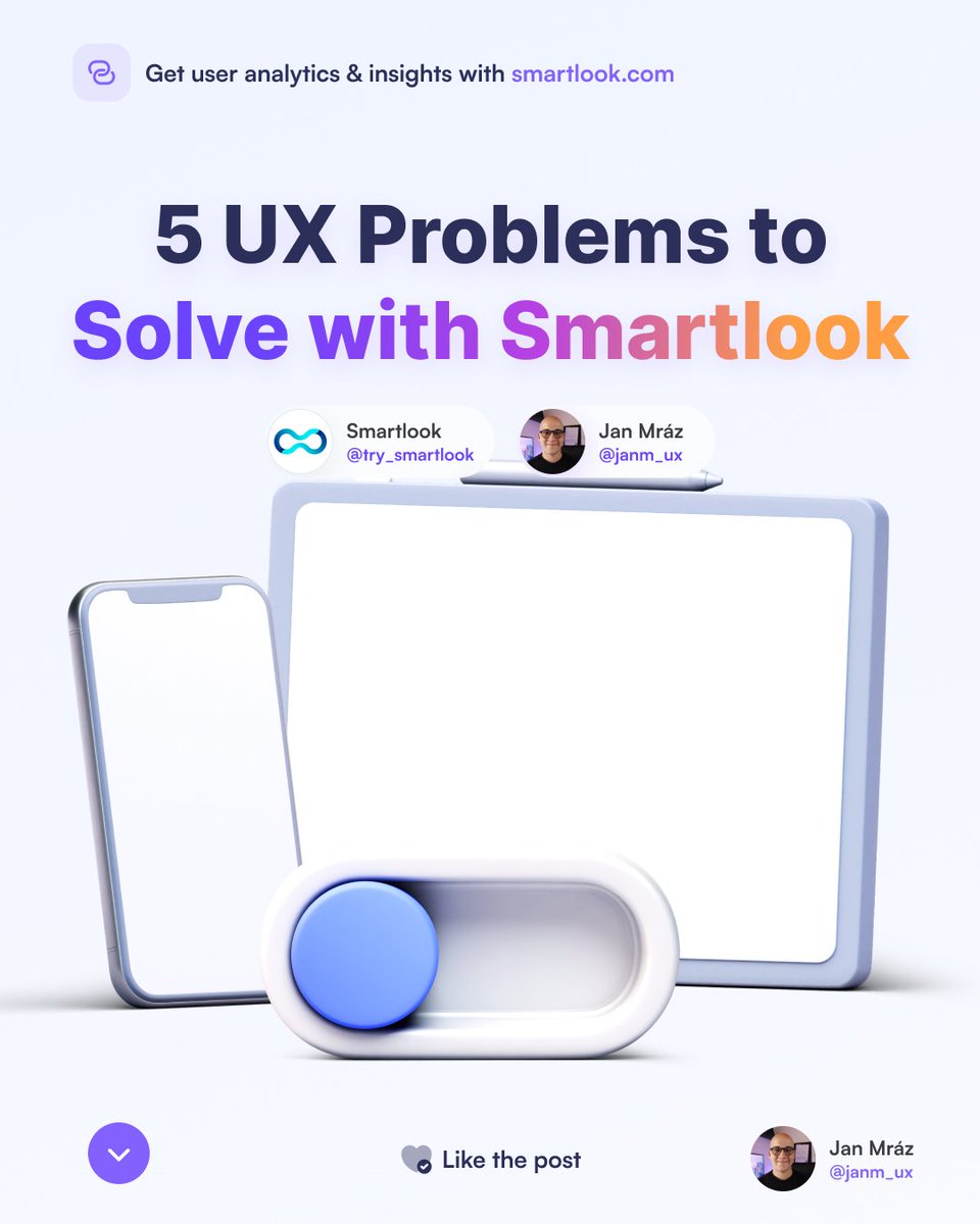
The most effective way to solve UX problems is to get data directly from users. Let’s discover some general issues that you can solve with Smartlook! 🔥
What are the biggest #heatmap limitations?
1️⃣ Their information is usually obvious and non-actionable.
2️⃣ They can’t track a user’s journey across your site or app.
Heatmaps should be treated as a starting point for understanding #userbehavior.
https://t.co/H7OYXL6YBd