In 2010, my roommate and I watched the Olympic men’s hockey final on a 27-inch TV in a tiny dorm room. Before the Blues’ Cup run in 2019, that game perfectly summed up my hockey fandom.
Watching Team USA chase gold again brought that 2019 feeling back. There’s something powerful about seeing your fandom reach its peak — the celebration of a true pinnacle moment.
In pro and college sports, we commemorate those moments with official championship marks. The Olympics? Not so much. So I figured… why not?
Someone connect me with USA Hockey 😂
This is not another “Make @SuperBowl Logos Great Again” post… but hear me out :eyes:
What if the @NFL took the NHL’s approach to the playoffs? The Stanley Cup is the postseason — the name, the symbol, the goal. The Lombardi Trophy stands for the same thing. What if it became the face of the playoffs, the championship games, maybe even the Super Bowl? Sixty years of football history wrapped into one powerful mark.
I don’t make many conceptual logos anymore, but this one felt right. Is it a slightly altered take on the NHL’s approach? Sure, but what do y’all think?
I grew up in a small town in southern Illinois, and when I was 16, we finally got our first pro sports team. Sure, it was just an independent league baseball organization, but to us, it was huge.
The Southern Illinois Miners wrapped up their existence in 2021 after 15 seasons, and I was lucky enough to design their commemorative anniversary mark before they closed the book. Getting to create something for the club that shared my home was genuinely special.marion
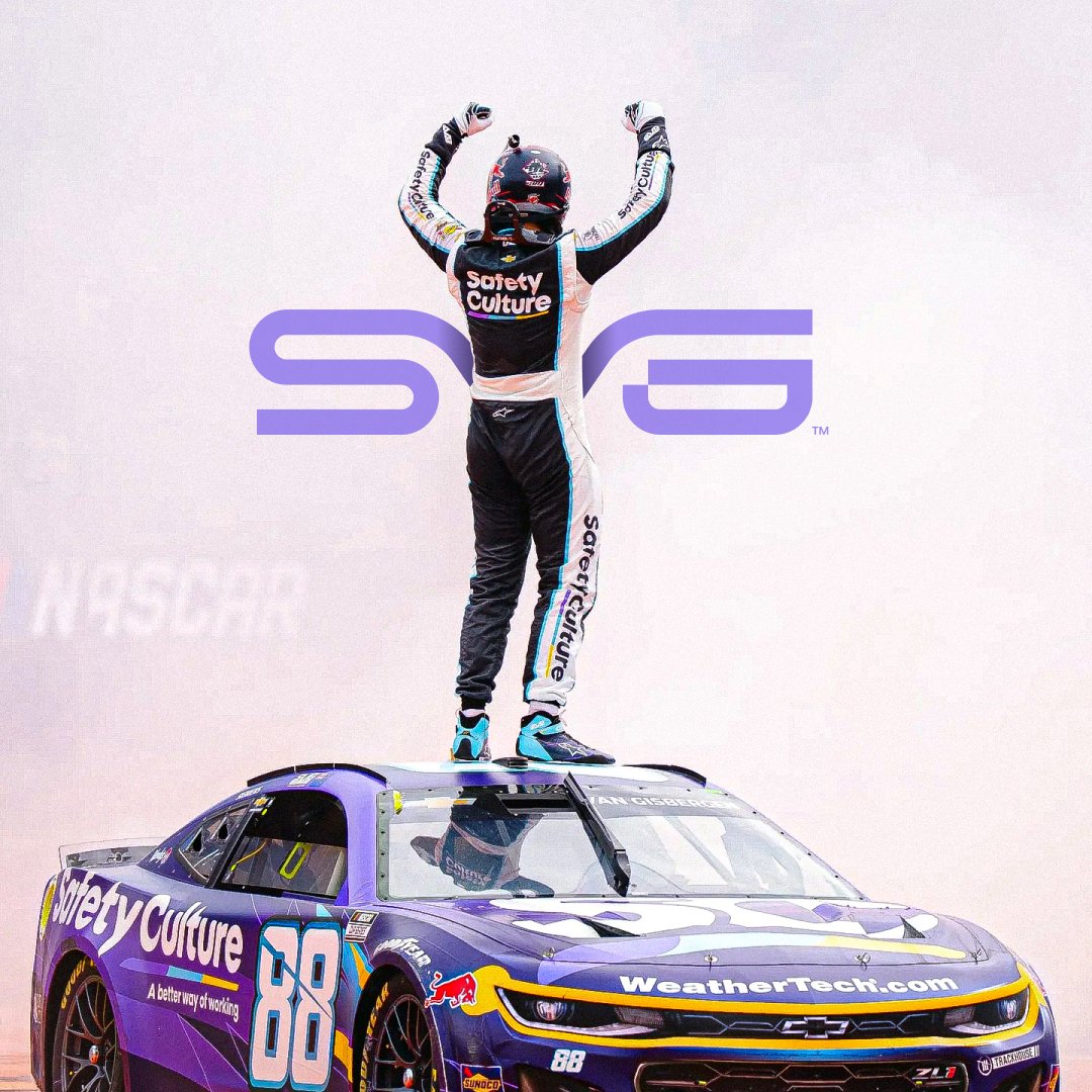
Lowkey fun fact: I’m a big motorsports guy — specifically @NASCAR. It’s something I picked up from my dad, and it’s even the reason behind my favorite number and the name of my studio.
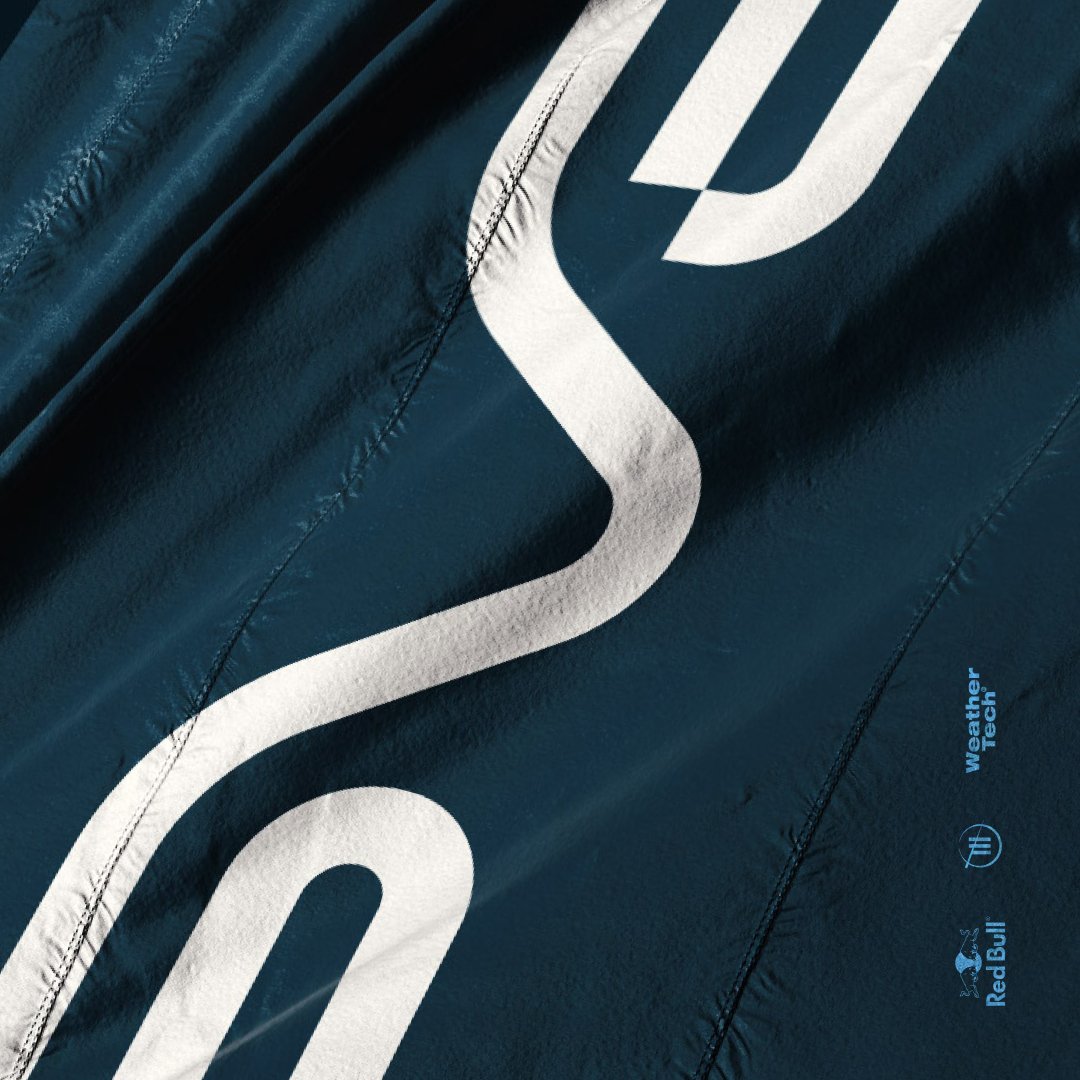
Motorsports are packed with great design, and driver marks have always fascinated me. Most lean aggressive and angular, but I wanted to explore a subtler, modern take.
@shanevg97 dominated road courses on his way to Rookie of the Year, so I built a mark inspired by the lines, curves, and apexes from the tracks he dominates.
Let me know what y’all think
This was genuinely one of my favorite projects in recent years. New Haven City SC is a soon-to-be entrant in @NPSLSoccer, and this identity came together in the best way — simple, natural, and purposeful. I don’t mean that from a standpoint that demeans the quality of the work, or the effort that went into it. But, New Haven is literally nicknamed the “Elm City”...
So the brand almost designed itself. We leaned fully into that nickname — from the marks and color palette to the uniforms — everything revolved around the elm tree. A symbol, namesake, and story that the city can truly rally around.
It’s so dang cool when you have the agency to chase an idea with full steam and watch it work. This brand feels delicate yet powerful, simple yet memorable, and above all, distinctly New Haven. Keep an eye out for NHCSC when they take the field.
One of my longest-standing partners has been the @SEC — specifically my good friend, @BC_Romano. We’ve worked on dozens of projects across nearly every sport that SEC schools participate in. When you’ve got a relationship that spans more than five years and 30+ projects, you end up with a whole heap of work I like to call “What Could Have Been” — concepts, ideas, and iterations that were explored but didn’t land.
Back when Dribbble was still a go-to hub for creative sharing and networking, I used to post some of that work — pieces I loved that ultimately found their home on the cutting room floor. I called it “What Could Have Been Wednesdays.” Silly, but fun.
I wanted to highlight a few of my favorite SEC pieces here — designs that didn’t make it past the inbox or the Illustrator artboard, but still hold a special place for me.
Look y'all — goofy logo grids.
Genuinely, I love the details of a mark. They tie it all together and make it memorable. I have distinct childhood memories tied to team identities that don’t even exist anymore. Those memories are joyful, comforting, and deeply impactful.
When I designed this mark for @TheWAPB2020, I obsessed over things like the sunburst elements terminating perfectly with the sides of the mountain, and the inner radius of the banner matching the container’s curve. It’s small stuff, but I want a kid to go to a game and remember this brand forever.
Not every sports identity needs to be steeped in symbolism or backed by exhaustive brand strategy. Often they do — but sometimes, it’s just about making something really, really cool. Something people remember.
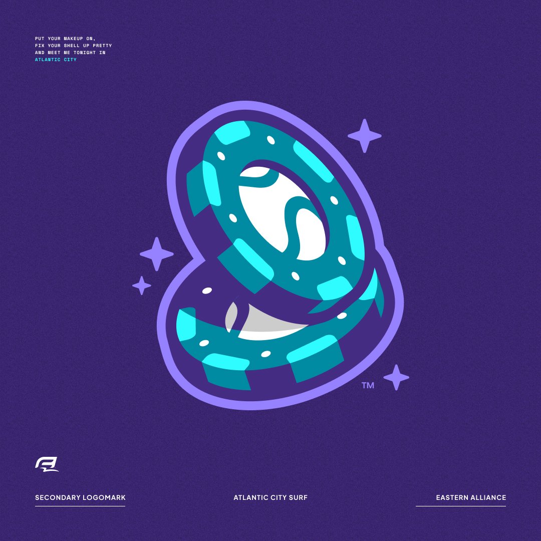
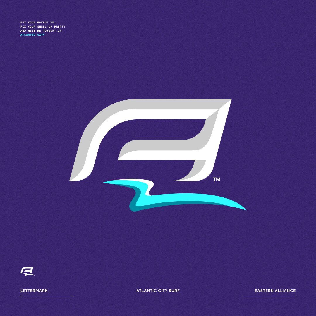
Enter, the Atlantic City Surf. We could have crafted a story around Atlantic City’s coastal culture or its “East Coast Vegas” vibe. But honestly? The idea of a surfing turtle was just plain fun. It looked great, it made people smile, and it captured that playful minor league spirit right away.
I’ll never be fully convinced that the roundel isn’t the perfect container for a mark. I get the value of breaking out of that boundary — but there’s just something nostalgic and timeless about a circular logo.
Pamela W. Henderson and Joseph A. Cote put it perfectly when they describe how qualities like harmony, balance, symmetry, proportion, and circularity evoke a sense of completeness. What’s even more interesting is how breaking outside of those borders can create dynamic, asymmetrical energy.
Maybe I’m just chasing that feeling of earning a new scout patch — or maybe it’s simply our human craving for balance. Either way, in a digital age where profile pictures carry more weight than ever, leaning into the roundel isn’t the worst idea.
Sometimes a rebrand doesn’t need to be extreme. Sometimes it builds on — and pays respect to — the original identity. In 2020, I worked with @dhspesh to revitalize the @MountainPL, a soccer league offering clubs throughout Colorado, Utah, Wyoming, and Idaho a pathway to professionalism through sporting merit and sound business practices.
The original look had character, memorability, and the bones of a great identity. It just needed a little refinement to reach its full potential.
We centered our efforts on the league’s namesake — the mountains. Bringing that visual idea into a clearer, more modern form laid the foundation for the rest of the work. The MPL didn’t want an overhaul; it wanted to become the best version of itself.
In an era of modernism and minimal design, there’s something especially sweet about a logo that feels just as at home in 2025 as it would have in 1902. When I was tasked with modernizing the Northern League’s identity, that became my goal. A historic league deserved a timeless brand.
The previous identity, created in 1993, had its strengths, but it was time for a refresh.
@ToddRadom really sets the standard for this kind of work. I tried to channel a bit of his spirit in this project, though it’s hard to mimic the godfather.
For a bit more context, you can check out the full project here: https://t.co/JRYUhZ33Aq
I grew up doodling fake team logos on napkins and scratch paper—usually when I was supposed to be paying attention to something else. That’s where my love for design and sports first collided. I thought I’d be an animator or illustrator, but instead I’ve found myself designing mascots and identities for real teams across the country.
Every project here was commissioned in some way, but I still draw just for the fun of it. I still invent fictional teams and give them names and logos. It’s how I started, and it’s still what keeps me inspired. 10-year-old me would be stoked.