Midnight pool. Don’t go home yet. 🌙💦
ミッドナイトプール。まだ帰らないで。🌙💦
MIDNIGHT POOL
#AIVoB_Crayon_Drawing_Style_Illustration
Prompt :
Create an original commercial poster artwork that looks unmistakably like a real physical children’s crayon drawing, titled:
“MIDNIGHT POOL”
The image must look as though an actual person took a box of ordinary children’s wax crayons and drew this scene directly onto thick, slightly rough white drawing paper.
This is NOT a digital illustration with a “crayon style.”
This is NOT a polished painting.
This is NOT a sophisticated illustration pretending to be handmade.
It must visually communicate:
REAL WAX CRAYON ON REAL PAPER.
The childish crayon medium is the dominant visual identity of the entire artwork.
⸻
SUBJECT
Draw an unmistakably adult American grunge woman standing beside a swimming pool late at night.
She wears an oversized faded T-shirt, distressed denim shorts, worn sneakers, a loose vintage jacket, and simple accessories.
Her appearance should be charmingly imperfect and simplified.
Do not render realistic skin.
Do not render realistic hair.
Do not create detailed fashion illustration.
Instead, represent her using simple colored shapes surrounded by thick, wobbly crayon outlines.
Her hair is constructed from chaotic black, purple, blue, and pink scribbles.
Her clothing consists of large blocks of unevenly applied crayon.
Her shoes are simplified into crude but expressive shapes.
Her face contains only a few childlike marks.
Her pose is relaxed and slightly awkward.
She looks quiet, detached, and mildly rebellious.
⸻
EXTREME CRAYON REALISM
The most important feature is the physical behavior of wax crayons.
Use the visual appearance of actual children’s crayons:
thick wax sticks,
blunt crayon tips,
uneven pressure,
hard pressed strokes,
soft lightly pressed strokes,
broken strokes,
dragged wax,
dry patches,
dense wax buildup,
visible pigment clumps,
scratched pigment,
overlapping colors,
repeated scribbling,
circular scribbling,
back-and-forth coloring,
short frantic strokes,
long sweeping strokes,
horizontal strokes,
vertical strokes,
diagonal strokes,
cross-hatching,
random scribbles,
accidental marks.
Every object should contain visible individual crayon strokes.
DO NOT smooth the strokes together.
DO NOT blur them.
DO NOT airbrush them.
DO NOT create digital gradients.
DO NOT make the crayon texture microscopic or subtle.
The crayon marks must be large, obvious, chunky, and immediately recognizable.
The viewer should be able to look at the image and instantly say:
“That is wax crayon.”
⸻
CHILDREN’S COLORING BEHAVIOR
Intentionally reproduce the behavior of a child coloring a picture.
Color outside the outlines.
Allow pigment to cross boundaries.
Let the blue of the pool overlap the concrete.
Let purple sky marks cross into the moon.
Let hair strokes escape beyond the head.
Let clothing colors extend beyond the clothing outlines.
Allow several colors to overlap accidentally.
Some areas should be completely saturated because the child pressed the crayon extremely hard.
Other areas should be almost empty because the child colored lightly.
Leave obvious white paper showing through.
Do not make the coloring uniform.
Do not make every surface perfectly filled.
Do not make the edges clean.
The imperfect coloring is essential.
⸻
PAPER
Use unmistakable physical drawing paper.
Visible paper tooth.
Rough paper fibers.
Off-white paper.
Subtle paper dents.
Tiny depressions created by heavy crayon pressure.
Areas where the wax catches on the paper texture.
Small gaps where paper texture interrupts the pigment.
Slightly dirty fingerprints.
Very subtle smudges.
Occasional rubbed areas.
The white paper must remain visible between some strokes.
The artwork should feel like a scanned or photographed real child’s crayon drawing on paper, not a digital recreation.
⸻
CRAYON OUTLINES
Use extremely obvious hand-drawn outlines.
The outlines must wobble.
Some lines should be drawn two or three times.
Some lines should suddenly become extremely thick.
Some lines should be broken.
Some lines should overshoot corners.
Some shapes should have visibly uneven contours.
Use black, dark purple, dark blue, burgundy, and brown crayons for outlines rather than perfectly uniform digital black lines.
The outlines should have the unmistakable appearance of a child repeatedly tracing the same shape with a blunt crayon.
⸻
NIGHT POOL
The swimming pool should be rendered almost entirely through thick crayon strokes.
Use:
turquoise crayon,
cyan crayon,
dark blue crayon,
purple crayon,
lavender crayon,
white crayon,
pink crayon.
Do not create realistic water.
Instead, fill the pool with hundreds of visible horizontal scribbles.
Some strokes should be straight.
Some should be crooked.
Some should overlap.
Some should extend beyond the pool.
The pool reflections should look like a child trying to draw sparkling water with white and yellow crayons.
Create chunky white and pale-yellow wax marks representing reflections.
The pool should feel magical rather than realistic.
⸻
NIGHT SKY
Use an enormous dark blue and purple sky.
The sky should visibly consist of large overlapping crayon strokes.
Do not use smooth color fields.
Leave individual strokes visible.
Add a huge pale-yellow moon drawn as an imperfect circle.
The moon should have uneven edges.
Fill it with yellow and cream crayon.
Allow some blue and purple strokes to overlap its edges.
Add childish stars:
★ ★ ★
but make them imperfect hand-drawn crayon stars.
Some should be tiny dots.
Some should be crooked.
Some should be oversized.
Some should be accidentally colored outside their shapes.
Add random little doodles between the stars.
⸻
CHILDLIKE DOODLES
Surround the main composition with spontaneous crayon doodles:
hearts,
stars,
clouds,
arrows,
smiley faces,
lightning bolts,
tiny flowers,
random circles,
scribbled spirals,
abstract shapes,
little handwritten notes.
These should look like marks made by a child while playing with crayons.
Do not make them perfectly designed graphic elements.
They should be irregular and spontaneous.
⸻
COLOR PALETTE
Use an intentionally unrealistic children’s-crayon palette.
Strong wax-crayon colors:
midnight blue,
royal blue,
violet,
purple,
turquoise,
cyan,
hot pink,
coral,
orange,
lemon yellow,
lime green,
cream,
white,
black,
burgundy.
Allow unexpected combinations.
A shadow can be bright purple.
Skin can contain peach, pink, orange, and lavender.
Hair can contain black, blue, purple, and pink.
The pool can contain turquoise, cyan, purple, and pink.
The artwork should feel like someone opened a large box of crayons and used almost every interesting color.
⸻
POSTER COMPOSITION
Even though the actual drawing technique is deliberately primitive, the overall composition should be professionally art-directed.
Strong central silhouette.
Large moon.
Large swimming pool.
Clear focal point.
Excellent visual balance.
Sophisticated negative space.
Strong color rhythm.
Poster-like framing.
The contrast is intentional:
professional poster composition + extremely primitive physical crayon execution.
This combination should make the artwork feel like a contemporary gallery poster created from an authentic child’s drawing.
⸻
TYPOGRAPHY
The title should also look hand-drawn with crayons:
MIDNIGHT POOL
Large uneven letters.
Each letter colored individually.
Different amounts of pressure.
Crooked baseline.
Uneven letter sizes.
Crayon marks extending beyond letter boundaries.
Some letters partially overwritten.
Some letters outlined twice.
Underneath, add:
AFTER DARK
in smaller crude handwritten crayon lettering.
Do not use professional fonts.
Do not use clean typography.
The lettering must look physically drawn with a blunt wax crayon.
⸻
IMPORTANT NEGATIVE DIRECTION
Absolutely avoid:
digital crayon filter,
vector illustration,
clean illustration,
smooth gradients,
airbrushed texture,
photorealistic rendering,
realistic skin,
realistic water,
perfect line art,
clean outlines,
polished children’s book illustration,
3D rendering,
plastic surfaces,
digital painting,
watercolor,
oil painting,
chalk,
pastel,
colored pencil,
marker,
ink drawing,
anime,
manga,
hyper-detailed rendering.
The medium must specifically read as:
THICK WAX CRAYON.
Not pencil.
Not pastel.
Not chalk.
Not paint.
Not digital texture.
⸻
FINAL VISUAL IMPRESSION
The finished image should look like an authentic physical crayon artwork that somehow became a sophisticated independent art poster.
It should retain all the beautiful mistakes:
awkward proportions,
uneven coloring,
scribbles,
overshooting lines,
random marks,
uneven pressure,
white paper gaps,
color collisions,
rough circles,
crooked letters,
thick wax buildup,
visible paper texture.
The charm comes from the imperfections.
The artwork should feel nostalgic, rebellious, strange, innocent, slightly melancholic, and deeply handmade.
RAW CHILDREN’S WAX CRAYON DRAWING — EXTREMELY VISIBLE CRAYON STROKES — BLUNT CRAYON MARKS — HEAVY WAX PIGMENT — COLORING OUTSIDE THE LINES — RANDOM SCRIBBLING — REAL PAPER TOOTH — PHYSICAL CRAYON TEXTURE — CHILDLIKE IMPERFECTION — PROFESSIONAL POSTER COMPOSITION.
Vertical 9:16 composition.
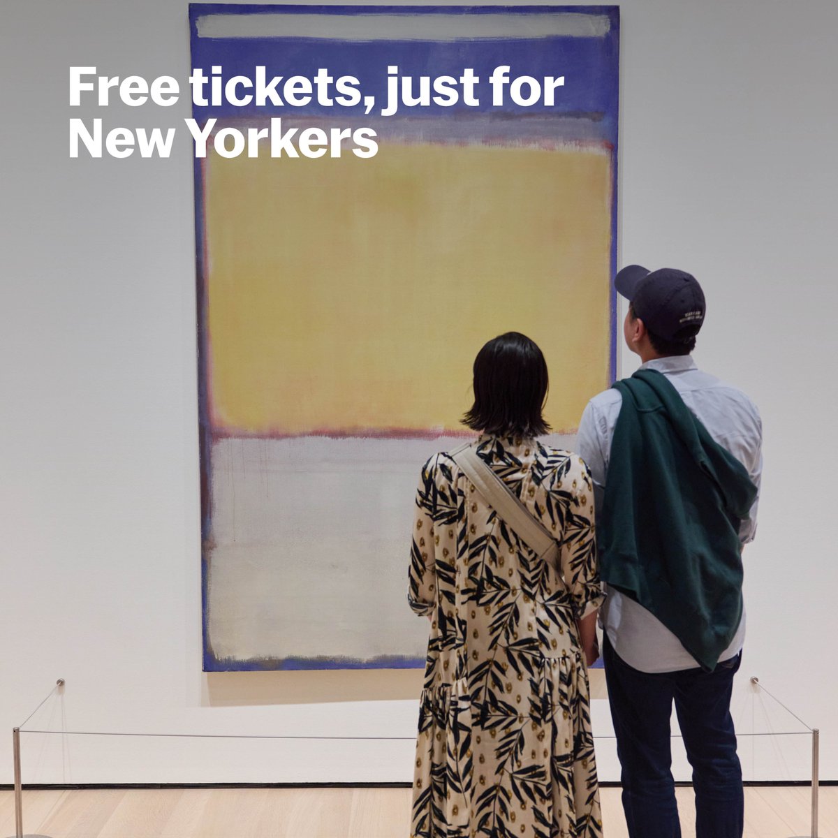
Free tickets, just for the five boroughs! We’re open late the first Friday of every month for art, drinks, music, and memories.
Join us for the next UNIQLO NYC Nights on December 6 → https://t.co/kmA7duRfYB