Branding for builders has to survive site life.
For M P Hare we paired red-brick orange (a nod to the colour of house bricks) with regal purple (reflective of project level), then put it on hoodies and scaffold debris netting.
Tasteful promotion with function.
East Farleigh Primary burnt down. When they asked us for a new logo, only one bird would do: a phoenix.
The greens mean something too: spring green for new pupils, deeper green for leavers.
A logo needs a reason to be what it is.
A brief is basically a translation document.
The founder knows the audience. The designer knows how to speak to it visually.
Once the basics are written, it's the collaboration that adds the polish.
The conversations around it that guide the result.
Print files are the things that bite people. Screens forgive a lot, paper doesn't.
Colours shift between RGB and CMYK, and that bright blue you loved on your laptop comes back looking like a wet Tuesday.
Gotta know your onions - we do :-)
Founders often tell us they dread opening their pitch deck in front of investors. The business is solid and the numbers are real, but the slides look like a free template. Fix the visual identity first, then rebuild the deck around it. Suddenly the deck looks like the company.
Honest feedback is a wonderful thing - good or bad. Who wouldn't want to hear "we love it!"? But "you've missed the mark here" (is unlikely) but just as valuable if it were to happen. Whichever one it is, tell us – you’ll get better results.
A rebrand rarely fixes what founders think it fixes.
The real issue is usually that the business has grown and the story hasn't caught up. The brand feels off because the positioning is off.
Good design makes that visible. It doesn't hide it.
Clients rarely come to us when things are going well. They come when the gap between how good they are and how good they look gets too uncomfortable to ignore.
Exhibition graphics is the brief that always arrives late. Client calls on a Thursday, the event's Monday.
We don't say no to these. Not because we enjoy the pressure but because pulling it off is how you become someone's first call next time. Stand looks great = clients happy.
86.5% of our sessions come from direct traffic.
people typing the URL straight in.
that's not a marketing strategy. that's a reputation doing the work while the website sits quietly in the background.
the site still matters — it just has to earn the visit, not generate it.
462 impressions on our homepage last month.
10 clicks.
That's a 2.16% CTR — meaning 452 people saw us in search results and kept scrolling.
The work is good. The site just isn't earning the trust yet that our existing clients get in person.
That's the gap we're fixing.
We once pitched against a bigger agency.
Their deck had 40 slides.
Ours had six.
We got the job.
The client told us afterwards that the other agency had impressed them with how much they knew.
But we'd impressed them with how much we'd listened.
Looking to update your brand, your website or need some adverts creating?
The team at Gulp have a wealth of experience to support your company with our design services. Want to know more than drop us a DM 😊
#designstudio#design#websitedesign#creativeagency#tunbridgewells
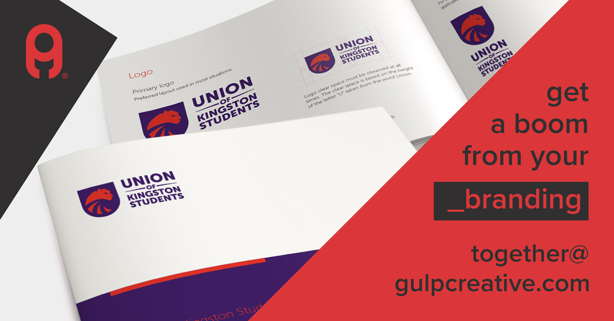
Your brand is your ambassador, it’s what brings a company’s purpose and personality to life. A company should be instantly recognisable by their logo alone. It should be bespoke, unique, beautiful, and perfectly created.
#typography#brandbuilding#brandguidelines#logodesign