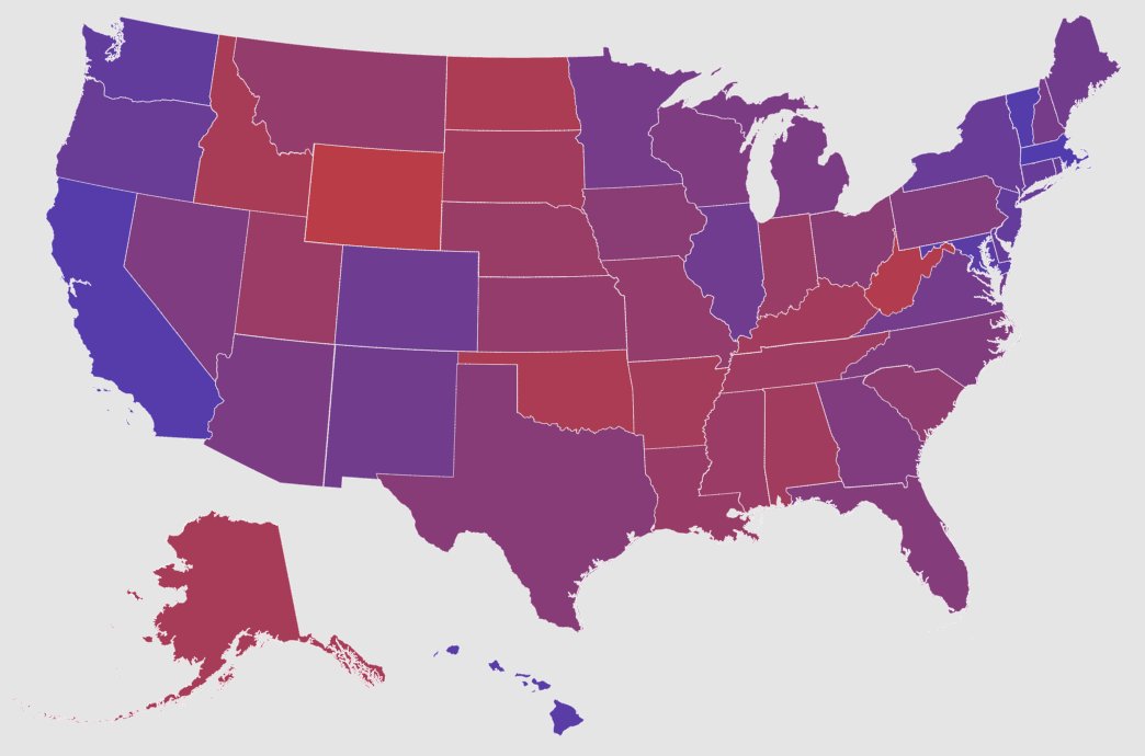
Showing red vs. blue maps leads people to see America as more divided—and judge people more by their state's stereotypes.
Data: purple maps of state proportions are more accurate, and reduce perceived polarization and stereotypes.
https://t.co/tHFsWsx6Il
https://t.co/z16GdnYKHN