Designed this logo animation, as part of Proma brand identity.
Composability was the whole idea behind the product, so it needed to be the whole idea behind the logo too.
I had this idea of starting with 4 circles and composing them from the start, so just brought it to life.
This animation started my framer-motion journey.
Gave a detailed prompt to ChatGpt but it didn't do it as I wanted. So I had to go back to documentation and learn how the code worked.
And now I enjoy doing fun projects with motion. Inspiration from @CamilleMormal website
@adriankuleszo I recently had a hard time convincing one of the founders that demo video would do a far better job than empty promises in bullet points since the users can literally see how the product works.
How do you usually convince client about your design decisions? (if you ever had to..)
Jan Summary:
Updated my portfolio website with projects and experiments.
(You can check them out from link in my bio)
Followers gained: 2 🥳
Posts: 18
Ongoing Projects: 2 (retainer)
Trying to be more consistent and sharing experiences.
"Why does it even look dull/muddy?" (if anyone is wondering)
Thats because of the gradient transition from cold color to warm color which usually happens when you're using complimentary colors.
So, a quick fix is to use a middle point hue like in image (if you can't use OKLCH)
If you ever feel like the gradients you're using are dull or muddy, try using OKLCH colors instead.
In OKLCH, hue is angular, which means that the colors the gradient passes through are different compared to sRGB.
Love messages like these haha 😂
I always encourage suggestions/opinions while working with Founders and they trust me to make decision based on what's best for the company.
3. Feeling
When you are making a new view in a system. It shouldn't feel like filling out a form. Just a premium-vibe/feel will make the user feel delightful and the product will feel powerful at the same time.
Think back: While creating a new issue in linear, how does it feel?
2. Guidance
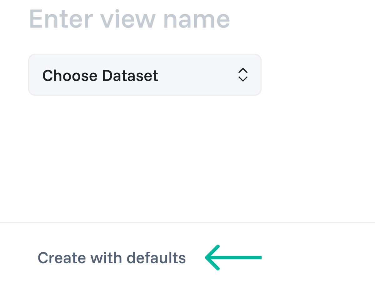
First of all there's too much going on in the first modal increasing cognitive load. What are the essentials and what are optional?
So I switched it over to step-by-step creation (with an option to create view immediately). Mainly because its not a repetitive task.
As a solo designer, I use StoryBrand Framework for creating Landing Page copies (especially if its a startup). Then we iterate on that, or a copy writer comes to polish things up. And its honestly working great till now.
Any other copy writing tips I could use to improve?
This bug has been making me nuts for days now.
When ever i click a project and scroll. The main page is also being scrolled. The individual projects open in different pages so idk what's happening. This only happens when I click the middle column projects btw.
Smbdy help me 😭