Introducing Bork: a display typeface born from an exercise in blackletter calligraphy. In this font, @leitenperger mixes the style’s characteristic dark texture and interrupted strokes in the lowercase with the roman construction of the uppercase.
https://t.co/H299tzN81l
Big news!! Today we welcome 21 new foundries onto our platform and we could not be more excited 🎉🎉
Great people, gorgeous typefaces, and a whole lots of amazing intro offers till Oct 31st! Please joining us in welcoming them!
https://t.co/lxdALBxHQ3
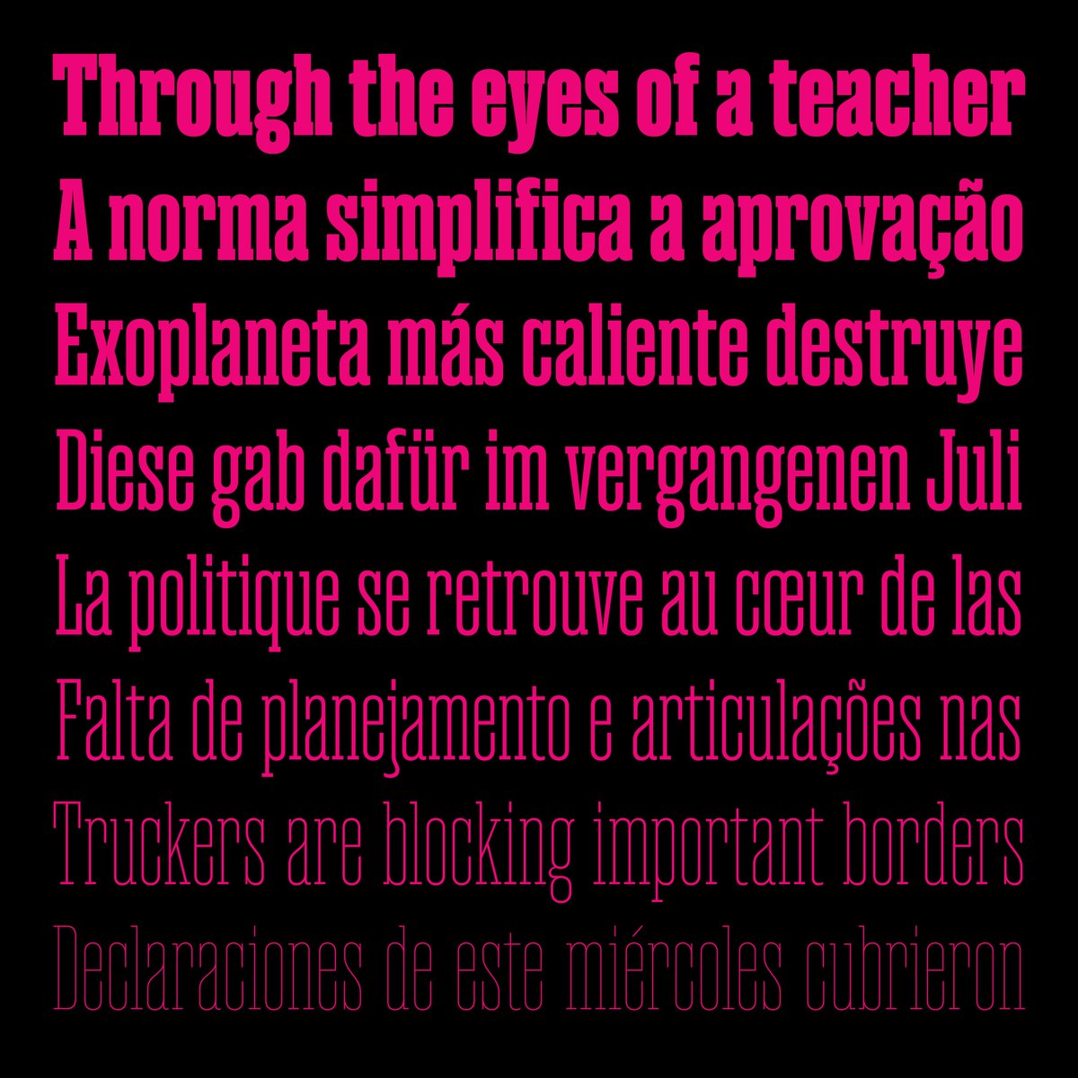
NEW RELEASE: Magno Serif & Sans
Magno is a superfamily in 8 condensed weights, obliques and several alternates. Read full story here:
https://t.co/aBhKHeu4Cj
Type Design: @LucasGini
Font Mastering: @harbortype
Download Free Trials:
https://t.co/QCStWoXDnP
@mwichary It might even simpler than that. It seems each individual style has different values for hheaAscender and hheaDescender, resulting in different line heights.
@mwichary I have a feeling it might have something to do with the Agrave and the ascender value. I’m not near a Mac right now, so I couldn’t test this. https://t.co/kPTlKiSlAv
It's tempting to think that simpler letterforms = more legibility. But in my experience, that's not true. Typefaces are design systems too, and they need a certain level of complexity to work well. Here's why
(thread) 🧵
Hey @figmadesign! Is there any documentation on how the algorithm for style linking works? What do you look for in the font files? Some of my fonts don’t work correctly in Figma but they work in TextEdit...
Hey @Figma (cc @mwichary), are you aware of this issue regarding the order of font styles and style linking on MacOS Big Sur? I’ve been trying to circumvent this for months to no avail. Apparently it affects all third-party fonts (non-system and non-Google).
@PlauDesign@figmadesign Well, apparently this might be an issue with @figmadesign running on Big Sur. Everything works as expected on Mojave. Notice how the order of the styles in the dropdown change between OS versions.