With a generally special (pun intended), detailed and solid thesis defence on Emerging infectious diseases in the Shola Sky Islands, three cheers to Dr @AshwinW10!! 🎓💯🎉💪
Need to visualize multi-dimensional categorical data in R? ggalluvial, an extension of ggplot2, makes it easy to create alluvial diagrams and Sankey plots, helping you uncover patterns and flows across categories.
✔️ Plot alluvial diagrams to represent relationships between categorical variables.
✔️ Create Sankey plots to visualize flows and transitions.
✔️ Customize aesthetics, including colors, labels, and node arrangements.
✔️ Handle both wide and long-format data sets with ease.
Whether you're analyzing survey responses, tracking user behavior, or exploring categorical trends, ggalluvial simplifies the creation of clear and informative visualizations.
The visualization shown here is taken from the package website: https://t.co/LIm6nlQwim
Learn more about ggplot2 and its extensions in my online course "Data Visualization in R Using ggplot2 & Friends."
Further details: https://t.co/ztlEzoEDWv
#Python #DataVisualization #RStats #statisticsclass #tidyverse #datavis
Combining layers effectively is key to creating compelling plots in R. The ggblend package for ggplot2 allows you to blend layers seamlessly, making it easier to highlight important details and enhance your data visualizations.
Here’s why ggblend is worth exploring:
✔️ Layer Blending: Combine multiple layers with different blending modes to create more informative plots.
✔️ Customizable Transparency: Control opacity to emphasize key information without clutter.
✔️ Enhanced Visual Hierarchy: Use blending techniques to guide the viewer’s focus to important parts of the plot.
✔️ Creative Freedom: Experiment with various blending effects to make your plots visually appealing and insightful.
✔️ Efficient Workflow: Integrates smoothly with ggplot2 and the tidyverse for a streamlined plotting process.
The visualizations shown below are sourced from the package website: https://t.co/qdU00VL9Oy
If you’re interested in mastering data visualization in R with ggplot2 and its extensions, you might want to explore my online course on "Data Visualization in R Using ggplot2 & Friends"!
Take a look here for more details: https://t.co/ztlEzoEDWv
#database #datascienceenthusiast #rstudioglobal #tidyverse #Python #RStats #datavis
@balaji25_t What you are probably observing is the trans-oceanic migration of the dragonfly species Pantala flavescens. The numbers associated with this migration are huge! I’ve seen big swarms.
Article : https://t.co/rYJAchHam5
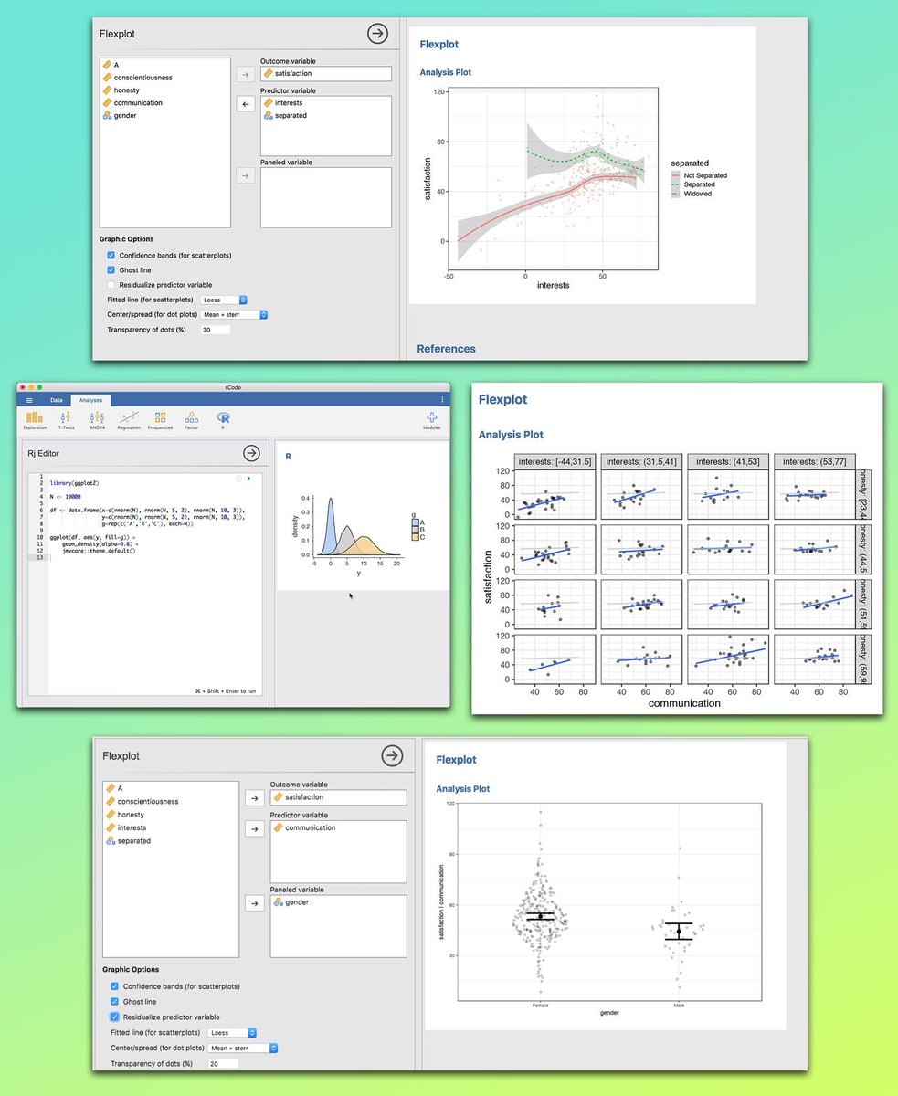
If you want to explore your data visually without spending hours coding, the Jamovi GUI is a game-changer. It offers seamless integration with R, allowing you to combine a simple point-and-click interface with the flexibility of advanced scripting. This makes it easy to spot patterns, understand relationships, and communicate results with clear, customizable plots, all in one tool.
Why use the Jamovi GUI?
✔️ No heavy coding required, work visually
✔️ Easily set your target variable, predictor variables, and panels
✔️ Customize plots with confidence bands, ghost lines, and transparency options
✔️ See trends and differences at a glance
✔️ Works well for both simple and multi-variable analysis
✔️ Seamless integration with R for custom scripting and advanced analysis
The image below shows the Jamovi GUI in action. You can see examples of scatterplots with fitted lines, density plots, faceted scatterplots, and violin plots, all created with just a few clicks. The interface makes it easy to select variables, adjust settings, and generate publication-ready plots instantly. Images shown here are taken from: https://t.co/4fymjvakcS
Sign up for my newsletter to get more practical tips on statistics, data science, R, and Python.
More info: https://t.co/X93SeCe0rb
#DataVisualization #datascienceenthusiast #datavis #database #RStats #programmer #R #datastructure
You can easily export your #tidyplots in various formats by chaining multiple save_plot() functions together. This is a handy trick for efficiently creating and saving visualizations in different file types during your workflow.
Thanks for sharing this tip, @JanBroderEngler.
#RStats #DataVisualization #CodingTips #Tidyverse
I recently stumbled over the tmap R package and was amazed by its capabilities! With tmap, you can craft dynamic, interactive maps with ease. The package offers a flexible syntax similar to ggplot2, but with a dedicated focus on maps.
Key Features:
✅ Interactive Maps: Switch between plot and view modes for static or interactive experiences.
✅ Multiple Shapes & Layers: Combine various spatial objects and layers for intricate map designs.
✅ Facets: Segment your data visually with facets, enhancing comparison and analysis.
✅ Basemaps & Overlay Tile Maps: Integrate beautiful basemaps and overlay tiles to enrich your maps.
✅ Customizable Options & Styles: Tailor your maps with numerous styling and layout options.
✅ Shiny Integration: Seamlessly embed maps in Shiny applications for interactive web apps.
✅ Quick Thematic Maps: Generate thematic maps swiftly with a single function call.
✅ Exporting Maps: Easily save your creations as images or interactive HTML files.
For those interested in delving deeper, there's a comprehensive guide to get started, available at CRAN: https://t.co/iceErsrSQc
I've also learned from a recent post by Jakub Nowosad, one of the contributors to this package, that the development version of tmap now supports adding various charts to the maps (see image of this post).
Thanks to Martijn Tennekes and the other contributors for their great work on this package!
Want to stay ahead in statistics, data science, and programming? My free newsletter delivers regular insights directly to you. Learn more by visiting this link: https://t.co/X93SeCe0rb
####################
Special Promotion - Get 33% Off All My Courses Through July 23: https://t.co/nfnsYuxayc
####################
#DataVisualization #Python #RStats #datascienceeducation #Rpackage
Excited to share that some of my PhD research is now up on bioRxiv as a preprint! 🐾❄️
This study explores how high-elevation, cold-adapted pikas from the Trans-Himalayas responded demographically to Pleistocene glaciation events.
@NandiniRajamani
https://t.co/F8RVVUA0JX
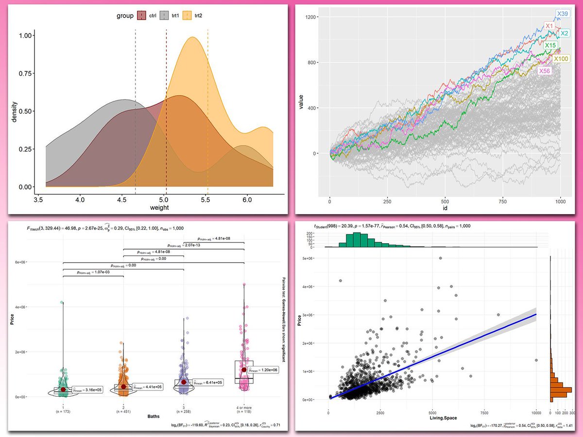
Adding statistical metrics to your plots can transform your visualizations from basic to highly informative. With ggplot2 in R and its versatile extensions, incorporating features like p-values, confidence intervals, and regression lines becomes both straightforward and visually appealing.
These are my top 5 packages for adding statistical metrics in ggplot2:
1️⃣ ggstatsplot: Combines statistical analysis and visualizations, displaying p-values, confidence intervals, and effect sizes directly on your plots.
2️⃣ ggpubr: Simplifies the process of adding p-values, statistical comparisons, and summaries to boxplots, bar charts, and more.
3️⃣ ggsignif: Adds significance brackets with p-values to plots like boxplots and bar charts, making statistical comparisons easy to interpret.
4️⃣ stat_poly_eq: Annotates regression equations, R² values, and p-values on scatter plots, ideal for showcasing relationships in linear models.
5️⃣ gghighlight: Highlights specific data points or groups in plots, drawing attention to key statistical trends or outliers while maintaining context.
With these tools, integrating statistical insights into your ggplot2 visualizations becomes both effective and effortless. In the graph shown here, you can see examples of how these packages enhance your plots: a density plot with group means marked by vertical lines, a crowded line plot with selected series highlighted for clarity, a violin-boxplot hybrid with p-values annotated for group comparisons, and a scatter plot featuring a regression line, confidence intervals, and marginal histograms for added context. These enhancements demonstrate the power of ggplot2 extensions for making statistical insights visually accessible.
If you’d like to learn how to use ggplot2 and these extensions, join my online course, Data Visualization in R Using ggplot2 & Friends. I’ll guide you step-by-step to create visualizations packed with statistical insights! More info: https://t.co/ztlEzoEDWv
#R4DS #datastructure #RStats #tidyverse
IISER Tirupati @vvrobin lab at #NSAB2025 making a clean sweep of the poster awards!
HUGE shout out to @minivets and the entire organising team at @nsab2025 for a seamless and fun filled conference at Mohali! 😄
Congratulations to Dr Ullasa Kodandaramaiah (https://t.co/YZbbuQiSSe) for being elected as a Fellow of the Indian Academy of Sciences. He is one among 40 scientists across all disciplines of sciences elected this year. https://t.co/4miyLLWhIk
A recent PhD graduate from @tamal_das's lab @TIFRH_buzz, Purnati Khuntia (@PurnatiK) spoke to @DeccanChronicle about her research goals as a Rowland Fellow @Harvard. Purnati would be setting up her independent lab at The Rowland Institute @Harvard.
https://t.co/yA3HambIgR
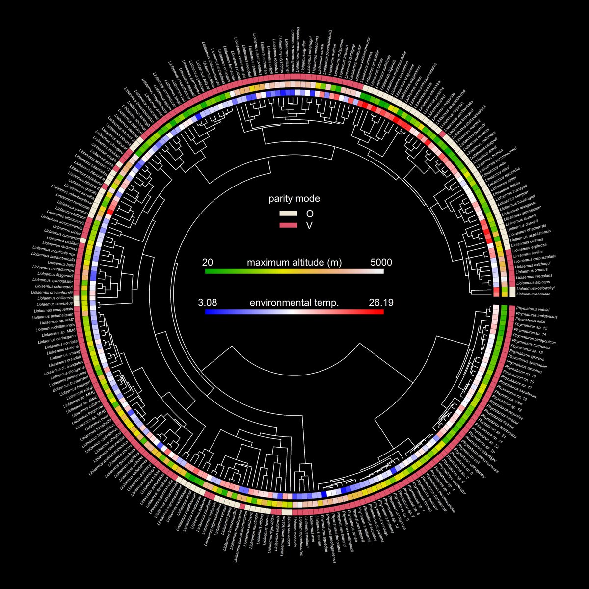
This is one of my favorite visualizations made for the #phytools blog in 2024: parity mode, maximum altitude, & environmental temperature in liolaemid lizards using data from @DamienEsquerre et al. (2018). More details here: https://t.co/in0upNwNXL.
⚠️ BREAKING:
U.S. 🇺🇸 Reports 5.236 million New COVID-19 Infections in One Week.
Currently, 1 in 64 Americans is Infected with COVID-19.
COVID-19 transmission is currently higher than it was during 73.3% of the pandemic.
As an academic, I finally got an Equal Opportunities grant to attend a genomics workshop outside India, only to have my Visa rejected @CZinIndia. Despite having an invitation letter and a booked itinerary for the trip, the justification for the intended travel was unreliable.🧵