Top Tweets for #DesignDecode

Your logo should feel predictable - not surprising.
Using a consistent position improves recall and brand memory.
Small discipline, long-term branding gain.
#BrandingByMukesh #DesignDecode #ConsistencyHacks #LogoUsage #BrandRecall #VisualIdentity #BrandingTips
Wide shots dilute focus.
Tight crops bring attention exactly where you want it.
Less background, more impact.
#DesignDecode #BrandingByMukesh #VisualImpact #BrandingBasics #CreativeTips

Trying to say too much, weakens impact.
Strong visuals communicate ONE clear idea.
If your message isn’t clear in 3 seconds, it’s too complex.
#DesignDecode #BrandingByMukesh #Minimalism #VisualClarity
Symmetrical designs feel calm, balanced, and trustworthy.
Asymmetrical layouts feel bold, modern, and energetic.
Choose based on the emotion your brand wants to convey.
#BrandingByMukesh #DesignDecode #VisualPsychology #DesignThinking #BrandEmotion #VisualStrategy #BrandingTips


If everything blends in, nothing stands out.
Contrast helps your audience instantly notice what matters most.
Use it wisely — for headlines, CTAs, or key messages.
#BrandingByMukesh #DesignDecode #AttentionTriggers #VisualContrast #DesignTips #BrandVisibility #BusinessBranding

Bold text is a powerful attention tool - when used sparingly.
Highlight only the most important words.
Minimal-bold = Maximum impact.
#BrandingByMukesh #DesignDecode #Minimalism #TypographyDesign #CleanVisuals #BrandingBasics #DesignMindset

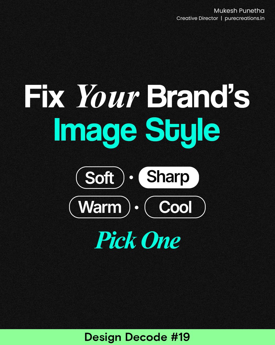
Your visuals shouldn’t feel like they’re from different brands.
Define your image style: warm tones, high contrast, soft shadows, minimal edits, etc.
Consistency = automatic brand recall.
#BrandingByMukesh #DesignDecode #ConsistencyHacks #VisualIdentity #DesignTips
Size = importance.
If everything is the same size, nothing stands out.
Use larger elements to control what viewers see first — it’s pure psychology.
#BrandingByMukesh #DesignDecode #VisualPsychology #DesignPrinciples #BrandVisibility #BusinessBranding #DesignSmarter

Straight lines feel static.
Diagonal lines naturally guide attention and add energy to your design.
Use them carefully to direct the viewer’s eye exactly where you want.
#BrandingByMukesh #DesignDecode #AttentionTriggers #VisualHierarchy #BrandingInsights #DesignStrategy

Too many highlight colors = visual chaos.
Choose one accent color and let it guide attention.
Minimalism isn’t lack of elements — it’s clarity of intention.
#BrandingByMukesh #DesignDecode #Minimalism #CleanDesign #BrandVisuals #VisualClarity #DesignTips

Thin, bold, filled, rounded — icons come in many styles.
Mixing them breaks visual consistency.
Pick one style and use it everywhere for a clean, cohesive identity.
#DesignDecode #ConsistencyHacks #BrandIdentity #VisualConsistency #BrandingTips #DesignForBusiness

Colors influence perception more than we realize.
Blue = trust, security, professionalism.
Use it when your message needs seriousness, credibility, or calm confidence.
#BrandingByMukesh #DesignDecode #VisualPsychology #ColorPsychology #BrandPerception #DesignStrategy

A simple color overlay can fix lighting issues, create mood, and unify your brand look.
Quick win, big polish.
#BrandingByMukesh #DesignDecode #QuickWins #VisualTips #DesignHacks #BrandingBasics #BusinessDesign

Humans are wired to notice faces, they create instant connection and trust.
Use faces in your visuals to attract attention and humanize your brand.
#DesignDecode #AttentionTriggers #VisualMarketing #DesignPsychology #BrandEngagement #BrandingByDesign

Simplicity is clarity.
Every visual should say one thing strongly, not ten things weakly.
Try this: remove one element from your design — if it still communicates the message, it’s better now.
#BrandingByMukesh #DesignDecode #Minimalism #CleanDesign #VisualClarity

If every post looks different, your audience won’t recognize your brand.
Create and reuse branded templates for social media, presentations, and ads.
Consistency builds memory — and memory builds trust.
#DesignDecode #ConsistencyHacks #BrandGuidelines #VisualIdentity

Our brains process visuals 60,000x faster than text.
Before they read your words, they’ve already judged your brand by its visuals.
Make sure your design speaks clearly — even with the sound off or without a caption.
#DesignDecode #VisualPsychology #DesignThinking

A little depth can make your visuals look more realistic and premium.
Use soft shadows to separate key elements and create focus — just don’t overdo it.
Small design tweaks, big perception shifts.
#BrandingByMukesh #DesignDecode #DesignTips #VisualDepth #BrandingBasics

Your design should lead the viewer’s eyes — not leave them wandering.
Use size, color, and contrast to show what’s most important first.
When everything looks equally loud, nothing gets heard.
#BrandingByMukesh #DesignDecode #VisualHierarchy #DesignTips #BrandingBasics

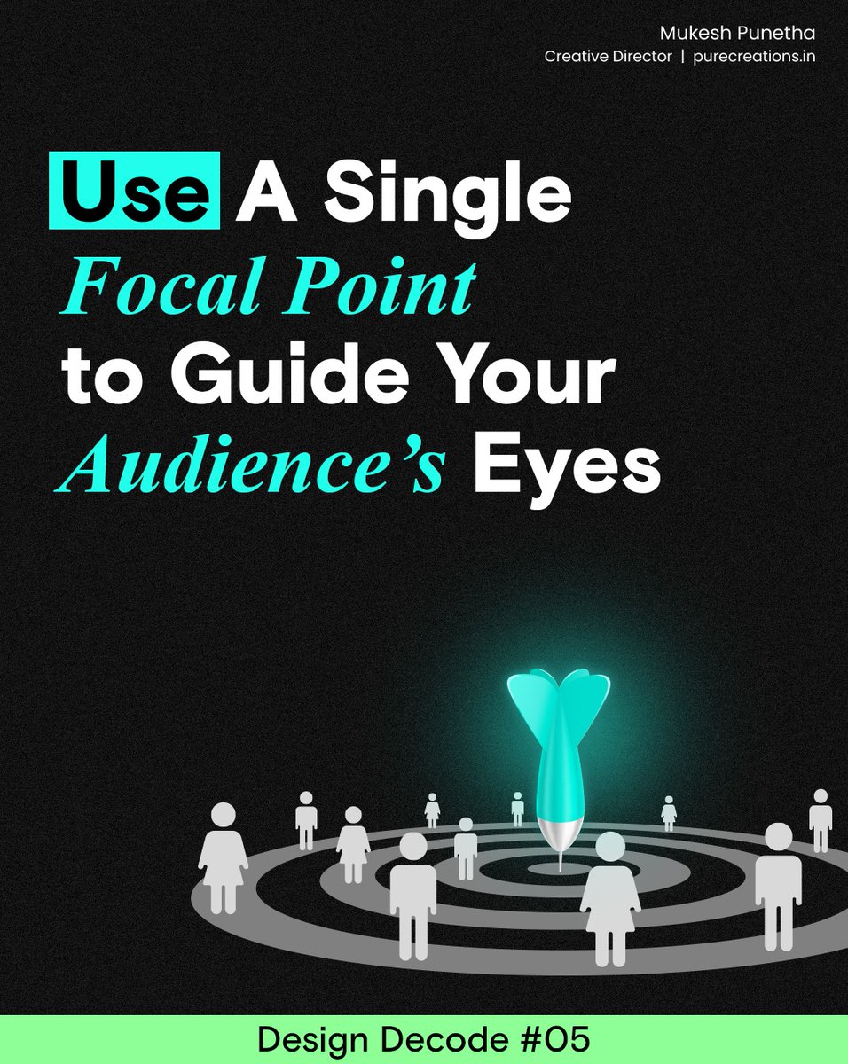
Every great visual has a hero, the element you want people to notice first.
Guide your audience’s attention intentionally and avoid multiple competing focal points.
Focus = engagement.
#BrandingByMukesh #DesignDecode #AttentionTriggers #VisualHierarchy #BrandVisuals #DesignTips
Last Seen Hashtags on Sotwe
Most Popular Users

Elon Musk 
@elonmusk
240.1M followers

Barack Obama
@barackobama
119.3M followers

Donald J. Trump
@realdonaldtrump
111.6M followers

Cristiano Ronaldo
@cristiano
108.7M followers

Narendra Modi
@narendramodi
106.9M followers

Rihanna
@rihanna
97.2M followers

NASA
@nasa
92.1M followers

Justin Bieber
@justinbieber
90.5M followers

KATY PERRY
@katyperry
86.7M followers

Taylor Swift
@taylorswift13
80.5M followers

Lady Gaga
@ladygaga
72.1M followers

Kim Kardashian
@kimkardashian
69.3M followers

YouTube
@youtube
68.6M followers

Virat Kohli
@imvkohli
68.4M followers

Bill Gates
@billgates
63.4M followers

The Ellen Show
@theellenshow
62.5M followers

CNN
@cnn
61.9M followers

Neymar Jr
@neymarjr
60.9M followers

X
@x
60.9M followers

CNN Breaking News
@cnnbrk
59.9M followers