

Top Tweets for #VizoftheWeek

#VizOfTheWeek ☄️🌎 This Oracle Analytics Cloud visualization taps into the NASA Asteroid API to track objects approaching Earth, turning real-time space data into an engaging, interactive dashboard. It’s a great example of how APIs + OAC bring complex scientific datasets to life.
Explore more #DataViz innovations (or submit your own!) in the Oracle Analytics Data Visualization Gallery 👉 https://t.co/ANHkRgnoFy

#VizOfTheWeek ⚡🤖 This AI Energy Consumption dashboard, built in Oracle Analytics Cloud, visualizes how artificial intelligence workloads impact power usage over time. With clear comparisons, trend analysis, and intuitive controls, it highlights a critical topic at the intersection of technology and sustainability.
Explore more #DataViz innovations (or submit your own!) in the Oracle Analytics Data Visualization Gallery 👉 https://t.co/7066NjKNgZ

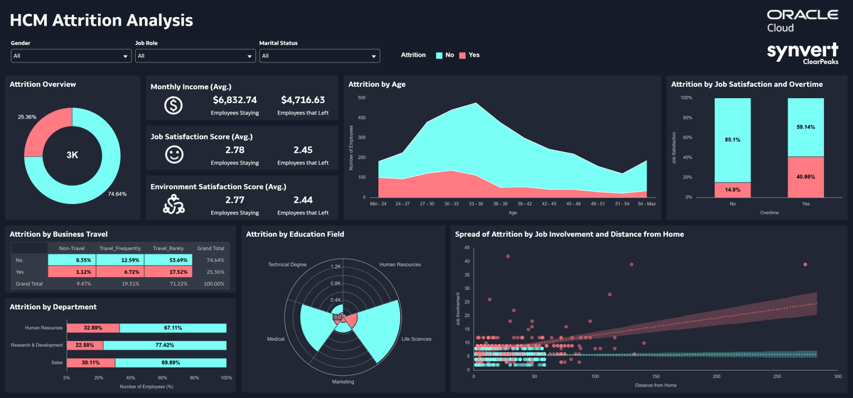
#VizOfTheWeek 📉👥 This HCM Attrition Analysis dashboard, built in Oracle Analytics Cloud, uncovers key drivers behind employee turnover with clear visuals and intuitive drill-downs. It helps HR teams identify trends, understand root causes, and take proactive action to improve retention.
Explore more #DataViz innovations (or submit your own!) in the Oracle Analytics Data Visualization Gallery 👉 https://t.co/t4Ielpgu4x
#VizOfTheWeek 🌙🍜 This Taiwan Night Market analysis, built in Oracle Analytics Cloud, captures the energy of Taiwan’s iconic street food culture through rich visuals and interactive exploration. From vendor trends to visitor patterns, it’s a fun and insightful look at how data brings real-world experiences to life.
Explore more #DataViz innovations (or submit your own!) in the Oracle Analytics Data Visualization Gallery 👉 https://t.co/AemPciLL5b

#VizOfTheWeek 🎓📘 This learning-focused infographic, built in Oracle Analytics Cloud using metrics from Fusion AI Data Platform, turns educational metrics into a clean, engaging visual story. From progress tracking to skill development insights, it shows how #OAC and #FAIDP can make learning data easier to understand and act on.
Explore more #DataViz innovations (or submit your own!) in the Oracle Analytics Data Visualization Gallery 👉 https://t.co/sZSfGrCzul

#VizOfTheWeek 🚢💙 This creative Oracle Analytics Cloud visualization reimagines the story of Jack and Rose on the Titanic, blending data storytelling with cinematic flair. It’s a great example of how OAC can turn even iconic narratives into engaging, insight-driven experiences.
Explore more #DataViz innovations (or submit your own!) in the Oracle Analytics Data Visualization Gallery 👉 https://t.co/6RM3kNS7CY

#VizOfTheWeek ☀️🏁 This interactive dashboard, built in Oracle Analytics Cloud, brings the World Solar Car Championship to life. Created in collaboration with the University of Michigan, it allows fans to follow each solar-powered mile in real time while showcasing the power of analytics for live event tracking.
Explore more #DataViz innovations (or submit your own!) in the Oracle Analytics Data Visualization Gallery 👉 https://t.co/YEXWWQZBz1

#VizOfTheWeek 🧬 Explore “Life Sciences: Patients Dashboard”, a powerful visualization created with Oracle Analytics Cloud for healthcare leaders and researchers. The dashboard provides a clear view of patient cohorts, treatment outcomes, drug and vaccine usage, and demographic trends by age and country. It helps teams identify gaps in care, monitor recovery progress, and improve decision-making through data.
Check out this #DataViz and others or submit your own in the Oracle Analytics Data Visualization Gallery 👉 https://t.co/kJUqo4K08V

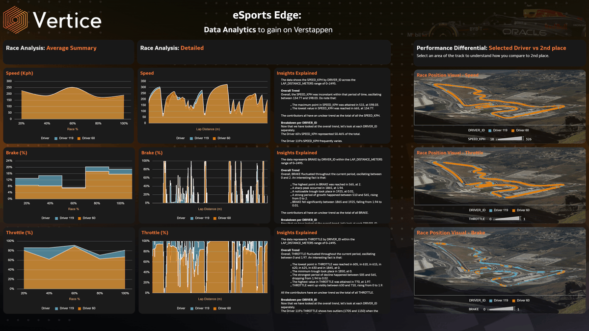
#VizOfTheWeek 🎮 Check out “Esports Driver Comparison”, an engaging analytics dashboard crafted with Oracle Analytics Cloud that dives into competitive esports driver performance across key metrics like wins, reaction time, consistency and team contributions.
Explore the full #DataViz or submit your own analytics masterpiece in the gallery 👉 https://t.co/3z9x4zta1p
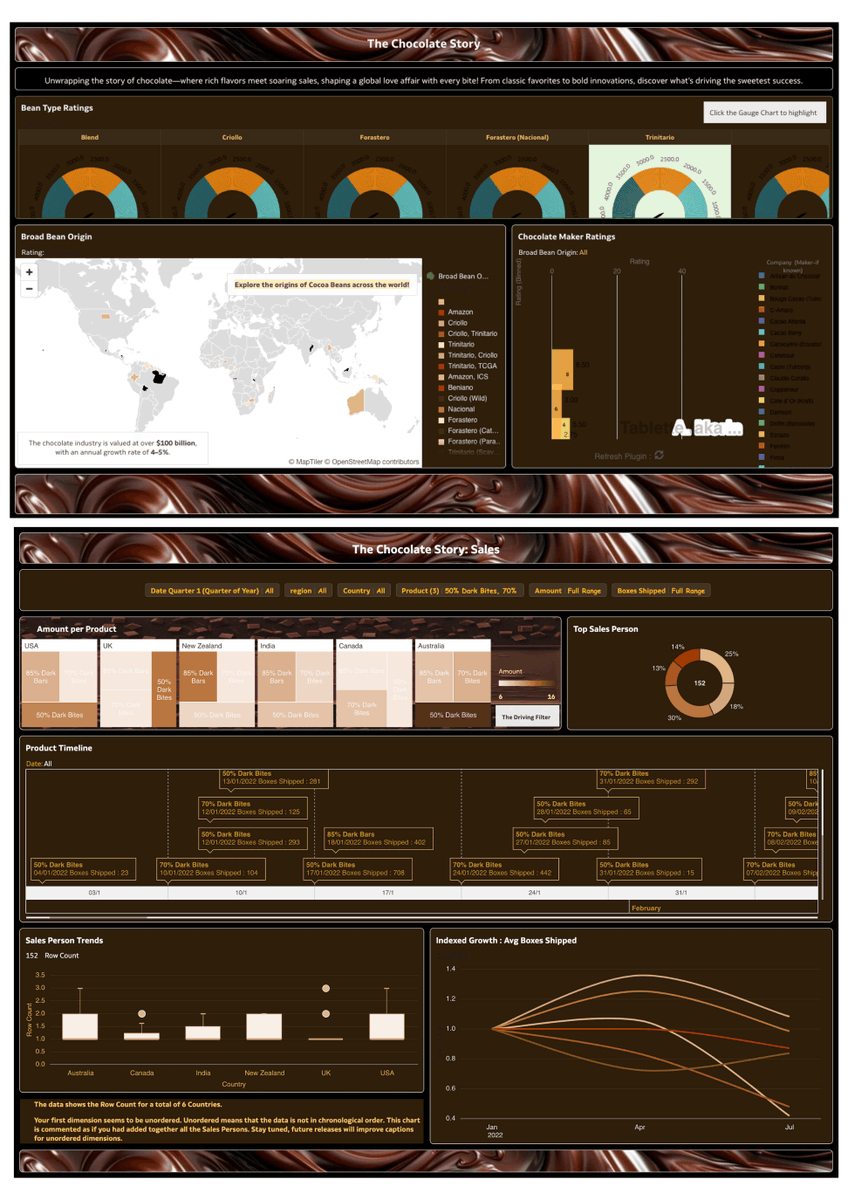
#VizOfTheWeek 🍫 This interactive data-story built in #OracleAnalytics explores how chocolate became a global phenomenon. It blends data on flavors, sales patterns and market trends to uncover what makes certain chocolate varieties irresistible.
Discover more data stories or submit your own to the Oracle Analytics Data Visualization Gallery 👉 https://t.co/9668gx5rSl

#VizOfTheWeek: The HCM Attrition Analysis dashboard created by ClearPeaks focuses on attrition within a company and some employee key attributes that could affect it with the aim to help the Human Resources Department gain insights on why the employees might be leaving the company and how it could be avoided.
Check out more #visualizations in the Oracle Analytics Community's Gallery: https://t.co/FWBGvX9SSL

Chocolate isn’t just a treat, it’s a global phenomenon! 🍫
This #VizOfTheWeek blends data related to chocolate flavors and sales to unveil the story of flavors, trends, and sales insights, revealing what makes chocolate an irresistible success.
Explore Oracle Analytics Data Visualization Gallery for more data stories or upload your own: https://t.co/UlQIJVYhrx

Hi #datafam! Week 10 of #Back2VizBasics is here 🎉
We’re featuring @Blu7ip' viz on "Expenses Asian Americans Worry About" - a clean, powerful take on percent of total.
Read why it stands out 👉 https://t.co/CyR6wVXNHP
#B2VB #Tableau #DataViz #VizOfTheWeek


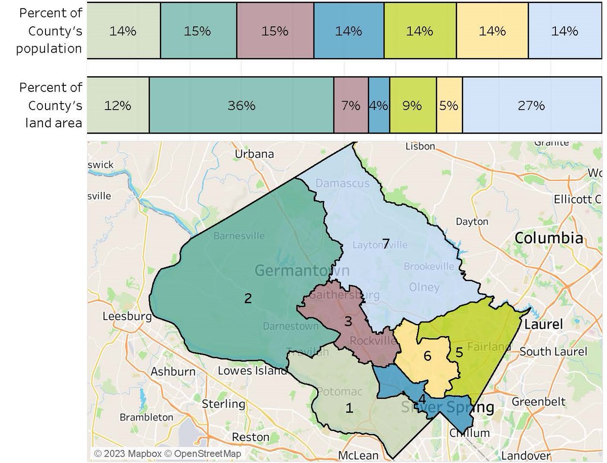
Where the people are. County Council Districts have about the same size population but account for very different percentages of the County's land area. #vizoftheweek
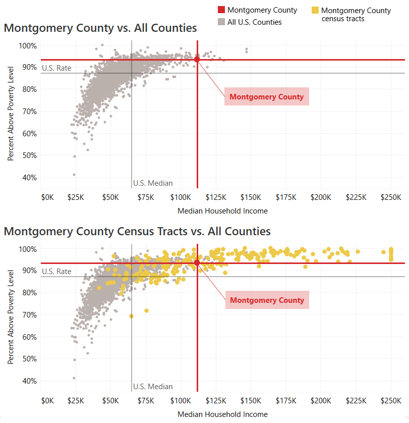
Averages don't always tell the whole story. Montgomery County is diverse in many ways, including economic well-being. #Vizoftheweek
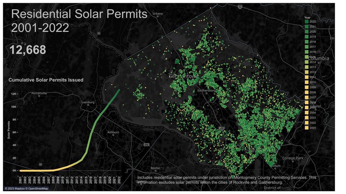
Between 2001-2022 the Department of Permitting Services issued over 12,500 residential solar permits #vizoftheweek
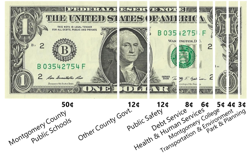
Ever wondered how a dollar of your Montgomery County tax bill is spent? #vizoftheweek
https://t.co/wm4pBSldtU

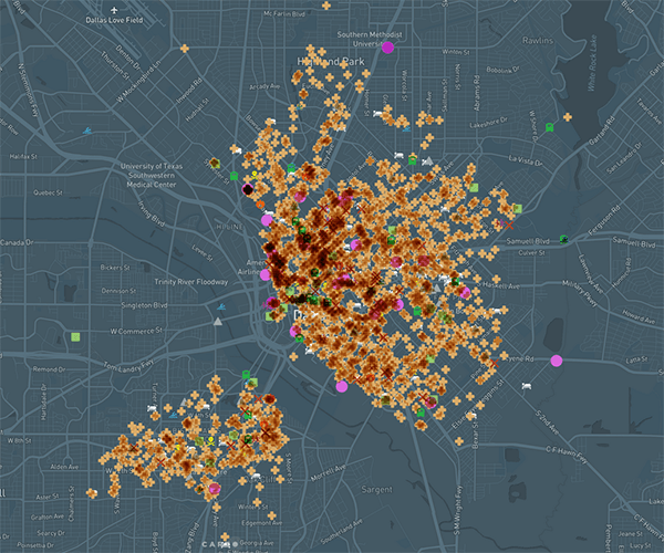
Have you ever wondered which parts of the Dallas area are “haunted”? This interactive map, created by @TejanaArchivist and @isawil_, lets you explore the Big D in a whole new way.
Learn more with this #VizOfTheWeek: https://t.co/j1t1ZE9wz1
#Dallas #DFW #dataviz #datalibs
Many grants, funding agencies, and research publications now require that you deposit your data in an open access data repository.
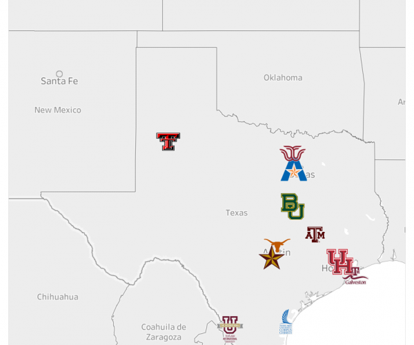
Learn more about our local data repository, UTA Mavs Dataverse, with @Data_Librarian in this #VizOfTheWeek!
Read more: https://t.co/n7R01Ire4T
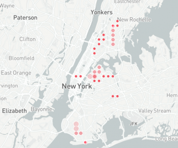
Have you seen our #VizoftheWeek? Join Data Visualization Librarian @isawil_ on a journey through subway growth and transit deserts in NYC on our blog: https://t.co/51GO7e5WS6 #dataviz #datalibs #nyc
Last Seen Hashtags on Sotwe
minichat()*** filter:videos
Seen from Turkey
adanapasif
Seen from Turkey
goonette
Seen from Germany
asian #caption
Seen from Thailand
sonexe
스마타
Seen from Korea
blacked car
Seen from United States
琼明神女录
minichat (**) filter:videos
Seen from Argentina
minichat()**************************************************+filter:native_video
Seen from Belgium
Trends for you
Most Popular Users

Elon Musk 
@elonmusk
241.8M followers

Barack Obama
@barackobama
119M followers

Cristiano Ronaldo
@cristiano
114.6M followers

Donald J. Trump
@realdonaldtrump
111.9M followers

Narendra Modi
@narendramodi
107.2M followers

Rihanna
@rihanna
98.7M followers

NASA
@nasa
92.4M followers

Justin Bieber
@justinbieber
91.8M followers

KATY PERRY
@katyperry
90.1M followers

Taylor Swift
@taylorswift13
84M followers

Lady Gaga
@ladygaga
75.5M followers

Virat Kohli
@imvkohli
73.5M followers

Kim Kardashian
@kimkardashian
70.9M followers

YouTube
@youtube
68.8M followers

Neymar Jr
@neymarjr
66.5M followers

Bill Gates
@billgates
65.3M followers

Selena Gomez
@selenagomez
63.1M followers

The Ellen Show
@theellenshow
62.3M followers

CNN
@cnn
61.8M followers

X
@x
60.7M followers