What do diff-in-diff event-study designs really tell us about the employment effects of min wages?
My new paper with @NeumarkEcon tackles this using the stacked design of Cengiz-@arindube-@attilalindner-@benzipperer and the related LP-DiD design in Dube-Lindner’s HLE chapter. 🧵
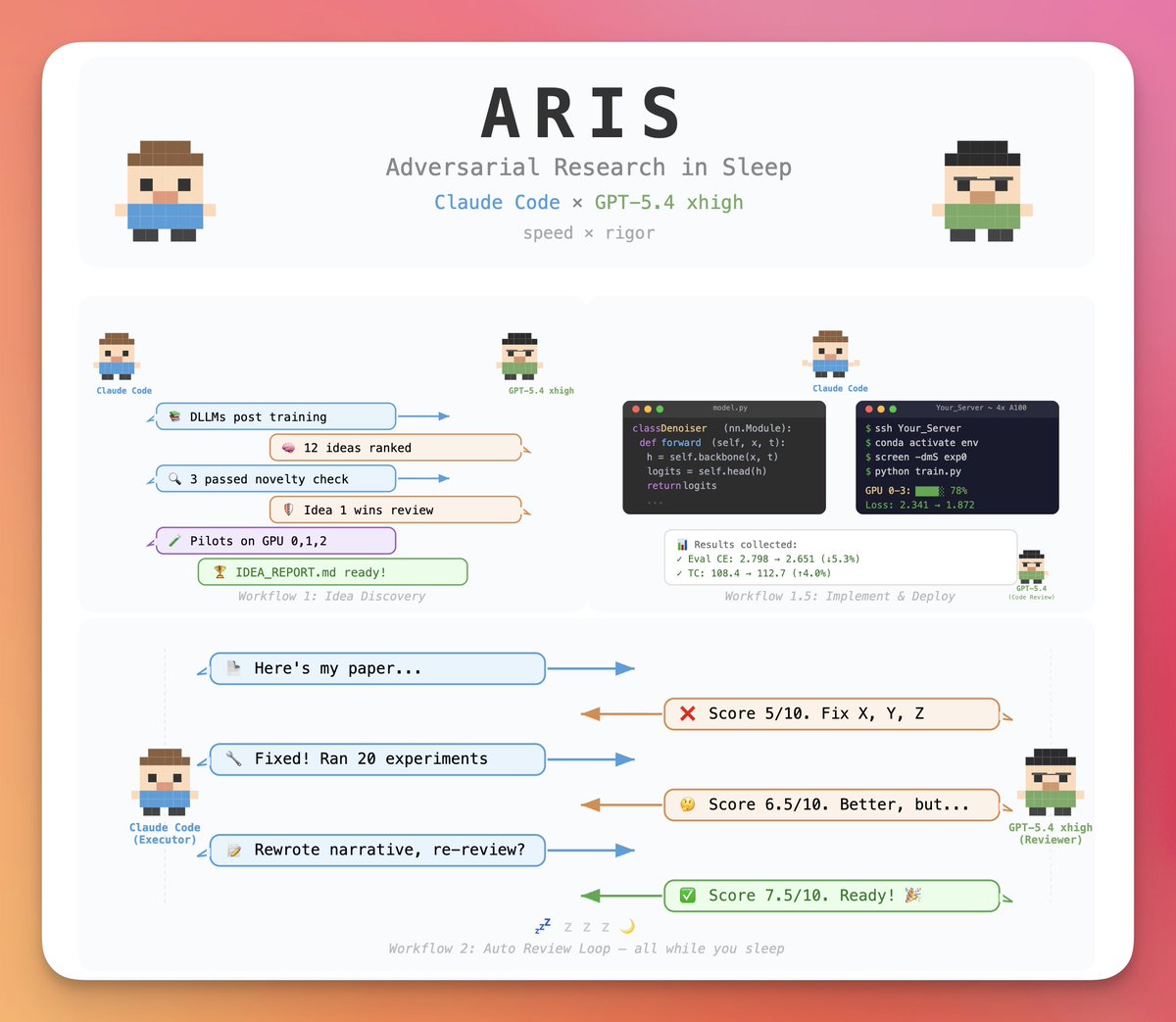
Claude Code can write research papers while you sleep?
But are the papers any good?
A paper written by this was accepted at AAAI 2026 (7/10 — "Good paper, accept").
GPT-5.4 and Claude Code work adversarially to improve papers while you sleep.
Github link in the replies:
gander is an R package that brings AI directly into RStudio or Posit.
Instead of switching between your IDE and a chat window, gander lets you ask questions or request code changes right inside your script. It automatically shares relevant context such as variable names, data types, and the surrounding code, so the model can provide precise answers without extra copy-pasting.
You can trigger it with a simple keyboard shortcut, choose from different AI models (OpenAI, Claude, or local ones), and control how much of your data is sent for context. In short, gander makes working with AI in RStudio smoother, faster, and smarter.
Take a look at the visualization below. It shows an example of how to use gander to create a ggplot2 graph. It’s taken from the package website: https://t.co/DbsZTbsmVK
In a recent Statistics Globe Hub module, you will learn step by step how to use gander for AI-assisted coding in R, write effective prompts, and apply it to real data science workflows.
The Statistics Globe Hub is an ongoing learning program focused on practical skills in statistics, data science, AI, and programming with R and Python.
More info about the Statistics Globe Hub: https://t.co/NA2b7UAXJ4
#AI #DataScience #RStats #Coding #Programming #DataAnalytics #statisticsglobehub
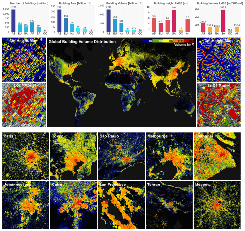
The UN estimates there are roughly 4 billion buildings on Earth.
Researchers have just released the first open dataset providing 3D models for 2.75 billion of them at 3m resolution:
🎉 New: We know great charts take a bit of experimenting. That’s why you can now undo any changes in Datawrapper (Cmd/Ctrl+Z), and use our new chart menu to duplicate, move, copy, and delete charts right from the editor.
Learn more: https://t.co/aVHBOhL7t5
Public Good Alert 🚨
If you’ve ever spent hours merging messy admin datasets reconciling districts/subdistricts splits,merges, or renaming, well, no more!
we(I,@harikv73,@asad__tariq) have built adminlineage, a Py package that uses AI to solve this #AI https://t.co/NtyEvu1OAF
Major update: **fect** 2.2.0 (CRAN)
(again, made possible by Tianzhu @Maple_Optboy & @statsclaw)
Check it out: https://t.co/P9rg4UQHjk
- Supports >2 fixed effects
- Supports unit-specific (linear, quadratic, smooth) time trends
- Supports time-invariant covariates
- Core C++ upgrade to improve convergence
- User-facing model selection based on MSPE
- Major refactoring relative to **gsynth**
- Tons of new visualization options
- Fully reproducible results under parallel computing
- Resolves bloated memory issues
- did_wrapper() & esplot() bug fixes
- and many more....
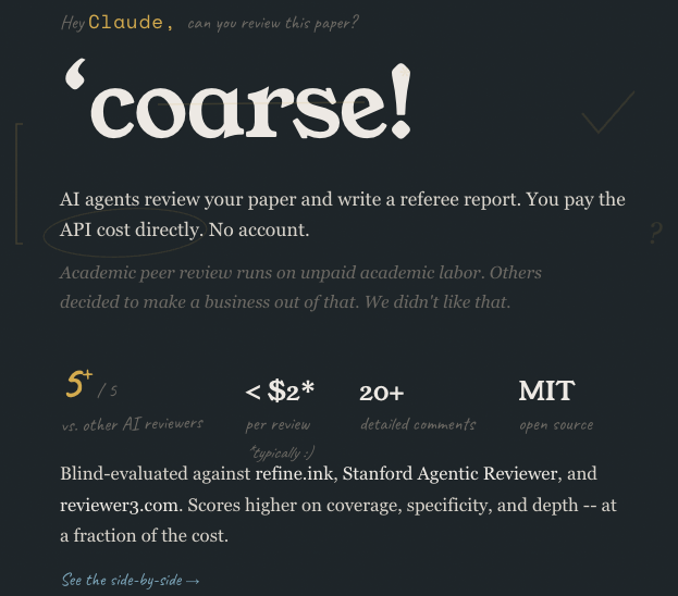
I coded up an open-source, not-for-profit AI paper reviewer that rivals the performance of @reviewer3, @RefineInk, and Stanford Agentic Reviewer (according to @GeminiApp). Costs <$2!
Live @ https://t.co/5m1Srky4H8. Plug in paper, @OpenRouter key, and email. #econtwitter.
In the last few weeks I have been working on automating economics research. With the current advances in AI coding agents, many are trying to produce high-quality economics research at scale by using autonomous swarms of AI agents, but as far as I can see nobody did crack the code yet.
Therefore, I decided to take it on me to design a sophisticated orchestration system that completely automate economic research from idea to full research article. And I think I have done it. Research in economics will never be the same.
The system still needs some tweaking, and it is very expensive, however at this point I can reveal that it produces AER-level research output. I link here the first paper produced with this new system. I would be grateful for your comments.
https://t.co/IhjT3SEV5h
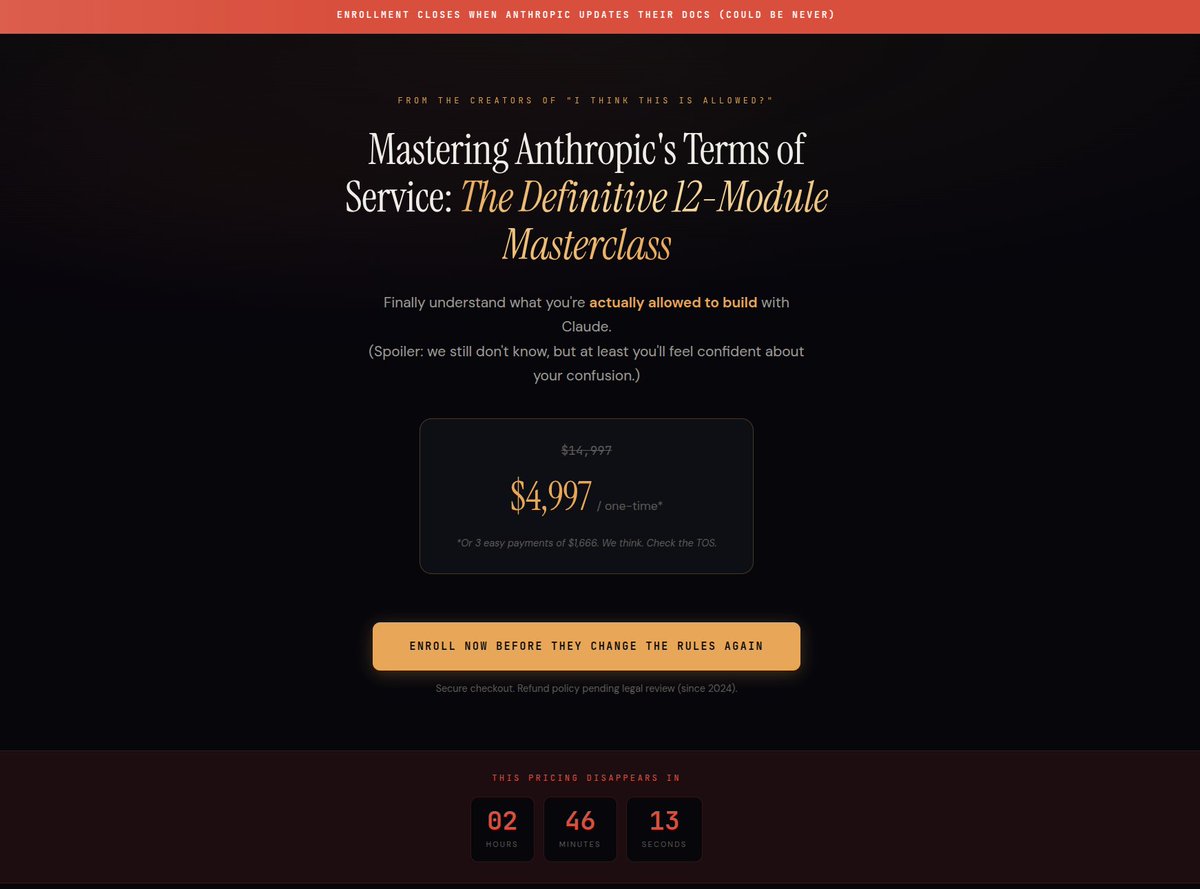
Due to popular demand, I am proud to announce my brand new course!
Mastering Anthropic's Terms of Service: A 12-Module Masterclass
"Finally understand what you're allowed to build."
--------
Here's a quick peek into the course and what you can expect:
Module 1: Is Claude Code a Product or a Suggestion?
Module 2: The -p Flag: Personal, Professional, or Please Don't Sue Me
Module 3: ACP: What It Means and Why Even Anthropic Isn't Sure
Module 4: Can You Ship an App or Just Stare at One Lovingly?
Module 5: Advanced Interpretive Reading of the 1,300-Page SDK EULA
Module 6: Case Studies from Developers Who Tried and Disappeared
Bonus Module: How to tag Anthropic employees on @X for Clarification
------
Join 43,000 confused developers. Lifetime access. No refunds.
Link in comments 👇
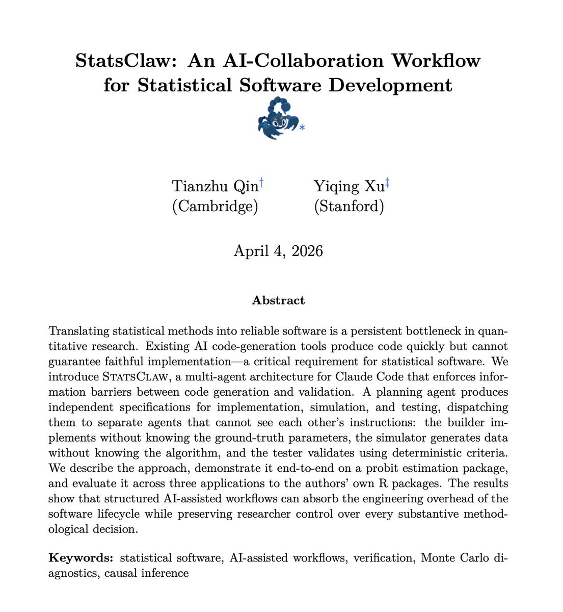
1/ Happy to release StatsClaw — an open-source multi-agent workflow for building statistical software with AI. w/ @Maple_Optboy
Site: https://t.co/4svIckWc4m
Paper: https://t.co/HrzzB4BJcG
🧵1/ Our first meta-science paper (with 350+ coauthors) is published today in Nature. It presents one of the largest-ever reproducibility projects in economics & political science.
Here’s what we found 👇
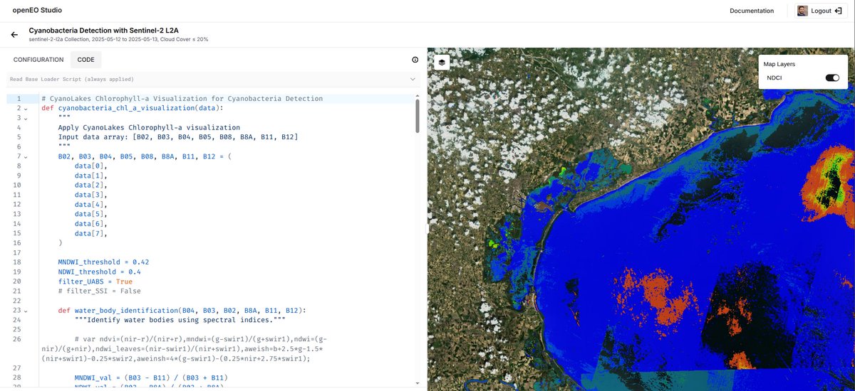
Studying the Earth involves more time downloading files than analysing them.
The European Space Agency holds 90 petabytes of planetary data, and they just fundamentally changed how anyone interacts with it.
For years, working with Copernicus Sentinel data meant pulling massive files from SAFE archives. You had to store them locally, install mission-specific software, and navigate formats built before cloud computing existed. If you wanted to check a single scene for cloud cover, you couldn't just glance at it. You paid a massive upfront cost in time and hard drive space.
That era is now over. ESA's transitioning Sentinel data to Zarr, a cloud-native format that treats data as an API instead of a static file.
So ESA has now launched the EOPF Sentinel Zarr Explorer. Everything happens directly from cloud storage. You don't download a single megabyte of raw data to your machine.
The workflow starts with discovery. The platform uses STAC, meaning you browse the massive catalogue using open community standards. You locate the exact coordinates and timeframes you need instantly.
Then you look at the data. You can load a Sentinel-1 radar or Sentinel-2 optical scene right in your web browser.
Analysis happens in the exact same environment through openEO Studio. You write Python code in your browser, define a processing graph, and execute it. A researcher can track algal blooms in the Venice Lagoon by computing a Normalised Difference Chlorophyll Index, and the result appears instantly as an interactive map. The barrier between a hypothesis and a working environmental analysis is now just a few lines of code.
The developers actively avoided building a walled garden. They collaborated directly with the wider community to establish modular geospatial conventions. Because they built on open standards, desktop tools like QGIS and libraries like GDAL can read the exact same data without any proprietary plugins.
Anyone with a web browser can now run analyses that used to require a dedicated computational lab.
March's @OvertureMaps release is 615 GB, 98 GB more than last month's release and the largest month-to-month jump I can remember seeing.
Buildings alone are 48 GB of that increase. Very few hexagons saw a net decrease in buildings; the global south saw widespread increases.
Some AI+econ opportunities coming up:
1. Schmidt Sciences grants up to $200k https://t.co/zewWcXGDru
2. Microsoft AI economy grants $75k https://t.co/fdMlqUcADK
3. UChicago AI in social science conference https://t.co/n96crYyAOh
Here is Pascaline's Handbook Chapter. Below I provide a thread that focuses on the rural to urban transition in nations that face extreme climatic challenges. Urbanization as a solution isn't discussed in her chapter.
https://t.co/wX5NmMAzMO
Take your data storytelling to the next level with ggalign in R! This powerful extension of ggplot2 allows for precise alignment of complex data visuals, letting you explore trends and correlations across different variables in a single, integrated view.
In this visualization, we see measles cases across U.S. states from 1930 to 2001, with a clear shift after the vaccine's introduction in 1961. The heatmap shows the intensity of cases, with red indicating high case numbers, transitioning to blue as cases decline. Bar charts on the top and right provide cumulative totals by year and state, respectively, giving a comprehensive perspective on the data.
Here’s why ggalign is a must-have for data enthusiasts:
✔️ Rich Context in One View: Align multiple plot types—heatmaps, bar charts, dendrograms, and more—for layered insights.
✔️ Clear Trend Tracking: Aligning panels helps you trace changes over time or across categories effortlessly, perfect for historical or epidemiological studies.
✔️ Smooth Integration: Works with ggplot2, so you can build on your existing knowledge.
Visualization credit and package website: https://t.co/YJfaSaLKqF
Ready to build visuals that tell deeper stories? Join my Data Visualization in R Using ggplot2 & Friends course. Check out this link for more details: https://t.co/ztlEzoEDWv
#StatisticalAnalysis #RStats #VisualAnalytics #datastructure #Rpackage #RStudio #tidyverse