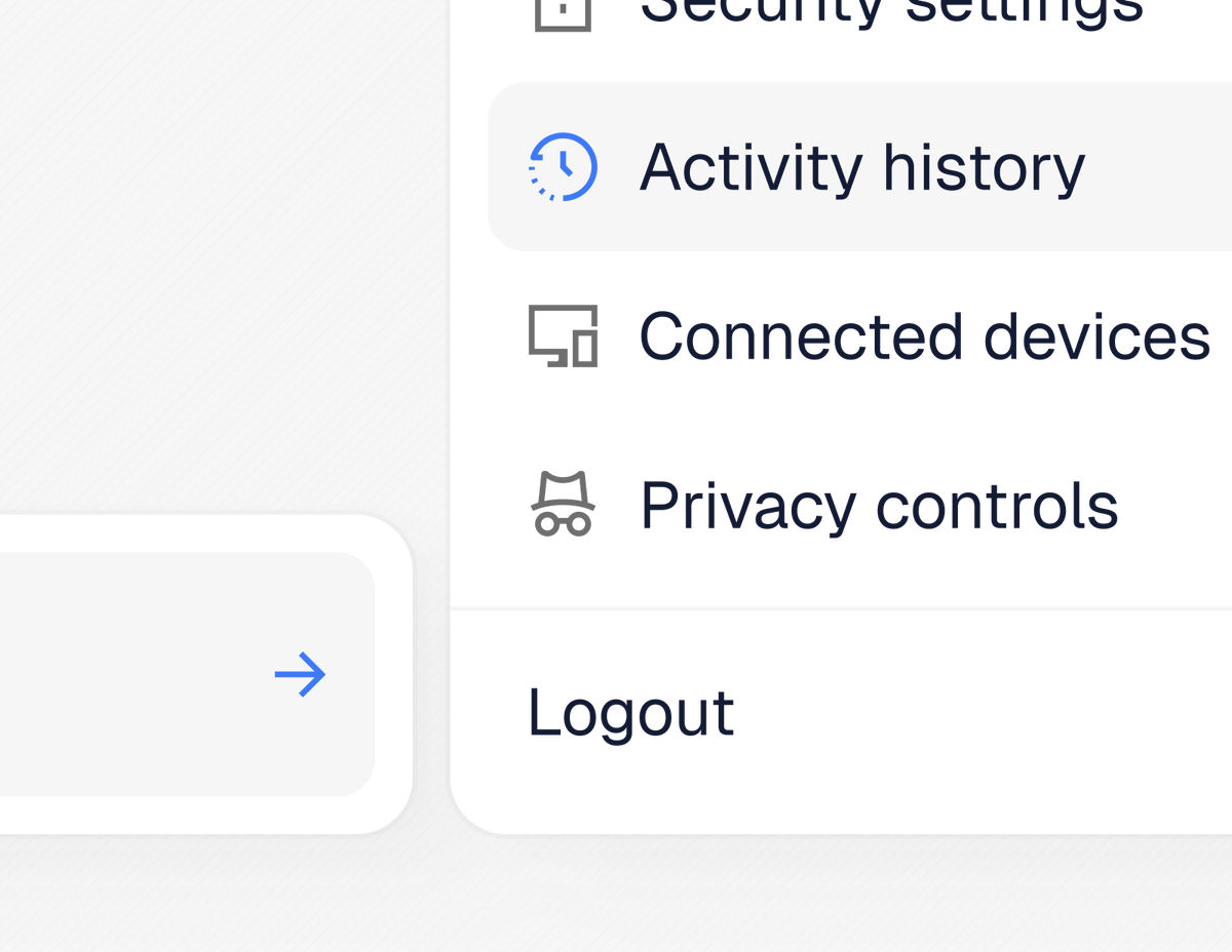
One of the most challenging projects I’ve worked on in a while.
Tons of dashboards, tables, and stats that look super similar. It gets to a point where every screen starts blending together.
I'm currently testing hierarchy options, sheets vs modals, and making sure we have proper UX in place.


![CJfromJBW's tweet photo. Submenu [component + details] https://t.co/kcoXdB5HYc](https://pbs.twimg.com/media/HPHisH-XUAAW6NP.jpg)
![CJfromJBW's tweet photo. Calendar context menu [details] https://t.co/lOQwxWBs9j](https://pbs.twimg.com/media/HPCaLfMXYAAwXTP.png)
![CJfromJBW's tweet photo. Calendar context menu [details] https://t.co/lOQwxWBs9j](https://pbs.twimg.com/media/HPCaLfIXYAARyO_.jpg)
![CJfromJBW's tweet photo. Calendar context menu [details] https://t.co/lOQwxWBs9j](https://pbs.twimg.com/media/HPCaLaDXEAAvqJv.jpg)
![CJfromJBW's tweet photo. Open request [WIP] https://t.co/KvNnhpaEHy](https://pbs.twimg.com/media/HJusLxOXYAAVTyj.png)
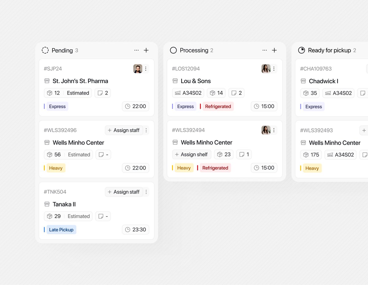
![CJfromJBW's tweet photo. Customize table columns sheet [default and empty states] https://t.co/AndwW48Qxt](https://pbs.twimg.com/media/HBcVOvZXkAAm6vf.png)
![CJfromJBW's tweet photo. Date picker [component details] https://t.co/JPirA2g9wZ](https://pbs.twimg.com/media/HA9fE0JaQAAYqwr.png)
![CJfromJBW's tweet photo. Date picker [component details] https://t.co/JPirA2g9wZ](https://pbs.twimg.com/media/HA9fE0Ba8AAQt9F.png)
![CJfromJBW's tweet photo. Date picker [component details] https://t.co/JPirA2g9wZ](https://pbs.twimg.com/media/HA9fEzhWoAAPa0k.png)


![CJfromJBW's tweet photo. Submenu [component + details] https://t.co/kcoXdB5HYc](https://pbs.twimg.com/media/HPHisJ6WAAATRYH.jpg)
![CJfromJBW's tweet photo. Calendar context menu [details] https://t.co/lOQwxWBs9j](https://pbs.twimg.com/media/HPCaLgnWQAAn1vL.jpg)
![CJfromJBW's tweet photo. Calendar context menu [component] https://t.co/mXshTlh3FM](https://pbs.twimg.com/media/HO9ZFFVXAAAH7Wl.jpg)
![CJfromJBW's tweet photo. Open request [WIP] https://t.co/KvNnhpaEHy](https://pbs.twimg.com/media/HJusLxPXEAApMYn.png)


![CJfromJBW's tweet photo. Role settings [permissions] https://t.co/ghqsExI5yB](https://pbs.twimg.com/media/HIXoxFjWIAA7c3g.jpg)

![CJfromJBW's tweet photo. Logistics status [component] https://t.co/676anUuhYI](https://pbs.twimg.com/media/HIHruriXIAA-vZs.png)


![CJfromJBW's tweet photo. Calendar view [ui component] https://t.co/0yyqLDiToM](https://pbs.twimg.com/media/HEQuUdAWAAAeXBL.jpg)

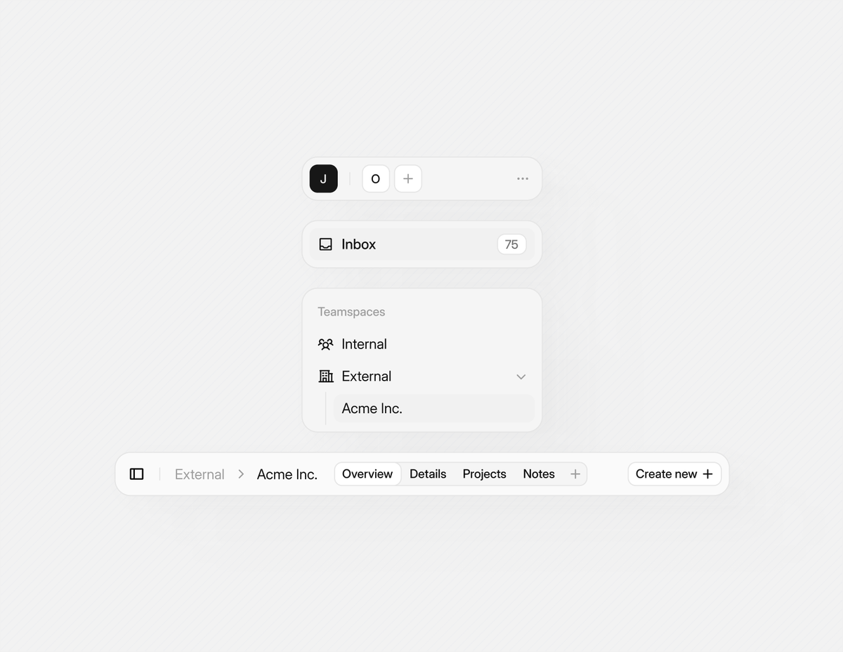
![CJfromJBW's tweet photo. Customize table columns sheet [default and empty states] https://t.co/AndwW48Qxt](https://pbs.twimg.com/media/HBcVOxlWYAAU5Re.png)
![CJfromJBW's tweet photo. Custom table components [built w/ shadcn + central icons] https://t.co/MjeI9U7Mhd](https://pbs.twimg.com/media/HAuCM3easAEsyKX.jpg)
![CJfromJBW's tweet photo. Date picker [component details] https://t.co/JPirA2g9wZ](https://pbs.twimg.com/media/HA9fE2ZaoAELceX.png)