Last chance to register for our Virtual Literary evening taking place tomorrow at 6pm, where you will be entertained by Peter Day, holding a Q&A with John Hilary -> https://t.co/QvKm1ttywd. See you there!
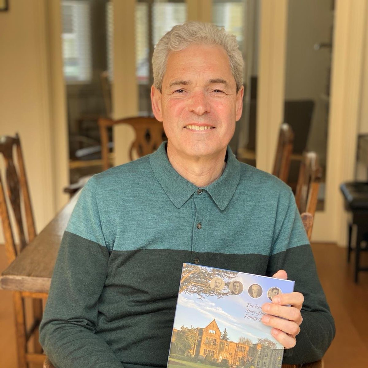
Join us for our next Literary Evening where John Hilary will introduce us to the remarkable story of his German-Jewish ancestors, the Messels, their life in 19th-century Germany, their immigration to London and integration into ‘English society’. Register: https://t.co/fNqWRLMF8k
@Tony_Pritchard_ If only the whole world looked like that. From a cursory look I didn't glean the name of the designer - maybe an ex-DVC by the look of it!
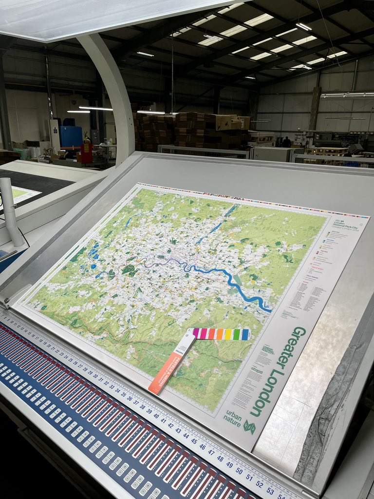
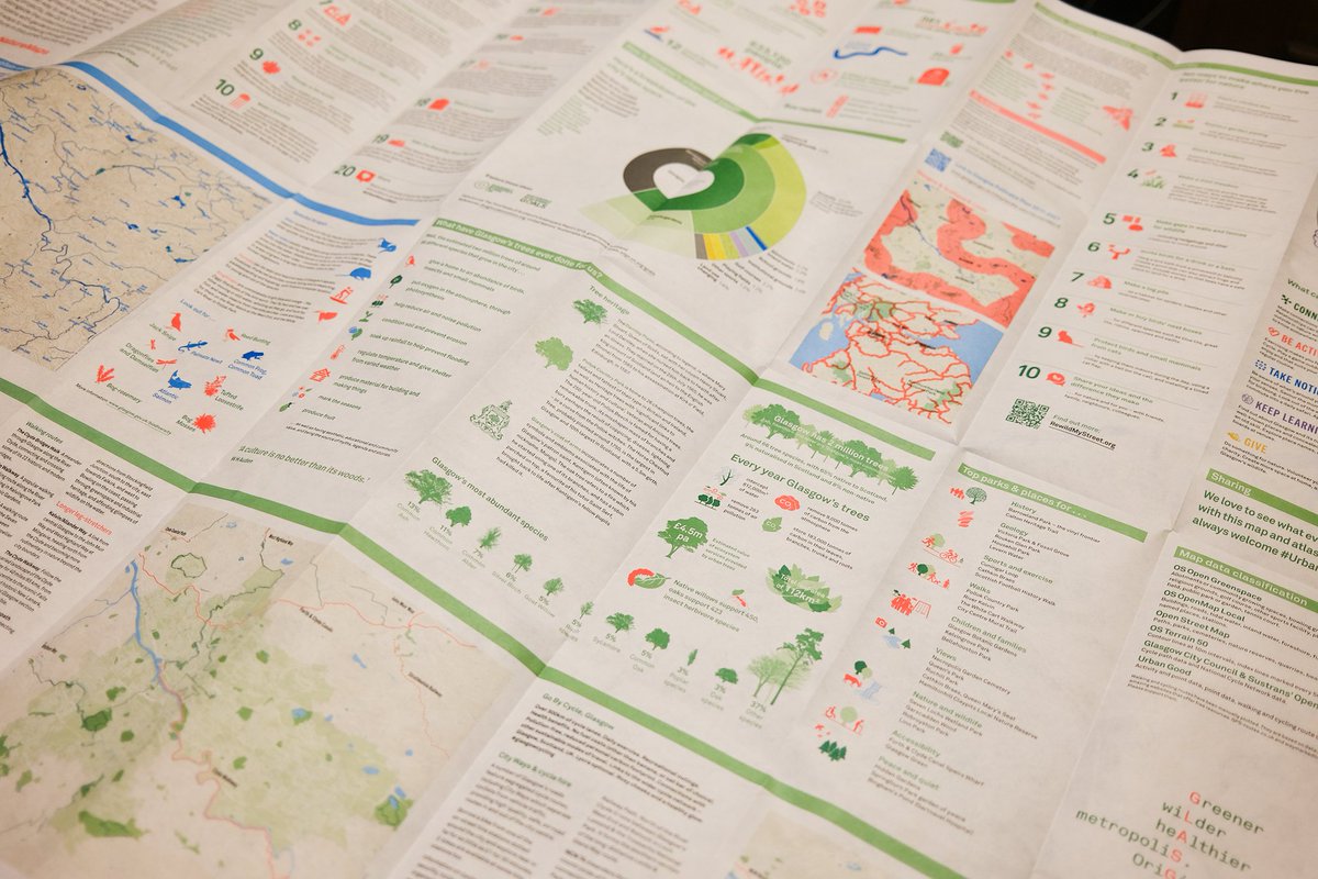
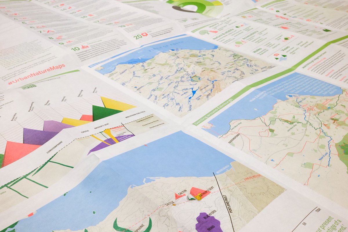
On the reverse is an atlas of information, graphics, & ideas specific to each city. How are green & blue spaces used? How do walking & cycling routes connect? How might you bring ‘five ways to wellbeing’ into your work? What can you do for nature? Turn your map over & explore! 3/
The ambience of this piece was inspired by 'Spiegel im Spiegel' (mirror(s) in the mirror) by Arvo Pärt. It doesn't, however, relate to the musical concept or structure. The idea of the mirror is in the connection between the audio and the moving image. #ArvoPärt#Audio#Animation
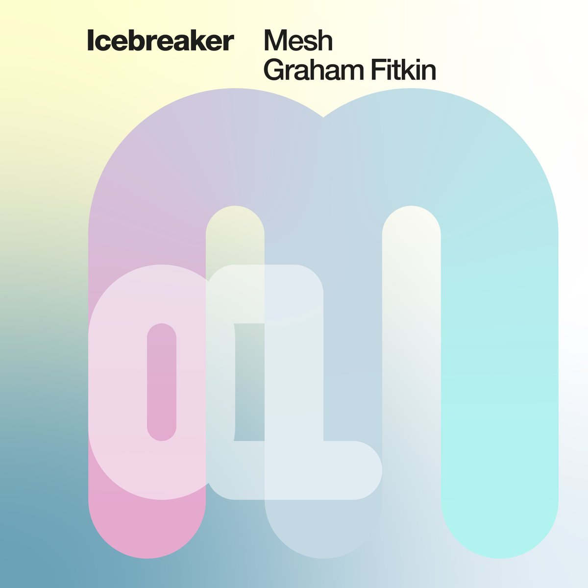
Tomorrow we’re set to release a newly remastered Mesh by @graham_fitkin!
Available on iTunes, Amazon, various streaming services all reachable via https://t.co/z3AWJswDXp
Graphic design of cover art by @Tony_Pritchard_
Part of our one per month series for 2021!
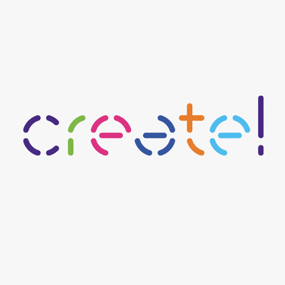
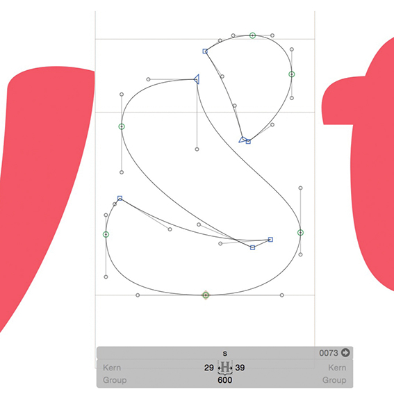
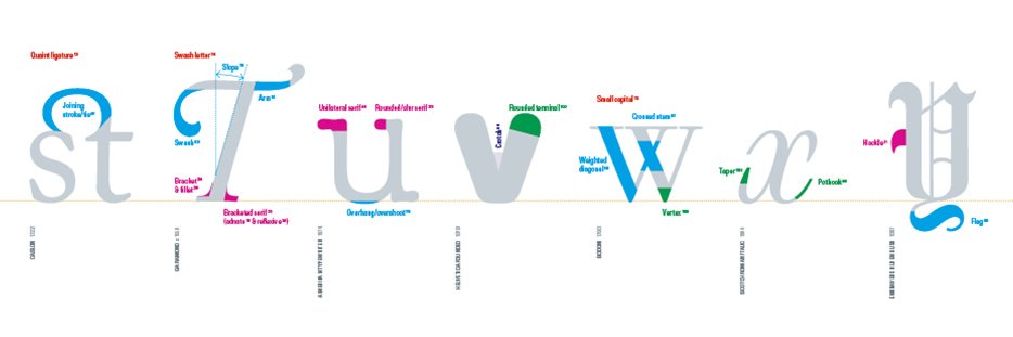
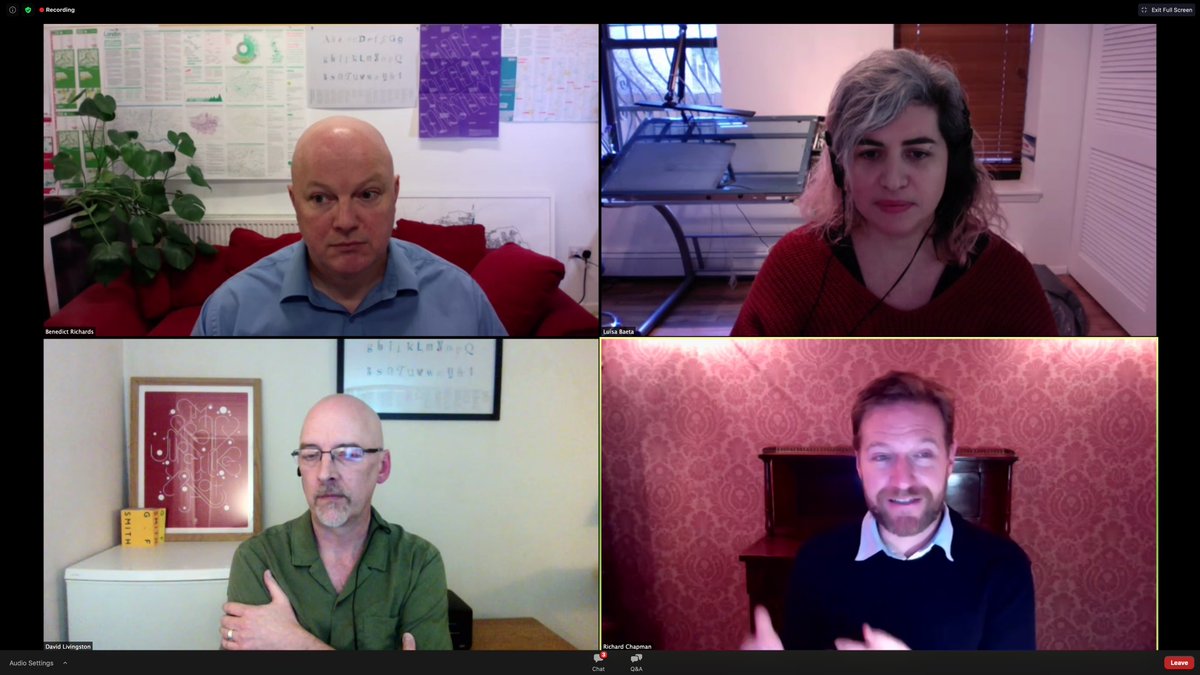
We are excited to welcome our guest speakers to our #typography and #branding event this week to provide insider design views on the topic. Book your ticket now for a chance to listen, learn and engage: https://t.co/ShomgQtaaJ
@Tony_Pritchard_ You mean Marti Caine the entertainer? Always interesting to find out about people’s interests outside their career. Eg Arthur Lowe restored a Victorian yacht!
Join us virtually on 28 January to explore aspects of modern typography and its relationship to #branding, #wayfinding and type on the web. Our guest speakers will share their design perspectives @luisbaeta@richardpchapman @butter_cross https://t.co/ShomgQtaaJ
@Tony_Pritchard_@_MattLamont@JakeTilson The booklets are packed away somewhere so don’t know the exact format - but about one third A4. Strong colours and simple clear typography. No big ideas. I believe the designer was Gordon House.
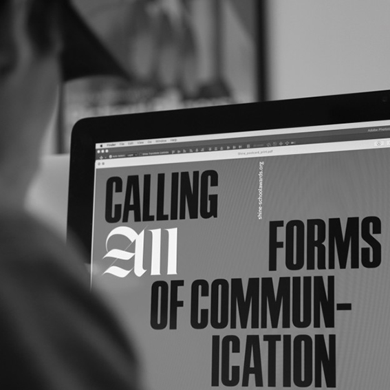
Join us on January 28th for our virtual event on Typography and Branding! A typeface can be the starting point of a project, creating a brand, enhancing a signage system or helping a website appear consistently across browsers and languages. Register here: https://t.co/ShomgQtaaJ