The process behind Chicess started with one question:
"What should people feel when they interact with this brand?"
Not what color should we use. Not what font should we use.
The answer became the foundation of the entire identity: Love. Sweetness. Joy
Finally crossed the finish line Day 30/30 🎉
What started as a challenge became discipline, growth, and a whole new level of creativity.
30 days. 30 designs. No excuses.
On to the next level 🚀
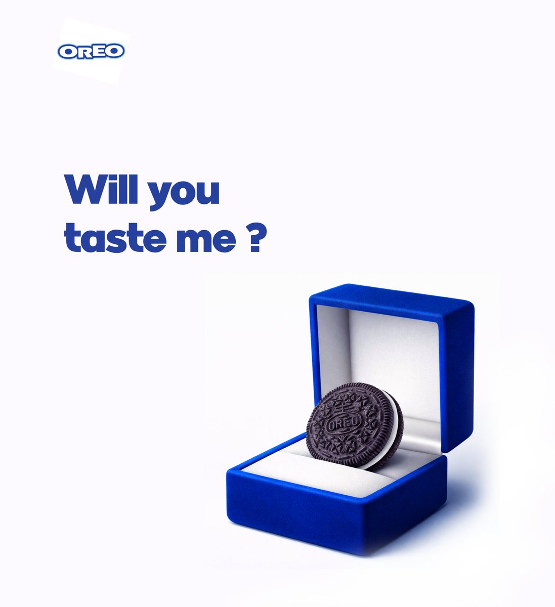
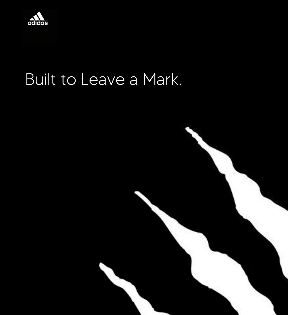
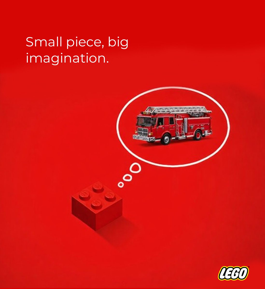
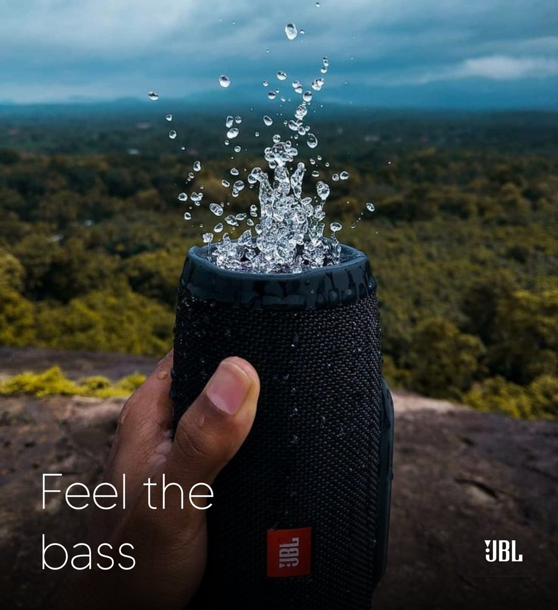
Day 16/30
Featuring @Heineken
Turned a simple bottle into a bold story.
I went minimal on purpose—because strong ideas don’t need noise. Brands don’t just need visuals… they need meaning that sticks.
That’s where I come in. let’s work.
📩 DM for high-impact creative visuals