Your app knows more about your user than you think.
Before they type anything. Before they click anything.
First-time visitor? IP gives you their city. Show their area immediately. No blank search box.
Returning visitor? You remember what they searched last time. Show it before they ask.
Most SaaS products treat every visitor the same. Empty screen. Start from zero.
The best ones already know you.
2 levels of personalization before they do anything:
→ First visit: location from IP
→ Return visit: last session from cookie
Use both. The faster users reach value, the more likely they come back for it.
"Our feature isn't getting used. We need to rebuild it."
Not always.
Sometimes low adoption just means bad discovery.
Financial agents at Fingo, a €20M ARR financial brokerage, were missing most product training webinars.
Not because webinars didn't exist.
Because agents didn't know when they were happening.
Checking institution websites manually. Waiting for newsletter announcements. Hoping managers would forward invites.
I designed a webinar hub that centralized discovery.
One screen. All institutions. Calendar sync. Push notifications.
Attendance tripled.
Before rebuilding your feature, make sure users can actually find it.
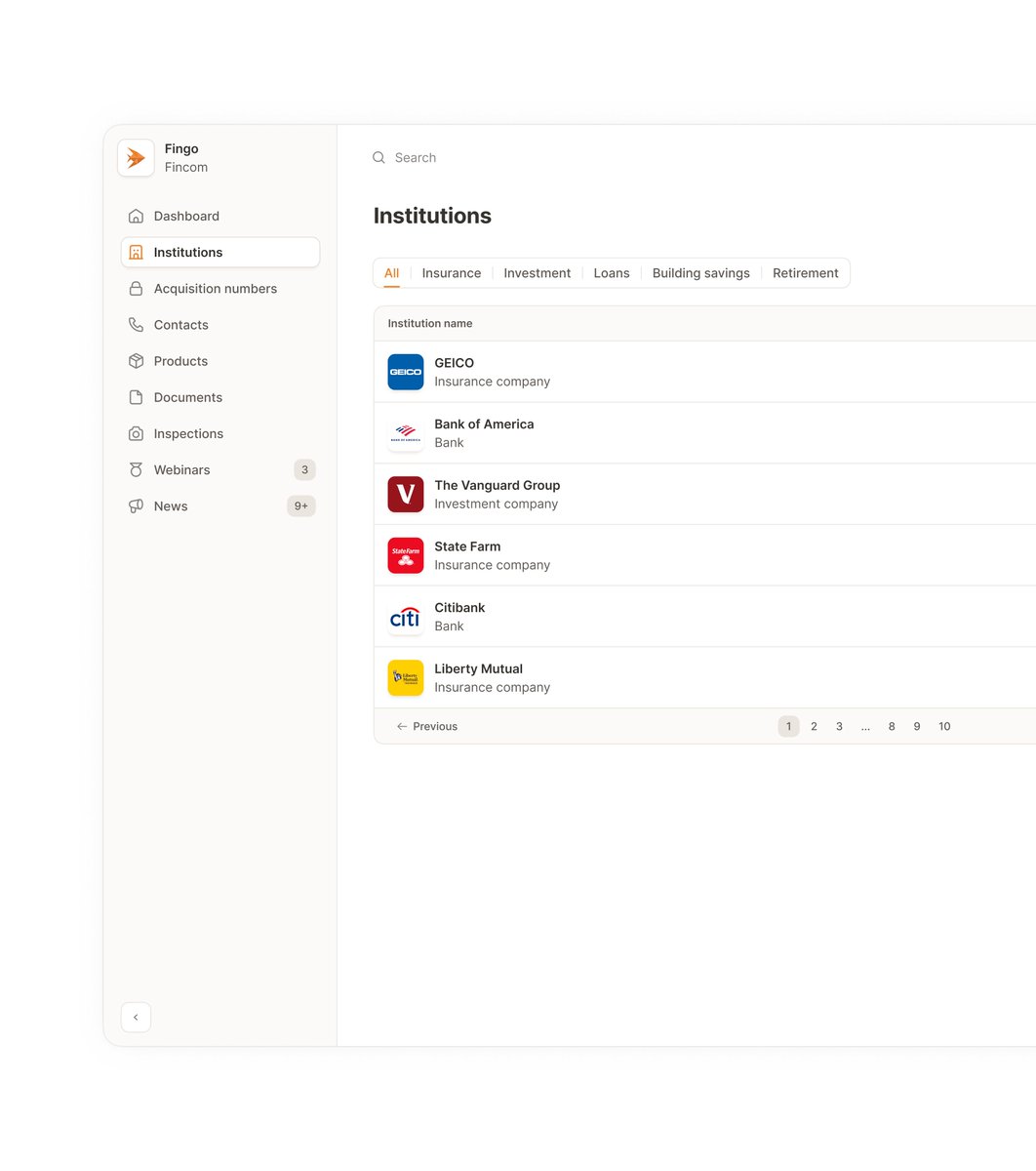
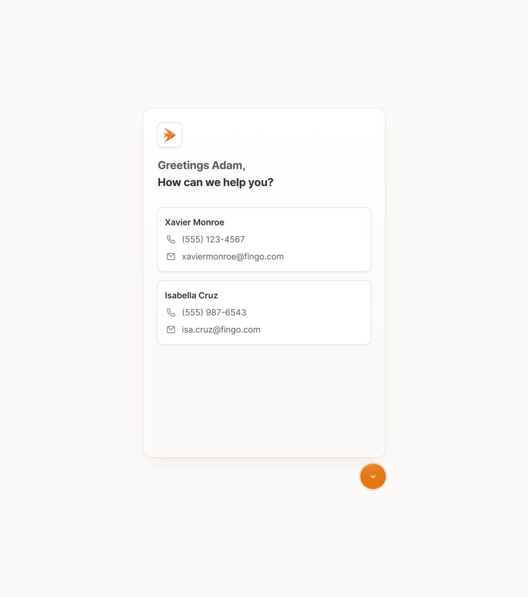
Financial agents at Fingo work with 20+ institutions.
Each institution updates constantly. New contract versions, new contacts, new product terms.
An agent needs to close a mortgage today.
Finds the contract in email. Version 2.3 from November.
Client signs.
Institution rejects it. They updated to version 2.7 last month.
Agent looks incompetent. Client frustrated. Deal delayed.
I designed Fingo's institution directory to solve this.
Every institution with current contracts, active contacts, and valid materials in one place.
No more guessing if you have the right version.
Agents shouldn't waste time hunting for the current version.
3,000 financial agents at Fingo had the same problem.
Mid-call with a client. Need an institution code to complete the contract.
Check the PDF in email. Wrong number. Outdated six months ago.
Try the website. Different contact there.
Client's waiting. Deal's getting cold.
I built Fingo's dashboard to solve this.
Real-time institution data. Codes. Contacts. Products. Terms.
On desktop. In their pocket. Favorites for what they need most.
Most AI tools switch modes instantly.
Users see a different screen. No explanation. They're confused about what changed.
For Pressmaster, I built a tab component that animates the transition when AI takes control.
The tabs scale and shift to the new screen. Users watch the mode change happen.
It's not about making tabs look good.
It's about removing friction: Users see what's happening, trust the process, and let AI do the work.
Remove confusion, get better adoption.
This is fractional design for funded products.
Design isn't slow. Rebuilding is.
Startups skip design to ship faster.
Then spend months rebuilding what they got wrong.
Catching a broken user flow in Figma takes an afternoon.
Catching the same issue in production takes days of work.
I've watched this pattern repeat. Skip the design phase, pay for the decision later in dev time.
Speed matters. Direction matters more.
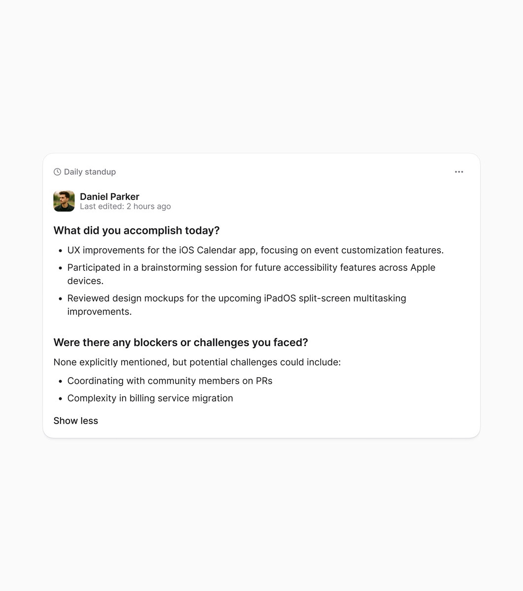
A 30-person product team spent 2 hours every week manually collecting data for standup summaries.
I analyzed their workflows to find where the time went. Then designed a standup tool to automate collection by connecting their existing tools.
GitHub, Figma, the rest of their stack.
For this team size, that's roughly €8k+ in monthly labor cost eliminated.
I won't use Figma prototypes again.
Tested @figma Make this weekend.
Took one of my designs, turned it into code. Pixel perfect. Added micro-animations, delays, all the small behavior that makes UI feel right.
The prototype I built feels better than what FE developers usually code from my designs. I could finally add the exact emotions and feelings I wanted. The personality that gets lost when you're just describing it in handoff notes.
This is what I've been trying to write in handoff docs for years. "Add 200ms here." "This needs to feel snappy." Devs read it, nod, then it gets deprioritized or lost in translation.
Now I just build it. Takes me less time than writing the doc and doing QA rounds.
When designers can code their own work, apps get personality. All those tiny details that usually die in "phase 2" don't die. The emotions, the feelings, the small moments that make people actually enjoy using something.
This is a new level for designers. The quality bar just moved.