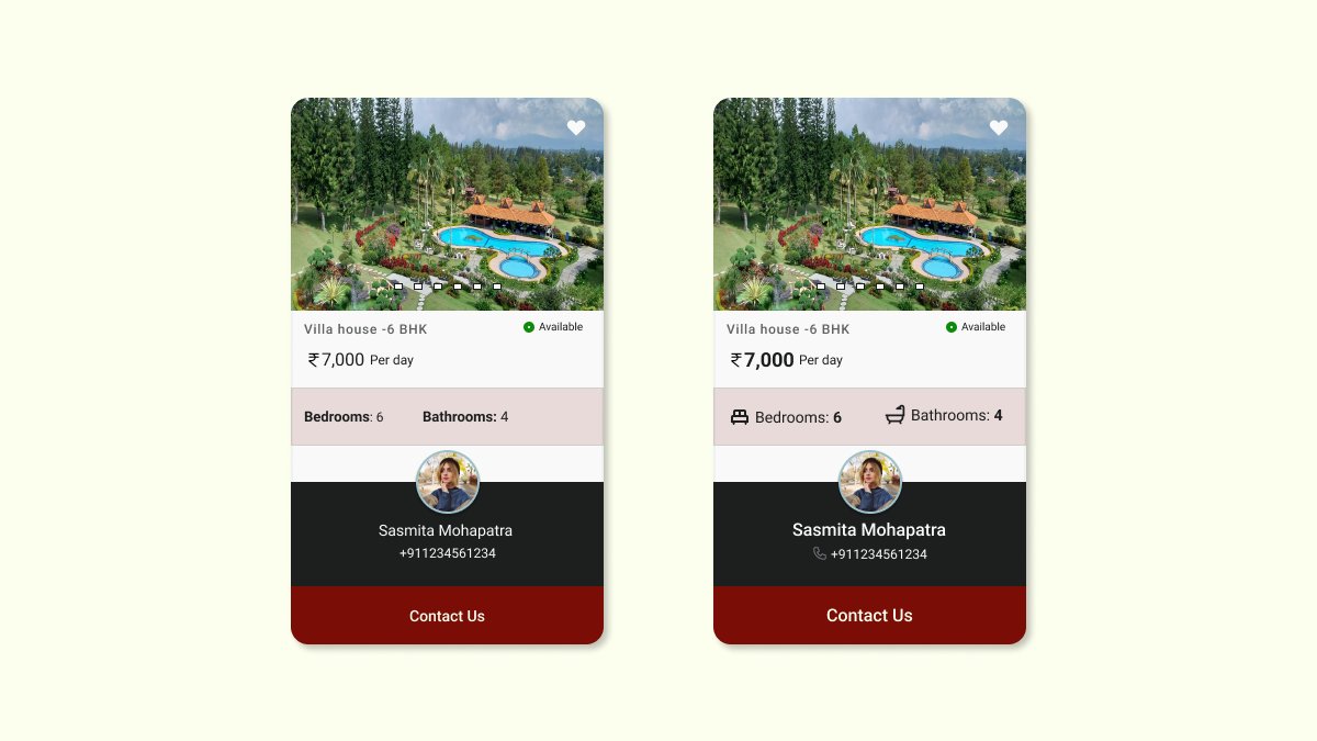
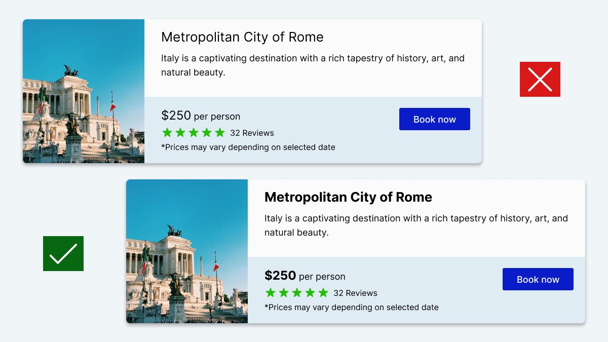
Combining labels and values into a single unit enhances readability and styling flexibility. This approach allows for clear and organized presentation of data, without losing clarity. In my design I will go for design 2 instead of 1 because of the following reason.
Effective hierarchy involves using a combination of font sizes, weights, colors, spacing, and other design elements to guide users through content intuitively. This ensures that important information stands out appropriately without overwhelming or neglecting secondary details.
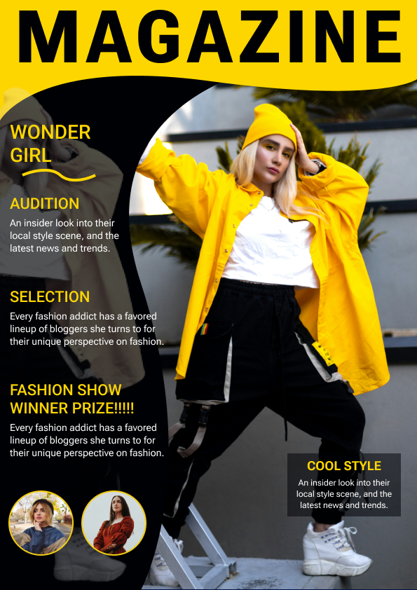
Today I designed another magazine Article page. I will really appreciate if you guys give some feedback. Thanks, have a wonderful day.
#uidesign#graphicdesign#magazine#figma
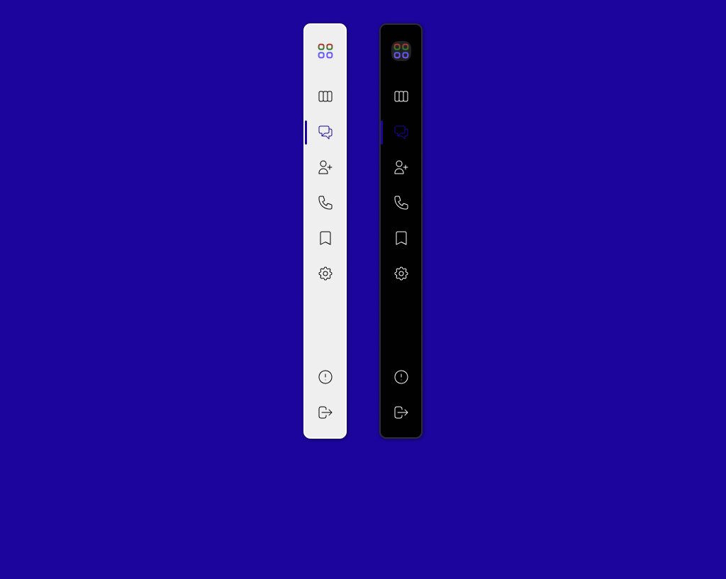
Hi guys 2nd day of my design work. please feel free to give me some feedback I really appreciate it. If anyone is interested to design their page kindly ping me. If you can provide me the content, I could design according to your preference. Thanks
#uidesigner#figma
Hi guys please give some feedback on my magazine design work. your feedback will really help me to improve. I am starting my new journey from today 🤞
#uidesign#magazinecoverdesign
Hi guys after along break I here again to refine my UI skill. So, I have stated to do daily UI challenge. Please have a look .#dailyuichallenge#uidesign