Not much of a Twitter guy, but I’ll use this opportunity to let you know https://t.co/Z3WYyXLG64 was just launched and I couldn’t be more happy about it. Buy fonts, check our client work or just peek the background stories behind each release 🙌
We are pleased to welcome 🔥 @hottypeco 🔥 to Fontstand! The founder Marko Hrastovec has built a small collection of crafted contemporary typefaces that build on top of historical models and cultural legacy, with high quality execution and exciting shapes.
https://t.co/9YCVHy2mQg
🔥 NEW HOT WORK: https://t.co/R7fAANAjIk 🔥
I’m honored to have participated in the creation of the digital home for the one and only type foundry in Croatia Check the behance case: https://t.co/FMLKb8ggx9 🔥 Marko Hrastovec @hottypeco#design#typography#type#UI#ux
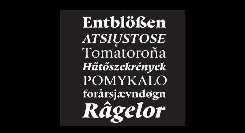
Hot Sans - straightforward, rational by choice and loosened up just enough. It balances between geometric sans and grotesque shapes, a blend of flavours that two genres bring to the fore. Read the full story on our website https://t.co/2osems1ZxQ
⚪️ The Roundup — a look back at the articles we published last week.
Featuring @FedrigoniUK and @tmstudio_, Scandinavian Design Group, @hottypeco, @open_under, @GraphicalHouse, Post-Spectacular Office, Hymn, @HybridDesignSF and Frost.
See more → https://t.co/9YP4ugMBtb
Not much of a Twitter guy, but I’ll use this opportunity to let you know https://t.co/Z3WYyXLG64 was just launched and I couldn’t be more happy about it. Buy fonts, check our client work or just peek the background stories behind each release 🙌
'Tis the season for more award-winning typeface designs! Here, Punta Display by Marko Hrastovec @markhrast of #Zabreb#Croatia It's one of the top typefaces of the year from the TDC65 competition now on view in Lublin Poland at House of Words: https://t.co/43wugAh8P9
@connordavenpo @monokromfonts @theoriginalecs@djrrb Sounds like a better part to leave out but personally I’d tried to figure some space inside even for a small bit :)
@connordavenpo @monokromfonts @theoriginalecs@djrrb Being native to croatian that uses /Đ, I’ve rarely (if any) seen /Đ without outside part of the bar. In serif/slab it makes sense to even remove the top serif in /đ. It might be weird but if it works...
Celebrating our award-winning #typeface designers! Marko Hrastovec @markhrast of #Zabreb#Croatia for Punta Display ! See it M-TH at @coopertype@cooperunion through August 9: https://t.co/SL2nfbr475