The running list of IO job market candidates for 2026-2027 is live!
Fill this out to add your info if you are an econ job market candidate in industrial organization this year: https://t.co/GOu94fdAhb
Running list here: https://t.co/xoZjHSslRa
#RDDers: check it out.
rd2d: Causal Inference in Boundary Discontinuity Designs
"This article introduces the R package rd2d, which implements and extends the methodological results developed in Cattaneo et al. (2025) for boundary discontinuity designs [like geographic RDDs]."
Half of all new US EV registrations, 2012–2023, went to the top 10 percent most Democratic counties, from Lucas W. Davis, Jing Li, and Katalin Springel https://t.co/okvIiDg4cy
Last year, we published a paper showing that AI models can "debunk" conspiracy theories via personalized conversations. That paper raised a major question: WHY are the human<>AI convos so effective? In a new working paper, we have some answers.
Co-authors: @GordPennycook@DG_Rand
TLDR: facts
I think the research uses are obvious here. I would also say, for academia, the amount of AI slop you are about to get is *insane*. In 2022, I pointed out that undergrads could AI their way to a B. I am *sure* for B-level journals, you can publish papers you "wrote" in a day. 8/x
What deeply affects us, is largely invisible, but is right before our very eyes? Our socio-economic backgrounds. As a trucker's son, I have felt this but having some evidence is always useful.
And, a fabulous new study from a superstar group of scholars estimates such effects for academics. One passage that jumps out for me: "academics from poorer backgrounds introduce more novel scientific concepts, but are less likely to receive recognition, as measured by citations, Nobel Prize nominations, and awards."
It gives some hope that while we might not know the hidden curriculum or have the fancy degree, our different views of life can be our super power! First gens everywhere should be celebrating, not hiding, our backgrounds.
https://t.co/cbGGMeCv7S
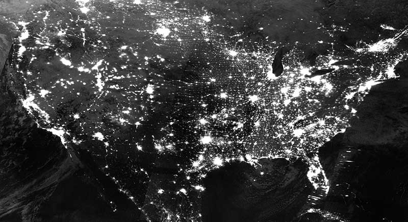
Soon we won't be able to use nightlights as a proxy for economic growth.
Why?
It's due to limitations of its spectral bands.
Here's the breakdown in simple terms:
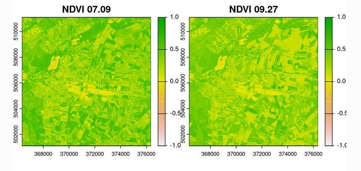
There is a new blog post at #geocompx:
"An overview of the rsi R package for retrieving satellite imagery and calculating spectral indices" by Mateusz Rydzik.
Read it at https://t.co/0m62VRIlNp
#rstats#remotesensing#stac
Global poverty is commonly measured by counting the number of people whose consumption falls below a given threshold.
This approach overlooks an enormous component of people’s economic well-being: public goods. 🧵
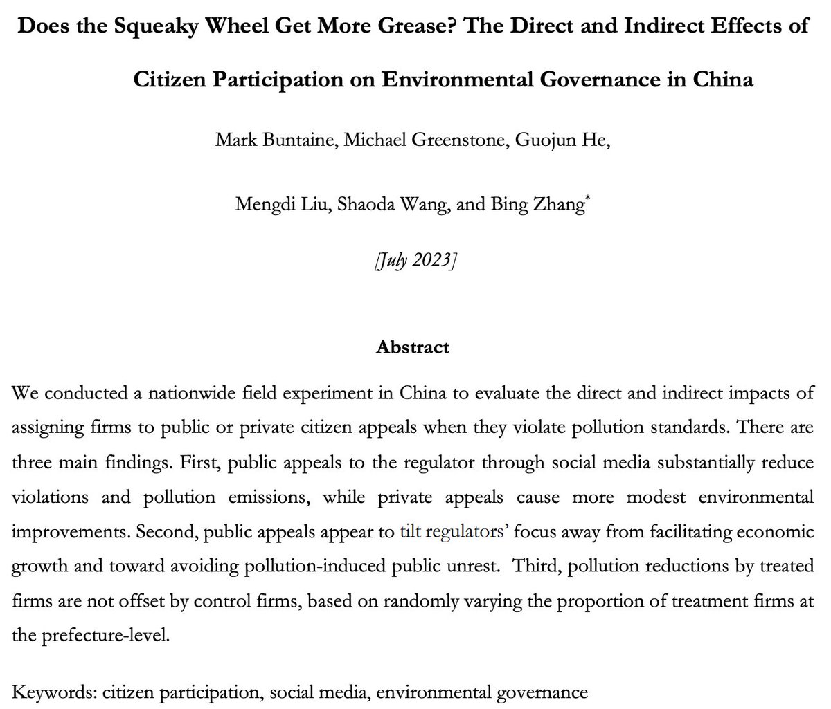
Now conditionally accepted at @AEAjournals AER (pending third party data/code verification).
We show that public complaints against polluting firms in China significantly increase compliance with emissions standards. Read the paper here:
https://t.co/8o2I9Kgzjn
Dropping a new guide on the latest @Stata map package: #geoplot, by Ben Jann. The Guide provides a comprehensive step-by-step walkthrough for this highly flexible and customizable package:
https://t.co/CMON8okUHz
Today, I started as Senior Economist at the @WhiteHouseCEA working on climate, energy, and environmental policies. I am proud and grateful of this opportunity to serve my country (and a bit awed by it). Thanks to @BrenUCSB@EconomicsUcsb@emLabUCSB colleagues for their support.
Heard today that a relatively high ranked econ journal has an accepted paper backlog of *a few years* -- such that a paper accepted for publication now won't get an official timestamp until 2024+ (!)
Is this common? Seems wild to me
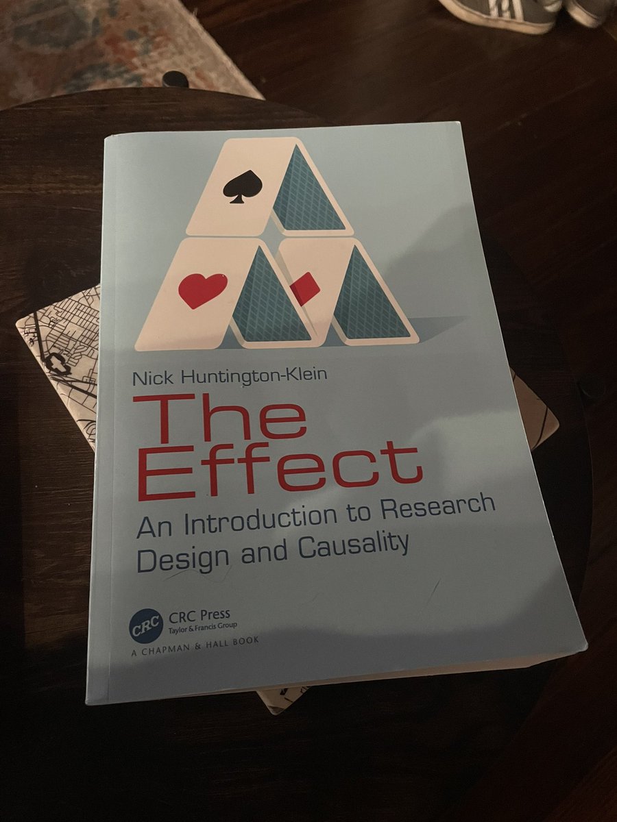
All kidding side, @nickchk really has created an impossible book. Every student, everyone new to design based causal inference, everyone who wants to use DAGs all the time — they need this. It’s absolutely brilliant.
Footnotes suck, at least in economics writing. There is no better way to make your referee or editor cranky than using tons of footnotes. Strive for zero, especially in the introduction, which should read like a short story. End up with a single-digit number.
As requested, slower graphs! Also added a graph on collider bias, the webpage explanation helps there.
These graphs are intended to show what standard causal inference methods actually *do* to data, and how they work.
This is what controlling for a binary variable looks like:


![JohnHolbein1's tweet photo. #RDDers: check it out.
rd2d: Causal Inference in Boundary Discontinuity Designs
"This article introduces the R package rd2d, which implements and extends the methodological results developed in Cattaneo et al. (2025) for boundary discontinuity designs [like geographic RDDs]."](https://pbs.twimg.com/media/Gq821ZjWgAA9I3K.jpg)
![JohnHolbein1's tweet photo. #RDDers: check it out.
rd2d: Causal Inference in Boundary Discontinuity Designs
"This article introduces the R package rd2d, which implements and extends the methodological results developed in Cattaneo et al. (2025) for boundary discontinuity designs [like geographic RDDs]."](https://pbs.twimg.com/media/Gq820xRWYAANm6x.jpg)
![JohnHolbein1's tweet photo. #RDDers: check it out.
rd2d: Causal Inference in Boundary Discontinuity Designs
"This article introduces the R package rd2d, which implements and extends the methodological results developed in Cattaneo et al. (2025) for boundary discontinuity designs [like geographic RDDs]."](https://pbs.twimg.com/media/Gq820IjXUAAubD7.jpg)



![JohnHolbein1's tweet photo. “Just 27% of [academic] mothers get tenure, compared with 48% of fathers and 46% of women without children.”
https://t.co/JjfPLtPn35 https://t.co/BrnKcOtXsm](https://pbs.twimg.com/media/GC8v0iSXYAApoZP.jpg)
![JohnHolbein1's tweet photo. “Just 27% of [academic] mothers get tenure, compared with 48% of fathers and 46% of women without children.”
https://t.co/JjfPLtPn35 https://t.co/BrnKcOtXsm](https://pbs.twimg.com/media/GC8vz6ZXQAAEkcq.png)





![JohnHolbein1's tweet photo. #RDDers: check it out.
rd2d: Causal Inference in Boundary Discontinuity Designs
"This article introduces the R package rd2d, which implements and extends the methodological results developed in Cattaneo et al. (2025) for boundary discontinuity designs [like geographic RDDs]."](https://pbs.twimg.com/media/Gq822EgXYAAaJkS.jpg)




![JohnHolbein1's tweet photo. “Just 27% of [academic] mothers get tenure, compared with 48% of fathers and 46% of women without children.”
https://t.co/JjfPLtPn35 https://t.co/BrnKcOtXsm](https://pbs.twimg.com/media/GC8v1MnXUAAenNz.jpg)