🔈 If you didn't yet, you should definitely visit our website.
.
Please.
.
Until it’s entirely revealing its content, you can mess around with the bezier curves of our logo and see how hard type design actually is. 🤡
Fostering diversity in the enormous microcosm of typography. We've just backed 'Words of Type' on Kickstarter – an amazing project we believe in.
Only 2 days left to lend a hand, every contribution could tip the scale to a positive change. @Kickstarter
https://t.co/ZiPrw91E5T
✨NEW VERSION✨ Even after graduating earlier this year, @hypertype_xyz 하이퍼타입 continues to improve Neutronic Hangeul Compressed 뉴트로닉 컴프레스드! Version 1.1 brings a number of improvements to details, as wells as webfonts! https://t.co/TvE2uD5lVC
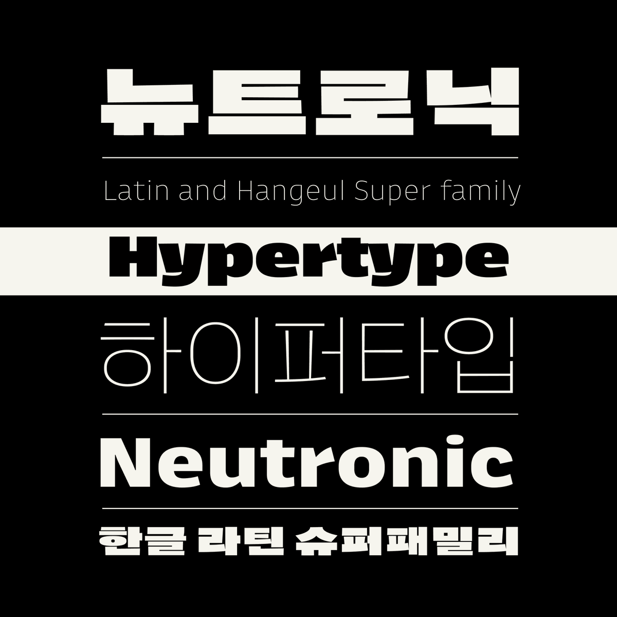
✨GRADUATION✨ Neutronic Hangeul v0.1 by @hypertype_xyz has crossed the finish line! It now has 10 styles and 2,780 meticulously crafted Hangeul characters, along with Basic Latin and punctuations.
https://t.co/G8hlZmRhiD
✨NEW VERSION✨ Neutronic Hangeul Compressed v0.8 by @hypertype_xyz adds Medium, Semibold, Bold, Extrabold, and Black, along with fine tuning across the family. Punctuation and more symbols are next up.
https://t.co/3mmflAwD1W
✨NEW VERSION✨ Neutronic v0.9 by @hypertype_xyz brings the family to 10 weights! This update also expands the language support and equalizes vertical metrics to fit in all weights and widths.
https://t.co/KRTs0oDblu
✨NEW VERSION✨ Neutronic Hangeul Compressed v0.7 by @hypertype_xyz adds three new weights: Extralight, Light, and Regular. Stay tuned for Medium, Semibold, Bold, Extrabold, and Black ahead!
https://t.co/geMNnxnfbi
✨NEW VERSION✨ Neutronic Compressed v0.8 by @hypertype_xyz brings many changes: a new Thin weight, a thicker Heavy, many new or improved glyphs, and equalized vertical metrics.
https://t.co/vD3NW9YNAq
@SatyaRohit3 @Mark2Mark_one @futurefonts No. But you might be interested in Neutronics monospaced predecessor Gintronic. That one is specifically designed for coding:
https://t.co/ehCncDQTWC
Meet our new type »Neutronic« a brand new superfamily! This kept us busy recently. »Neutronic« is the proportional descendant of @Mark2Mark_one 's monospace font Gintronic. Get it from @futurefonts
✨UPDATE✨ Neutronic Hangeul v0.5 by @hypertype_xyz brings the family up to 10 weights and includes all basic Hangeul (2,780 characters!) and basic Latin too. Next up: fine tuning and more glyphs. https://t.co/5V4rbLNVhB
@jayhxmo@azlenelza This looks great.
There are quite a few Korean variable fonts existing, though. At least they offer the weight axis to be variable already.
Here’s one:
https://t.co/HBtN6lX9IR
구글폰트에 새롭게 업데이트 된
힙한 한글폰트 ⚡️Hahmlet
https://t.co/CzIfk8c5xq
1940년대 한국 영화 "햄릿"에서 영감을 받아
디자인된 폰트로 무려 9개의 웨이트와
221개의 문자(언어)를 지원하는 다국어 폰트라고 합니다
제작자이신 @hypertype_xyz 님에게 감사드립니다
복많이 받으세요 😍
🤩 The folks at @hypertype_xyz have started work on a compressed version of their Neutronic and I'm 100% on board for this. They’ve only just started so get in at $25 and be a part of the ride!
@futurefonts@hhpapazian Thanks for explaining. However that’s just the case for the publishing. The design of the Hangeul is following the Latin for this particular family, though.
We alternate our strategies from typeface to typeface. Whichever works best.