Tata Tea 1868's pack visuals have been crafted in a highly evocative manner. The inner details create a layered perspective that draws you in, while the colour palette brings to mind the sensorials of the category. It all works together to bring a story to life!
Our challenge was to bring back the taste to Tetley, while building upon the Immunity story that consumer's associate with the category. Our refreshingly tasty designs have helped arrest Tetley's slide and seen the brand perform better.
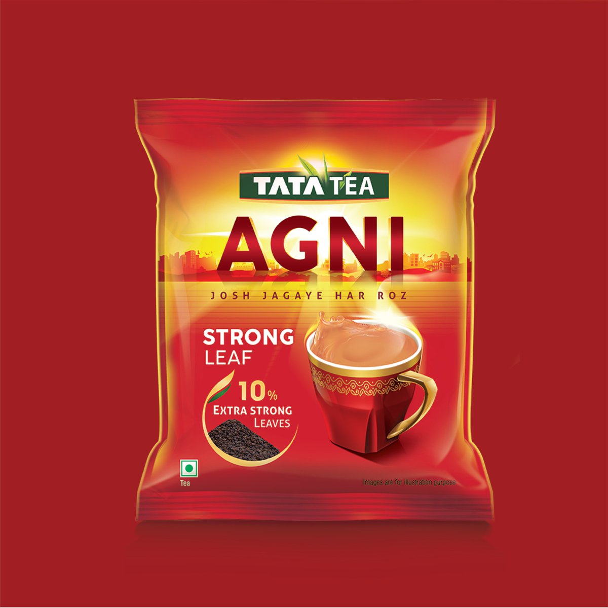
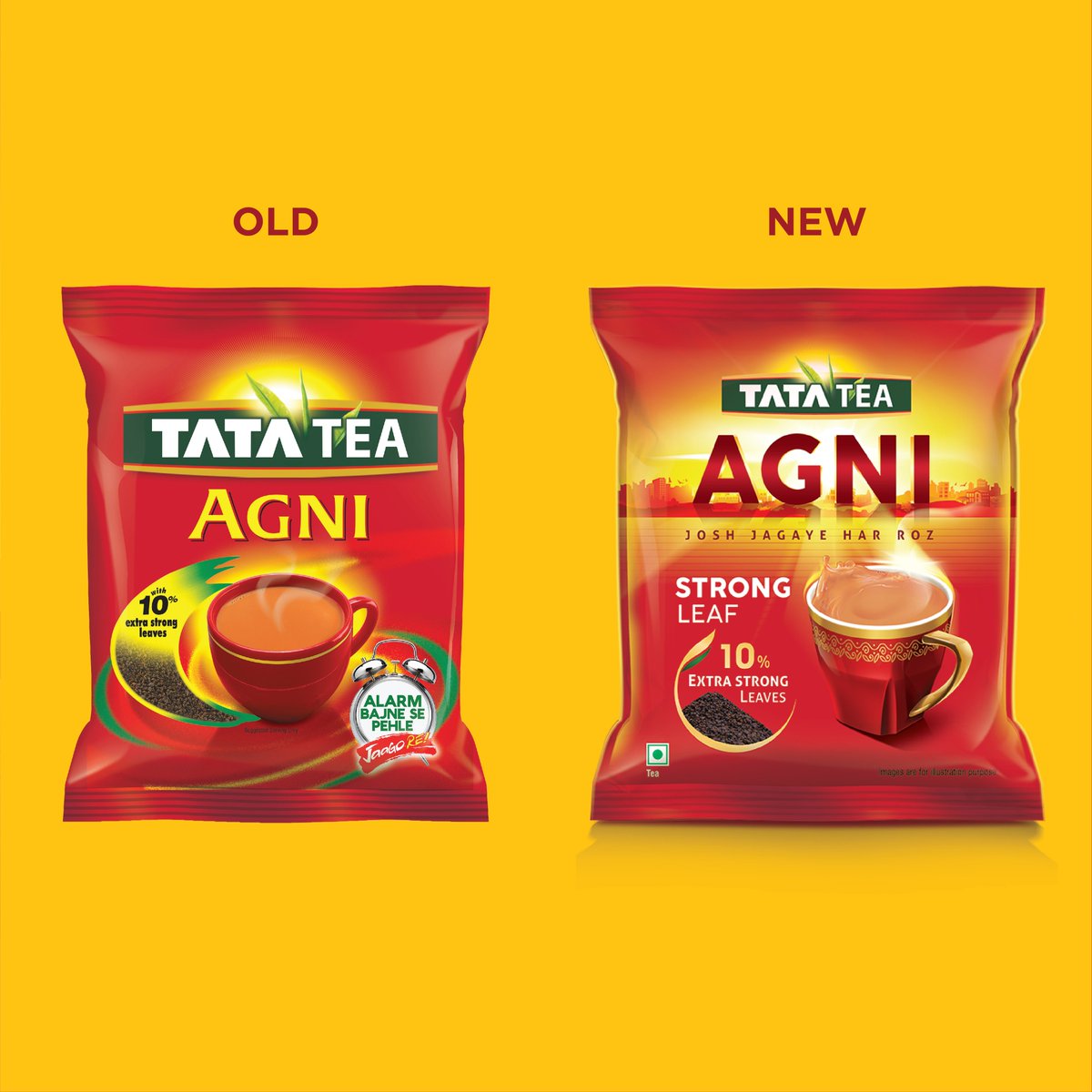
With Tata Tea Agni, the challenge was a tricky one. Contemporize a brand that’s looked the same for a decade, while bringing in a new story of awakening. Our design with a large brand identity looming over the horizon & the sun shining through managed to achieve all that & more.
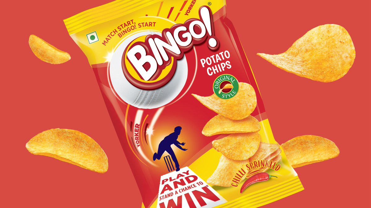
With the T20 World Cup round the corner, Bingo celebrated India’s love for cricket with special edition packs. Our designs retained the sense of quirky fun at the heart of the brand, while adding further action through cricket elements in a perfect symphony of brand and occasion!
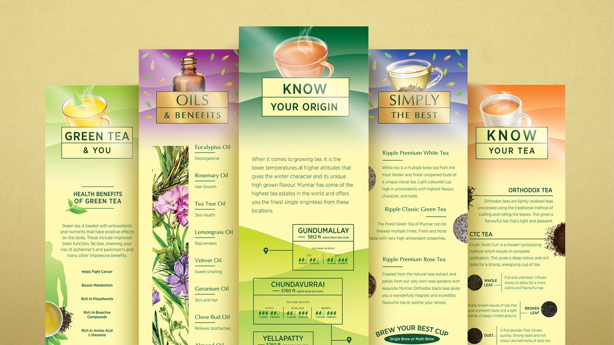
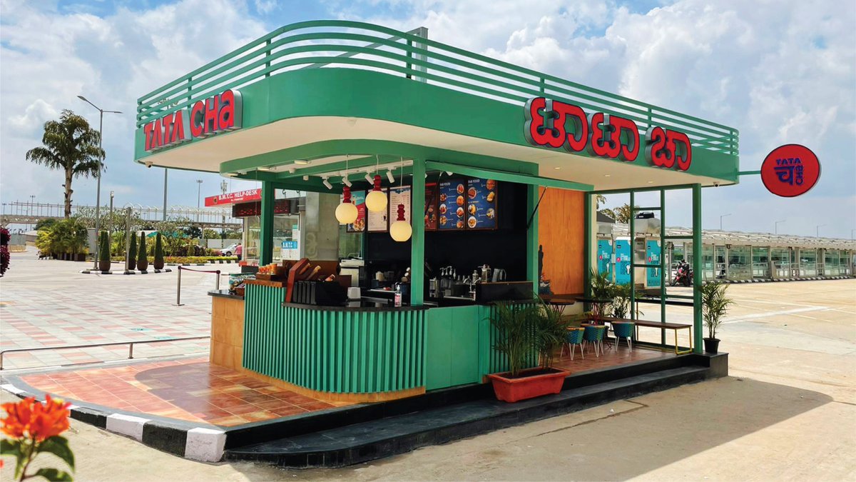
The Ripple brand has always been more than just tea. As part of a Service Design engagement, our in-store graphics developed for Chai Bazaar outlet uses contour lines to replicate tea gardens & convey a brand intricately connected to the land Celebrating Munnar in all its glory!
As strategic design partners, we helped define both the NURA service and brand to position it as a customer centric, non clinical experience where healthy, asymptomatic people can walk in voluntarily & walk out with a detailed health report in 120 minutes.
https://t.co/UHqI5D8c2S
With its promise of Plantation Fresh Coffee, Icarus helped set Tata Coffee Grand against the category heavyweights. A distinct colour palette and highly evocative imagery that tapped into consumer associations of fresh coffee helped create an instant connect across India.
A spice brand aimed at South Asian expats in the UK, Rajah wanted to reinvent itself to be relevant to a second-generation audience. Our identity reflects the confidence and dynamism, while the visuals reflect the nostalgic yearning for the fields of India they’ve heard about.
With Tata Tea Tulsi Green the key challenge was to convey that the product contained real Tulsi leaves something we locked into the identity itself. The brown paper effect and muted colors also added freshness and a natural appeal giving the pack a tasty yet good-for-you feeling!
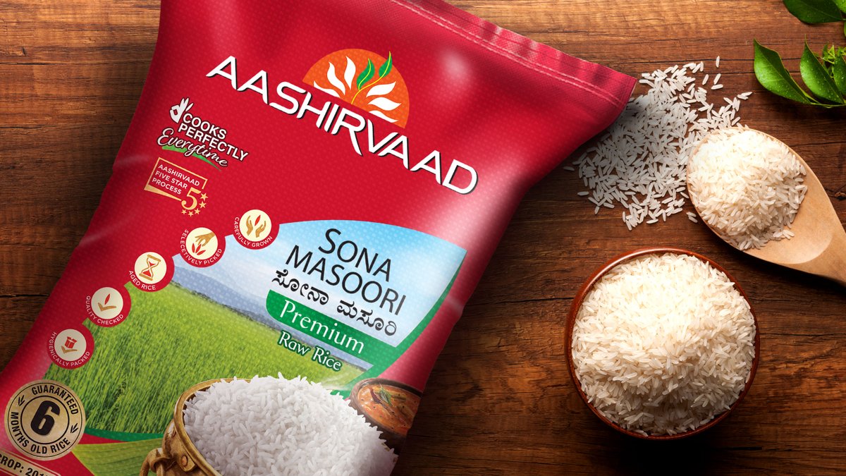
Rice is brought with it the complexity of multiple varieties for different regions and price points. Our visual architecture allowed for this while holding on to a family look – giving Aashirvaad the perfect start in its biggest challenge for a while! @AashirvaadAtta
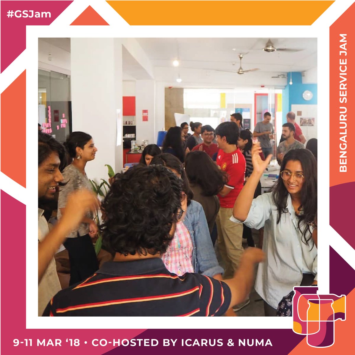
Bengaluru Service Jam 2018 was where over 80 Bangaloreans came together to explore ways to build services, using design & a playful mindset. In less than 48 hours, we went through a whole Service Design process and prototyped new services together, based on a shared global theme.
From its Sanskrit-inspired name Mitvana to a visual language that balanced scientific precision & cleanliness with the beauty of nature – we designed products that felt Indian yet international, natural yet scientific, and most crucially, felt like your perfect skincare partner!
With more and more young, urban Indians increasingly embarking on culinary adventures, it was time for us to dive into one of our own! Tasked with developing designs for ITC MasterChef's range of dips and chutneys, our striking designs capture the bold and experimental spirit.
As Aashirvaad forayed into new niches - with Select Atta, or Sugar Release Control, or Multigrain Atta - Icarus helped distill those complex messages into distinct and memorable visual styles, thereby driving the Aashirvaad brand into new spaces. @AashirvaadAtta
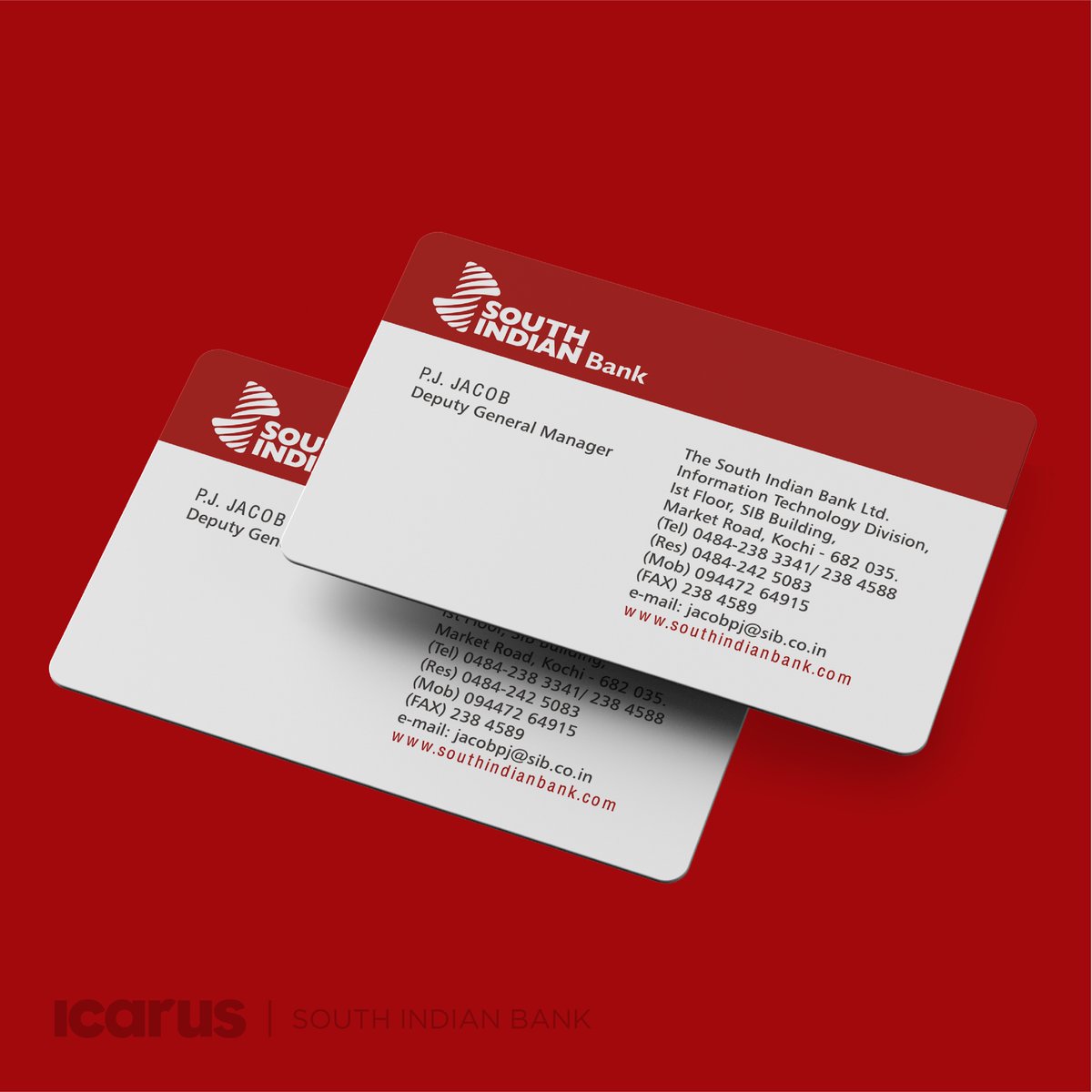
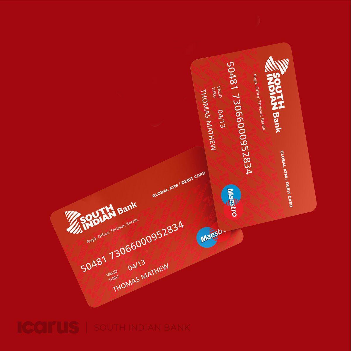
Throwback to our rebranding project for South Indian Bank, one of the largest and most trusted private banks in Kerala.
Our extensive rebranding exercise included the bank’s identity, as well as how it would translate effectively across various touch points. @OfficialSIBLtd
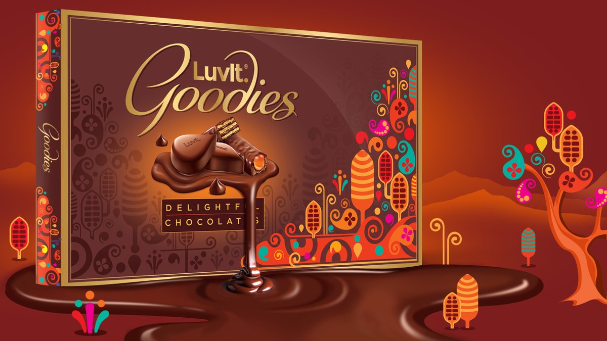
LuvIt’s always been a fun brand. So when they approached us to design their gifting range we let our imaginations run wild! The result was an alternate chocolate universe full of sweet goodies – endlessly fascinating for kids, yet sophisticated enough to appeal to adults as well.
#throwback to our redesign of the UB Group logo & visual language back in 2006!
Our redesign of the now ubiquitous soaring Pegasus perfectly captured UB Group's confidence and capability as they expanded into the global market.