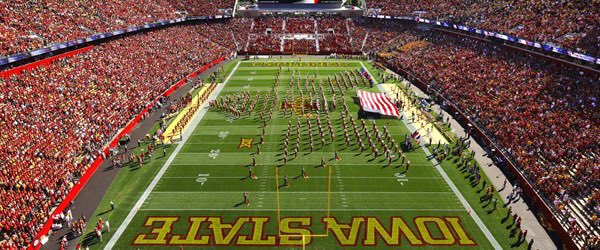
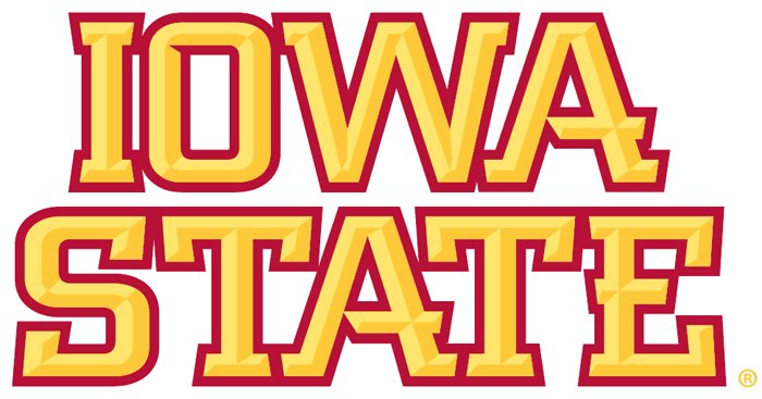
What’s even more exciting is that it looks like the wording will be cardinal colored with a gold outline as opposed to the opposite, the same end zone we’ve seen since 08.
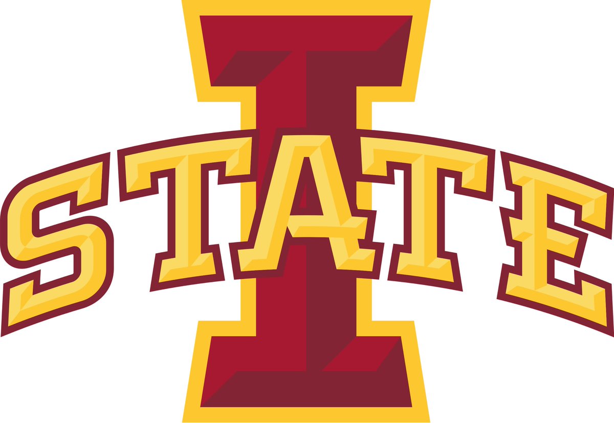
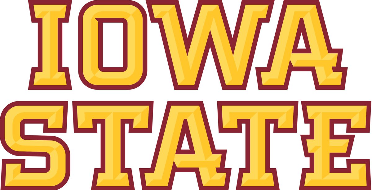
They’re finally putting the updated font on the end zones 😭😭 (the newer font is bolder to match the I-State logo that is more spaced out). Even though they put the updated logo in centerfield 2018, the same old font has remained since 2008).
Very small difference, but it’s major if you’ve never noticed it. Updated font on the left, outdated font on the right. There’s much more angular consistency in the newer font, plus a change in color as well.